The network for creativity
Join 1.25M professional creatives like you
Connect with clients, get discovered, and run your business 100% commission-free
Creatives on Contra have earned over $150M and we are just getting started
Back to feedPost
I built a font. Not just a visual experiment, an actual working one.
This started as a simple question: what would happen if every letter was built only from two shapes, a square and a circle?
No extra curves. No decorative tricks. Just sharp square structures with circular cuts pushed into them until the alphabet started feeling usable.
I developed the direction with AI, refined the logic through ChatGPT, and used Claude Code to help turn it into a functional, downloadable font file. I tested it inside Photoshop, and it works.
It’s still experimental, but that’s the point. I wanted to see if AI could help move a type idea beyond a pretty mockup and into something that actually functions as a design asset.
This is the first version of the typeface. Let me know if you would like to try it and I would love to provide it to you.
Workflow provided by: https://x.com/Ror_Fly


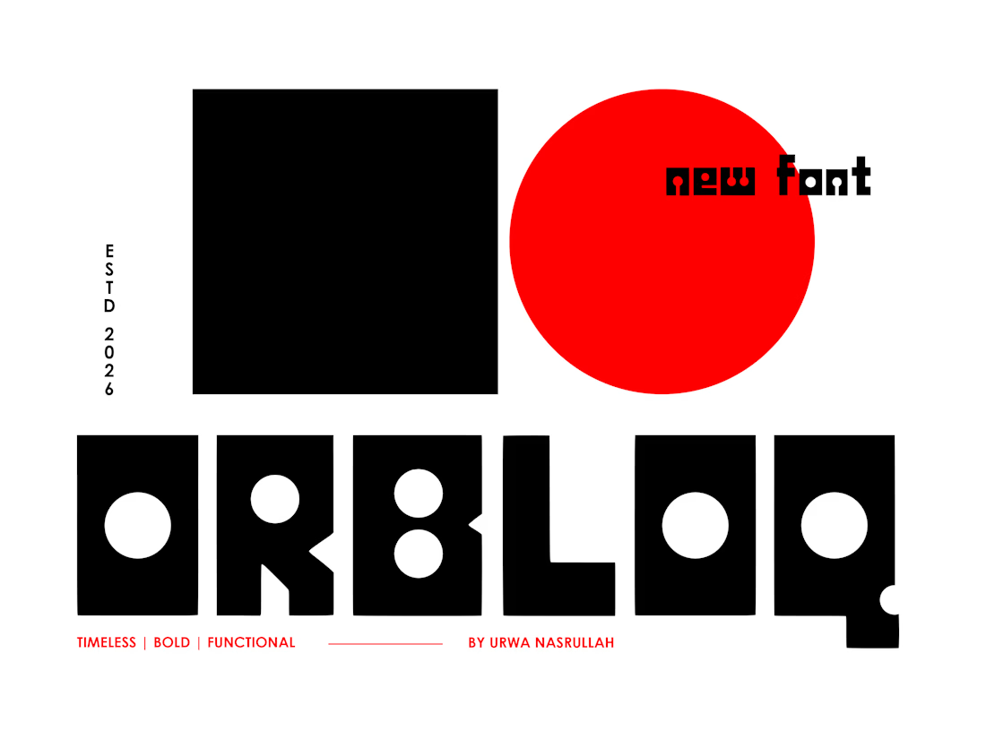

Still rough in places, but honestly, that’s the exciting part for me, AI helped move it from concept to something actually functional. Would you like to try the first version?
The network for creativity
Join 1.25M professional creatives like you
Connect with clients, get discovered, and run your business 100% commission-free
Creatives on Contra have earned over $150M and we are just getting started






Related posts

Recent work on MAE - Visual identity


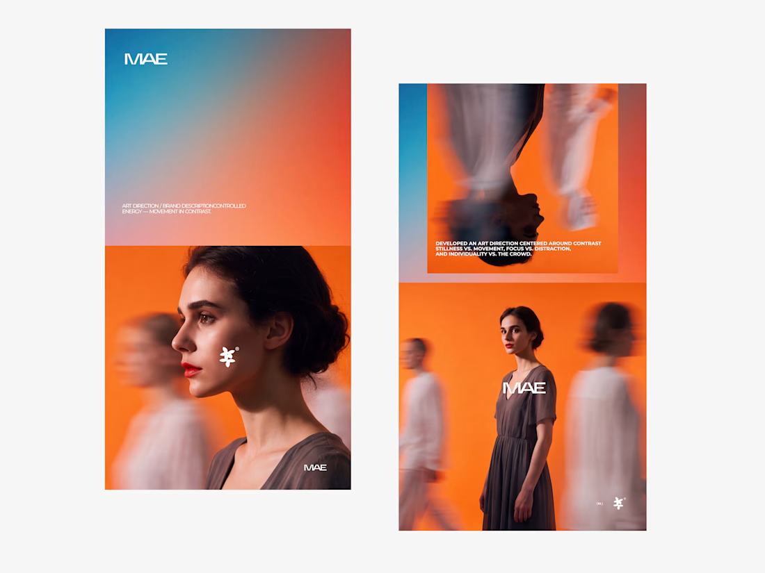

The motion blur on the figures gives the orange-to-blue gradient a reason to be there, and the small star mark stays readable on both the cheek and the shirt. Did the star come first as a standalone mark, or did it grow out of the photography direction?

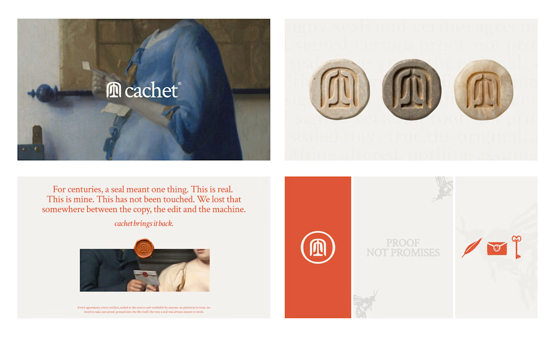
Cachet brand exploration.
Exploring patterns, textures, materials and hand-drawn illustrations

That's interesting I like it that's really unique ❤️❤️🎉🎉

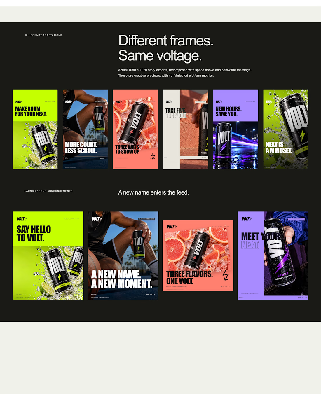
an electrolyte beverage campaign concept I created🚀👇
5 creatives. 20 static ads. One bold visual system built to stop the scroll.


This is genuinely creative! What I love most is how the design manages to stand out while still feeling intentional and well thought out. There’s something about the overall execution that naturally draws your attention and makes you want to take a closer look. It’s always...