The network for creativity
Join 1.25M professional creatives like you
Connect with clients, get discovered, and run your business 100% commission-free
Creatives on Contra have earned over $150M and we are just getting started
Back to feedPost
I’ve been making one visual experiment a day to see where my taste goes without client brief limits.
This one started as a fun exploration but turned into an AI-assisted art direction study around Gen Z officewear.
The style sits between geometric editorial fashion illustration, neo-Bauhaus color blocking, and flat vector poster art, bold outlines, absurd camera angles, exaggerated silhouettes, and officewear that feels too dramatic for a normal 9–5.
I may build this into a fictional fashion campaign later, but for now, I’m using it to push style, composition, and AI direction.
What do you think this should become next? A fictional fashion brand, a campaign series, or a poster collection?
Digital illustrationAdobe IllustratorChatGPTDailyeditorialillustrationcreativeaiflowAI ArtFashion Design


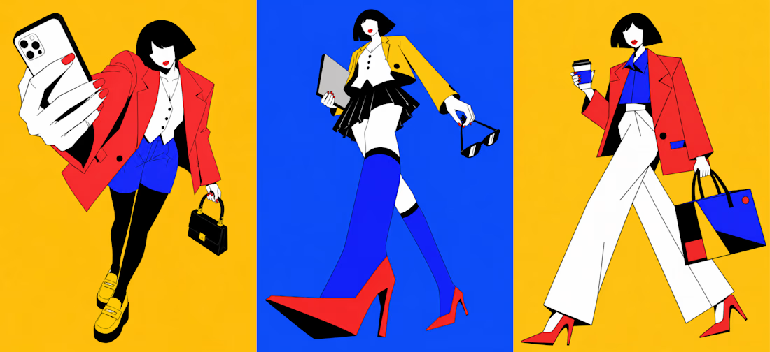

When using AI creatively, where do you think the real skill is? In generating more options, or knowing which ones are actually worth building on?

The neo-Bauhaus color blocking is doing a lot here. Of the three options, the fictional brand route feels most interesting because it gives the style a container, something to push against rather than just explore in the open.
I agree to an extent.
A fictional brand would give it structure, but I also don’t want to force a container too early.
The open exploration phase is usually where the stranger, more interesting decisions happen. Once it becomes a brand, it needs rules and I want to let it misbehave a little first 😊 .
The network for creativity
Join 1.25M professional creatives like you
Connect with clients, get discovered, and run your business 100% commission-free
Creatives on Contra have earned over $150M and we are just getting started






Related posts

Recent work on MAE - Visual identity


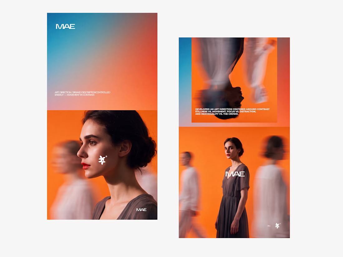

The motion blur on the figures gives the orange-to-blue gradient a reason to be there, and the small star mark stays readable on both the cheek and the shirt. Did the star come first as a standalone mark, or did it grow out of the photography direction?

Cachet brand exploration.
Exploring patterns, textures, materials and hand-drawn illustrations
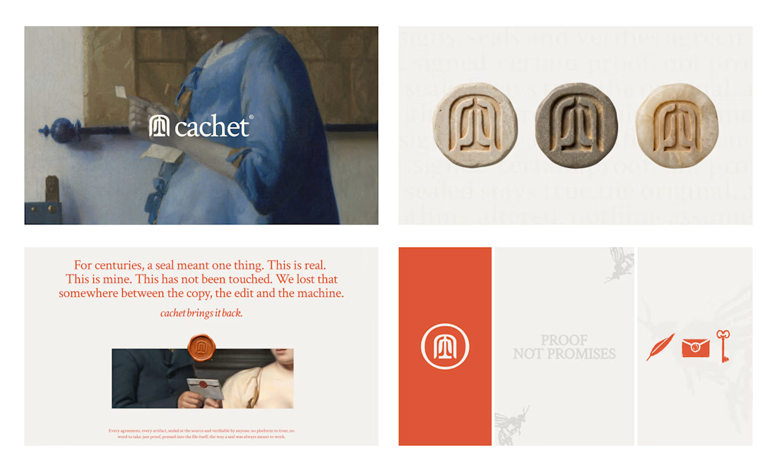

That's interesting I like it that's really unique ❤️❤️🎉🎉

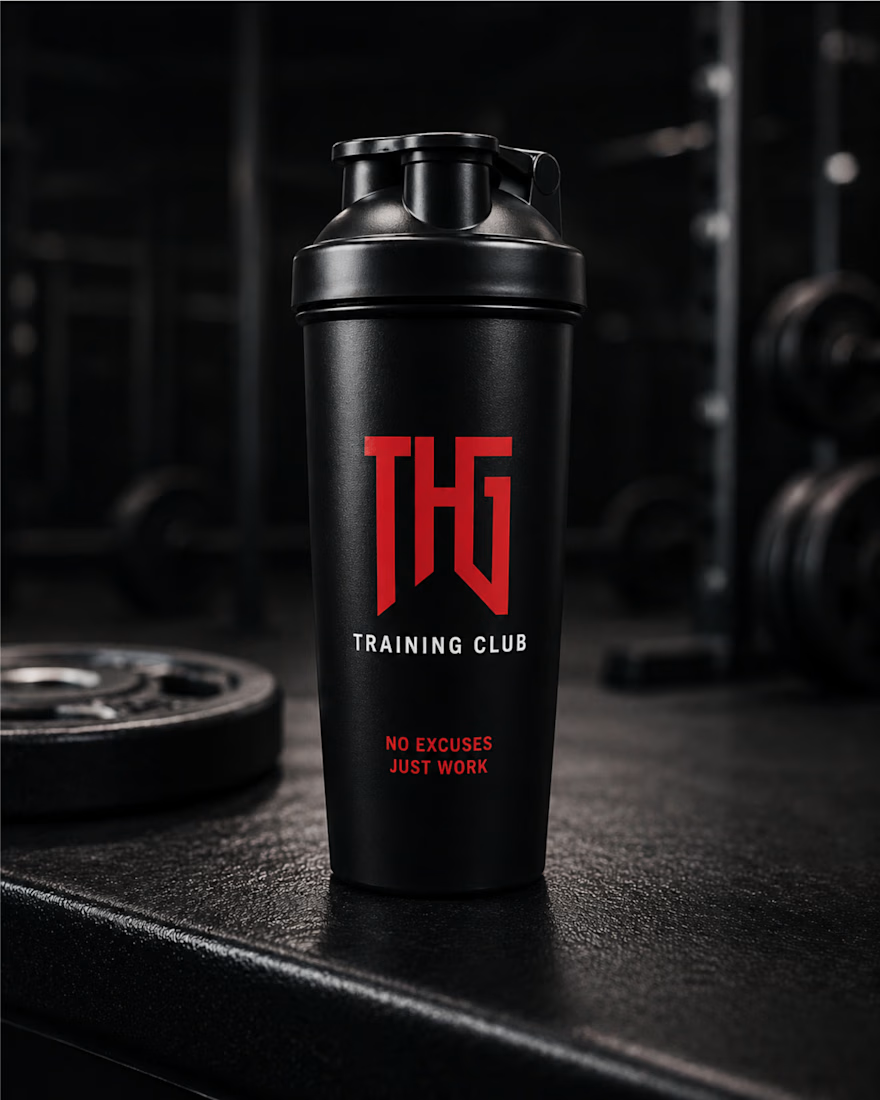
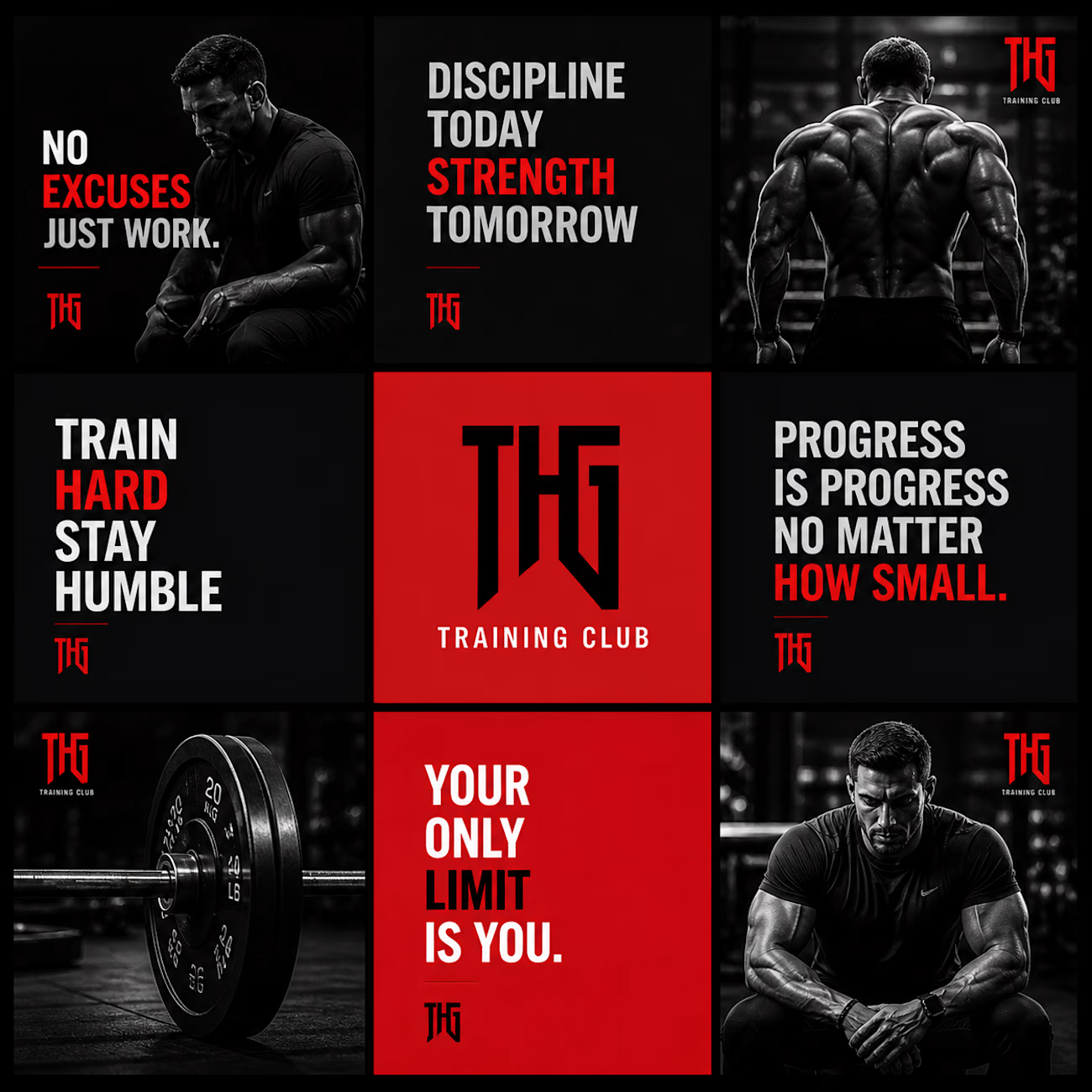
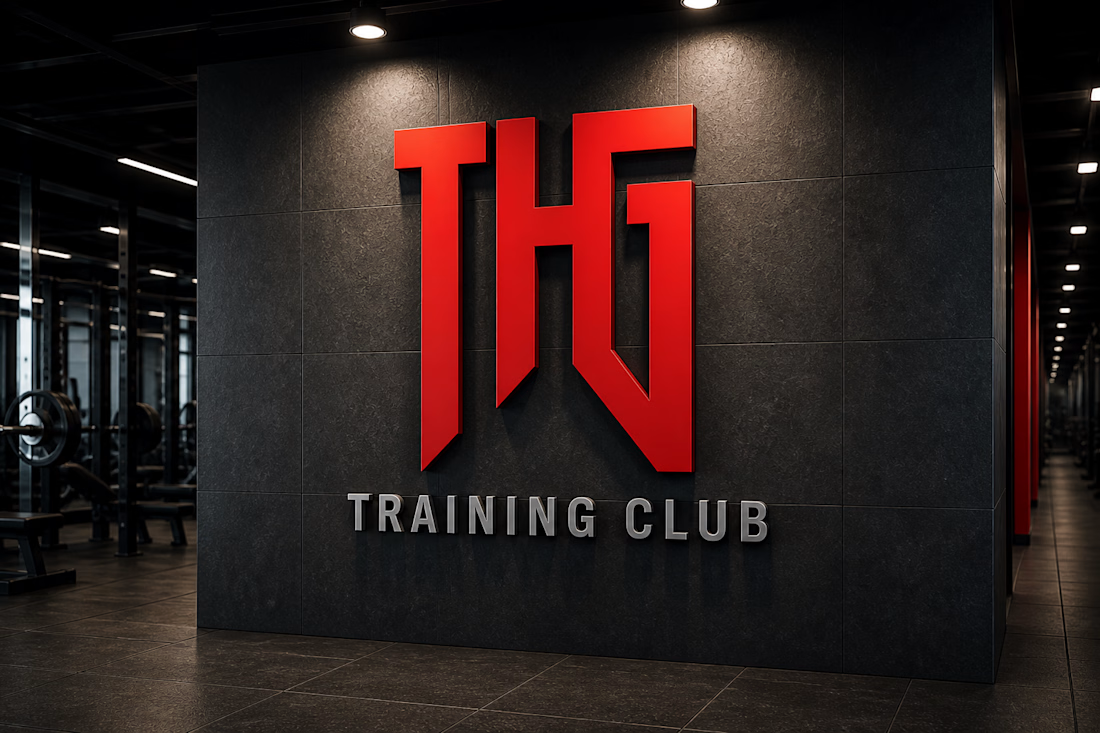
THG Training Club – Fitness Brand Identity & Mockup Design
A bold and modern fitness brand identity design created for THG Training Club. This project focuses on building a strong, powerful visual presence that reflects discipline, strength, and high-performance training culture.
The design revolves around a minimal yet aggressive aesthetic, using a dark theme combined with a striking red logo to create a premium and impactful look. The typography and visual hierarchy are crafted to enhance brand recognition while maintaining clarity across different applications.
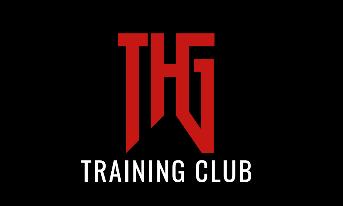


whos the target member for THG, serious lifters or more of a general gym crowd