


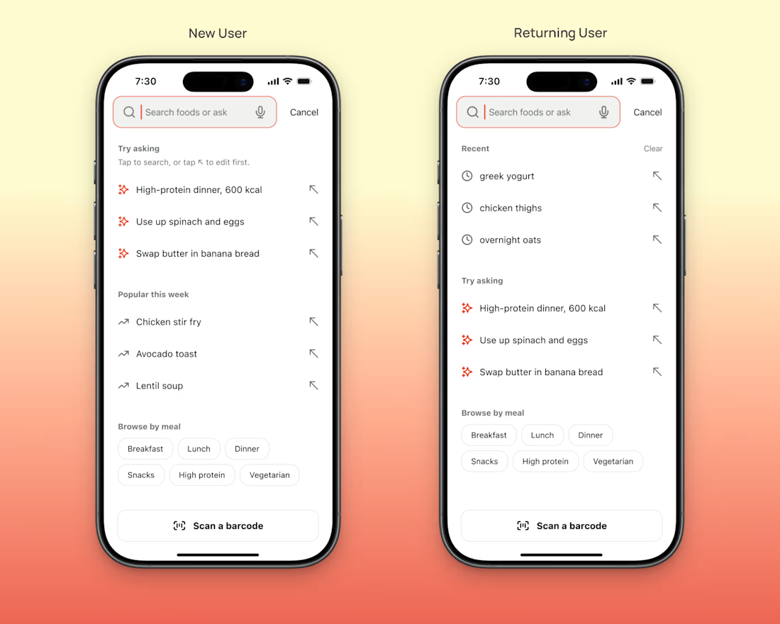
You know exactly what to type into your own search box.
A new user doesn't.
They open it and see a blinking cursor.
Then they have to guess what your app can do.
I designed an empty search screen for an AI food tracker concept here's what I put in it (if you want to steal it).
...

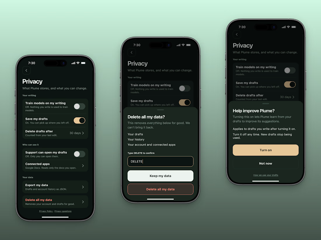
Before someone pastes their real work into your AI app, they look for one switch.
The one that says whether you train on their writing.
If they can't find it in 10 seconds, I'd bet they close the app.
I designed a privacy screen for a concept AI writing assistant.
Here's a checklist...
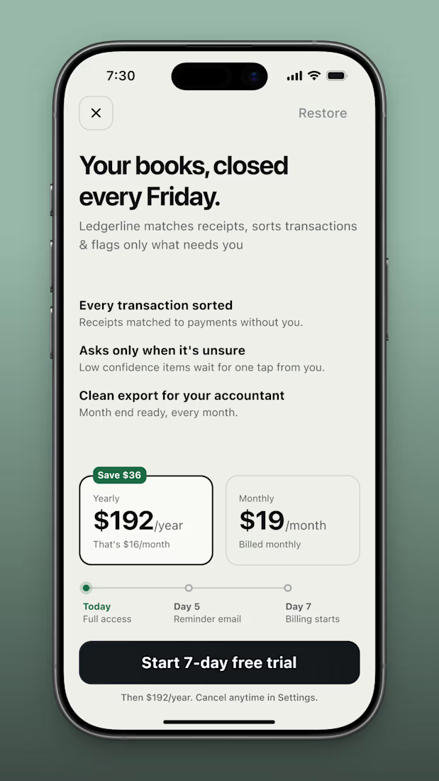
Trials die on day 7.
That's when the first charge lands.
If users didn't see it coming, they ask for a refund or worse, leave a 1 star review.
I made a trial paywall for an AI bookkeeping tool.
It's a concept, so nobody got charged.
My first draft led with $16 a month because it...

Solo landscapers lose jobs to slow replies. A customer messages, the owner's mid-mow, and by the time he replies hours later she's already booked someone else. He also double-books himself sometimes, because he's tracking everything by memory. And every so often, someone just...
upSYNC is an Agent that syncs data & integrations between the applications founders and operators already use. It sits in the workflow layer as the connective tissue between software stacks, eliminating the manual work of keeping data consistent across platforms.