
Sibelius Claussen
Creative Director & Product Designer | Brand Systems + SaaS
Ready for work
Sibelius is ready for their next project!

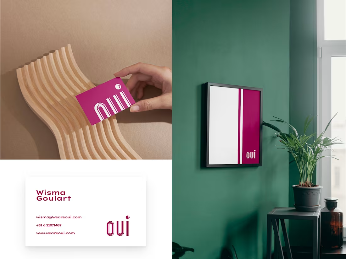
I created the entire brand ecosystem using my own methodology, leading a three‑week sprint with Wisma Goulart, a female‑led European design agency, to build a visual identity with more vitality while staying true to the director’s vision. I worked entirely in Figma, using a presentation structure I developed to guide the team through research, exploration, and final directions, and relied on third‑party tools to prepare assets for different devices.
A key outcome was the “OUI” logo: a clean wordmark with subtle cuts that symbolize a new era for the agency, paired with a circular symbol that embeds a discreet smile to convey positivity and approachability. This direction gave Wisma Goulart a cohesive visual foundation and logo system that strengthens their positioning as an optimistic, welcoming studio in the European market.
1
127
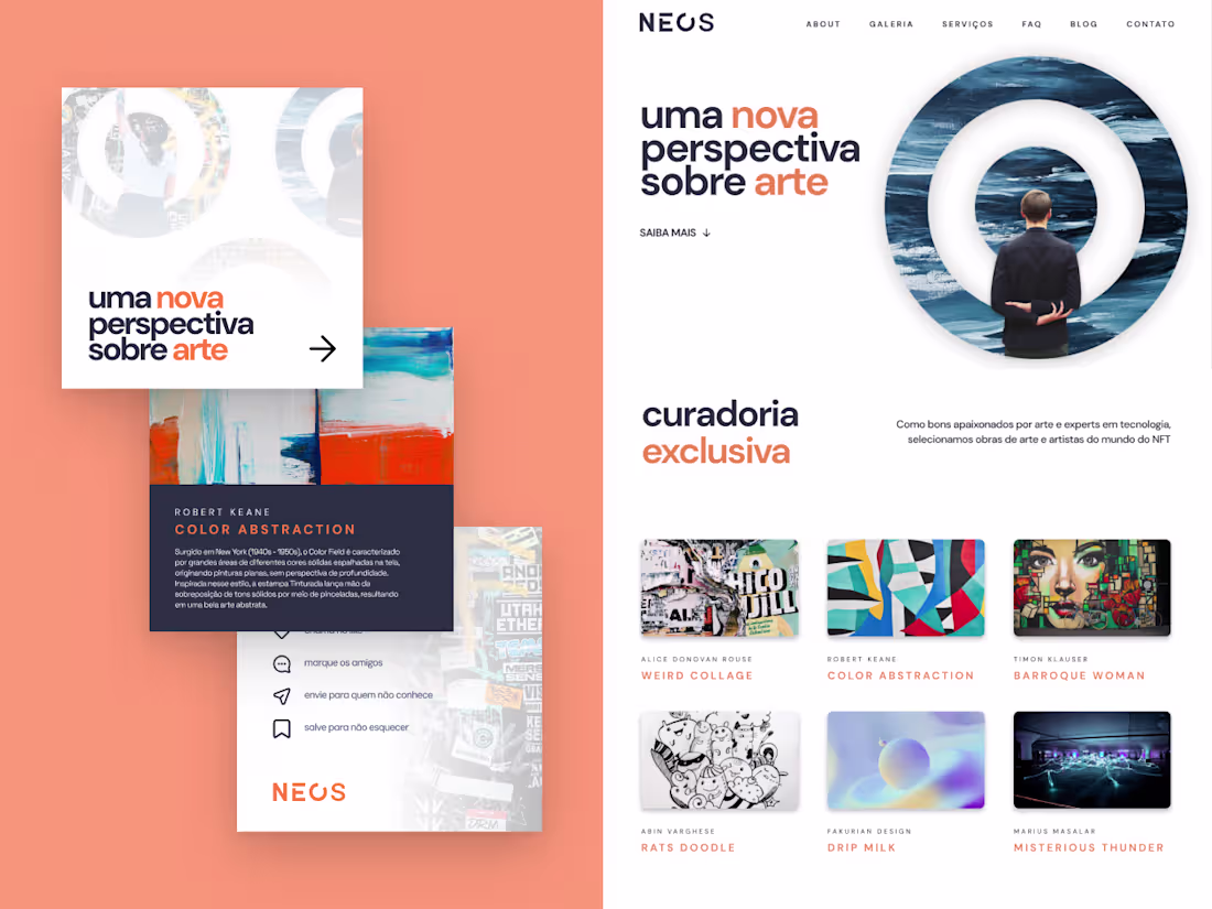
I led the NEOS NFT project for André Maso, overseeing the development of a new brand ecosystem and website to better connect a community of artists and investors. During this three‑month collaboration, I guided the branding implementation on the site, respected an existing logo created by another designer, and introduced strategic adjustments and new visual elements to strengthen the identity.
Working primarily in Figma and WordPress with custom CSS/HTML, I focused on translating the brand into a clear, engaging digital experience that showcased each artist’s work and presence. The result was a more organized and expressive brand structure, supported by a visual language that highlights individual artists while reinforcing a shared sense of belonging, recognition, and appreciation within the NEOS community.
#branding
1
104
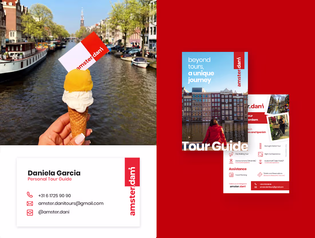
Dani approached me with a playful challenge: create a brand that felt unmistakably like Amsterdam while turning her nickname into the joke “Amster.dani.” Over a three‑week sprint using my own methodology, I designed the entire brand ecosystem, from concept and tone of voice to logo, symbol set, and key digital touchpoints.
At the center is a wordmark that can be read as both “amster.dani” and “amsterdam,” merging the city’s name with her story to signal a more intimate, local‑guided experience. Around it, I built a visual language that connects the city’s essence with Dani’s view as a resident, using clear typography, bold color blocks, and flexible icons for tour categories, so every interaction feels like “not just a tour, a unique journey.”
2
1
122
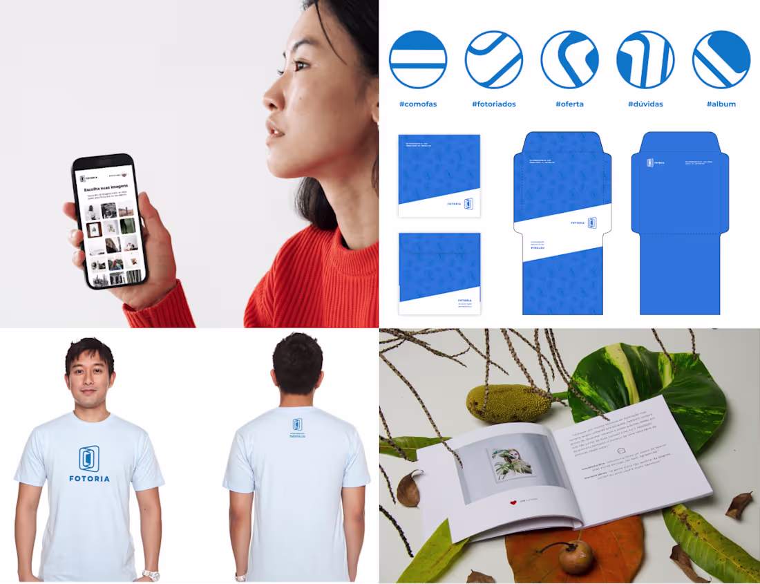
I founded Fotoria as a startup to help creators turn their Instagram feeds into tangible memories, designing both the physical photo book and the digital experience end‑to‑end. I led the project from user research to service design, defining how photos would be selected, laid out, and delivered so that the process felt seamless for non‑technical users.
Using Figma and Illustrator, I created the visual identity and the book layout system, then built an InDesign template that could generate entire albums automatically from Instagram data. A custom PDF‑conversion flow coded in React transformed user selections into print‑ready files, and the final experience ended with a curated package arriving at the user’s home as a finished book, connecting their digital stories with a physical object they could keep and gift.
#book #branding
2
3
129

As a human that love design things I usually do every day some photography exercise.
When I think in pictures I'm also motivated for the small details that we can have by looking the nature.
In my life I've always been amazed of how the smallest details can give us new ways to observe details in our own lives.
ps.: These photos were taken in my house during my working day.
2
0
61