The network for creativity
Join 1.25M professional creatives like you
Connect with clients, get discovered, and run your business 100% commission-free
Creatives on Contra have earned over $150M and we are just getting started
Back to feedPost
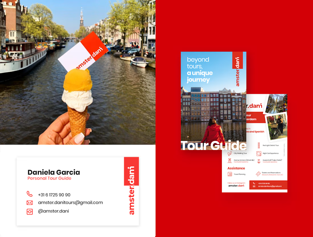
Dani approached me with a playful challenge: create a brand that felt unmistakably like Amsterdam while turning her nickname into the joke “Amster.dani.” Over a three‑week sprint using my own methodology, I designed the entire brand ecosystem, from concept and tone of voice to logo, symbol set, and key digital touchpoints.
At the center is a wordmark that can be read as both “amster.dani” and “amsterdam,” merging the city’s name with her story to signal a more intimate, local‑guided experience. Around it, I built a visual language that connects the city’s essence with Dani’s view as a resident, using clear typography, bold color blocks, and flexible icons for tour categories, so every interaction feels like “not just a tour, a unique journey.”




Thanks @Ciro !
The network for creativity
Join 1.25M professional creatives like you
Connect with clients, get discovered, and run your business 100% commission-free
Creatives on Contra have earned over $150M and we are just getting started





Related posts

Cleann🔥

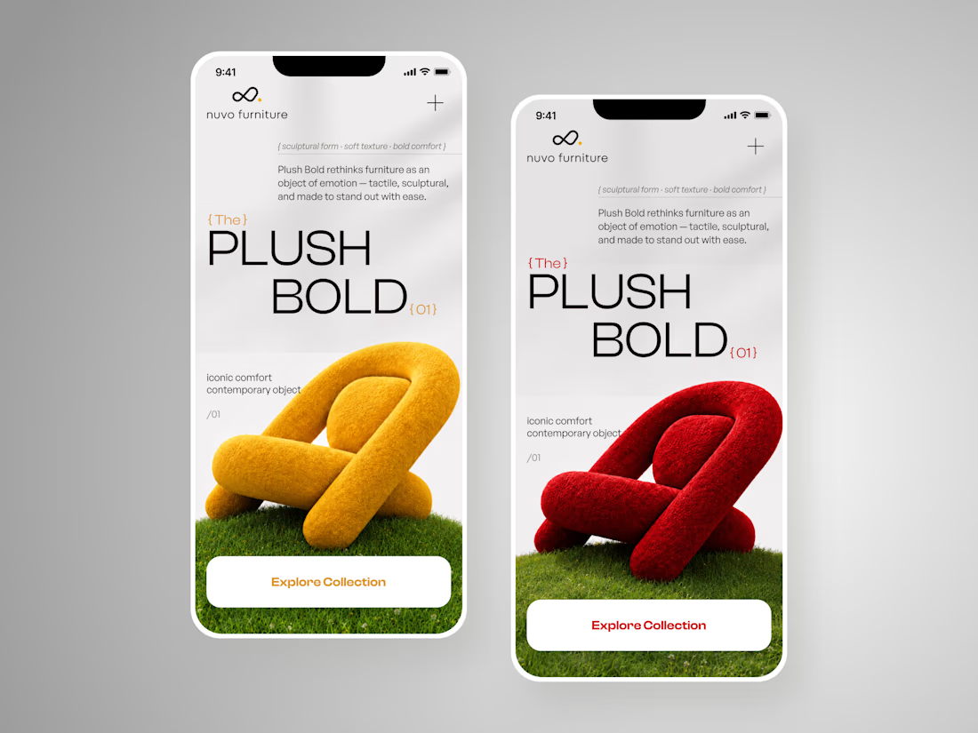
NUVO Furniture — Sculptural Furniture E-commerce Concept 🪑✨
NUVO is a contemporary furniture website concept built around one idea: let the product become the experience.
At the center of the concept is Plush Bold — an expressive statement chair designed to feel more like a...
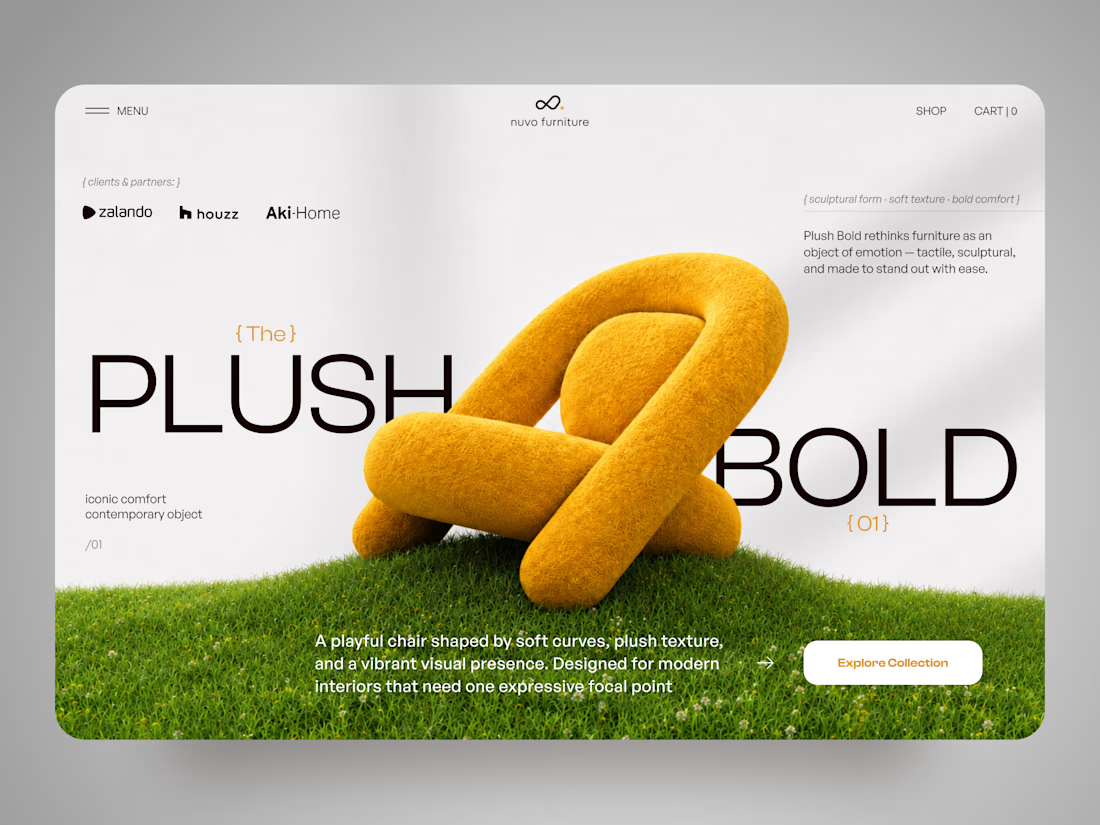
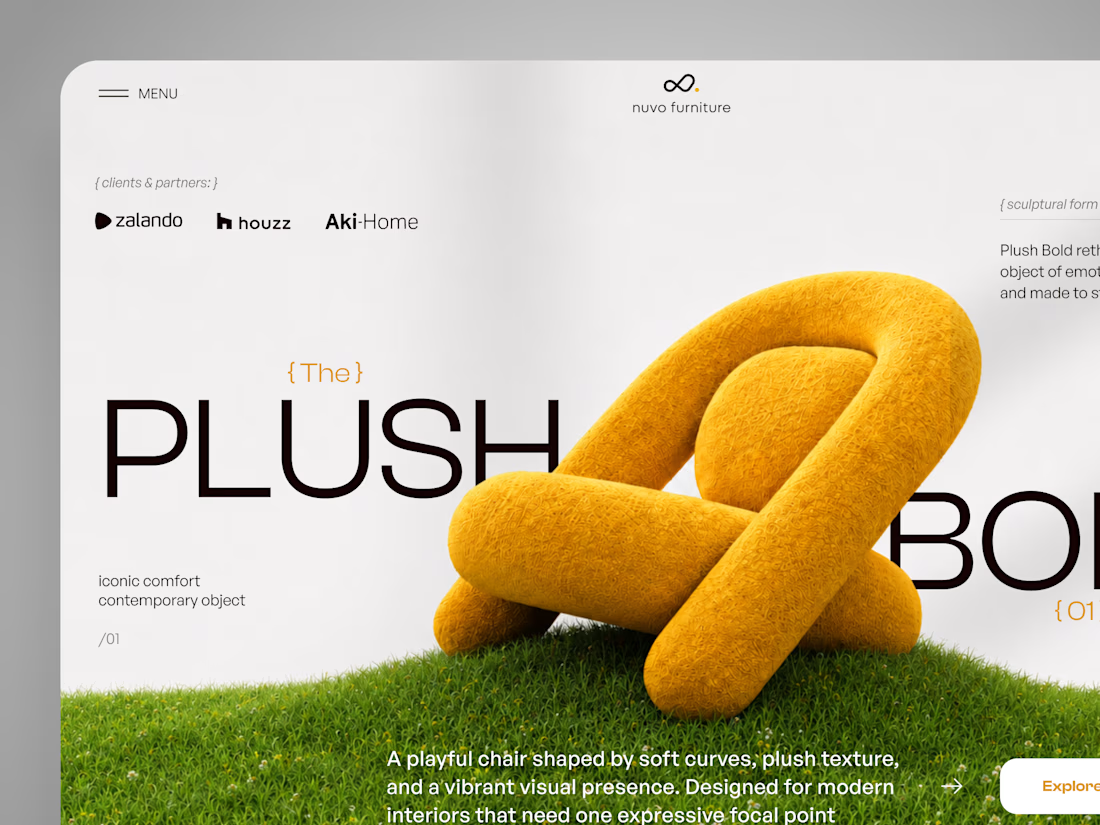

Hero section of one my new templates. Preview it live to see the animations.
Relay is HTML or React you actually own.
Hand it to your AI assistant and it already knows how the thing is built.
Starting at $29
https://no-code.supply/templates/relay
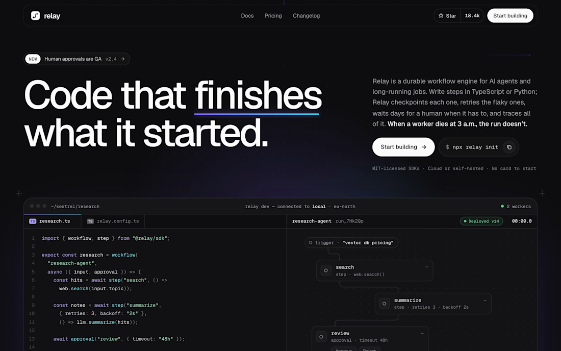

"Code that finishes what it started" is a great headline. Love that it's real HTML/React you own and not locked into a builder.

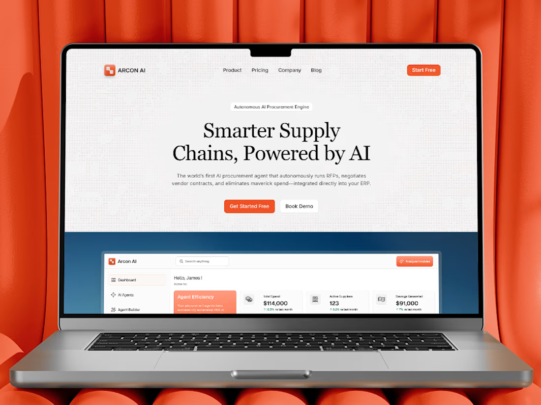
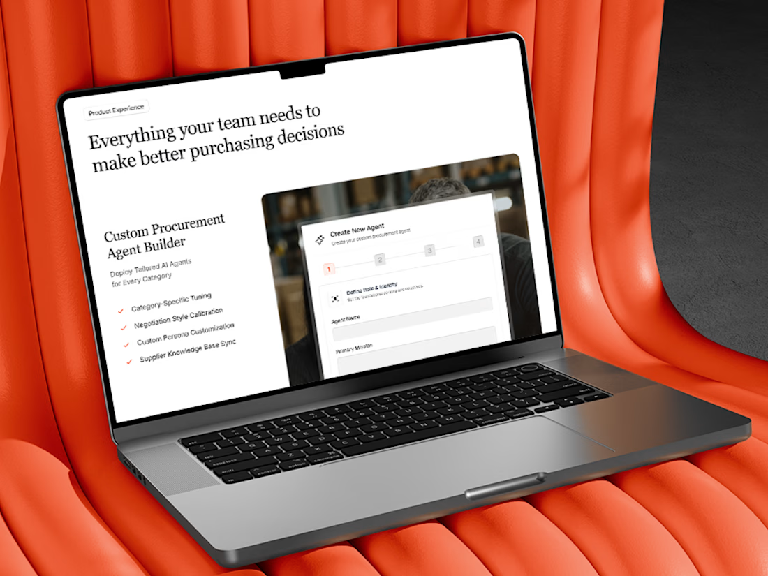
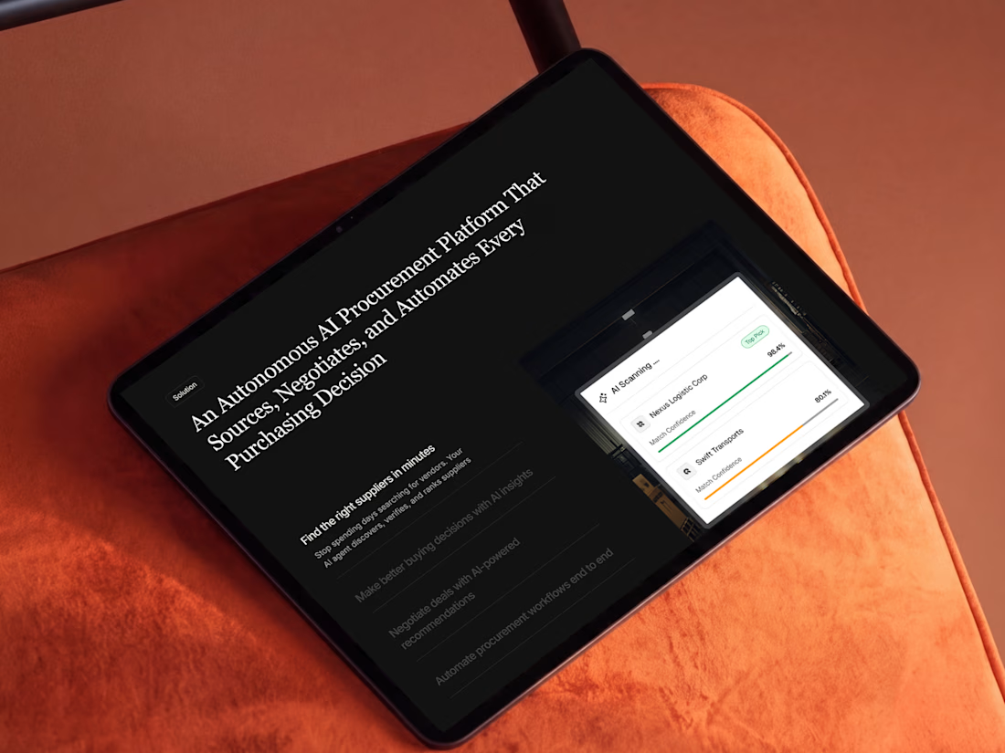
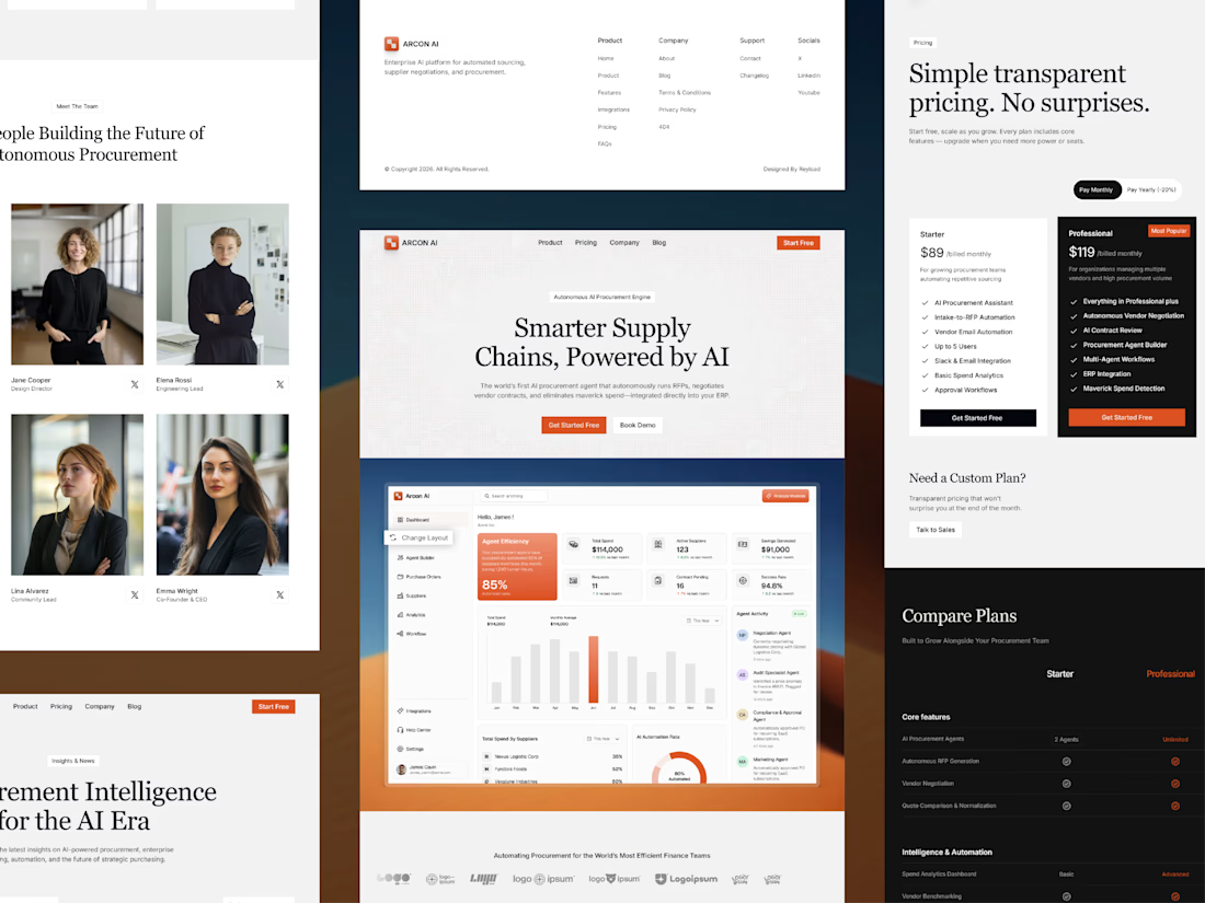
Free AI Framer template we designed for B2B SaaS.
Arcon AI is a premium Framer template built for AI startups, procurement platforms, enterprise SaaS, AI agents, workflow automation, supply chain technology, and B2B software. Designed with a modern enterprise aesthetic, it helps you launch a professional website that builds trust, showcases your product, and drives conversions.
Get it for free: https://www.framer.com/marketplace/templates/arconai/


Lovely work