The network for creativity
Join 1.25M professional creatives like you
Connect with clients, get discovered, and run your business 100% commission-free
Creatives on Contra have earned over $150M and we are just getting started
Back to feedPost
Taste Test

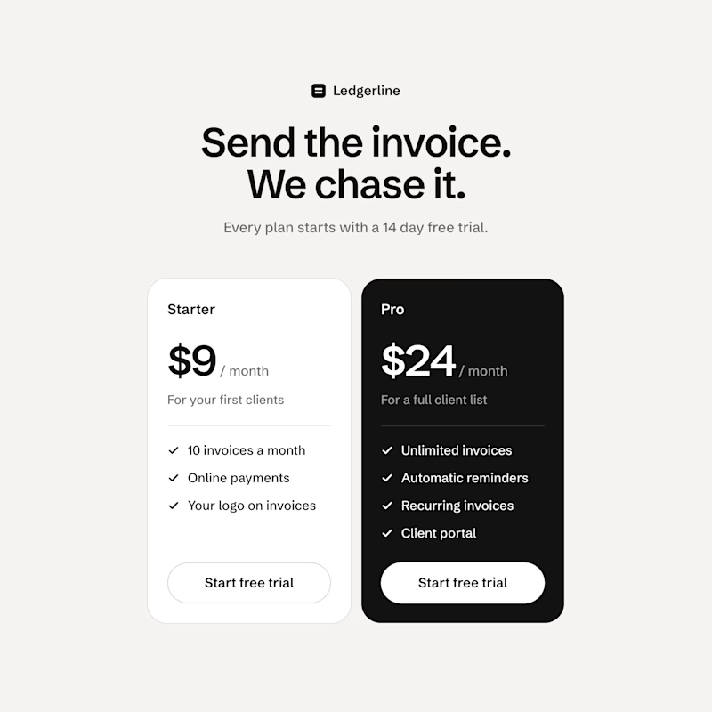
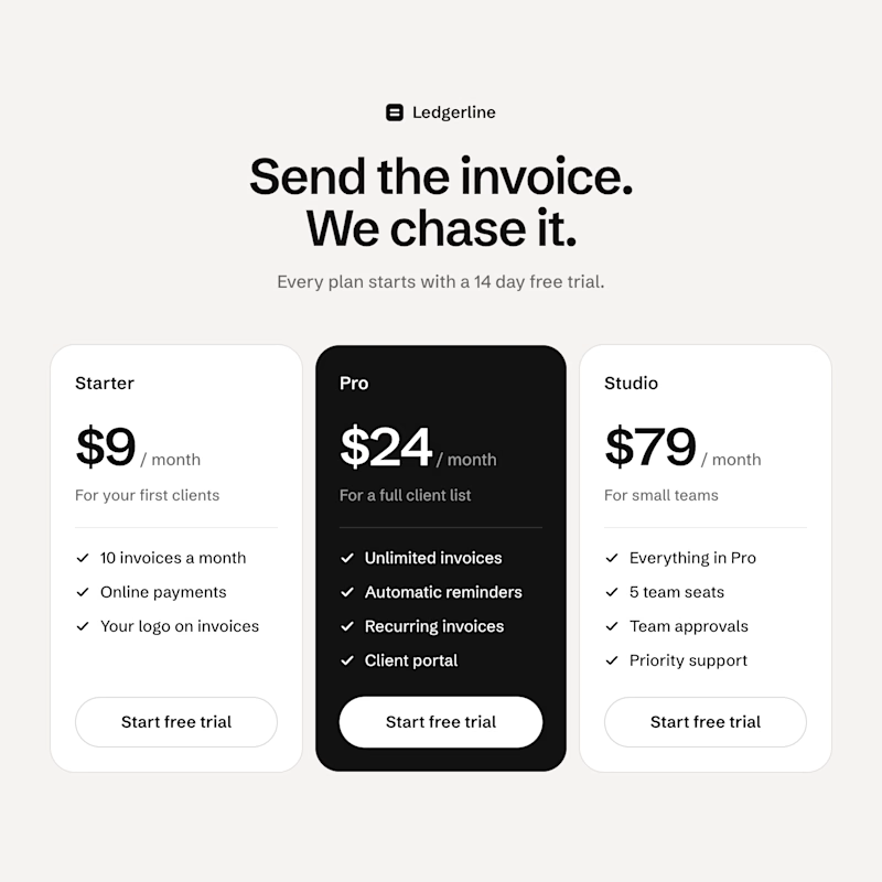
Built two pricing sections for a concept invoicing app in code with Claude Code. Same Starter, same Pro, same prices. B only adds a $79 plan that isn't really there to be bought.
Which one gets you to pick Pro, A or B?

17 votes
Ends in 1d

I'd go with B. The $79 Studio card makes Pro feel like the obvious middle choice, and the black Pro card already pulls the eye in both versions. Would love to see how it performs with real traffic.

3 plans makes Pro naturally appealing

Definitely B. Putting the $79 plan on the right makes the $24 Pro plan look like a total bargain. When there are only two options like in A, $24 feels expensive compared to $9.

B for me. Next to $79, Pro at $24 looks like the sensible middle, and the dark Pro card already does half the work.

B for me. Classic decoy effect, the $79 plan makes Pro look like the sensible pick without saying a word. Cool that you built both in code too, makes testing so much easier.

Great craft, Ergini!

B. Classic decoy. Would be fun to see if anyone actually buys the $79 one.

The network for creativity
Join 1.25M professional creatives like you
Connect with clients, get discovered, and run your business 100% commission-free
Creatives on Contra have earned over $150M and we are just getting started





Related posts


Which feels more established to you?
22 voted
30%

52 voted
70%

74 votes
Closed


Juice & Beverage Shopping App UI/UX Design
A fresh and modern juice and beverage shopping app designed to deliver a smooth and engaging shopping experience. Featuring vibrant product visuals, intuitive navigation, interactive animations, and a clickable prototype, this design makes it easy for users to explore beverages and enjoy a seamless ordering journey.
The project combines clean UI, thoughtful UX, and engaging micro-interactions to create a visually appealing and user-friendly mobile shopping experience.


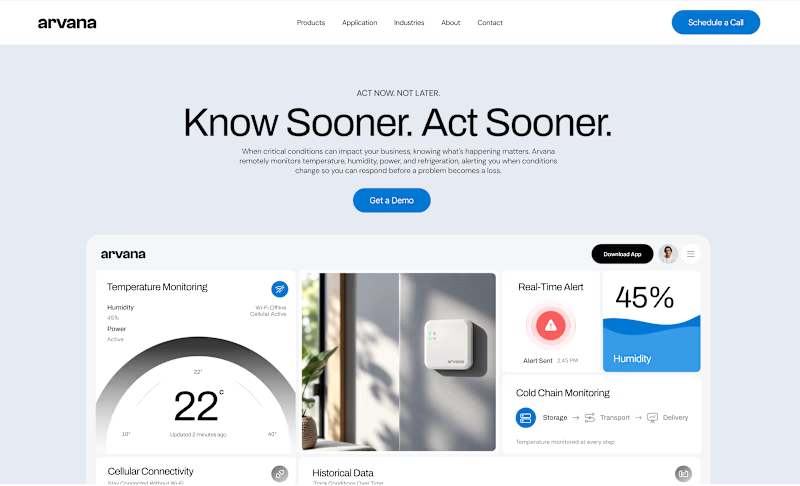
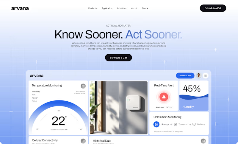
Worked on two hero directions for Arvana. Both show the same dashboard UI but the background treatment changes everything.
Which one do you click? 👇
6 voted
18%
27 voted
82%
33 votes
Closed

🔥