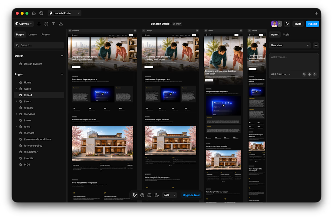


Here's my Loom video submission - https://www.loom.com/share/1b04b1e0b26d4ac481e28ea0812ce8b5
Your website doesn’t have an attention problem.
It has an attention competition problem.
I recently saw a website with great typography, beautiful animations, strong case studies, and lots of useful information.
Nothing was wrong with it.
That was the problem.
Everything was...


Most websites are designed section by section.
But this Mobbin website made me rethink that approach.
What stood out to me:
→ The website feels like one continuous story
→ Each section naturally leads into the next
→ Typography creates the rhythm
→ Motion adds continuity instead...
Your website is no longer just being read by people.
AI search engines are reading it too and they understand your website in ways surprisingly similar to how a good UX designer evaluates it.
@Framer's latest AEO guide highlights a few things that matter:
1. Clarity beats cleverness - If...
I usually don't stop at 3 breakpoints when building a website.
Most people think about: Mobile, Tablet, Laptop
I like adding one more: Desktop
Because what looks great at 1440px can feel completely different at 1920px...
- The layout gets too wide.
- Spacing starts feeling off.
-...