The network for creativity
Join 1.25M professional creatives like you
Connect with clients, get discovered, and run your business 100% commission-free
Creatives on Contra have earned over $150M and we are just getting started
Back to feedPost
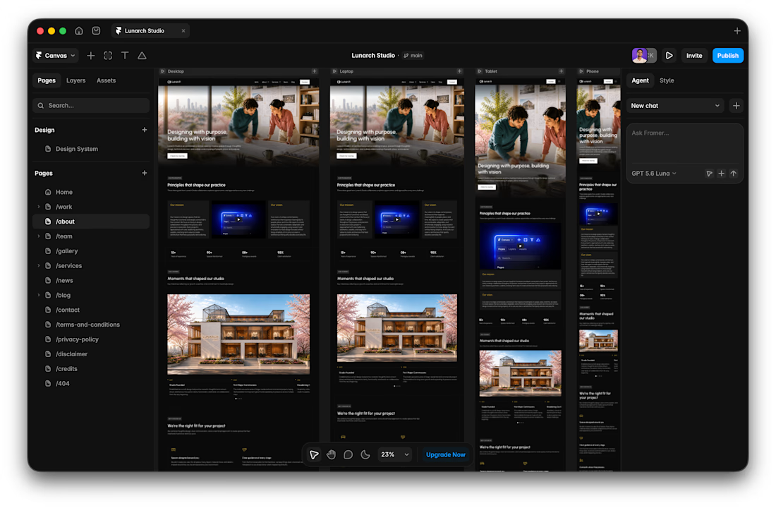
I usually don't stop at 3 breakpoints when building a website.
Most people think about: Mobile, Tablet, Laptop
I like adding one more: Desktop
Because what looks great at 1440px can feel completely different at 1920px...
- The layout gets too wide.
- Spacing starts feeling off.
- Content loses its balance.
So I like testing the system across: Mobile → Tablet → Laptop → Desktop
Not because every website needs exactly 4 breakpoints. But because responsive design isn't about making a few screen sizes work.
It's about making the whole system work.
Follow Rushabh for more website fundamentals, experiments, and things I learn while building for the web.


The extra desktop breakpoint is such a thoughtful detail—the way you’re protecting spacing and balance at 1920px really shows responsive systems thinking.

Great designs!!

Thanks!

Nice work
Thanks man!

cool work
Thanks!

Good Thinking!!!

Building web systems require this approach!

Wide screens expose spacing issues that laptop previews can hide.
The point is to cover majority of the screen sizes that's going to be used by the client's target audience so everything feels functional & visually directed.
Agreed—real audience sizes should guide the breakpoints.
Yeah!
The network for creativity
Join 1.25M professional creatives like you
Connect with clients, get discovered, and run your business 100% commission-free
Creatives on Contra have earned over $150M and we are just getting started

Challenges
View all


Related posts


This is amazing... I would love to see the final, please. 😍


The new Outredge site is live!
Building the studio has given me a clearer sense of what the brand should look and feel like.
This redesign is my way of catching the site up with that. Less chasing fancy effects, more trusting my own taste.
I also rebuilt it in Astro. Because I love a site that loads like a 🚀
It's cool... what font did you use on this?