The network for creativity
Join 1.25M professional creatives like you
Connect with clients, get discovered, and run your business 100% commission-free
Creatives on Contra have earned over $150M and we are just getting started
Back to feedPost

and here's how it sits on desktop.
more room to breathe, so the pulse carries the whole about page instead of sharing it.
looks clean?


Beautiful work!

Great work!

it does. the pulse gets the whole about page now, and the orange italic on "romper com o convencional" picks up its colour nicely. does the ring react to scroll or loop on its own?


yep, looks clean

Yes, the pulse carries the whole page cleanly.
The network for creativity
Join 1.25M professional creatives like you
Connect with clients, get discovered, and run your business 100% commission-free
Creatives on Contra have earned over $150M and we are just getting started


Related posts

New project: Impasto, a premium Framer template for restaurants.
A 3D hero, dishes that spin or float as you scroll, a preloader that draws your logo, and Agent skills so the Framer Agent builds new pages in the same style.
Open to custom sites; message me if you'd like one built for your brand.

Dishes that spin and float as you scroll is such a fun touch for a restaurant template. Is the 3D built in Framer or brought in from Spline?

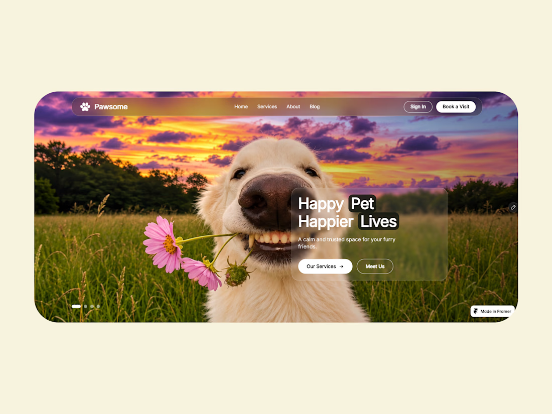
🐾 Meet Pawsome Hero — a modern Framer hero component built for pet websites!
✨ Animated background slideshow
✨ Customizable navigation bar
✨ Glassmorphism content card
✨ Responsive layouts
✨ Fully customizable from the Side Properties Panel
Whether you're building a pet clinic, grooming studio, or adoption website, Pawsome Hero gives you the flexibility to create your own design.
or
Looking for a Framer Designer to bring your next website idea to life? I'm available for freelance projects!
Try now - https://www.framer.com/marketplace/components/pawsome-hero/
📩 Feel free to DM me.
Let's build something awesome!

Awesome work!

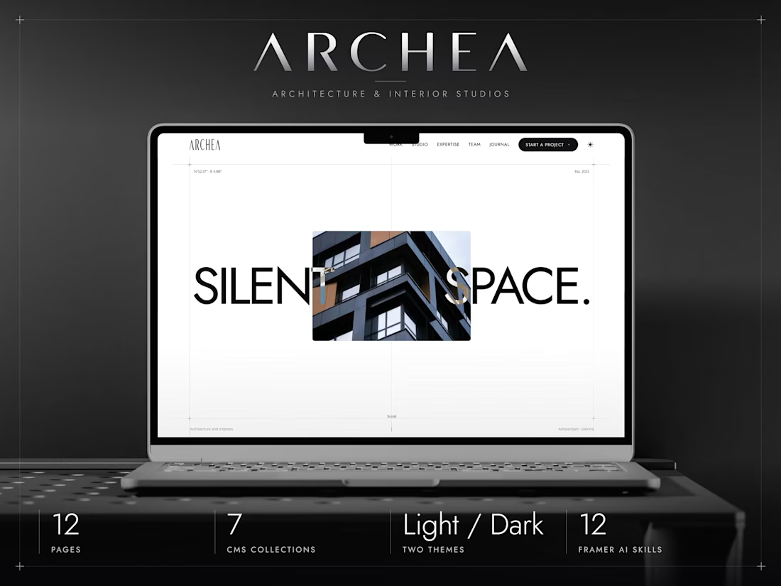
ARCHEA just hit #3 in Architecture on the
Framer Marketplace.
I built it to give architecture studios a quiet, editorial space to show their work. Really happy to see it find its audience.