Rok Rupnik's Work | Contra
Work by Rok Rupnik
Sign Up
Post a job
Sign Up
Log In
Rok Rupnik
Brand designer helping founders raise, launch, and grow
Message
Follow
Ready for work
Rok is ready for their next project!
Budapest, Hungary
Work
Posts
Services
About
Budapest, Hungary
0
Agent Sphere — Brand Identity & Go-to-Market
0
4
0
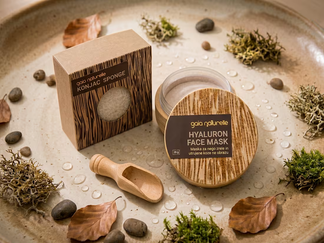
Eco-friendly Cosmetic Packaging and Branding
0
2
0
Compact Cocktail: Brand Strategy Case Study
0
2
0
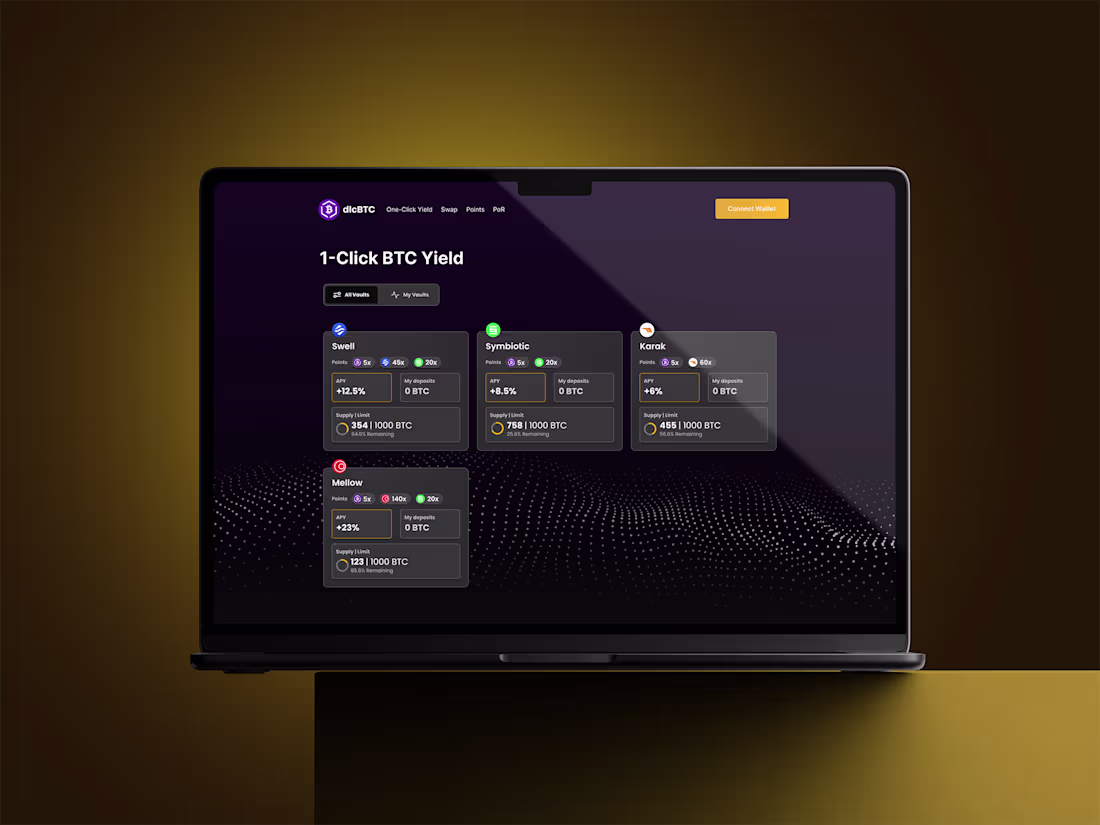
Bitsafe: Making Bitcoin Smart
0
2
0
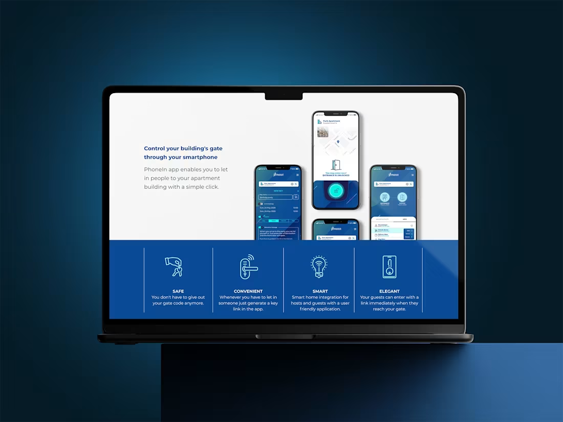
UX Design for PhoneIn's Secure Entry App
0
2
Challenges
promptandcircumstance
ommabuildathon
Renoise Challenge
characterchallenge
Challenges
promptandcircumstance
ommabuildathon
Renoise Challenge
characterchallenge