Nuro™ Frame Brand Development and Product Design

Ryan Framer


Nuro™ Frame — Brand Identity & Product Design
Overview
Nuro™ Frame is a conceptual health-tech wearable designed to support individuals living with epilepsy. The product combines intelligent neurological monitoring with modern industrial design to create a discreet pair of smart glasses capable of detecting abnormal brain activity, reducing visual triggers, and providing real-time feedback.
For this project, I was responsible for developing the complete visual ecosystem—from brand strategy and identity design to product visualization and presentation.
The Challenge
Healthcare wearables often prioritize functionality over emotional appeal, resulting in products that feel overly medical, intimidating, or disconnected from everyday life.
The challenge was to design a brand and product experience that would:
Communicate trust without appearing clinical.
Make advanced technology feel approachable.
Balance innovation with simplicity.
Create a premium product that users would feel confident wearing every day.
Present complex neurological technology through clear visual storytelling.
My Role
I led the project from concept to final presentation, including:
• Brand Strategy
• Creative Direction
• Brand Identity Design
• Logo Design
• Visual Language Development
• Color System
• Typography
• Industrial Product Design
• 3D Modeling
• Product Rendering
• Packaging Concepts
• Brand Guidelines
• Presentation Design
• Motion Graphics & Animation
Research & Discovery
The project began by studying existing medical wearables, accessibility-focused products, and premium consumer electronics.
Rather than following traditional healthcare branding, I explored visual systems that communicated confidence, precision, and innovation while maintaining a calm and human-centered aesthetic.
The visual identity draws inspiration from scientific visualization, neurological mapping, and the Viridis color palette—known for its clarity, accessibility, and strong perceptual consistency. This informed a design language that feels reliable, modern, and grounded in technology.
Brand Strategy
The brand was positioned around a simple idea:
Technology should quietly protect people without defining them.
Every design decision focused on creating a product that feels empowering rather than medical.
Core brand attributes:
Intelligent
Calm
Reliable
Human
Minimal
Innovative
Identity Design
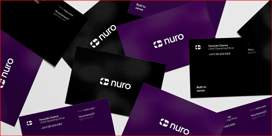
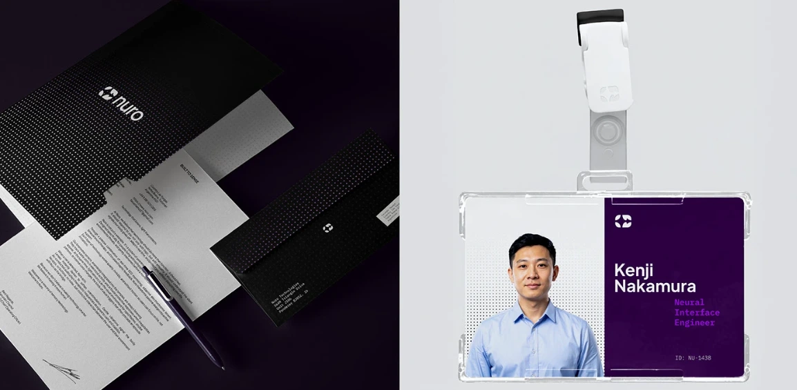
The identity system was intentionally minimal to allow the product itself to become the hero.
The visual language combines clean typography, spacious layouts, subtle gradients, and restrained color usage to reinforce clarity and trust.
A flexible design system was created to work consistently across:
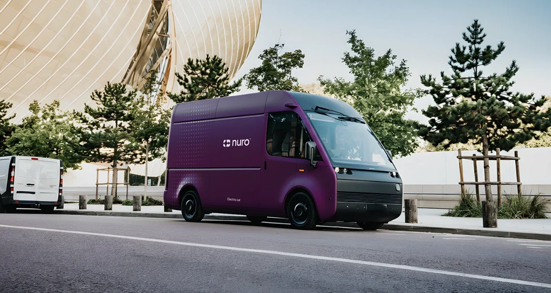
Product packaging
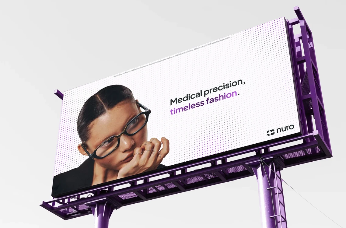
Marketing assets
Digital interfaces
Brand guidelines
Motion graphics
Product presentations
Product Design
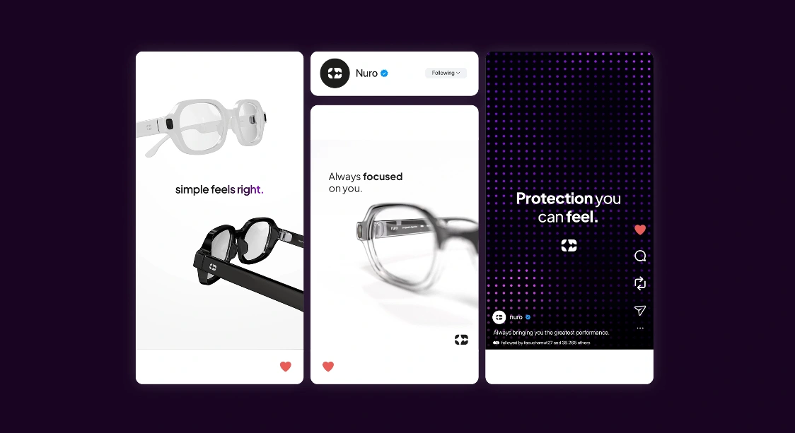
The product was designed as lightweight smart eyewear that seamlessly integrates advanced health technology into everyday life.
Key conceptual features include:
Neurological sensors integrated into the frame.
Real-time haptic vibration alerts.
Audio notifications through embedded speakers.
Electrochromic lenses that reduce visual stimuli when potential seizure triggers are detected.
Ergonomic frame designed for long-term comfort.
Every design decision prioritized usability without sacrificing aesthetics.
3D Visualization
To communicate the product realistically, I created high-quality 3D models and photorealistic renders showcasing:
Material finishes
Product proportions
Functional details
Lighting behavior
Hero marketing visuals
Product close-ups
Lifestyle presentation scenes
These visuals helped bridge the gap between concept and manufacturable product.
Brand Guidelines
To ensure consistency, I developed a complete brand guideline covering:
Logo usage
Clear space
Color palette
Typography
Iconography
Layout principles
Visual hierarchy
Photography direction
Product imagery
Motion principles
The guideline establishes a scalable identity system suitable for future digital and physical touchpoints.
Design Process
The workflow followed four primary stages:
1. Discovery
Research, competitor analysis, moodboards, and concept exploration.
2. Strategy
Brand positioning, messaging, visual direction, and design principles.
3. Design
Identity creation, product modeling, packaging, 3D rendering, and system development.
4. Presentation
Motion graphics, mockups, brand documentation, and final case study production.
Tools Used
Adobe Illustrator
Adobe Photoshop
Blender
Adobe After Effects
Figma
Outcome
The final result is a cohesive concept that demonstrates how branding, industrial design, and visual storytelling can work together to transform a complex healthcare technology into an approachable premium experience.
The project showcases not only the product itself but also the importance of building a complete design system capable of supporting future growth across physical products, digital experiences, and brand communications.
Key Takeaways
This project strengthened my ability to combine strategic branding with product visualization, creating experiences where aesthetics and functionality complement each other. It reinforced the importance of designing technology that feels human, accessible, and emotionally engaging while maintaining a strong, scalable visual identity.
Like this project
Posted Jul 18, 2026
Designed a complete brand identity and product concept for Nuro Frame, combining strategy, industrial design, 3D visualization, and storytelling.