NorthGrid Brand Identity Development

Ryan Framer


NorthGrid | Brand Identity
Project Overview
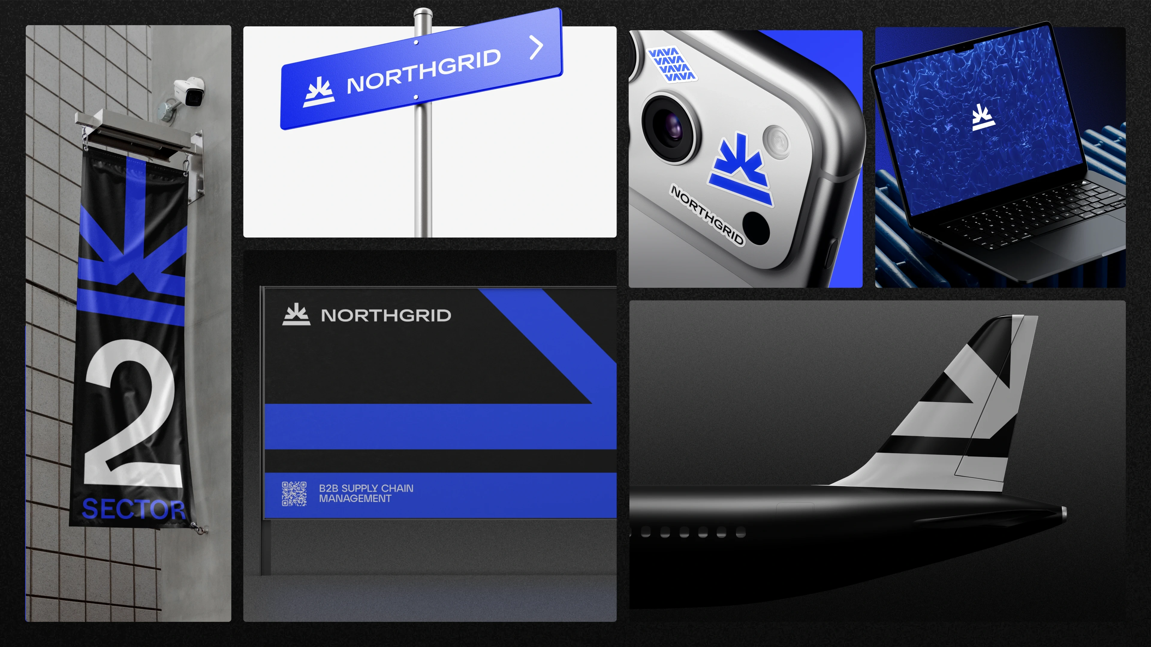
NorthGrid is a modern brand identity created for an industrial and technology-focused business. The identity was designed to give the brand a clear, professional presence while creating a visual system that could work consistently across digital and physical touchpoints.
The project focused on developing more than a standalone logo. The goal was to establish a complete identity system with a strong visual foundation, consistent typography, structured layouts, and flexible brand applications.
The Challenge
The challenge was to create an identity that could communicate precision, reliability, and a modern approach while remaining visually simple and recognizable.
The brand needed a system that could scale across different applications without becoming overly complicated or dependent on a single visual element.
My Role
I worked on the visual identity development and translated the initial brand direction into a consistent design system.
My work included:
Brand identity development
Logo direction
Typography
Color system
Visual language
Layout composition
Brand applications
Digital presentation
Brand Direction
The identity was developed around a clean and structured visual language.
The design approach focused on clarity, precision, and consistency, creating a brand presence that feels contemporary while remaining appropriate for an industrial and technology-oriented environment.
Rather than adding unnecessary visual complexity, the system relies on strong composition and consistent design rules.
Logo & Visual Identity
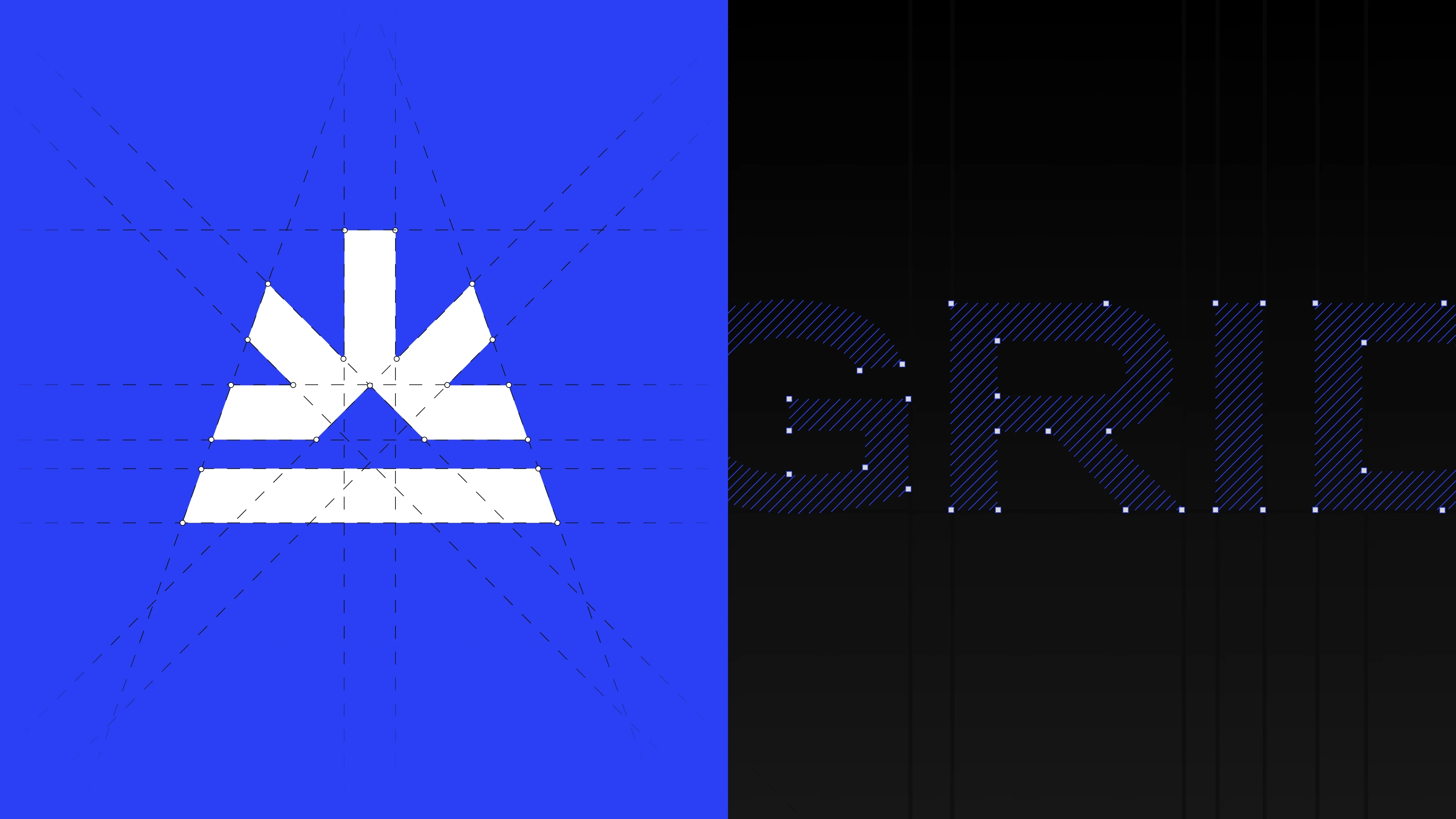
The logo serves as the foundation of the NorthGrid identity.
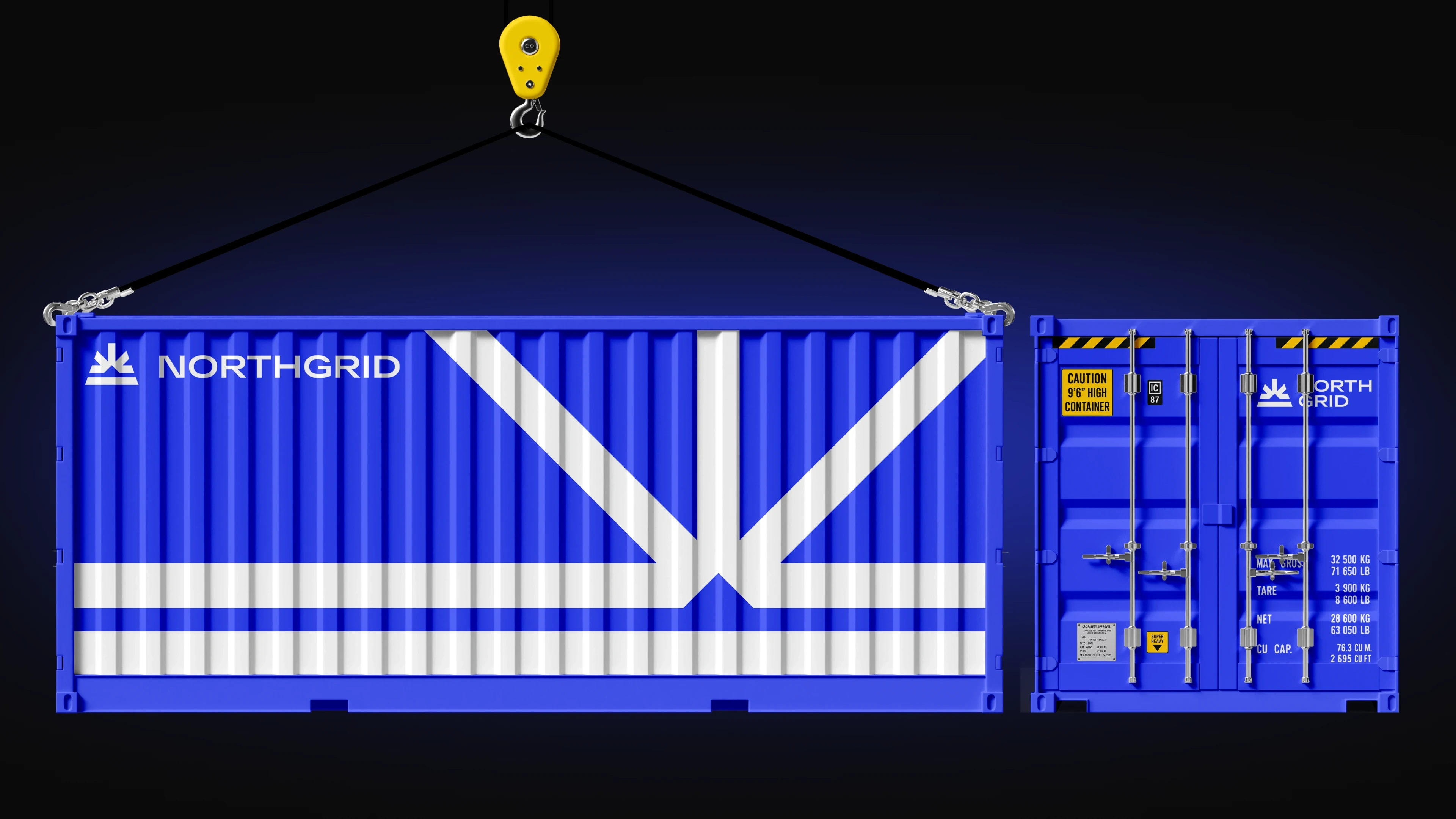
The visual mark and wordmark were developed to remain recognizable across different sizes and applications, from larger brand presentations to smaller digital placements.
Supporting visual elements were designed around the same principles, allowing the identity to remain consistent beyond the primary logo.
Typography
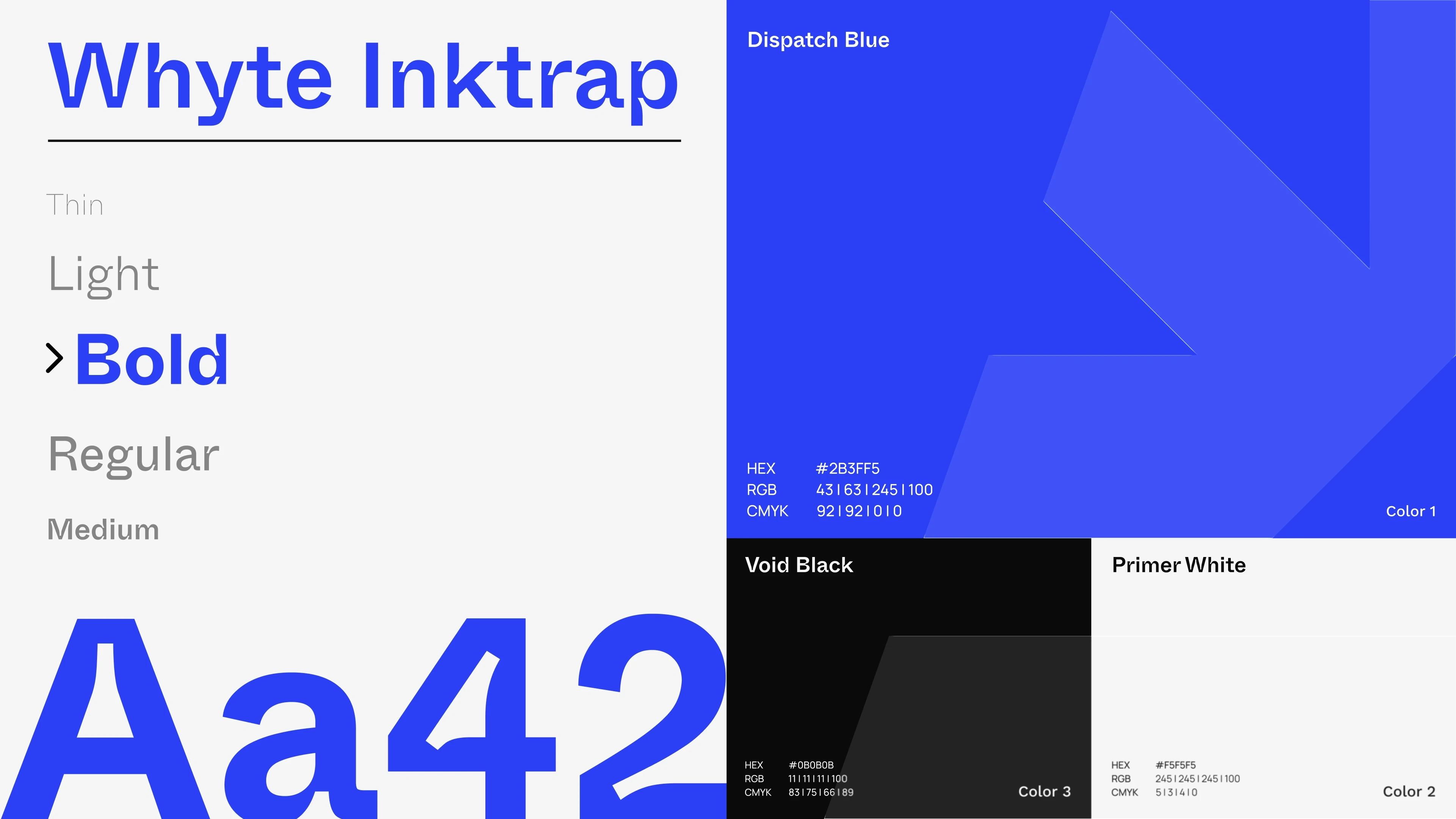
Typography was treated as an important part of the identity system rather than simply a supporting element.
The type system provides clear hierarchy between headlines, supporting information, and smaller content, helping the brand maintain a structured and professional appearance.
Color System
A defined color direction was established to create consistency across the identity.
The palette was designed to work across both digital and physical applications while providing enough flexibility for different brand compositions and communication materials.
Brand Applications
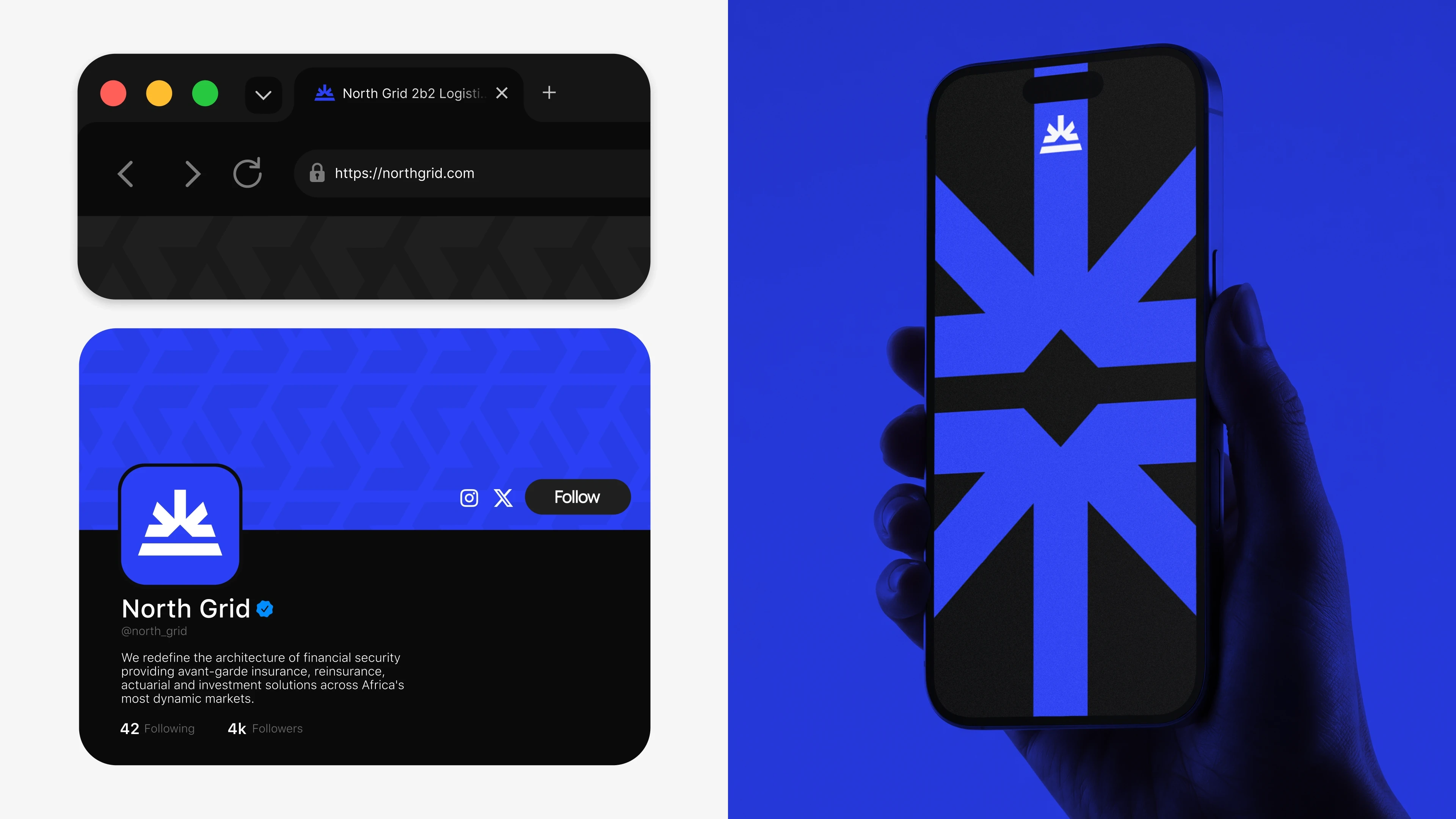
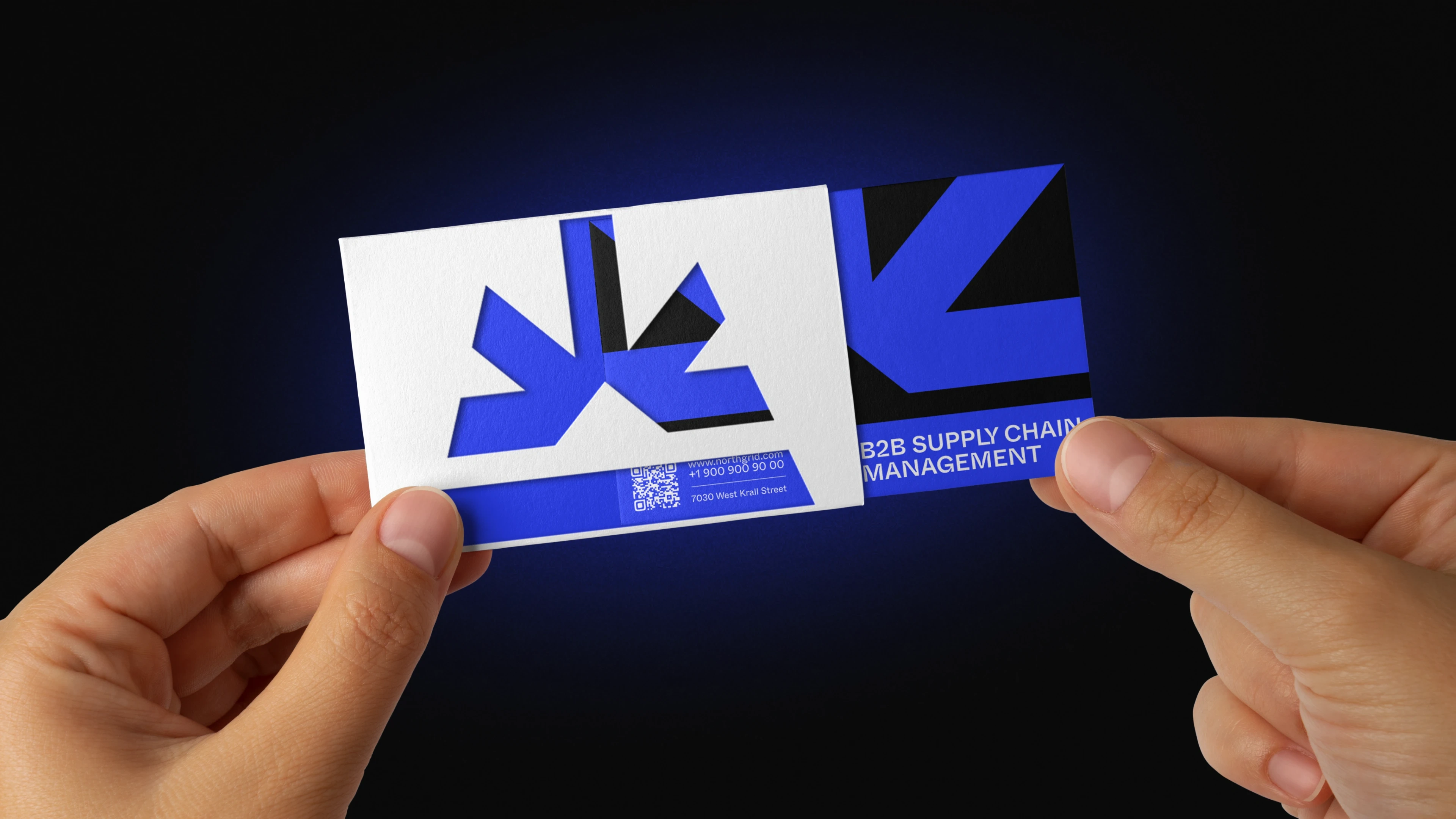
The identity was developed with practical applications in mind.
The visual system can be extended across:
Digital interfaces
Website and marketing materials
Presentations
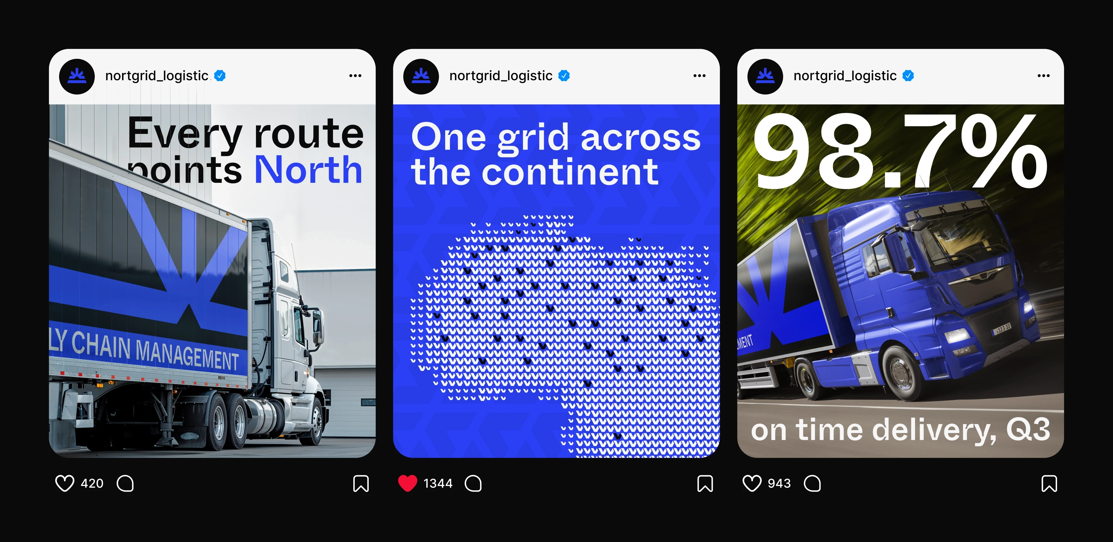
Social media
Business communications
Print materials
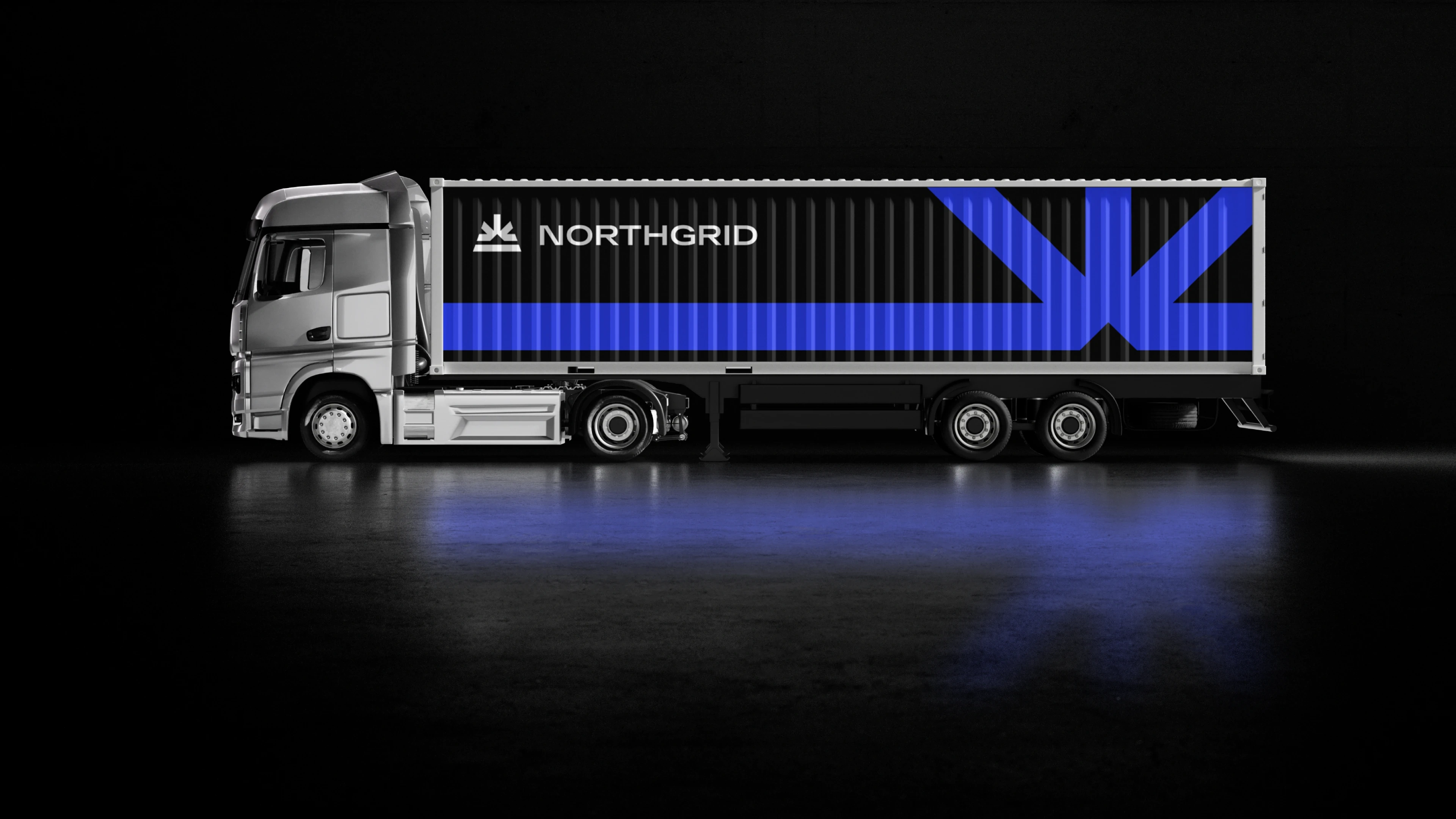
Brand collateral
Each application follows the same core visual principles to maintain a consistent brand presence.
Design System
The final identity works as a flexible system rather than a collection of individual assets.
Consistency is maintained through:
Logo usage
Typography
Color
Spacing
Composition
Visual hierarchy
Brand proportions
This creates a foundation that can continue to scale as the brand expands into new platforms and communication channels.
Outcome
The result is a structured and contemporary identity for NorthGrid, combining a professional visual language with a flexible brand system.
The identity provides a consistent foundation for presenting the brand across digital, marketing, and business applications while maintaining a clear and recognizable visual presence.
Design Process
Research → Brand Direction → Logo Development → Typography → Color System → Visual Language → Brand Applications → Final Identity
Like this project
Posted Sep 23, 2026
Modern NorthGrid brand identity with a structured visual system, clean typography, refined layouts and a professional design built for digital applications
Likes
0
Views
2