Ad bid Brand Identity Development

Ryan Framer


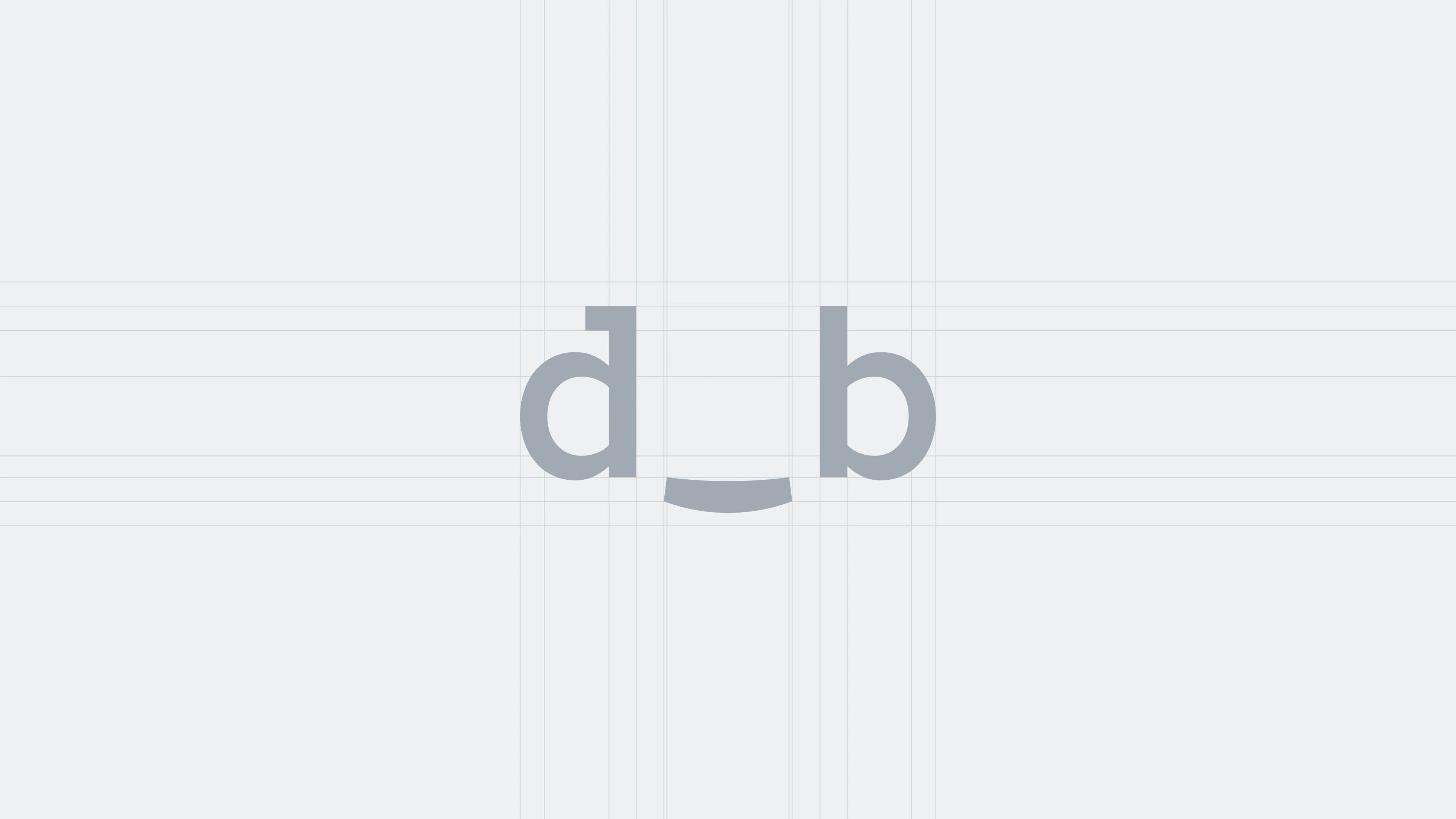
Ad_bid | Brand Identity
Project Overview
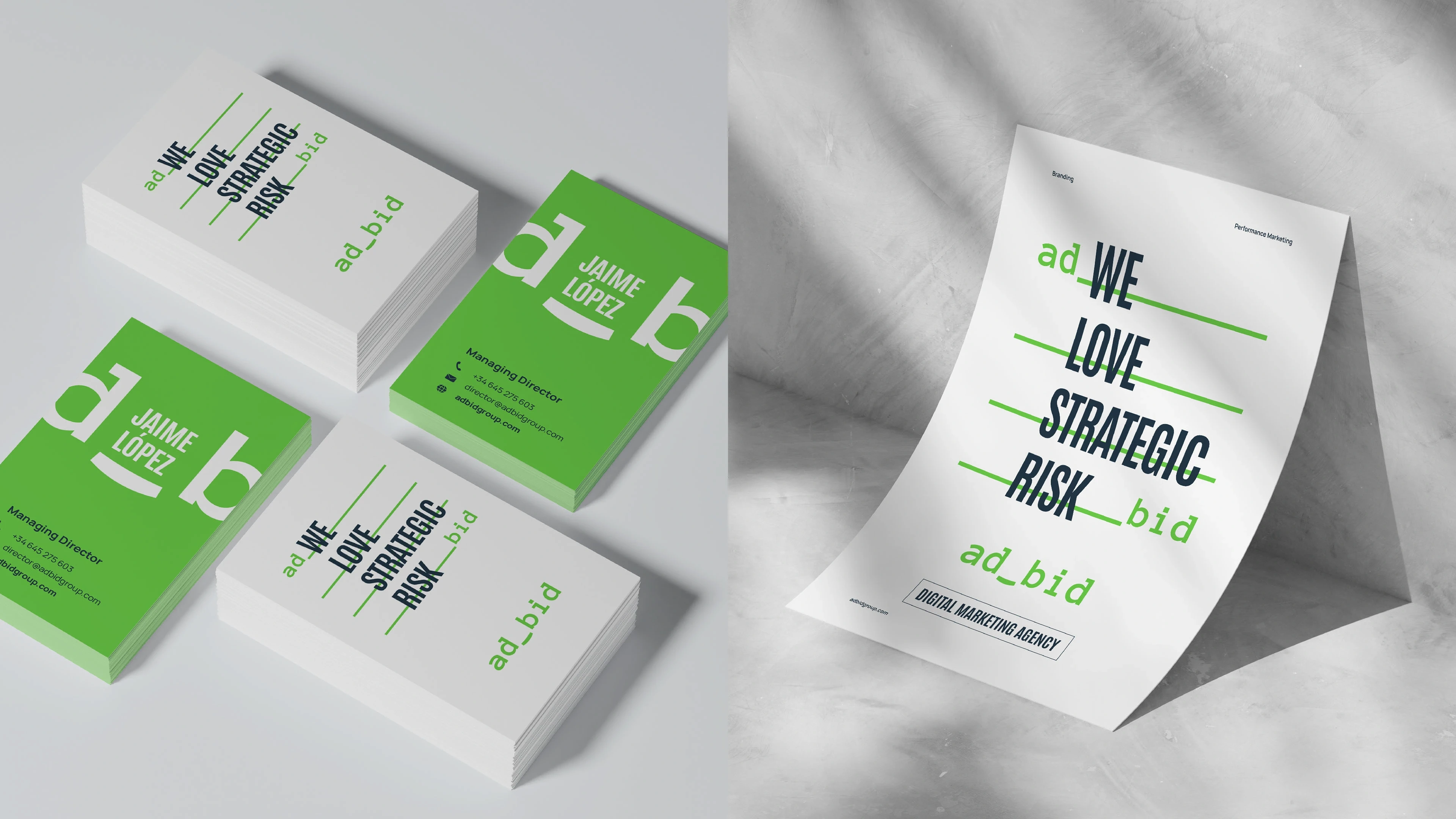
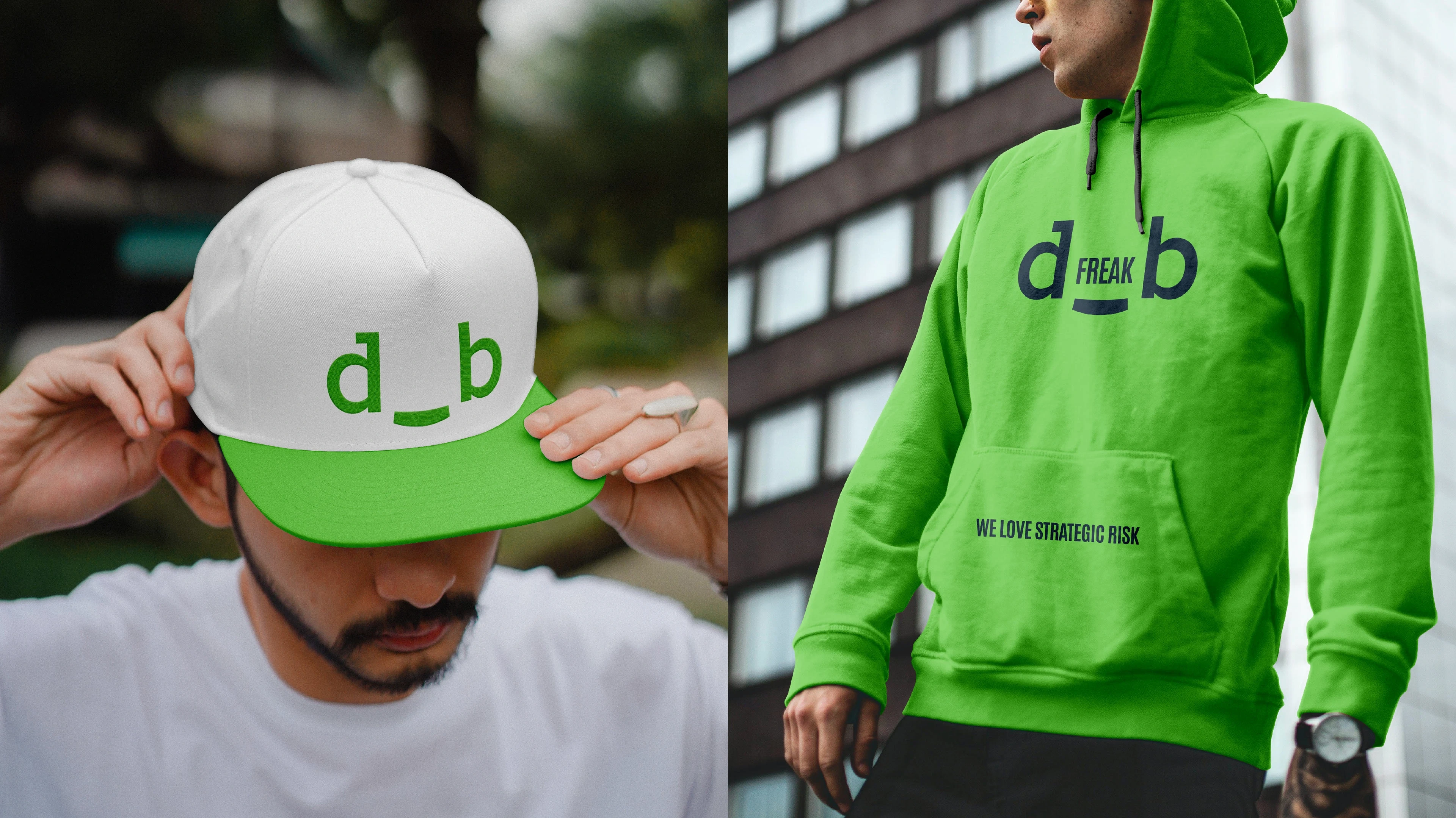
Ad_bid is a modern brand identity built around a calm, clean, and approachable visual direction. The branding uses green as the primary visual foundation, creating a sense of balance, trust, and simplicity.
The goal was to develop an identity that felt contemporary and professional while avoiding an overly aggressive or complicated visual style.
The Challenge
The challenge was to create a distinctive identity that could communicate professionalism while maintaining a calm and accessible personality.
The brand needed a visual system that could work consistently across digital touchpoints while remaining recognizable and easy to understand.
My Role
I worked on the visual identity and developed the core branding direction, focusing on creating a consistent system across the brand's visual elements.
My work included:
Brand direction
Logo development
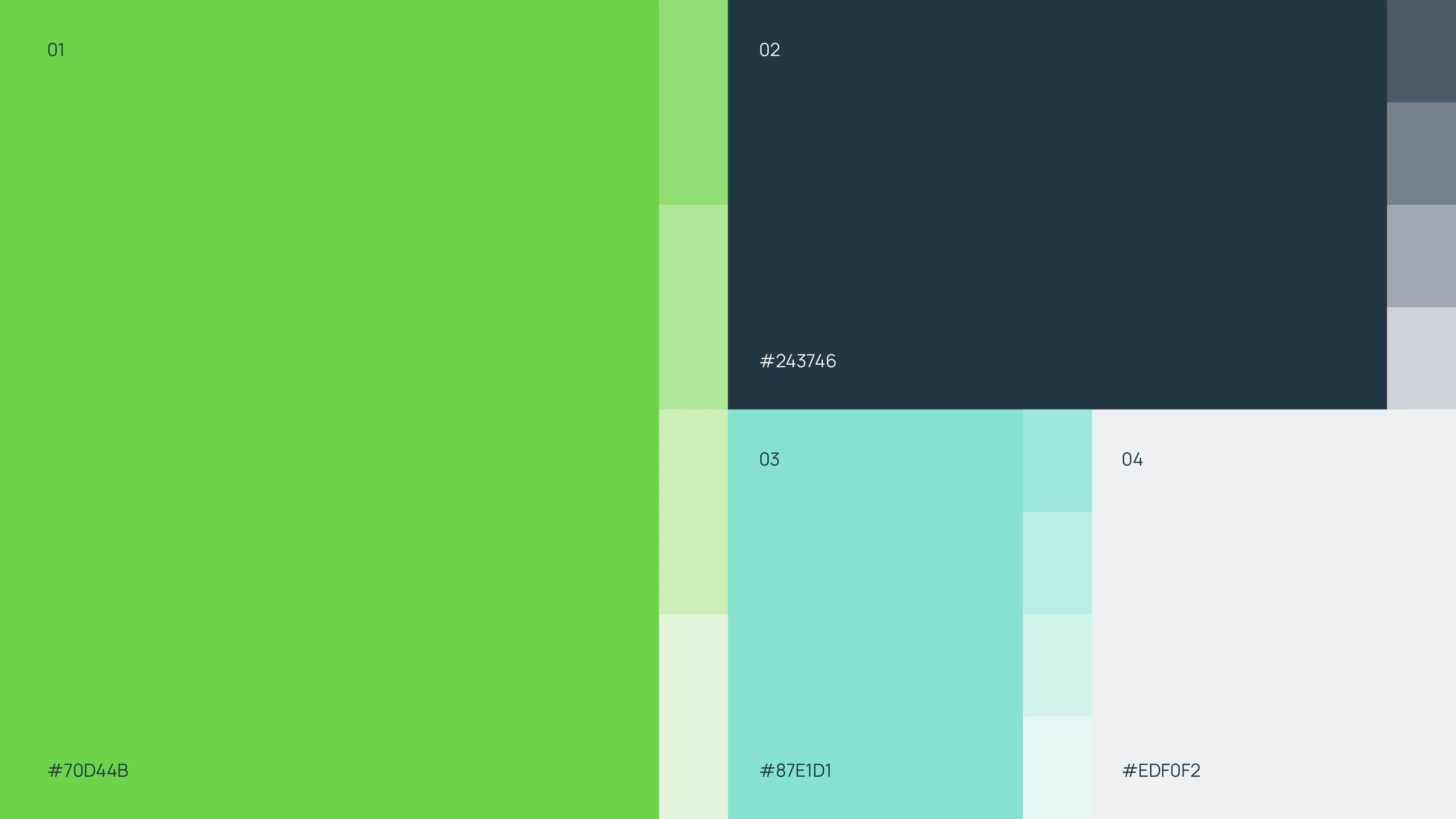
Color system
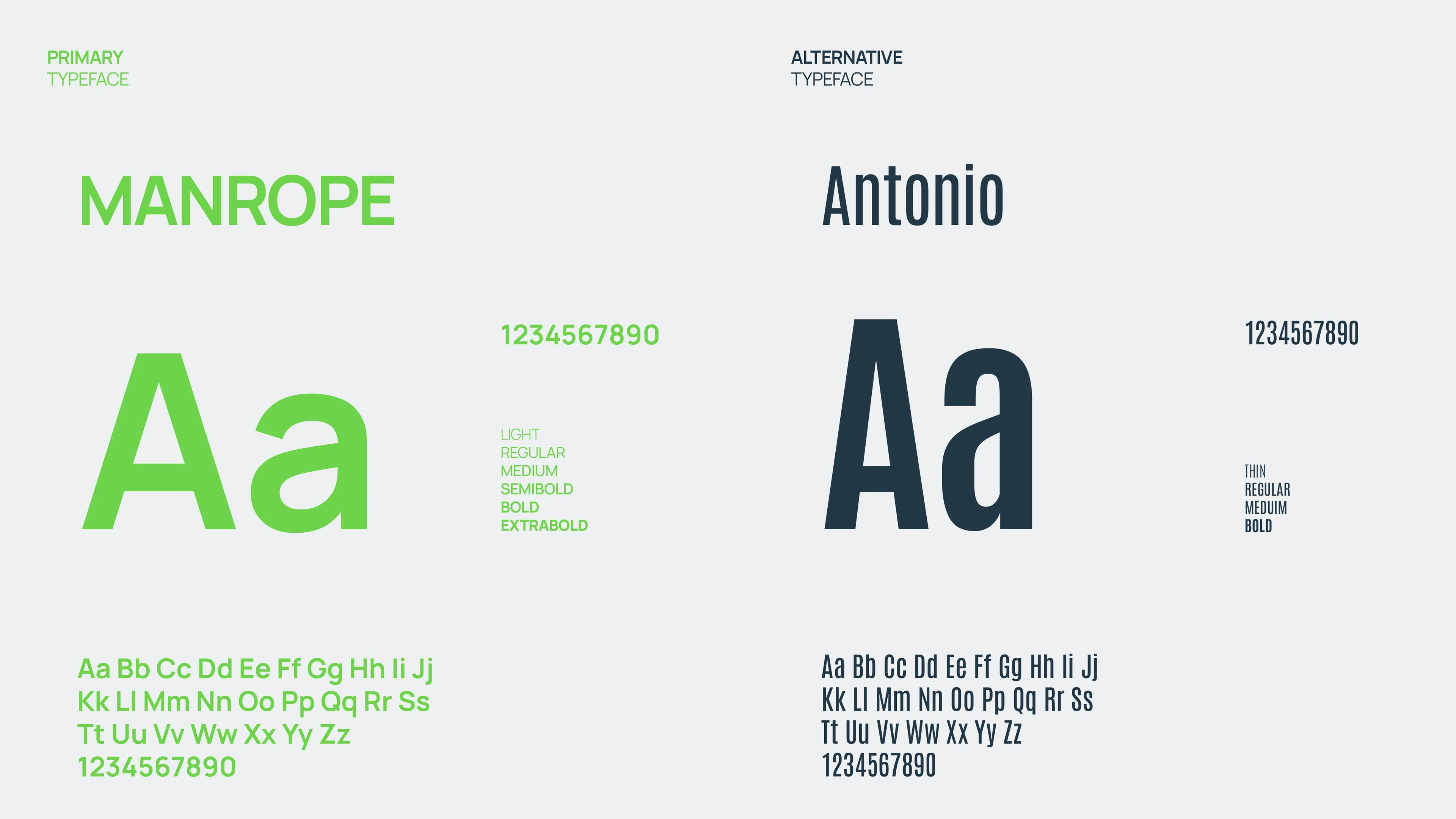
Typography
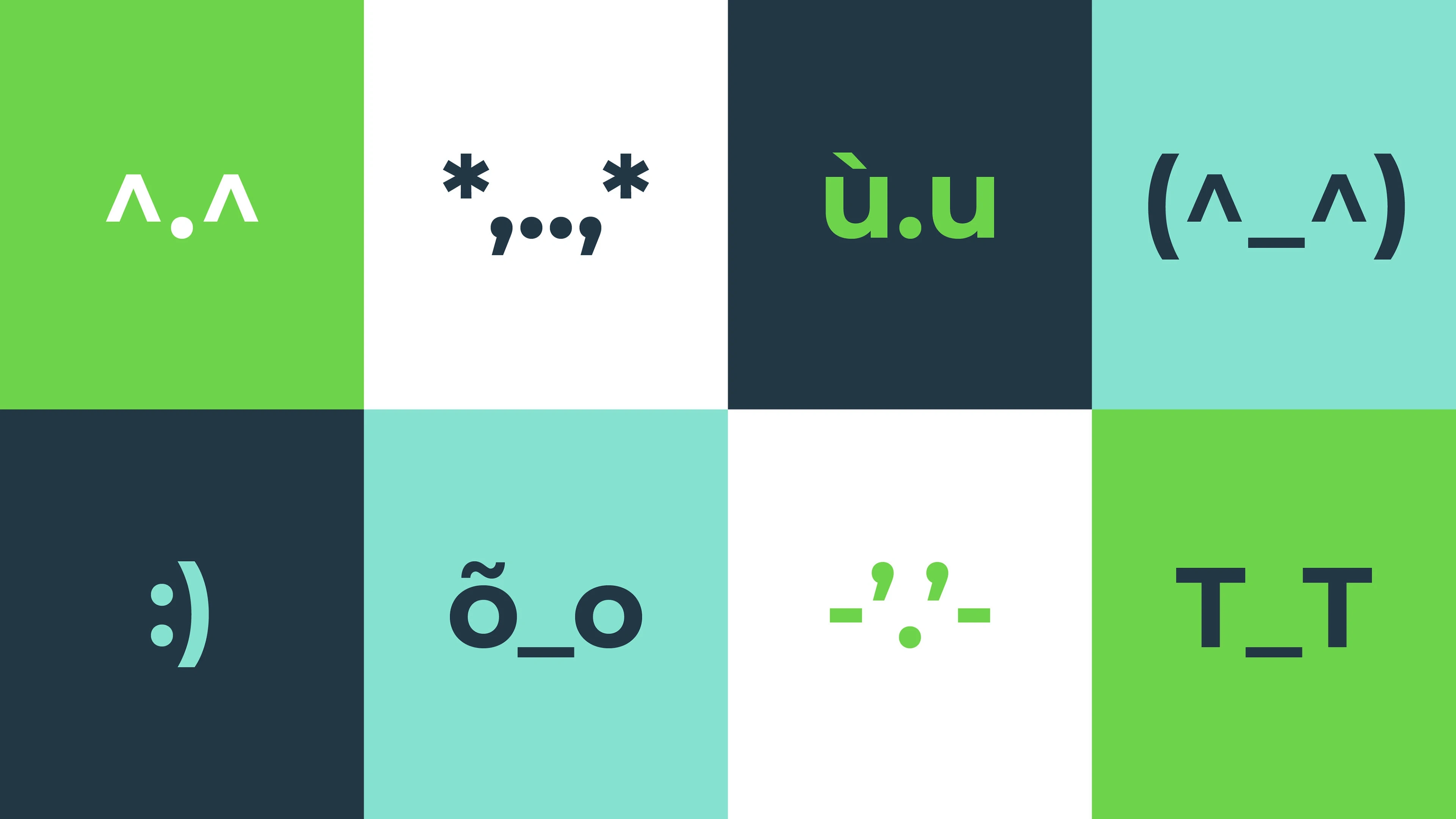
Visual styling
Brand composition
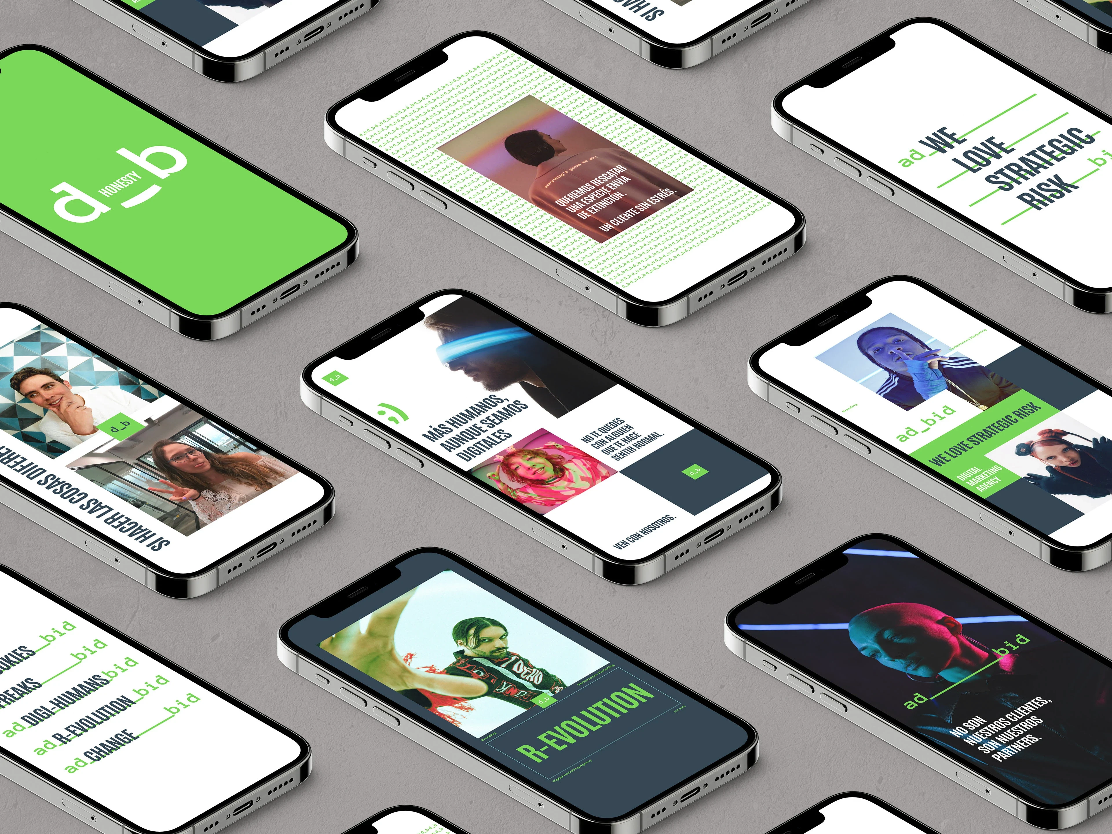
Digital brand applications
Visual Direction
Green was selected as the core color of the identity, giving the brand a calm and balanced appearance.
Instead of relying on heavy visual elements, the identity uses clean layouts, controlled spacing, and a minimal approach to create a more refined brand presence.
The visual language was designed to feel modern without becoming overly corporate or generic.
Color & Typography
The green-based palette establishes the primary personality of the brand, while supporting neutral tones help maintain clarity and balance.
Typography was kept clean and readable, allowing the brand communication to remain straightforward while supporting the overall modern aesthetic.
Together, the color and type system create a visual identity that feels calm, trustworthy, and contemporary.
Brand Identity System
The branding was developed as a flexible visual system rather than a standalone logo.
The system establishes consistency through:
Color usage
Typography
Layout structure
Spacing
Visual hierarchy
Brand composition
This provides a foundation that can be extended across different digital and marketing applications.
Digital Application
The identity was designed with digital use in mind, ensuring that the visual language could translate effectively across websites, social content, presentations, and other brand touchpoints.
The clean visual structure allows content to remain the focus while the green identity provides a recognizable brand signature.
Outcome
The final identity gives Ad_bid a calm and modern visual presence built around a distinctive green direction.
The result is a flexible branding system that combines simplicity, clarity, and consistency while giving the brand a recognizable visual personality.
Design Approach
Research → Brand Direction → Logo & Identity → Color System → Typography → Visual System → Digital Applications → Final Brand Identity
Like this project
Posted Sep 23, 2026
Modern Ad_bid brand identity built around a calm green visual direction, with clean typography, balanced layouts, and a simple, approachable brand system.