Premium Real Estate - Framer

Ryan Framer


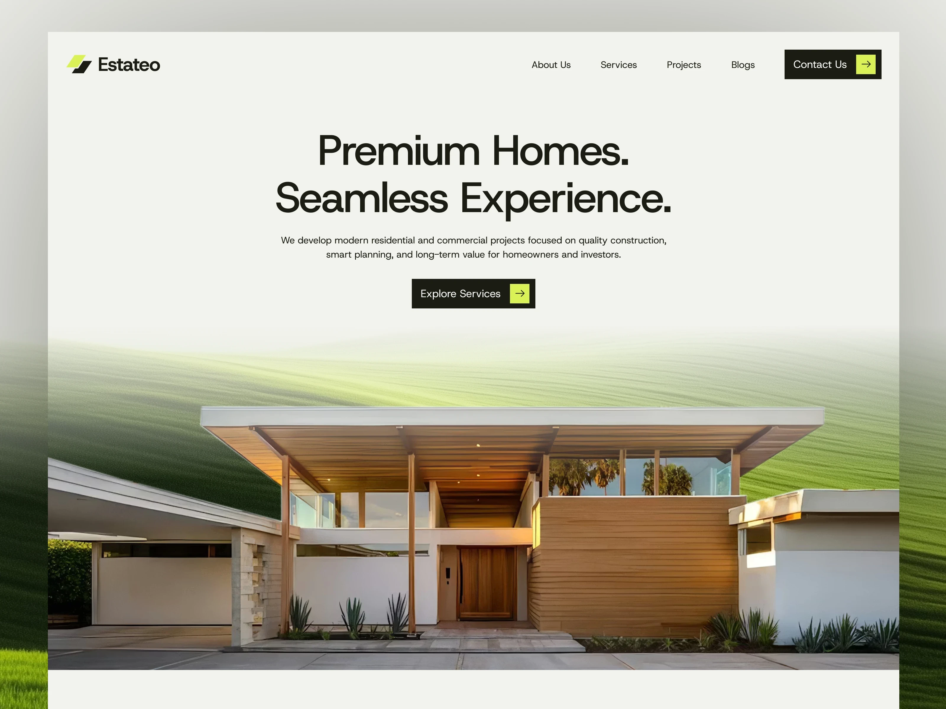
Real Estate Website Design
UI/UX Case Study | Figma + Framer
Overview
The Real Estate Website Design project was created to explore how a modern digital experience can elevate a real estate brand. The primary objective was to design a website that feels premium, trustworthy, and visually engaging while keeping the browsing experience effortless for potential buyers.
The project focused on combining elegant visual design with intuitive user experience principles. Every section was designed to guide users naturally through the website, helping them discover properties, learn about the company, and ultimately encourage inquiries.
After completing the UI design in Figma, the entire website was developed in Framer, allowing the final product to closely match the original design while incorporating responsive layouts, smooth interactions, and modern web animations.
Project Goal
The goal was to create a modern brand website for a real estate company that communicates professionalism, luxury, and trust.
Rather than creating a typical property listing website, the focus was on building a memorable brand experience that leaves a strong first impression. Every visual decision—from typography and spacing to imagery and color palette—was made to reinforce a premium identity.
The final experience needed to:
Present the brand in a modern and professional way.
Highlight featured properties with clear visual hierarchy.
Create an intuitive browsing experience.
Build credibility through clean design and thoughtful content presentation.
Deliver a fully responsive experience across desktop, tablet, and mobile devices.
My Role
I handled the entire design and development process independently.
Responsibilities
UX Planning
Wireframing
UI Design
Design System
Responsive Design
Prototype
Framer Development
Testing & Refinement
Tools Used
Figma
Framer
Design Process
1. Research & Inspiration
Before starting the design, I explored current trends in luxury real estate websites. I analyzed how premium brands present their properties, structure information, and use visual storytelling.
The research helped identify common patterns that improve user experience, such as large hero sections, minimal layouts, high-quality imagery, generous white space, and strong typography.
Instead of following trends directly, the goal was to adapt these ideas into a clean and timeless interface.
2. Planning the User Experience
The website structure was planned to ensure visitors could quickly understand the brand and navigate through the available content.
The information architecture was organized to create a logical flow:
Hero Section
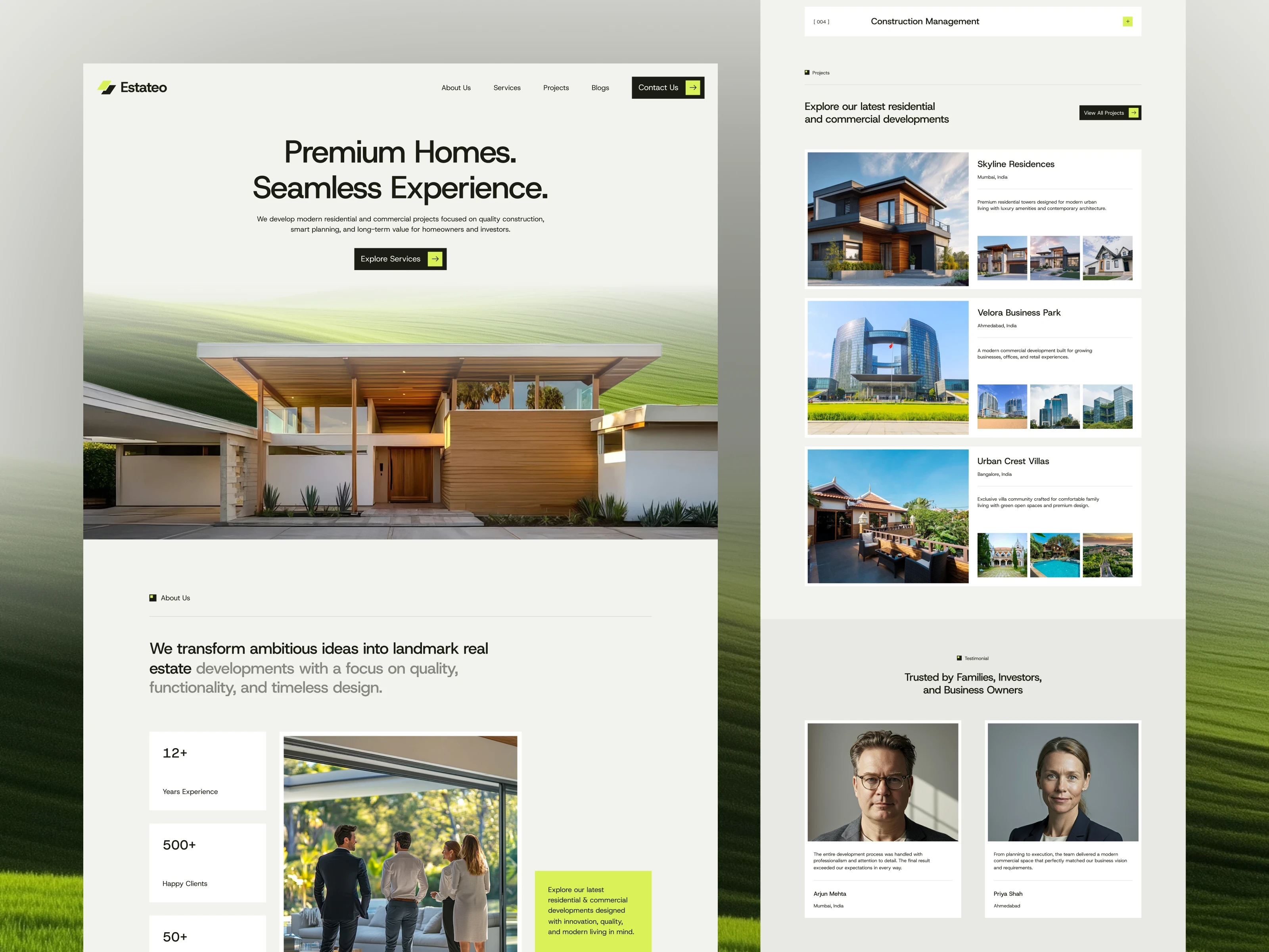
Featured Properties
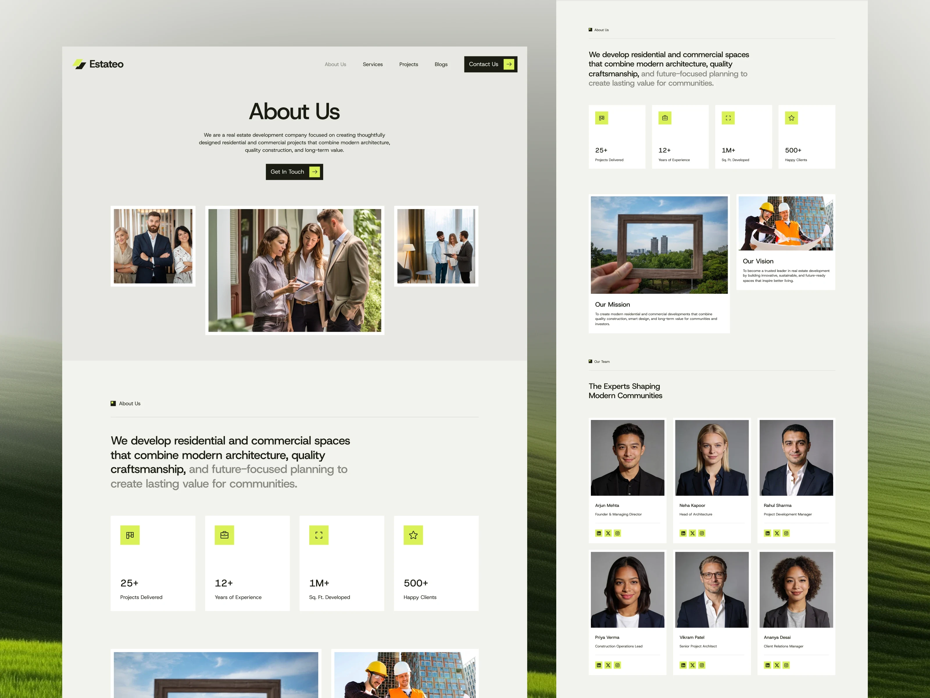
About Company
Services
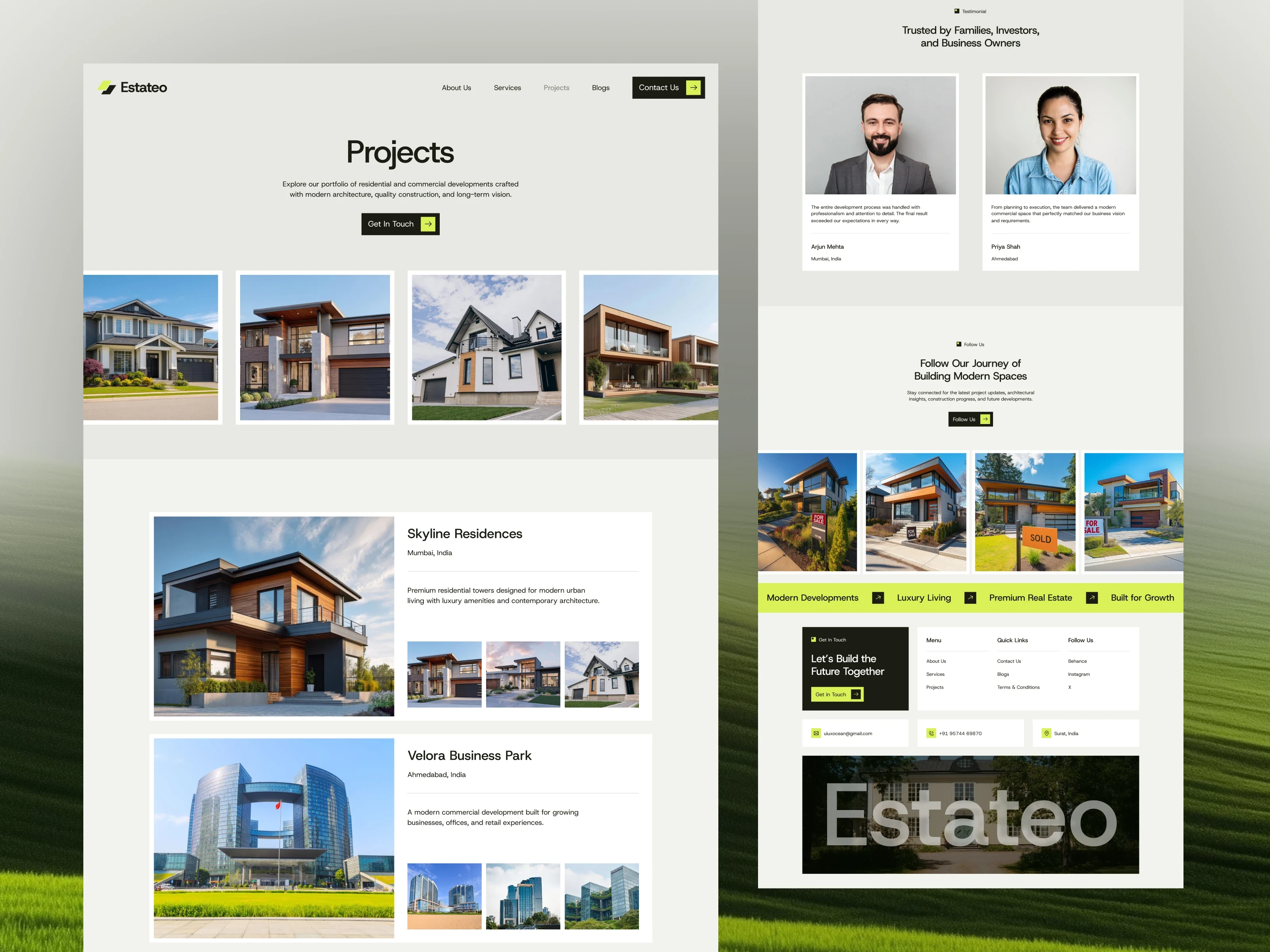
Property Showcase
Testimonials
Contact Section
Footer
Each section was designed with a specific purpose, ensuring users never felt overwhelmed while browsing.
3. Wireframing
Low-fidelity wireframes were created in Figma to establish layout hierarchy before moving into visual design.
This stage focused on:
Content placement
Navigation flow
Spacing consistency
Call-to-action positioning
User journey
Working with wireframes first made it easier to refine the overall experience before investing time in detailed UI design.
UI Design
The visual direction centered around simplicity and elegance.
A restrained color palette, clean typography, and spacious layouts help create an upscale appearance while allowing the property imagery to remain the primary focus.
Special attention was given to maintaining consistency across every section through reusable design patterns and balanced spacing.
The interface emphasizes clarity rather than unnecessary decoration, creating a polished and professional experience.
Biggest Challenge
The biggest challenge during this project was creating a premium visual style without making the interface feel overly complex.
Luxury design often depends on subtle details rather than excessive visual effects. Achieving this required careful refinement of typography, spacing, image composition, alignment, and visual hierarchy.
Several iterations were made before reaching a balance between sophistication and usability.
Building in Framer
After finalizing the UI in Figma, the project was developed in Framer.
The objective during development was to recreate the design with high visual accuracy while taking advantage of Framer's interactive capabilities.
Key implementation included:
Fully responsive layouts
Smooth page transitions
Scroll-based interactions
Modern hover animations
Responsive grids
Reusable components
Optimized spacing across breakpoints
Consistent typography scaling
Building the website in Framer enabled rapid iteration while maintaining design consistency across different screen sizes.
Responsive Design
Responsiveness was considered throughout the entire project rather than being added afterward.
Layouts were carefully adapted for desktop, tablet, and mobile devices to preserve readability, spacing, and usability regardless of screen size.
Images, cards, navigation, and content blocks were optimized to ensure the experience remained clean and intuitive across all devices.
Design Decisions
Several design decisions contributed to the overall user experience:
Large hero section to create a strong first impression.
Clean typography for better readability.
Spacious layouts to communicate luxury.
Consistent spacing system for visual balance.
Clear call-to-action buttons to encourage inquiries.
Minimal color palette to keep attention on the properties.
Card-based layouts for organized content presentation.
Every decision supported the primary goal of creating a refined and trustworthy brand presence.
Outcome
The completed website successfully combines modern UI design with a smooth browsing experience.
The project demonstrates how thoughtful visual design and careful user experience planning can strengthen a real estate brand's online presence.
By designing in Figma and developing in Framer, the final website remained visually consistent from concept to implementation while delivering responsive performance and polished interactions.
Key Takeaways
This project reinforced several important design principles:
Simplicity creates stronger user experiences.
Visual hierarchy is essential for guiding users.
Consistency improves usability.
Responsive design should be planned from the beginning.
Small visual refinements have a significant impact on perceived quality.
Translating a design from Figma into Framer requires attention to detail to preserve the intended experience.
Final Thoughts
This project was an opportunity to design and build a premium real estate website from the ground up. Managing the complete workflow—from UX planning and interface design in Figma to final development in Framer—allowed me to maintain consistency throughout the entire process.
The result is a modern, elegant, and responsive website that reflects the quality and professionalism expected from a luxury real estate brand while providing users with a seamless browsing experience.
Like this project
Posted Jul 23, 2026
Modern real estate website designed in Figma and developed in Framer, featuring a premium UI, responsive layouts, smooth interactions, and a seamless UI
Likes
0
Views
10