Website Redesign for Kapal Santai - Framer

Ryan Framer


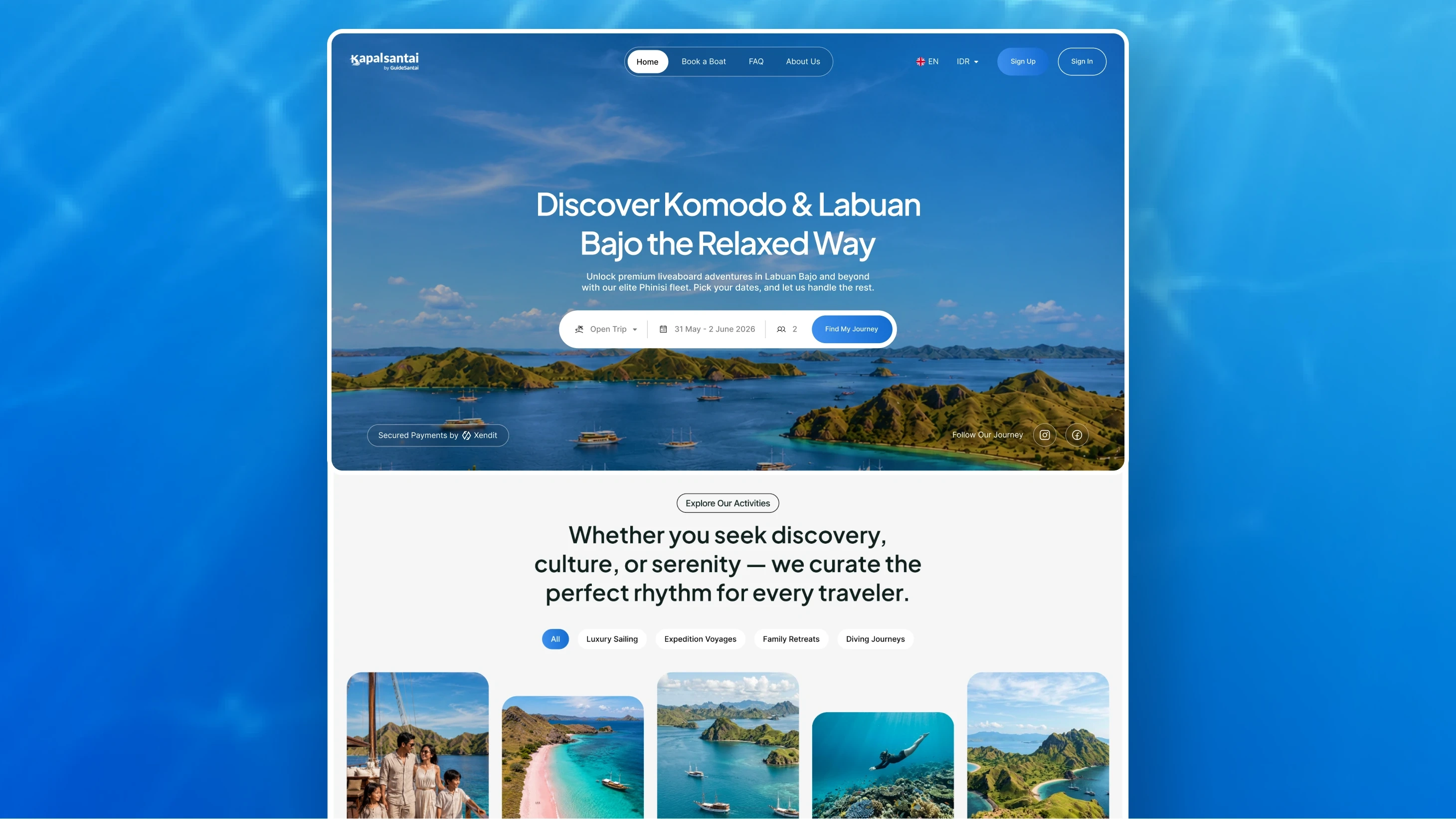
Travel Website Redesign – Kapal Santai
UI/UX Case Study | Figma + Framer
Overview
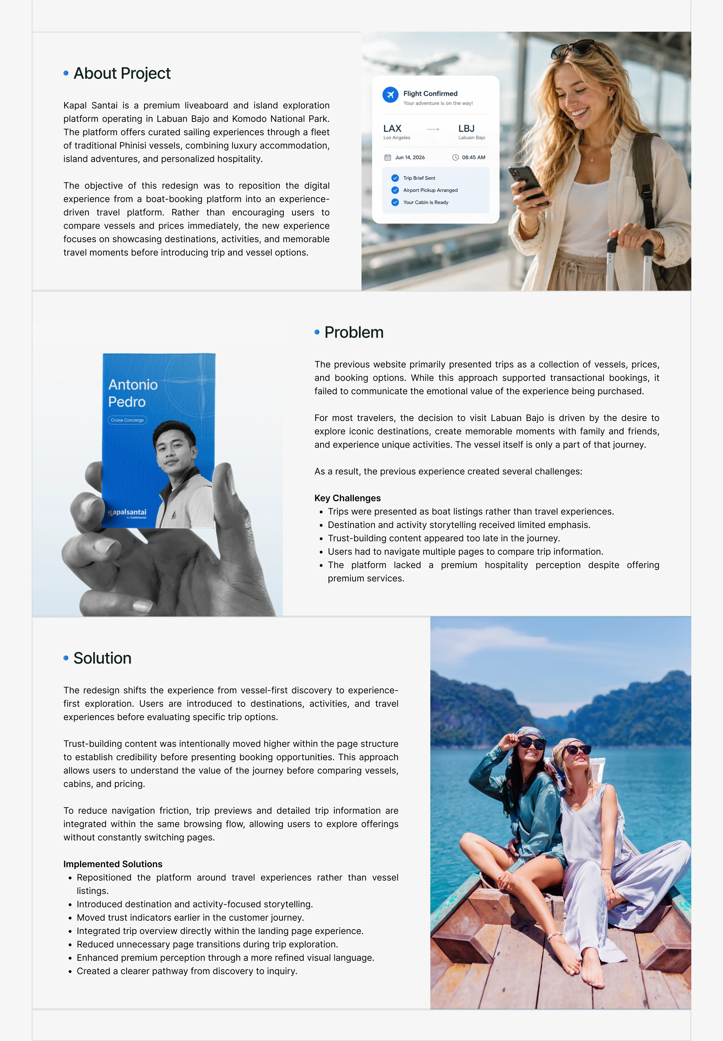
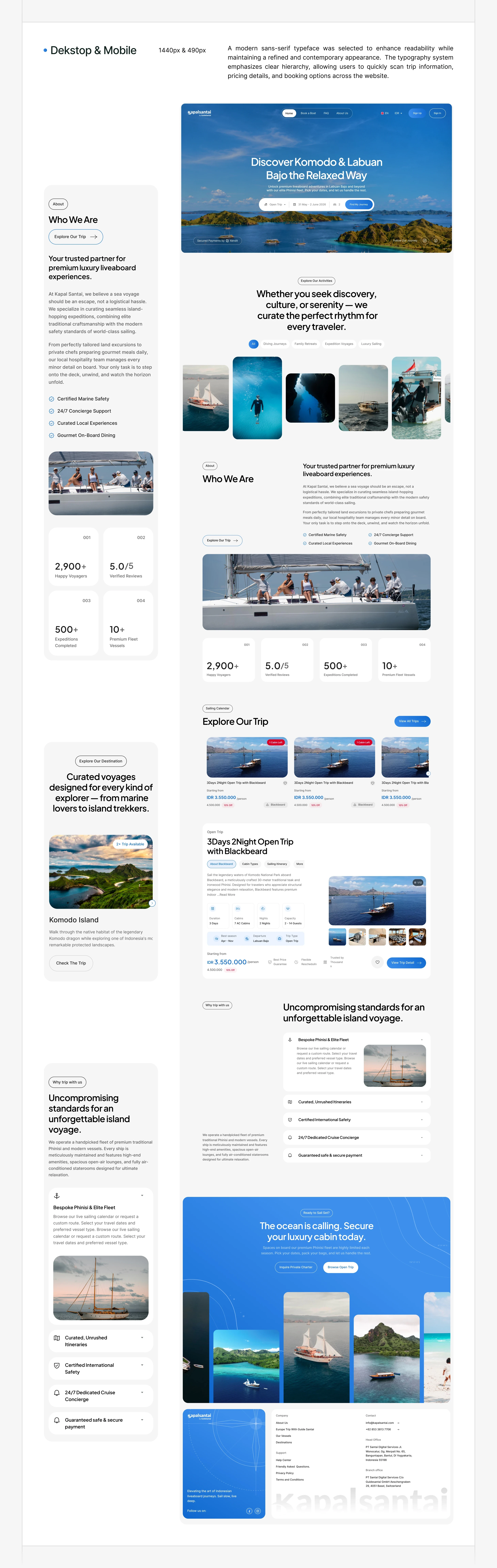
Kapal Santai is a travel website redesign project focused on creating a modern, immersive, and user-friendly digital experience for travelers. The goal was to transform a traditional travel website into a visually engaging platform that inspires users to explore destinations while making the booking journey simple and intuitive.
The project was designed entirely in Figma and later developed in Framer, ensuring that the final website closely matched the original design while incorporating responsive layouts, smooth animations, and interactive elements.
Project Goal
The objective was to redesign the travel website with a stronger visual identity, improved usability, and a seamless booking experience.
The redesign aimed to:
Create a modern and premium interface.
Inspire users through immersive visuals.
Improve navigation and content hierarchy.
Simplify the travel discovery and booking process.
Deliver a responsive experience across all devices.
My Role
I was responsible for the complete design and development process.
Responsibilities
UX Research
Information Architecture
Wireframing
UI Design
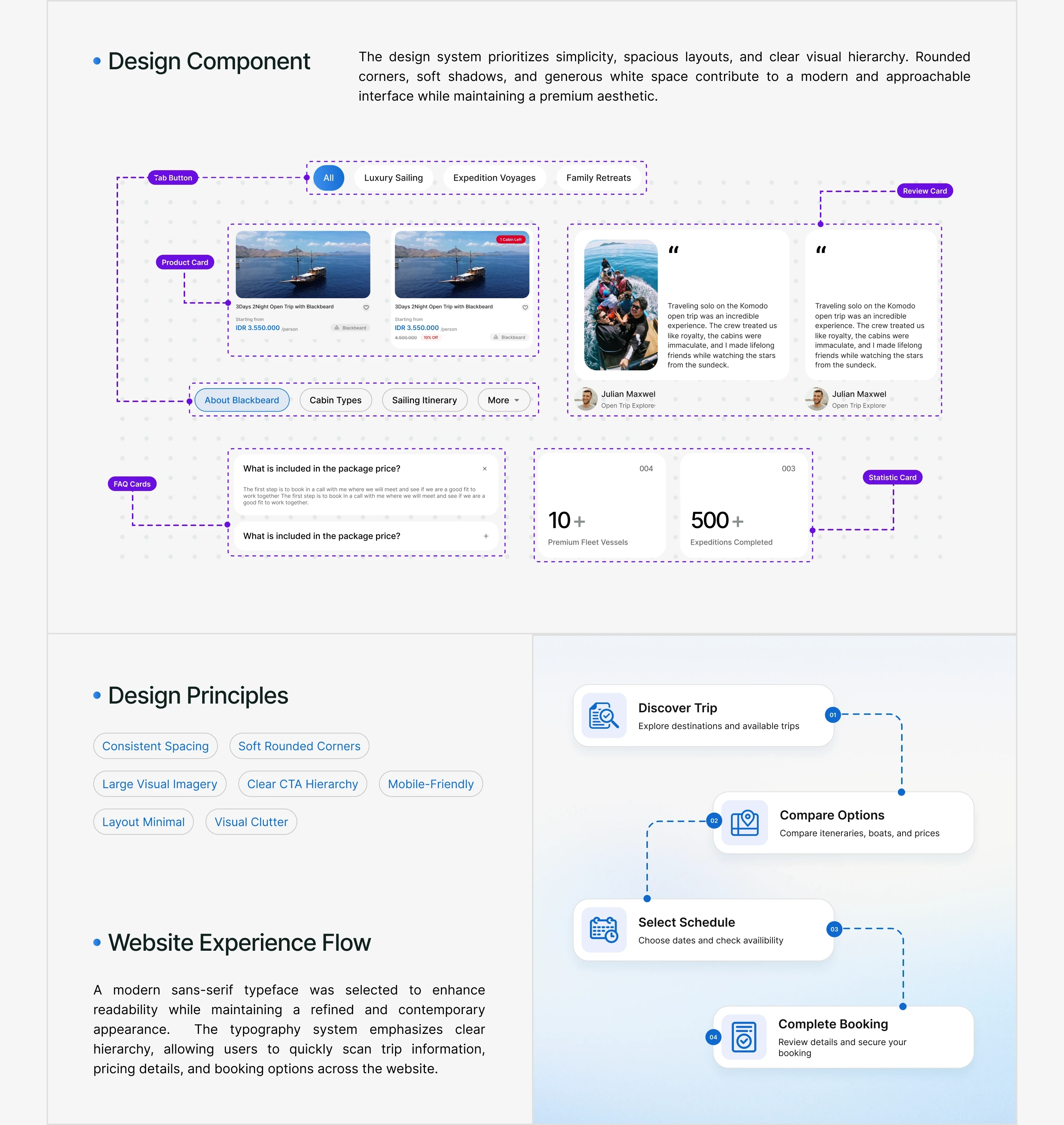
Design System
Responsive Design
Interactive Prototype
Framer Development
Testing & Optimization
Tools Used
Figma
Framer
Research & Discovery
Before starting the redesign, I analyzed modern travel platforms to understand how successful brands present destinations, packages, and booking experiences.
The research focused on identifying common UX patterns that encourage exploration while reducing friction during the booking journey. I also studied layout structures, typography, color systems, and navigation approaches to create a more engaging user experience.
The insights gathered during this phase helped define the visual direction and overall user flow for the project.
User Experience Strategy
The website was structured to guide visitors naturally from discovering destinations to taking action.
The content hierarchy was carefully organized into sections that progressively build user confidence:
Hero Section
Popular Destinations
Featured Travel Packages
Why Choose Us
Customer Testimonials
Travel Gallery
Booking Call-to-Action
Contact & Footer
This structure helps users quickly understand the brand, explore travel options, and move toward booking without unnecessary distractions.
Wireframing
Low-fidelity wireframes were created in Figma to establish the layout and user flow before applying visual design.
This stage focused on:
Navigation placement
Content prioritization
User journey
Layout consistency
CTA positioning
Creating wireframes first allowed rapid iteration and helped validate the overall experience before moving into high-fidelity designs.
UI Design
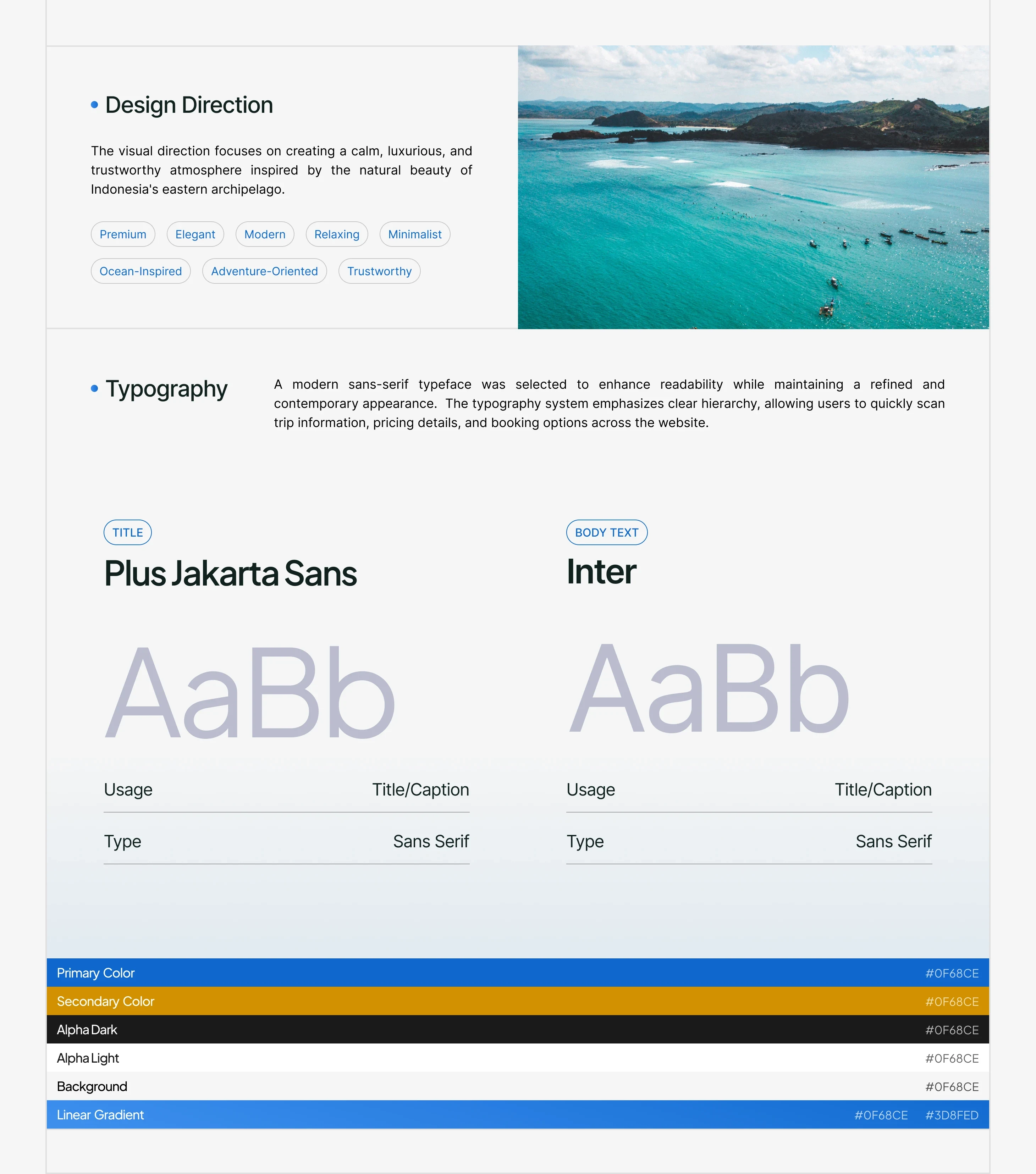
The visual design was inspired by the excitement and freedom of travel.
A vibrant yet balanced color palette, large destination imagery, modern typography, and generous white space were used to create an inviting interface. Each section was designed to encourage exploration while keeping information clear and easy to scan.
The design emphasizes visual storytelling, allowing destination images and travel experiences to become the focal point of the website.
Biggest Challenge
One of the biggest challenges was balancing visual richness with usability.
Travel websites often feature a large amount of content, including destinations, packages, reviews, and booking information. The challenge was presenting this information without overwhelming users.
This was solved by creating a strong visual hierarchy, using clean layouts, and grouping related information into easily digestible sections.
Building in Framer
Once the UI design was finalized in Figma, the website was developed in Framer.
The goal was to maintain pixel-perfect consistency while enhancing the experience with modern interactions.
Development included:
Fully responsive layouts
Smooth scrolling
Hover interactions
Page transition animations
Reusable components
Responsive grids
Optimized typography
Flexible spacing system
Framer made it possible to build a fast, visually polished website while preserving the original design intent.
Responsive Design
Responsiveness was planned from the beginning of the project.
The layouts were carefully optimized for desktop, tablet, and mobile devices, ensuring users enjoy the same smooth browsing experience regardless of screen size.
Navigation, cards, images, typography, and spacing were all adapted to provide consistent usability across every breakpoint.
Design Decisions
Several key decisions shaped the final experience:
Large hero imagery to immediately capture attention.
Clear typography for improved readability.
Card-based layouts for organizing travel packages.
Bright accents to highlight important actions.
Consistent spacing for a clean interface.
Strong call-to-action buttons to encourage bookings.
High-quality visuals to inspire travel.
Every design choice was made to create an engaging and trustworthy travel experience.
Outcome
The redesign successfully modernized the Kapal Santai website with a cleaner interface, improved navigation, and a more immersive user experience.
The final product demonstrates how thoughtful UX planning, modern UI design, and responsive development can transform a travel website into an engaging platform that encourages users to explore destinations and complete bookings with confidence.
Key Takeaways
This project reinforced several valuable lessons:
Great travel websites rely on visual storytelling.
Simplicity improves usability.
Strong hierarchy makes content easier to navigate.
Responsive design should be considered from the start.
Consistent design systems improve scalability.
Developing in Framer helps bridge the gap between design and production while maintaining visual consistency.
Final Thoughts
This project allowed me to take a complete product from concept to launch by designing the interface in Figma and bringing it to life in Framer. The process strengthened my skills in UX strategy, responsive design, and interactive web development while reinforcing the importance of creating experiences that are both visually engaging and highly functional.
The final result is a modern, responsive travel website that combines aesthetics, usability, and performance to deliver an enjoyable experience for every traveler.
Like this project
Posted Jul 23, 2026
Travel website redesign crafted in Figma and developed in Framer, featuring a modern UI, intuitive UX, responsive layouts, and immersive booking experience.
Likes
0
Views
8