Weingut Gebrüder Bart – Brand Identity & Packaging Design

Ryan Framer


Weingut Gebrüder Bart – Brand Identity & Packaging Design
Overview
Weingut Gebrüder Bart is a family-owned winery rooted in the Pfalz region of Germany, where generations of craftsmanship meet a progressive approach to organic winemaking. The objective of the rebrand was to create a visual identity that reflects the winery's heritage while positioning it as a contemporary premium wine brand. The new identity balances authenticity, minimalism, and timeless elegance, allowing the quality of the wine to become the central focus.
The Challenge
The winery required a cohesive brand system capable of standing out in an increasingly competitive wine market. While its history and commitment to sustainable viticulture represented valuable assets, the existing visual communication lacked the clarity and distinction needed to appeal to modern consumers.
The challenge was to create a brand identity that would:
Honor the family's long-standing winemaking tradition.
Communicate craftsmanship without relying on conventional wine branding clichés.
Build a recognizable identity across packaging, print, and digital touchpoints.
Appeal to both established wine enthusiasts and a younger design-conscious audience.
Brand Strategy
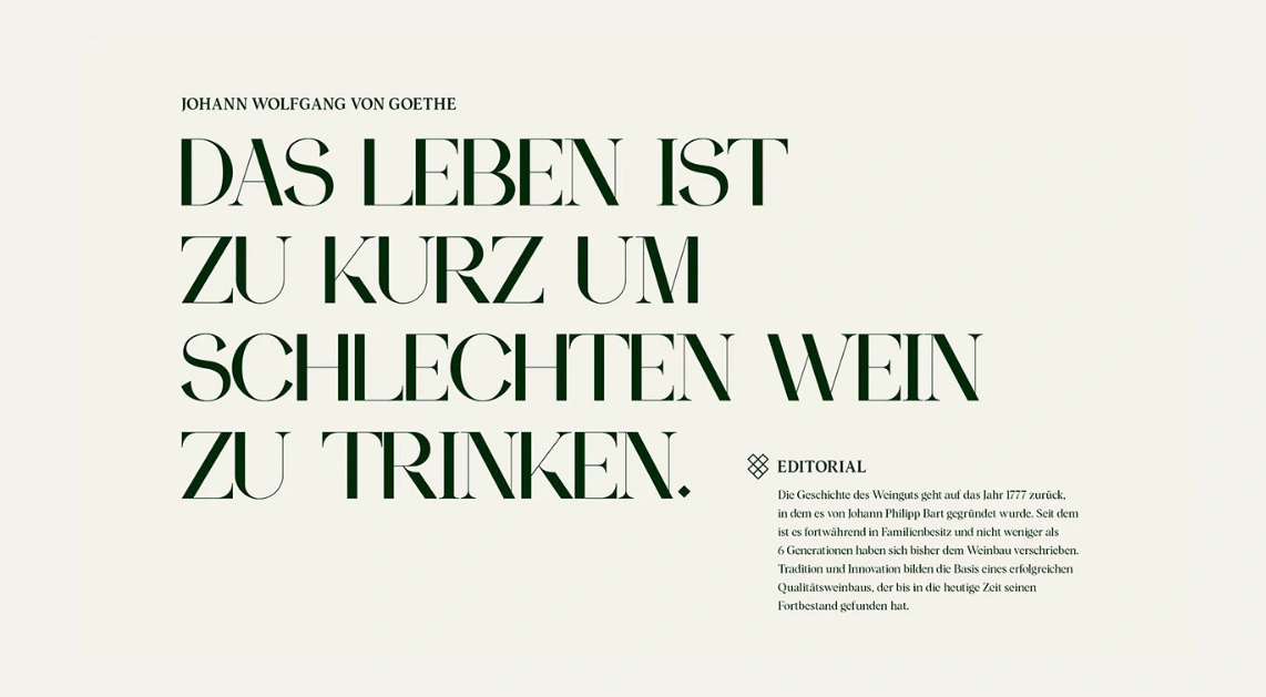
The identity was built around the idea that exceptional wine requires confidence rather than excess. Instead of decorative illustrations or overly ornate labels, the design embraces restraint and precision.
The strategy focused on three core values:
Heritage through simplicity
Premium quality through refined typography
Authenticity through honest and functional design
Every visual decision reinforces the winery's philosophy of allowing nature, craftsmanship, and product quality to speak for themselves.
Visual Identity
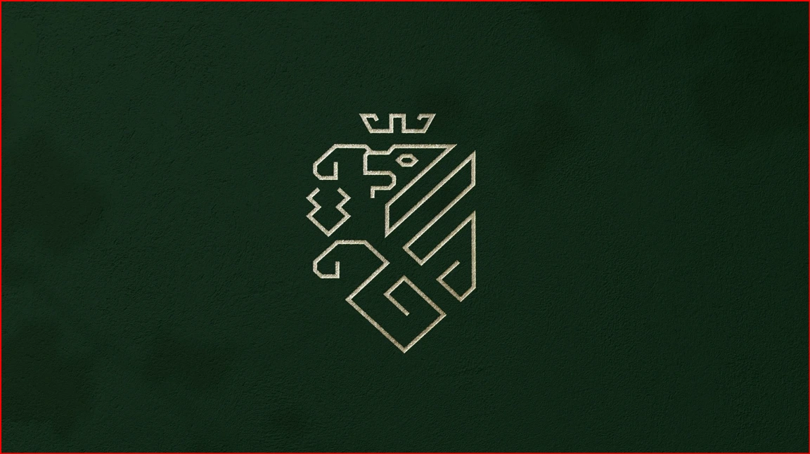
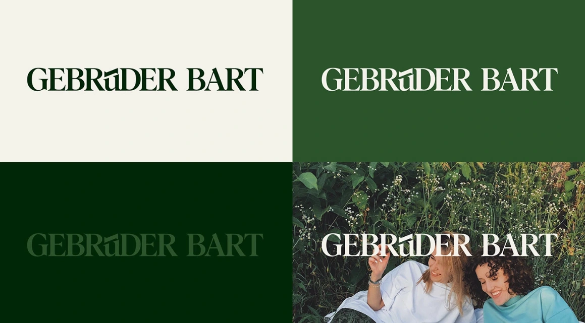
The logo system features a clean, balanced wordmark that conveys stability and sophistication. Carefully selected typography creates a timeless appearance while maintaining excellent legibility across every application.
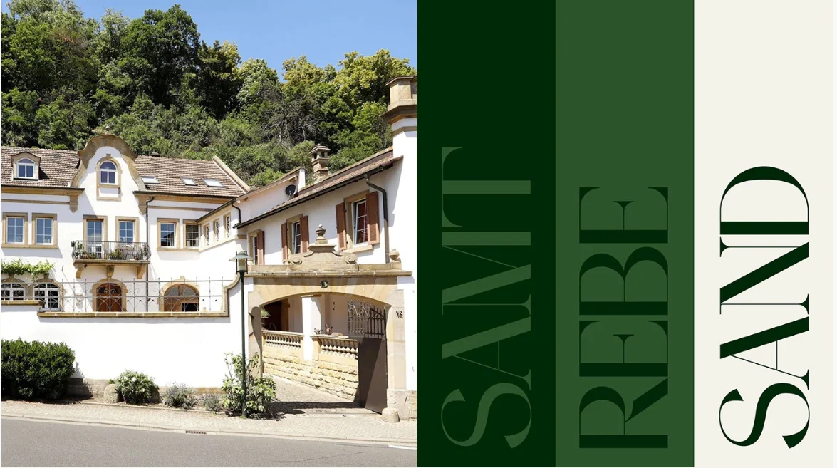
A restrained monochromatic color palette emphasizes elegance and ensures consistency throughout the brand ecosystem.
The overall visual language is minimal yet distinctive, creating a premium presence without unnecessary ornamentation.
Packaging Design
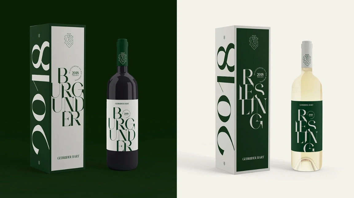
Wine labels became the centerpiece of the identity system.
The packaging uses generous white space, structured typography, and subtle hierarchy to create an understated yet luxurious appearance. Rather than competing for attention with elaborate graphics, the labels communicate confidence through clarity.
Each wine variety follows a consistent design framework, making the collection instantly recognizable while allowing individual products to maintain their own identity.
The result is a shelf presence that feels contemporary, refined, and highly memorable.
Design Principles
The identity is guided by five fundamental principles:
Minimal, timeless aesthetics
Clear typographic hierarchy
Functional information architecture
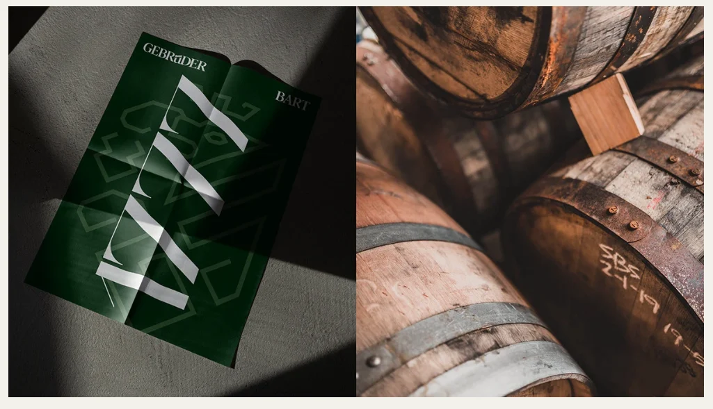
Premium material expression
Consistent visual language across all brand touchpoints
These principles ensure the brand remains adaptable while preserving a strong and recognizable identity.
Deliverables
The branding system includes:
Brand identity
Logo system
Typography guidelines
Wine label design
Packaging system
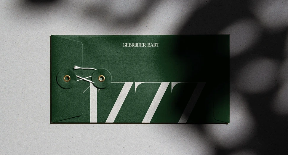
Brand stationery
Printed collateral
Digital brand assets
Brand application guidelines
Outcome
The final identity presents Weingut Gebrüder Bart as a modern winery deeply connected to its heritage. Through thoughtful typography, restrained aesthetics, and a cohesive packaging system, the brand communicates quality, authenticity, and craftsmanship with confidence.
Rather than following temporary design trends, the identity establishes a timeless visual language that can evolve alongside future wine collections while remaining unmistakably recognizable.
Credits
Project: Weingut Gebrüder Bart Branding
Creative Fields:
Brand Identity • Packaging Design • Typography • Art Direction
Tools:
Adobe Illustrator • Adobe InDesign • Adobe Photoshop
Like this project
Posted Jul 18, 2026
A timeless brand identity for Weingut Gebrüder Bart, blending heritage, minimalist typography, and refined packaging to elevate its premium wine experience