Coachbox Brand Identity

Ryan Framer


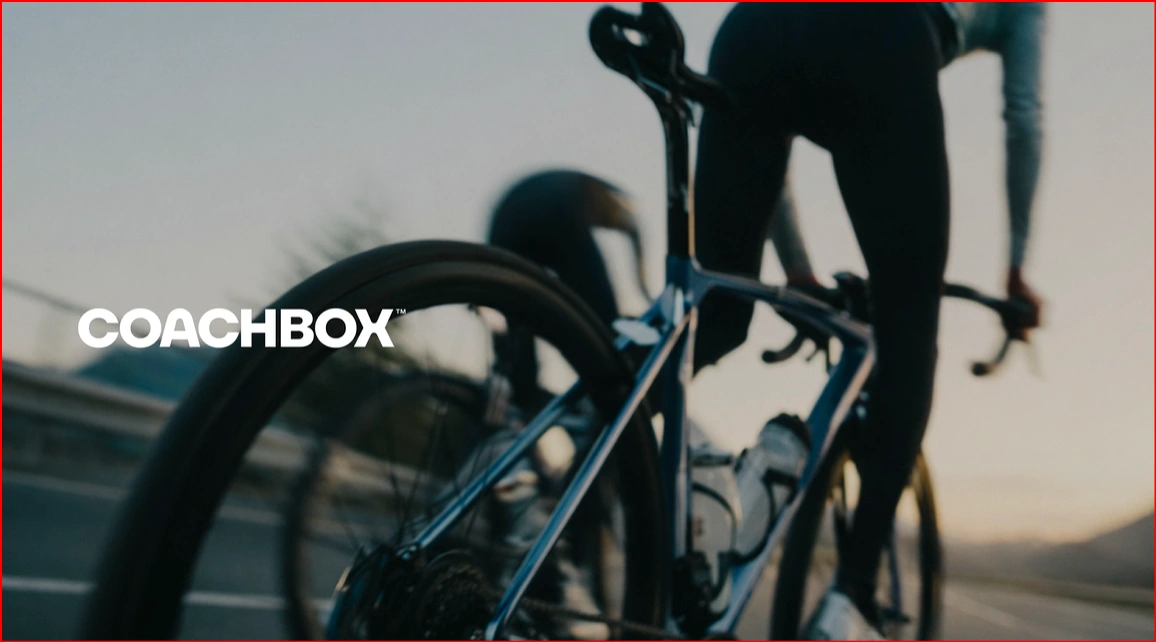
Coachbox – Brand Identity
Overview
Coachbox is an all-in-one platform that connects endurance athletes and coaches through training, performance tracking, and personalized coaching. As the platform evolved beyond coaching software into a complete training ecosystem, it needed a bold identity that reflected movement, ambition, and continuous progress.
The goal was to create a modern, energetic brand that resonates with both coaches and athletes while communicating trust, performance, and community.
The Challenge
Coachbox had grown into a comprehensive platform offering coaching tools, athlete management, and performance insights. However, its visual identity no longer reflected its expanded capabilities or competitive position.
The challenge was to develop a scalable brand system that could:
Differentiate Coachbox in the sports technology market.
Appeal to both professional coaches and ambitious athletes.
Communicate energy, precision, and progress.
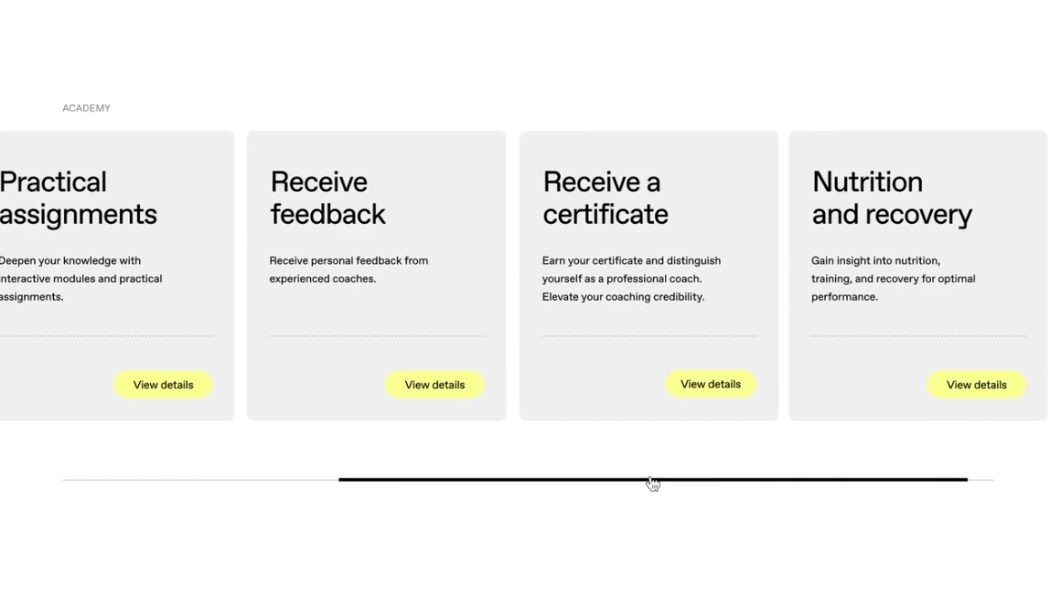
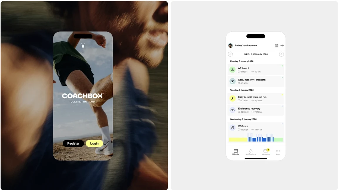
Maintain consistency across digital products, social media, and marketing materials.
Brand Strategy
The brand was built around one central idea: Every achievement begins with a shared journey.
Rather than focusing solely on technology, the identity emphasizes the relationship between coach and athlete. Every design element reinforces collaboration, growth, and measurable improvement.
The visual language captures the rhythm of endurance sports—steady, focused, and always moving forward.
Visual Identity
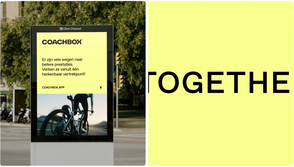
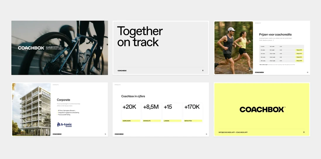
The logo combines bold geometric forms with dynamic movement, creating a distinctive symbol of strength and momentum. Its clean construction ensures flexibility across digital interfaces, apparel, and promotional materials.
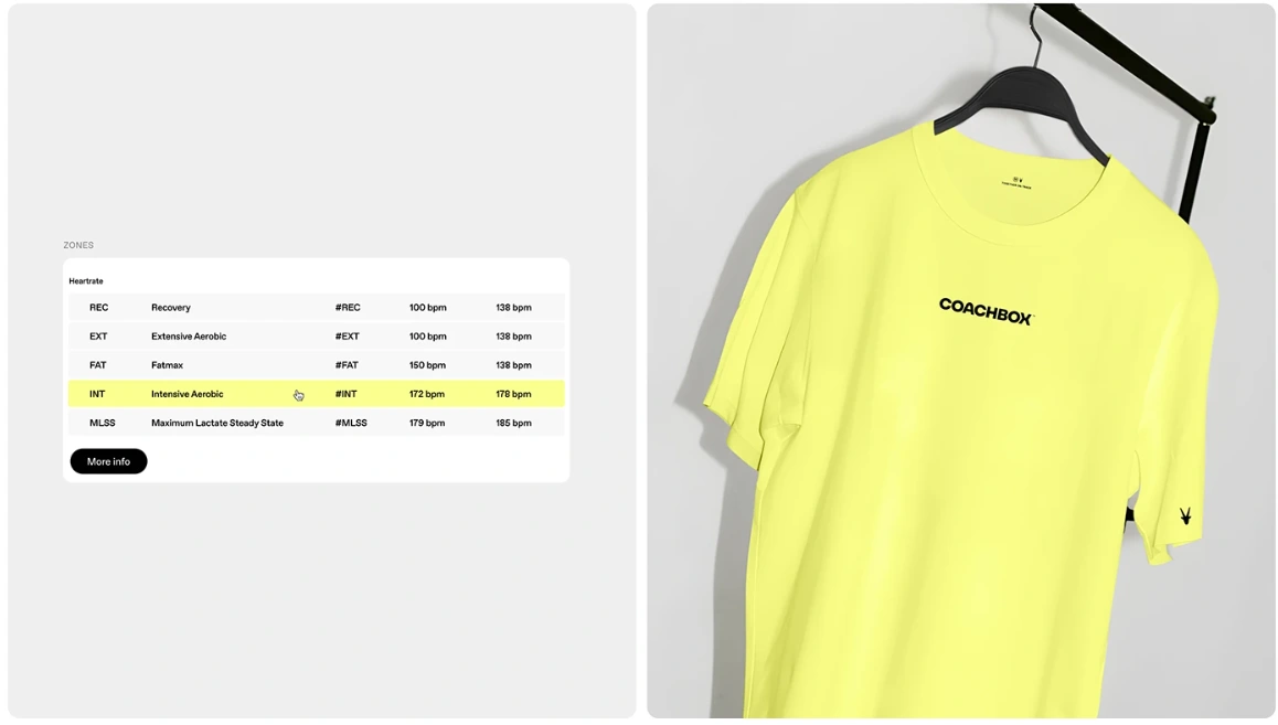
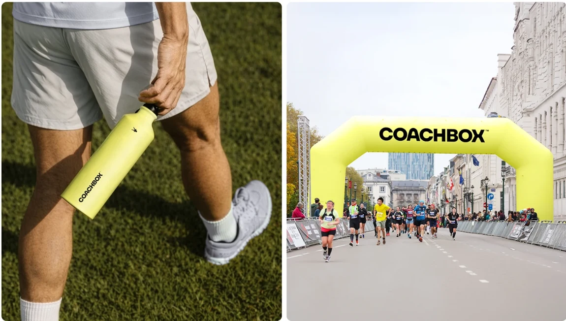
A vibrant yellow serves as the primary brand color, delivering high visibility, optimism, and instant recognition. Paired with dark neutrals and clean typography, the palette creates a modern and energetic visual system.
Supporting graphics, iconography, and motion elements reinforce the feeling of speed, endurance, and continuous progress.
Brand Elements
A key feature of the identity is the antelope symbol, representing endurance, agility, balance, and intelligent energy management—the same qualities required in long-distance sports.
Photography focuses on authentic moments of training and competition, highlighting real athletes, determination, and achievement rather than staged perfection.
A custom icon system simplifies complex training data while maintaining consistency across the platform and marketing assets.
Design Principles
The identity is built around five guiding principles:
Movement with purpose
Bold simplicity
Data-driven clarity
Human connection
Consistent digital-first design
These principles ensure every touchpoint reflects Coachbox's mission of helping athletes and coaches perform at their best.
Deliverables
The project included:
Brand Strategy
Logo Design
Visual Identity System
Color & Typography Guidelines
Iconography
Social Media Assets
Website Visual Direction
Motion Graphics
Marketing Materials
Brand Guidelines
Outcome
The new identity positions Coachbox as a confident, forward-thinking sports brand that combines technology with human performance. Through bold visuals, dynamic storytelling, and a cohesive design system, the brand creates a memorable experience across every touchpoint.
More than a software platform, Coachbox now communicates a clear promise: empowering coaches and athletes to move forward together, one goal at a time.
Like this project
Posted Jul 18, 2026
A bold and dynamic brand identity for Coachbox, uniting coaches and athletes through modern design, clear storytelling, and a vibrant visual system.
Likes
0
Views
6
Clients
Coachbox