LUMBRIKO BRAND DESIGN
Kit | Studio Otchi ✨
Are you tired of greenwashing too? Looking for a place where you can find accurate information and shop sustainably with peace of mind? Then Lumbriko is the place to be! Plus, you’ll even get an easy-to-use recycling tool to help you out.
Studio Otchi crafted a bold and inspiring brand design for this ambitious start-up. With custom illustrations and distinctive brand icons, this identity goes far beyond just a logo.
BRAND DESIGN OVERVIEW
Project
Lumbriko – Your sidekick for a truly sustainable lifestyle, made easy.
Challenges
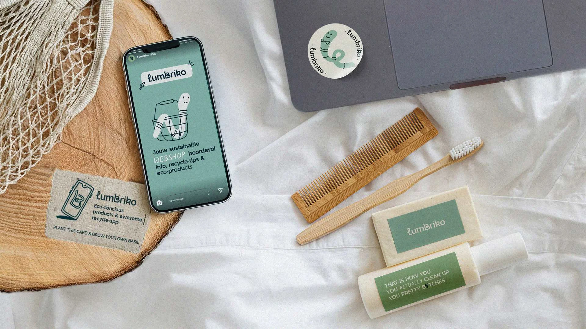
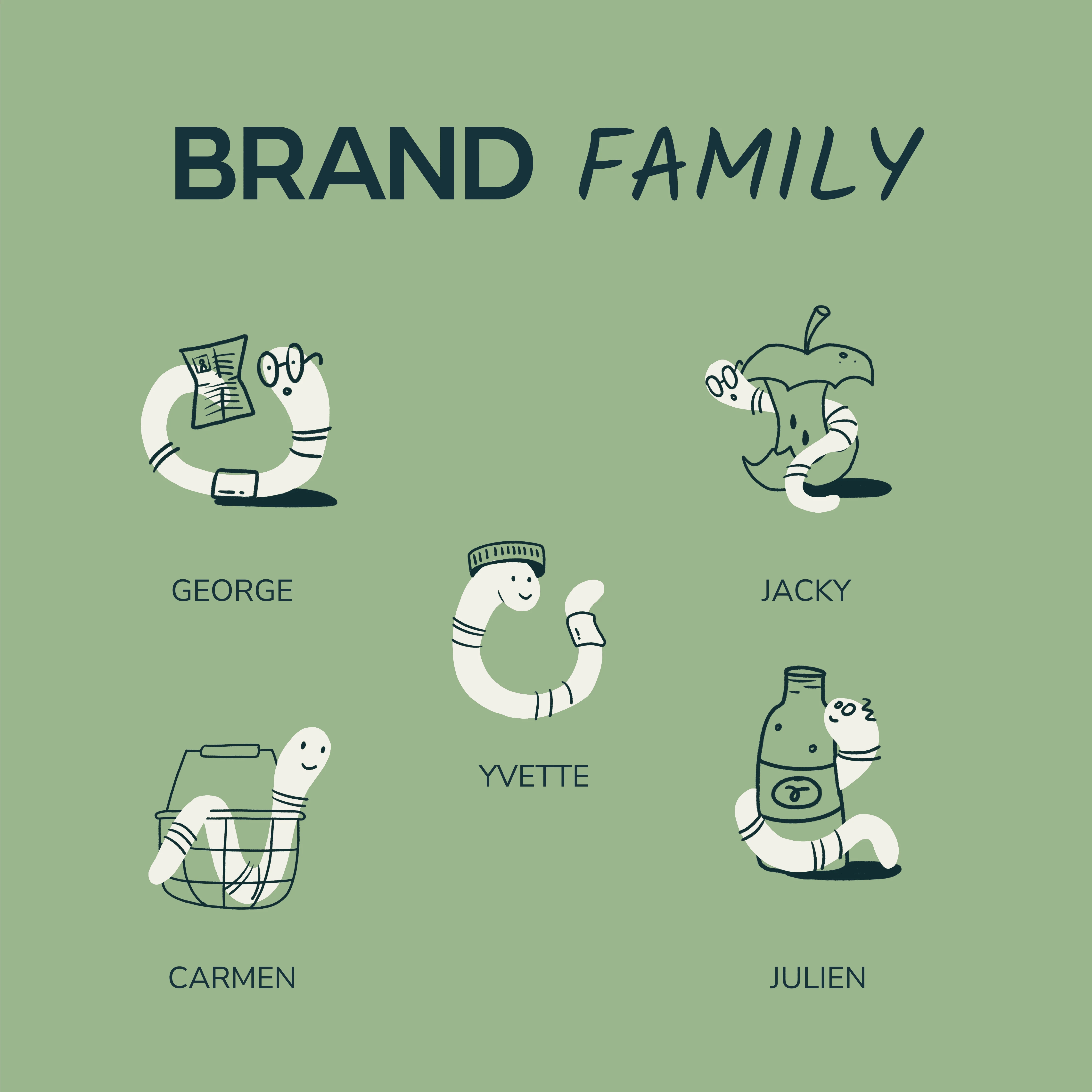
Lumbriko wanted branding with an eco-conscious look and feel. Since Lumbriko is the Latin word for earthworm—the ultimate recycling hero—the worm had to be incorporated into the branding without looking childish or generic.
Solution
The typographic logo is inspired by the worm’s fluid movement. The letterforms are friendly yet strong. The mascot—the worm itself—features a recognizable twist that is cleverly echoed in the ‘B’ of the logo. And this little character didn’t come alone—it has an entire family!
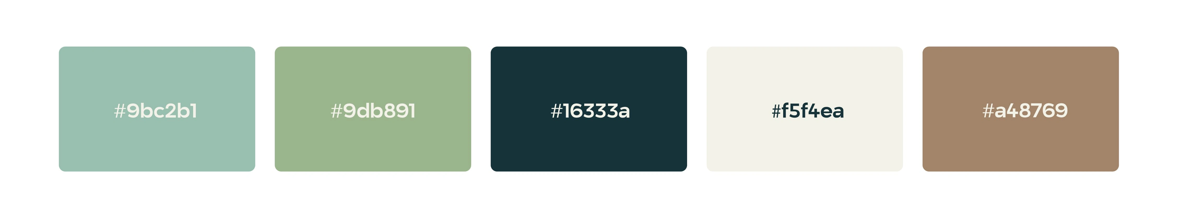
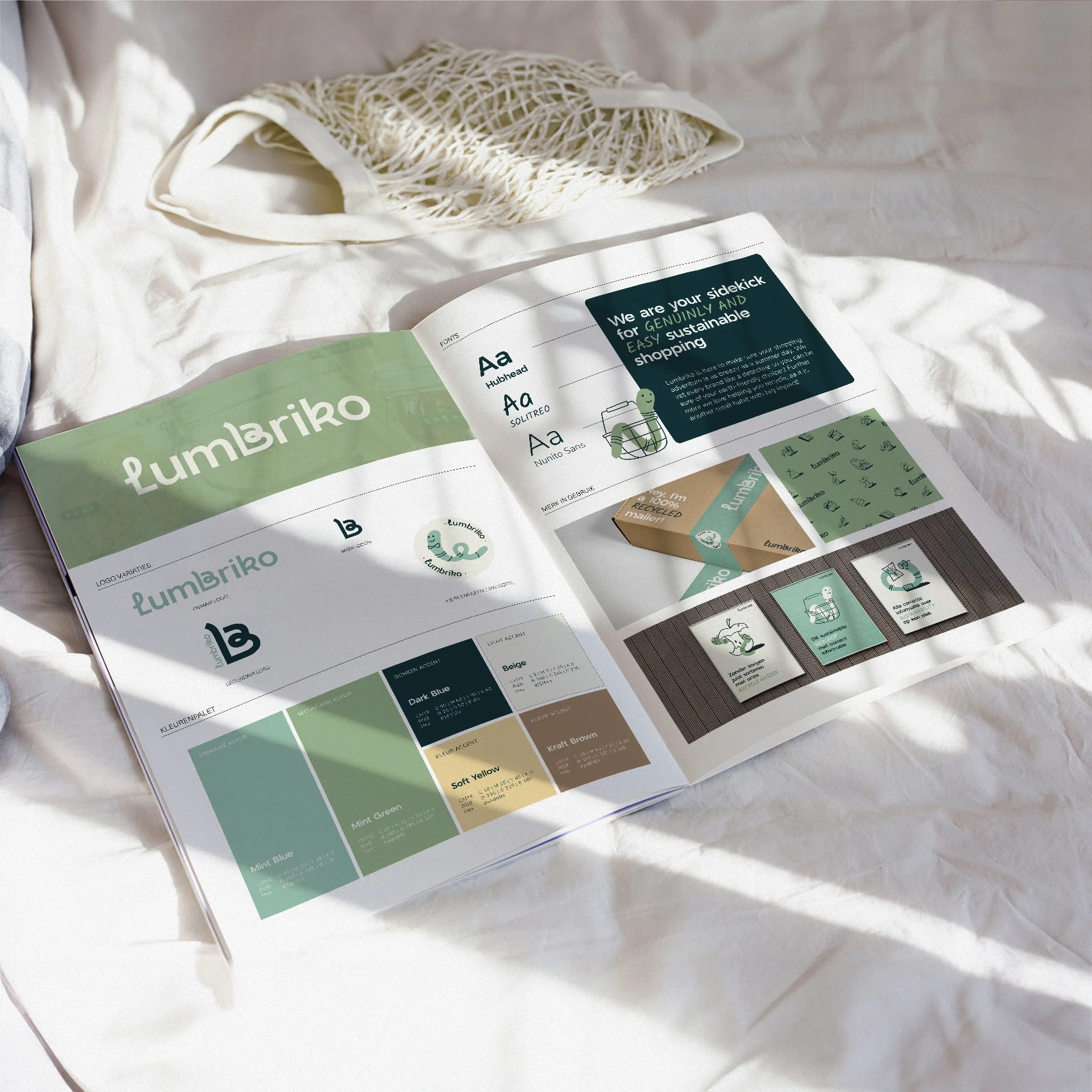
COLOR PALETTE
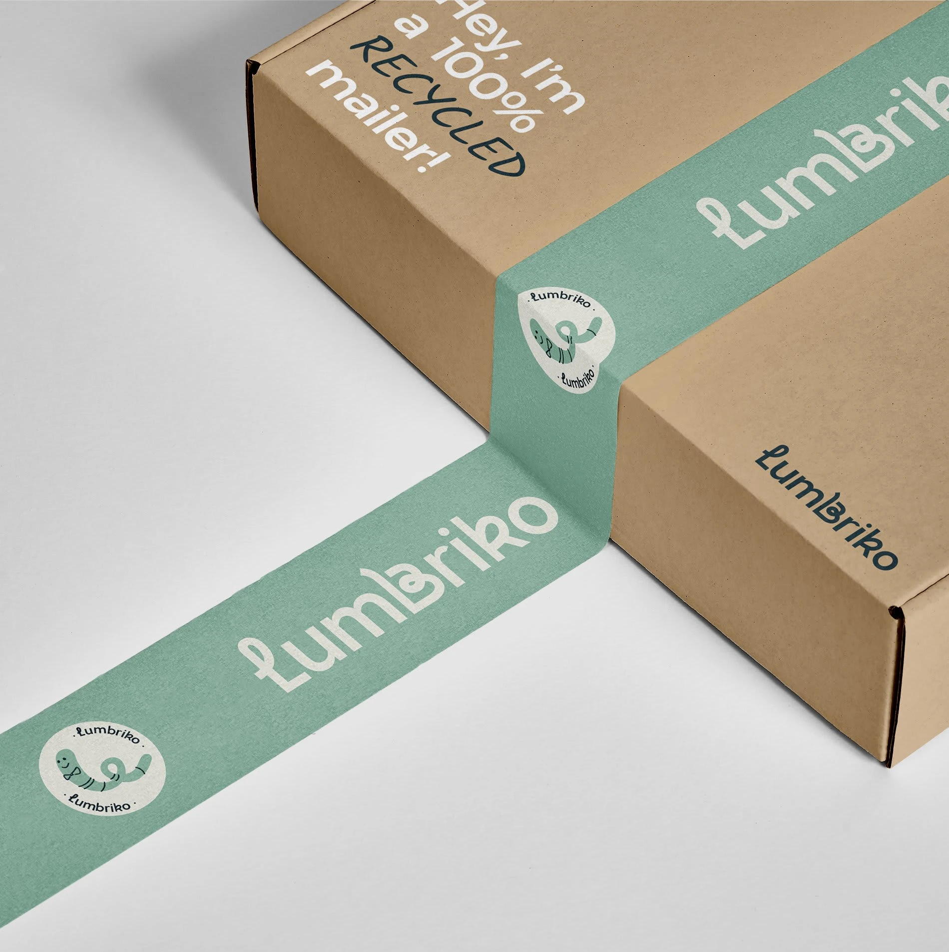
PACKAGING DESIGN
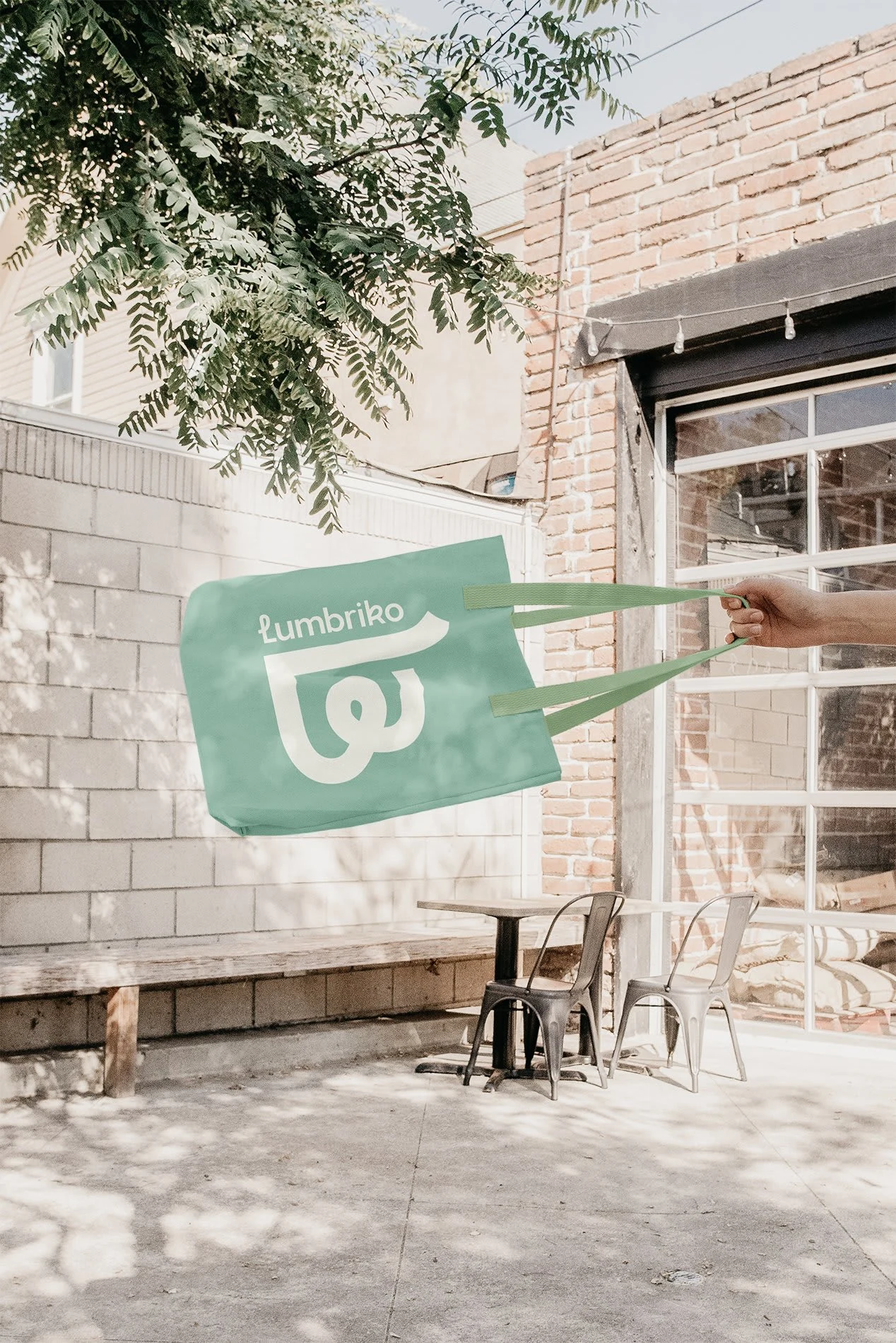
TOTE BAG DESIGN
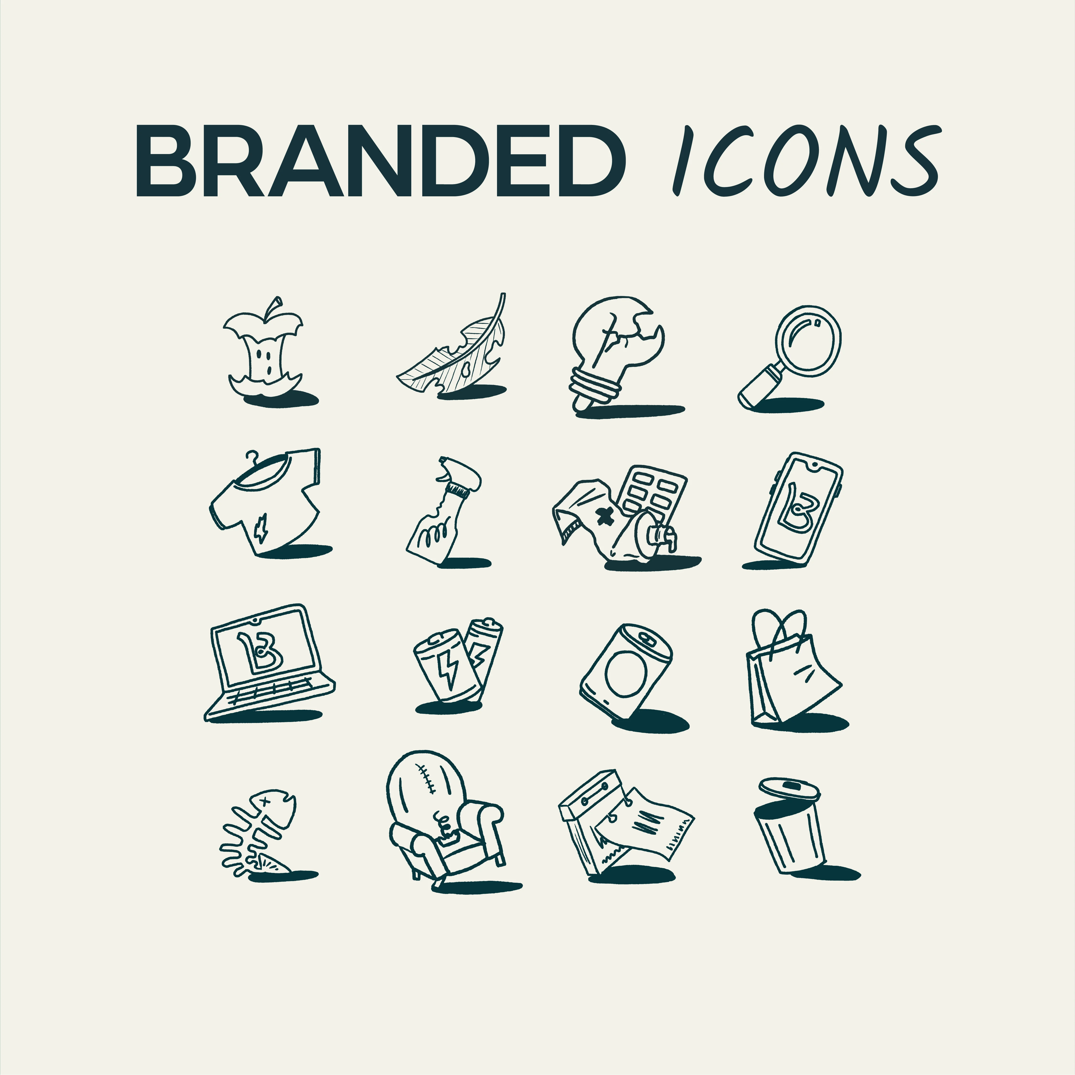
BRAND ICONS
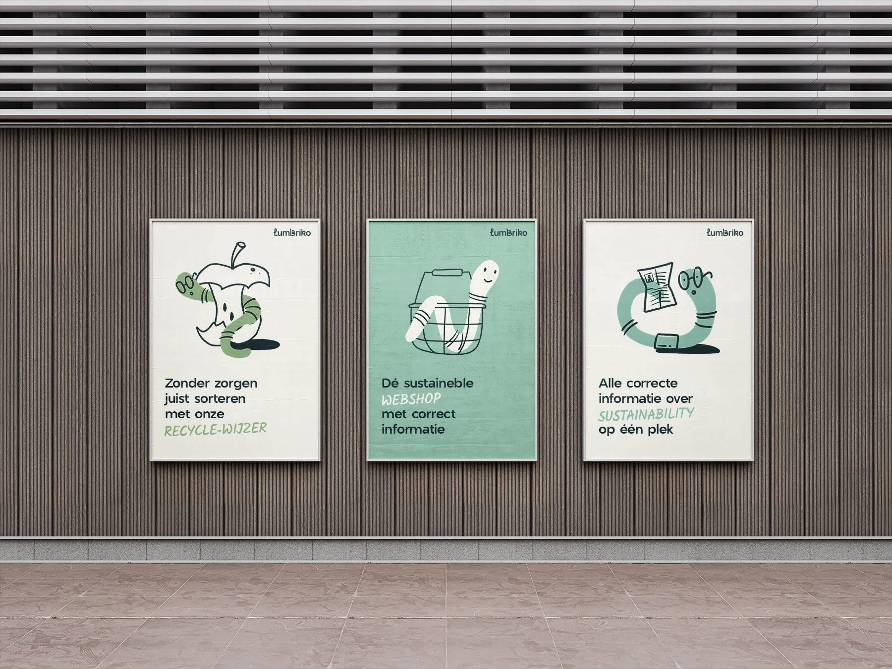
BRANDED ILLUSTRATIONS
More character through typography
Friendly yet impactful fonts
Every typeface at Lumbriko is carefully chosen to reflect the brand’s personality. Soft and welcoming letterforms, combined with a playful accent font, create a warm and accessible atmosphere.
Typography is more than just words—it’s a powerful tool to bring a brand’s identity to life.
Brand illustrations that tell a story
More than just a logo
At Lumbriko, branding goes beyond a single logo. By incorporating custom icons and illustrations, the identity gains more depth and dynamism. This not only boosts brand recognition but also enhances its professional image. These subtle additions make it easier to apply the branding consistently while building trust with customers.
Like this project
Posted Mar 6, 2025
A bold and inspiring brand design for this ambitious start-up. With custom illustrations and distinctive brand icons, this identity goes far beyond just a logo.