Amber Engine: Revolutionizing B2B E-Commerce SaaS
Alexandra Mosnitska
I redesigned the website of Amber Engine, a B2B e-com SaaS startup. This was a long-term project as we continuously worked on improving the UX and UI of the website throughout 2021-2023.
This project resulted in:
improving the success of corporate partnerships due to a more professional look
acquiring first customers through online representation (together with other marketing efforts)
startup getting acquired in March 2022 (together with other product&marketing efforts)
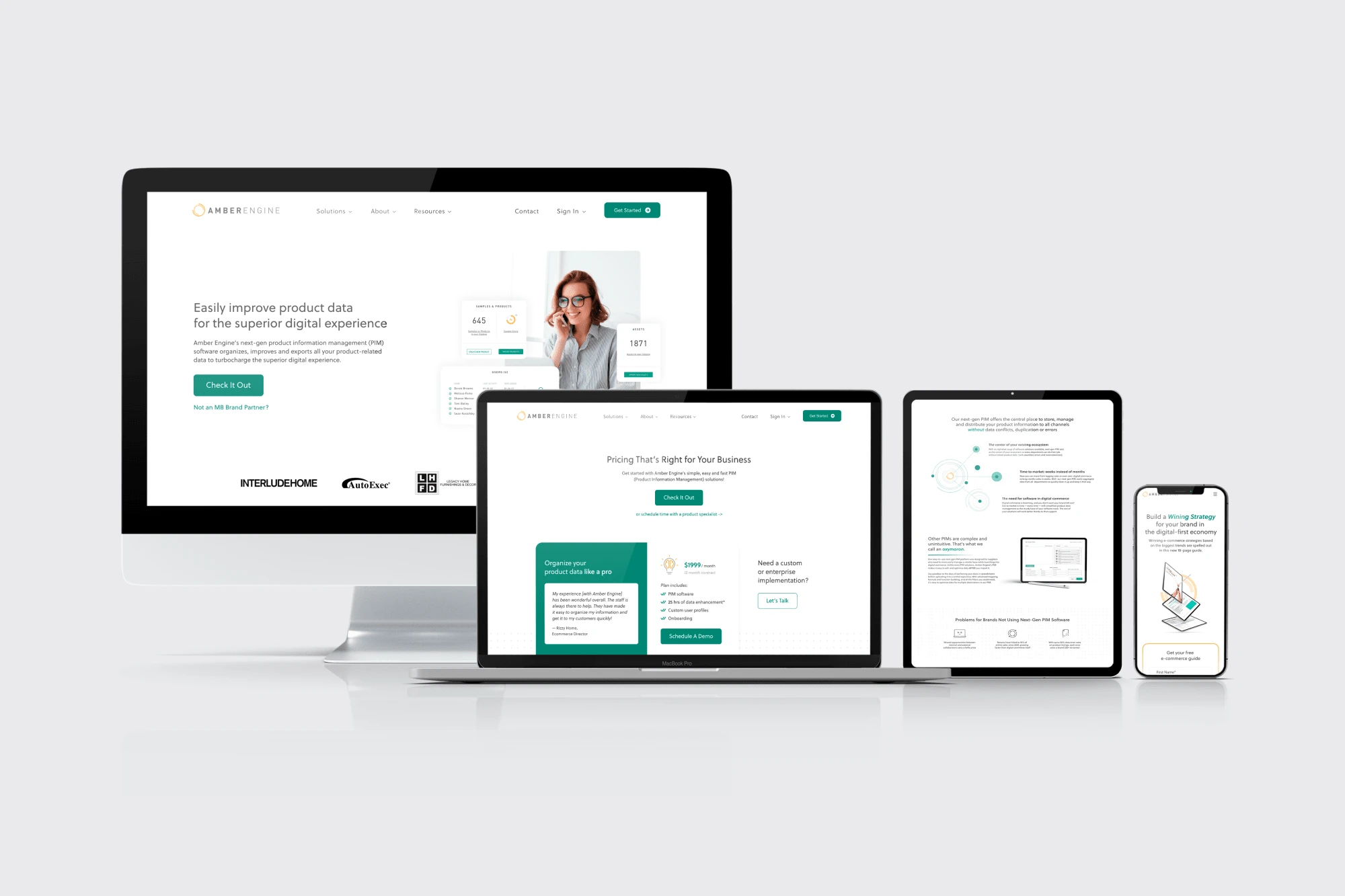
New website
Alexandra has been one of our top freelance hires. She came highly recommended from another designer, and has spearheaded our journey toward premium design and branding. She is constantly finding ways to deepen both her expertise and her understanding of what we really need to make our designs and branding standout in a positive way. To that end, she recently has been working on a comprehensive design system, with reusable elements, in order to standardize our design and development process. This is helping us to maintain consistent style while massively speeding up the design and development process for various assets. Alexandra is a passionate and committed team player, and we have gained significant value from our work with her. I recommend her strongly.
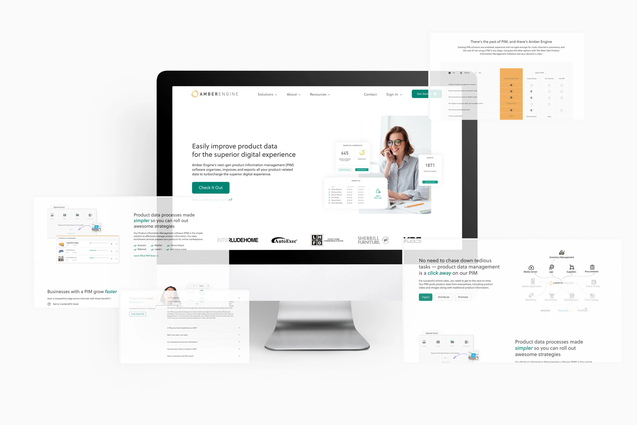
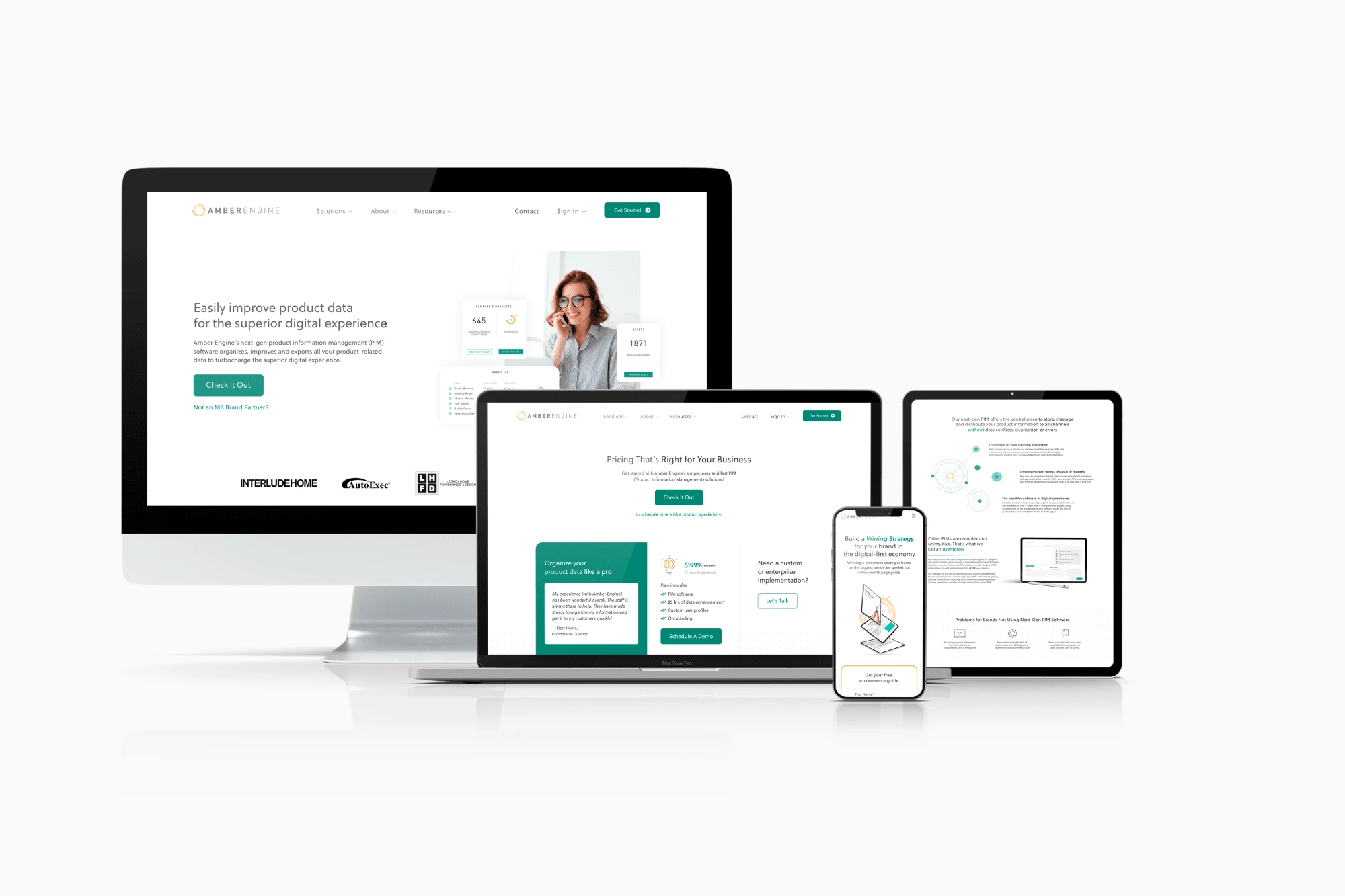
New homepage
Project Overview
My Role: Lead UX/UI Designer, Visual Language, Design System
Timeline: April 2021 - July 2023
Background
Amber Engine is a B2B company with an e-com SaaS product. Together we have created numerous pages and worked on numerous UX issues on their website, managing to greatly improve it overall. This is a permanently ongoing project as we always keep testing and adjusting the website, sometimes working on a bigger redesign projects, sometimes just changing minor details.
Problem
Amber Engine’s product was good, but their website was not. Because of this, they did not look credible and lost a couple of partnership opportunities with other companies who let them know that they need to level up their online representation game to be taken seriously. They were also not getting any customers from the online presence which we hoped could change with the new design that would make the company look trustworthy (together with other marketing efforts).
Goals
Update the brand look so that Amber Engine looks as good as their product is.
Design the new UI of the website based on the updated brand look so that it looks professional and credible to attract new customers (which is super important for a startup).
Improve the UX of the website to be easy and convenient to navigate so that the users can enjoy the experience of learning more about Amber Engine and their product.
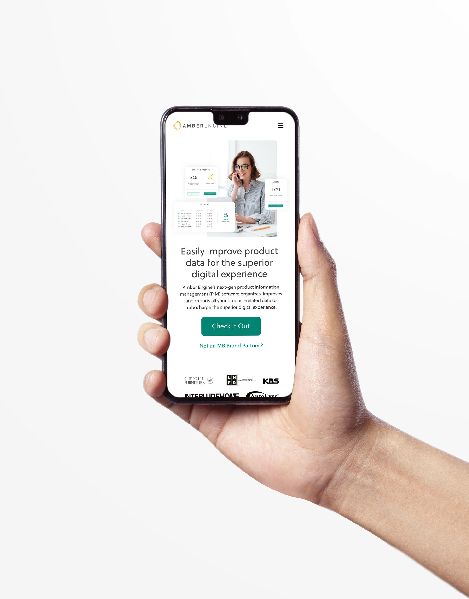
New homepage on mobile
Alexandra's expertise in design and branding has been invaluable to our company. She has led the charge in creating a premium look and feel for Amber Engine, and her work on our website redesign has been nothing short of outstanding. In addition to her design work, Alexandra has taken ownership of our brand guidelines and created a design system that has saved our team time and money. Her work on this project has been instrumental in standardizing our design and development process, resulting in a consistent style and faster delivery of assets. Overall, Alexandra is a passionate and committed team player who consistently goes above and beyond to deliver exceptional work. Her contributions to our team have been invaluable, and I strongly recommend her to anyone in need of a talented designer and branding expert.
Design Process
I worked on this as a part of an agile fully-remote cross-functional international team at Amber Engine, for the most part being the only person responsible for all things design. This was a very fast moving agile environment where we were constantly ideating, making dozens of changes, testing how new things work and then continuing to improve whatever we could. Sometimes we’d change the UI things, such as button colors or shapes; other times the UX things - for example, the forms on the website and the logic behind them, the information architecture in the navigation, the settings for pop-up windows, etc.
Since this was a permanently ongoing long-term project rather than a one-time redesign, the process was changing a lot depending on what we were trying to achieve at the moment, but a somewhat default framework (after we had redesigned the overall UI look) looked like this:
Ideation: someone would come up with an idea on what we could change/improve - this could be me, the director of marketing, or content manager, or anyone else at the company
Discussion: we would discuss the idea and see if/how we wanted to implement it and where to position it in the prioritization roadmap
Research: sometimes team members would bring pre-made research alongside their idea, and sometimes it was up to me or the project manager to check the competitors/heatmaps/other analytics
Design phase 1: I would start working on visualizing the idea on canvas
Presentation: I would present the first draft of the design and a Loom video explaining my decisions
Approval or further discussion + iterations
Development
Testing and further iterations if needed
Credits
Austin Szelkowski – Director of Marketing
Rein Bautista – Project Manager
Maria Fernandes – Junior Designer
Vijay Sutar – Lead Developer
Bianca Toia – Content Manager
Alexandra Borzo – Lead Copywriter
Working with Alexandra was an absolute pleasure! Her friendly and attentive approach made communication a breeze. She demonstrated impressive graphic design skills and delivered exceptional results every single time, surpassing all my expectations. I really appreciated her willingness to go above and beyond to make sure the results were the best. I highly recommend Alex to anyone seeking an outstanding designer!
Part 1 - Original website analysis
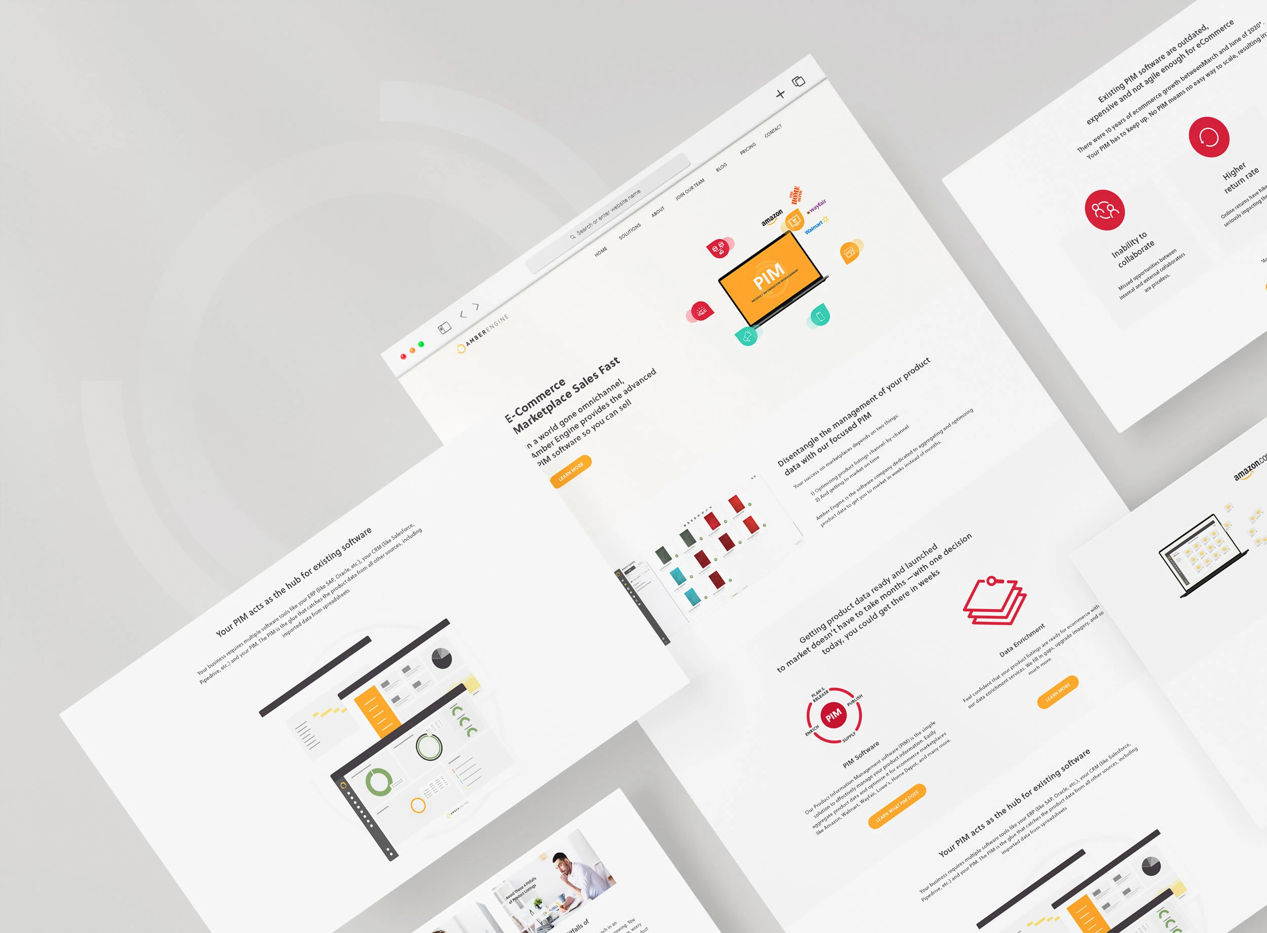
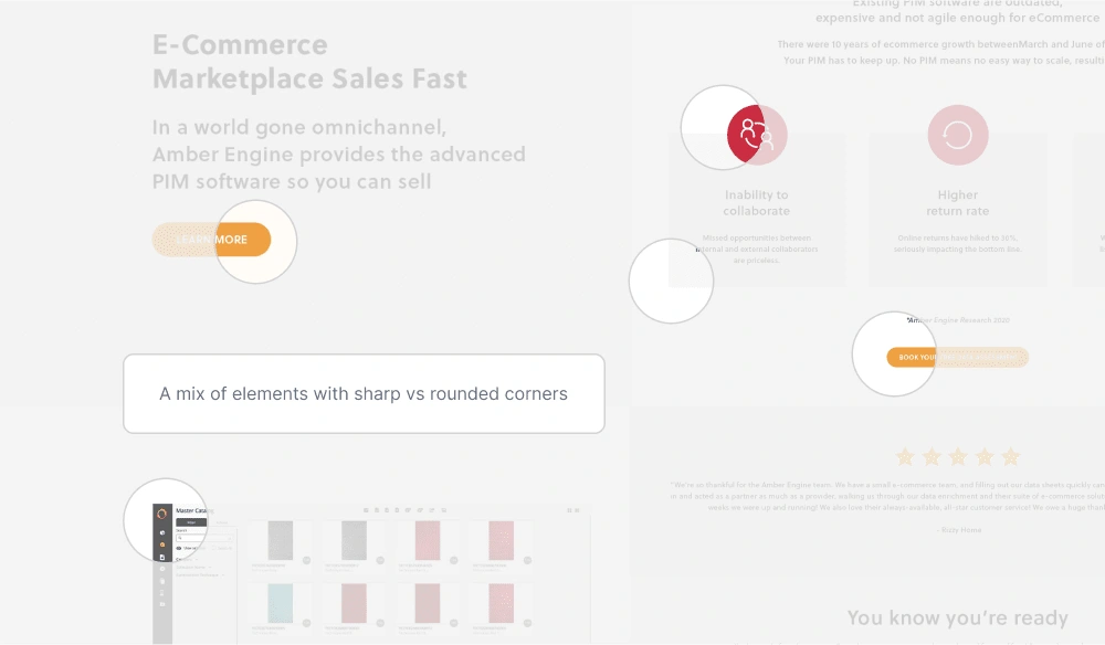
Original UI of the website
This is how the website looked before redesign.
This design had a couple of great aspects, namely:
it’s minimalistic and clean, definitely doesn’t feel overwhelming and gives a very “light” vibe due to all the negative space around elements and good spacing;
structure: the elements of the design feel structured, there definitely is a grid in place and no chaos.
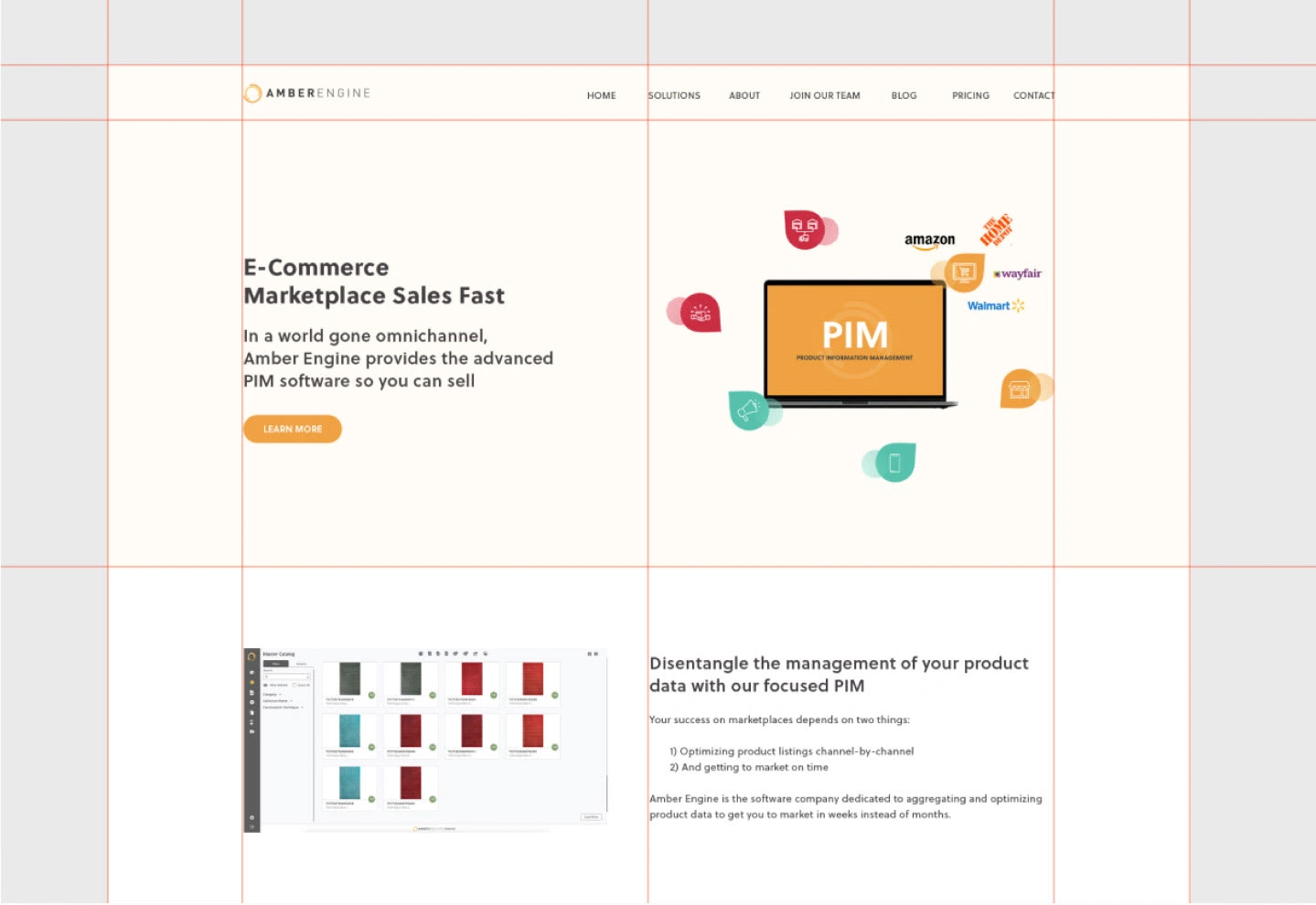
Original UI grids
However, certain aspects of the original design were not so great:
too much negative space, which together with plain light background colors makes the website look quite empty and too spaced-out (still better than chaotic or overwhelming though!);
it is not very illustrative of the product of Amber Engine, while the easy UI of the product is one of their main value points - there is just one product screen and the rest of the images are sketched illustrations that do not provide any explanation on what’s going on there;
no consistency in elements - some elements have rounded corners, some have sharp corners; buttons with the same CTA have different colors;
some lines of the text are too long, which makes them hard to read;
no human/emotional side in design, it feels very tech-y with just text and product illustrations;
the red color used for some elements gives a feeling of a warning sign or an error;
the blog section looks very different from the rest of the website, breaking the consistency of the page;
not accessible color combinations.
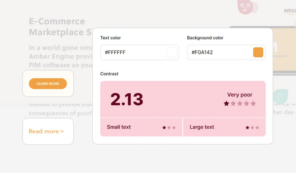
Original color contrast
UX/UI issues on the old website
UX/UI issues on the old website
These were just some of the issues of the original UI that could be easily fixed on their own, but the goal of the project was to give Amber Engine a brand new look - professional, elegant and clean. Therefore, we started working on the creative direction for the branding and the completely new website design.
Part 2 - UI redesign / branding update
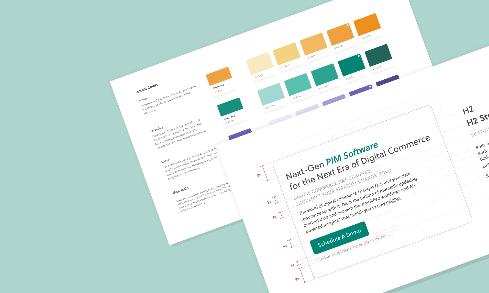
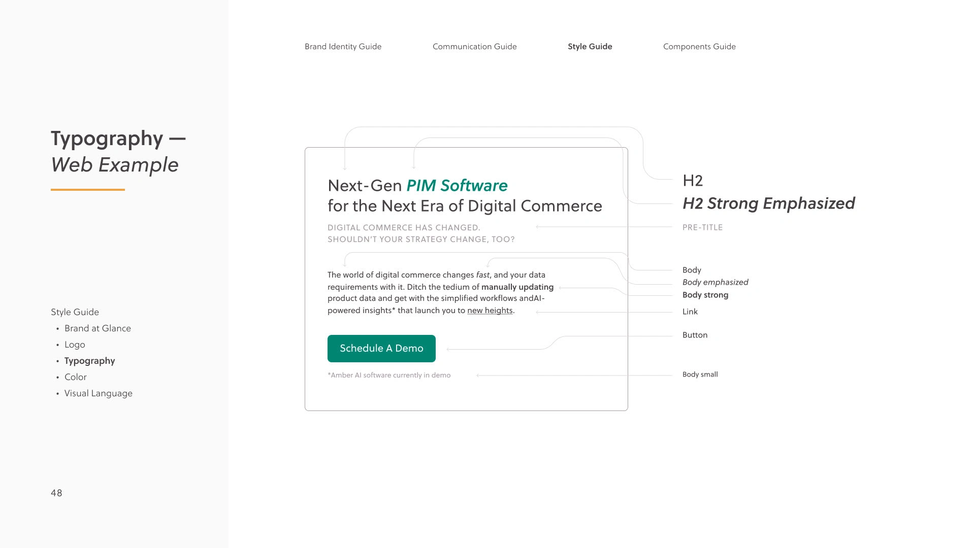
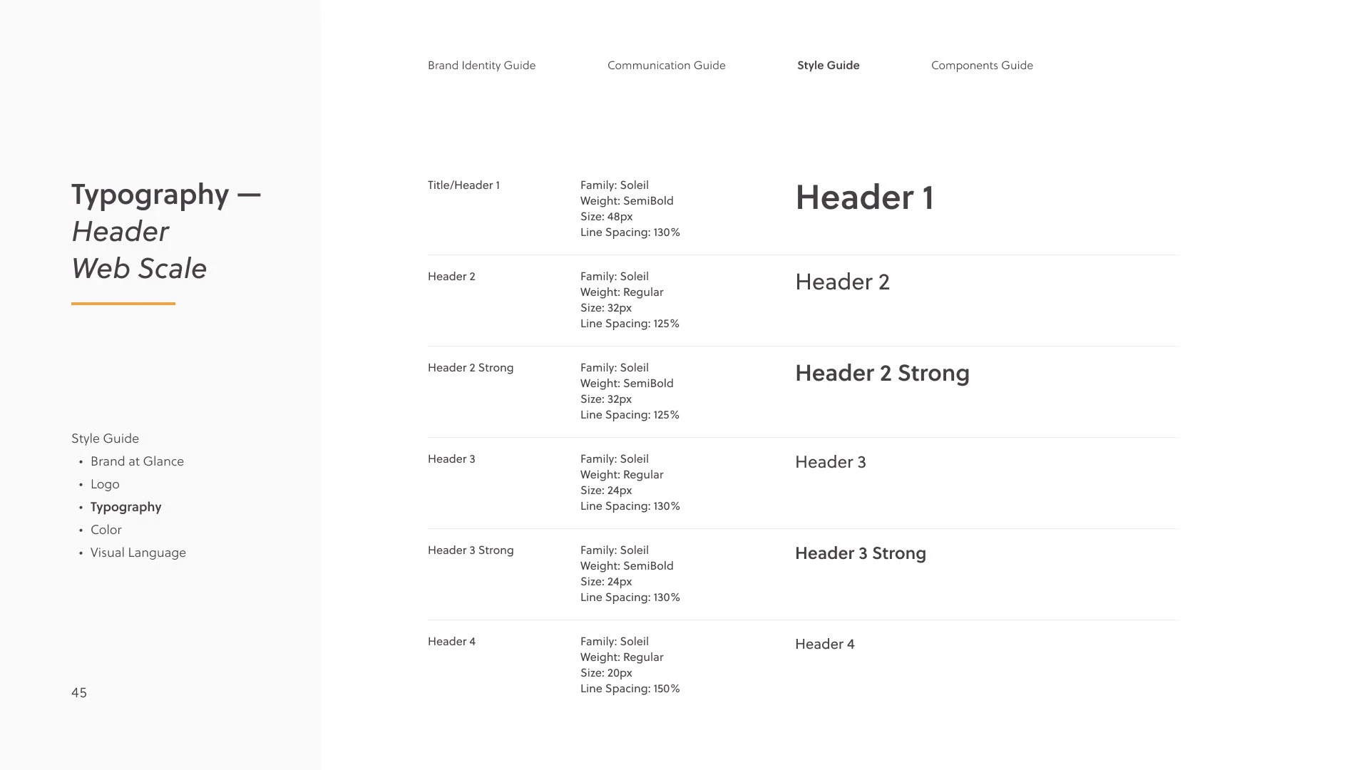
During my time at Amber Engine, we shifted back and forth with visual language — we tried to be more serious (e.g. more minimalistic look), tried to be more playful (e.g. bigger variety of colors, customized fun icons). As the company was developing and their identity was shaping up, I worked hard on leveling up their design maturity as well through taking initiative on such projects as analyzing and improving the UX of the website (and not only the visual look), advocating for inclusiveness (e.g. changing the color palette to make it more accessible, checking the correct tags and alt text on the website elements) and creating a design system to remain consistent afterwards.
The final new look of Amber Engine was designed based on the following:
First of all, Amber Engine is a B2B brand. Their primary audience is mostly C-level management, and their website is mostly an informational step to purchasing the product on the customer journey map. This calls for conciseness and minimalism – we should not distract the user with too bright, too eccentric design + the website needs to look professional and clean to be trustworthy. Moreover, as the branding is based on a light theme, it would be very easy to create an inconsistent and dirty look by using too many different colors and graphic elements.
The softness of the visual elements was inspired by (1) the fact that the logo of the brand has a circular glyph, which calls for adding more round elements into the designs, (2) the general UX/psychology principles stating that soft, rounded elements create more trust in users rather than sharp elements.
The bright accent elements reflected the values of the brand and the product, as in “easy and fun to use.”
I recommend Alexandra 100%. Alexandra is an amazing person, always willing to help without any hesitation, very professional and works as a team. Always with the concern to help. Alexandra managed me directly and taught me how to improve and come up with creative and innovative ideas for our projects. I would be happy to work with her again and i believe she would be a valuable asset to any project.
Part 3 - UX analysis & improvements
Here are some of the UX issues we've tackled:
Updating the website navigation to be more clear and concise
Analyzing the issue of hidden pricing and how it affects us
Ensuring that all the important details are easy to find (e.g. length of a trial)
Adding more case studies so that our potential clients know how exactly we can help them
Creating internally shareable materials that make it easier to present Amber Engine to team members, colleagues and other stakeholders
Removing the intrusive lead generation pop-up
Making the customer journey easy to understand by always providing context to our customers on what to expect next in the onboarding process
Demonstrating the product UI upfront to ensure that the customers find it aesthetically pleasing and easy to understand
Clarifying the difference between the products of Amber Engine and the role of each of them so that it's easier for the customers to decide which one they need
Improving the search engine of the website
Other materials
Here are some other materials I've designed for Amber Engine.
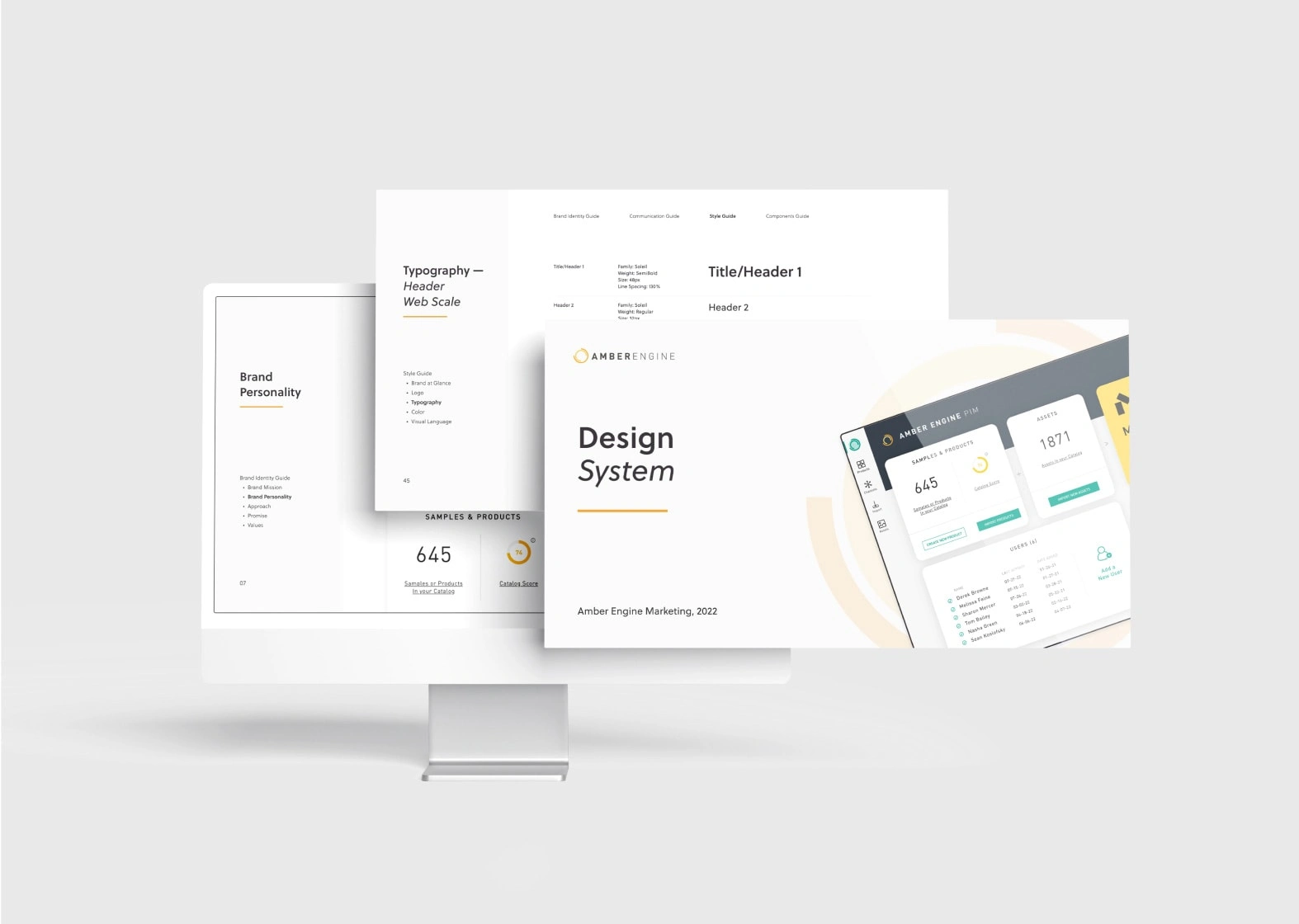
Design System for Amber Engine
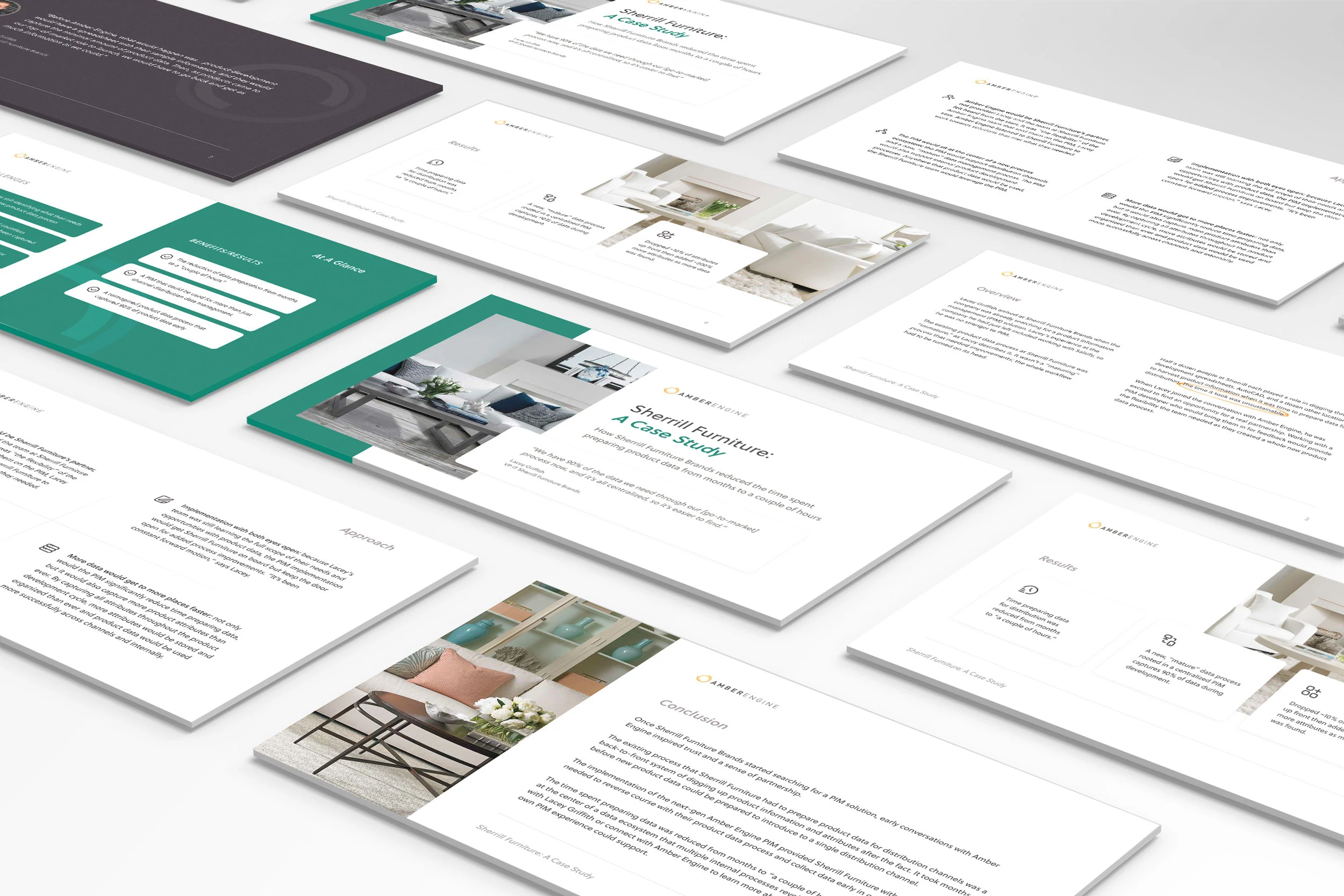
Case Study Presentation for Amber Engine
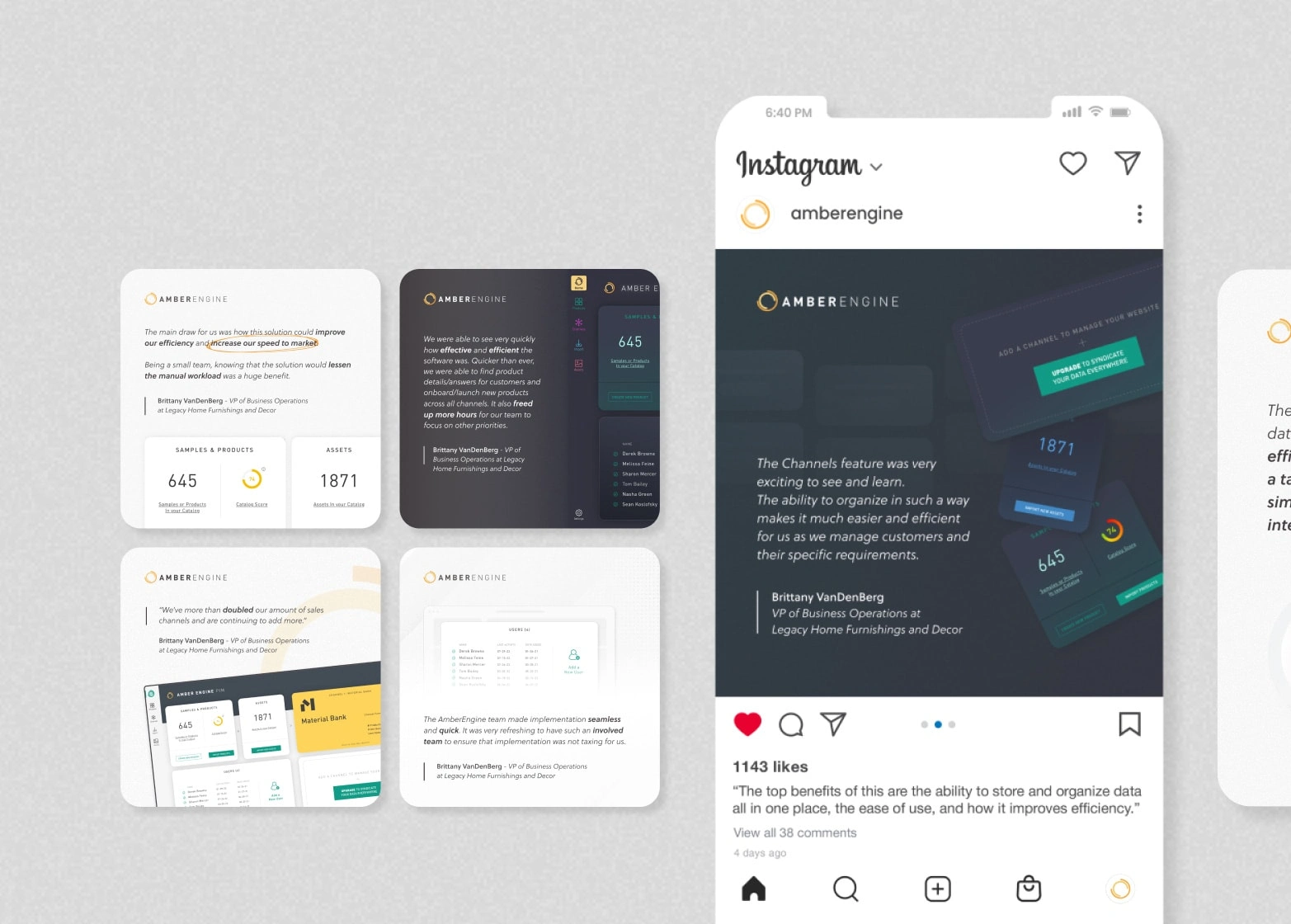
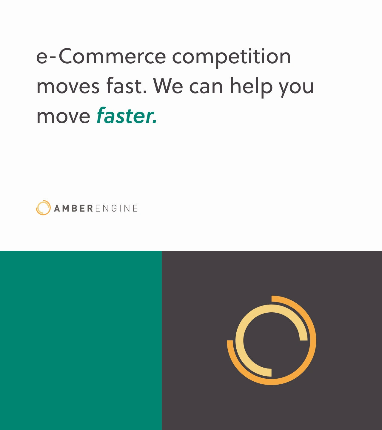
Social Media Graphics for Amber Engine
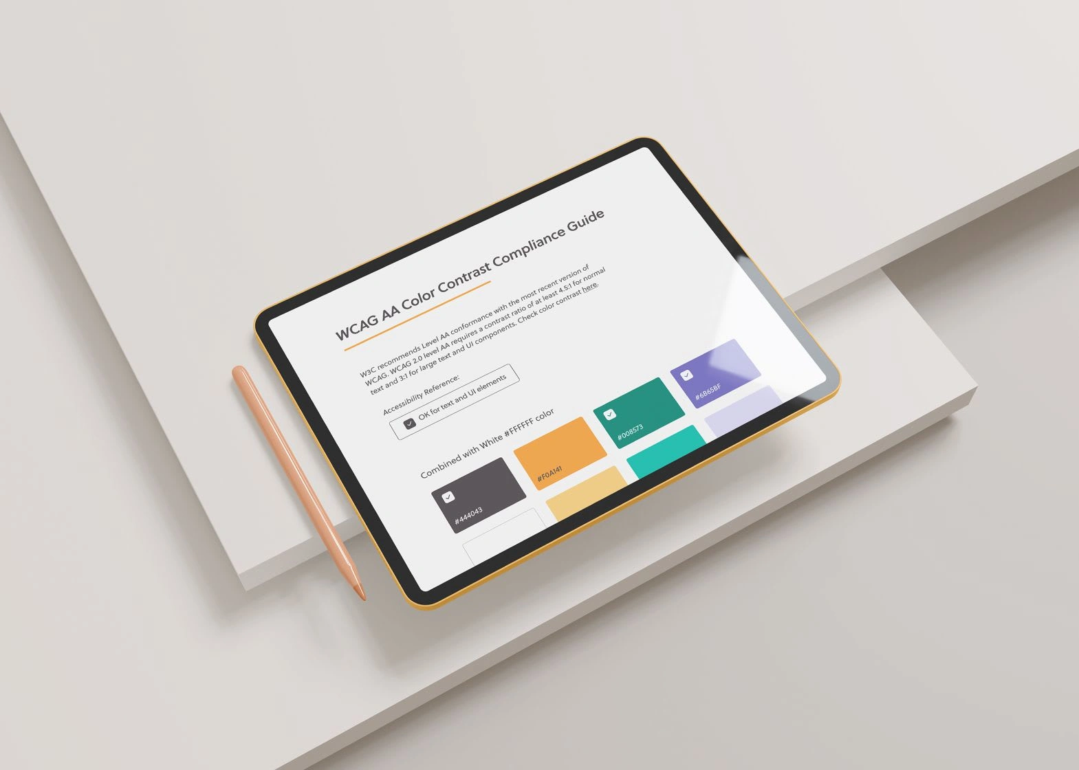
WCAG Color Contrast Compliance Guide for Amber Engine
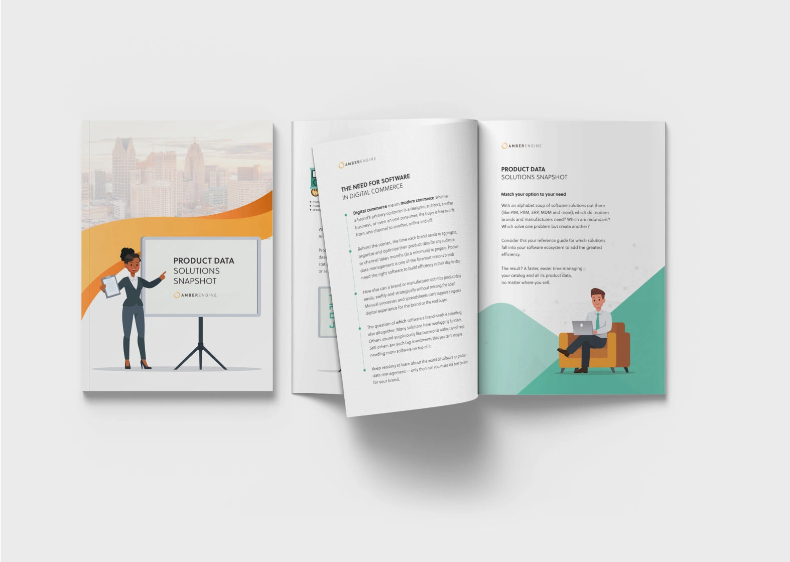
Brochure
Launch Campaign
A new product launch campaign designed with purple as the main color to make it stand out among the rest of the content (creative directed by me)
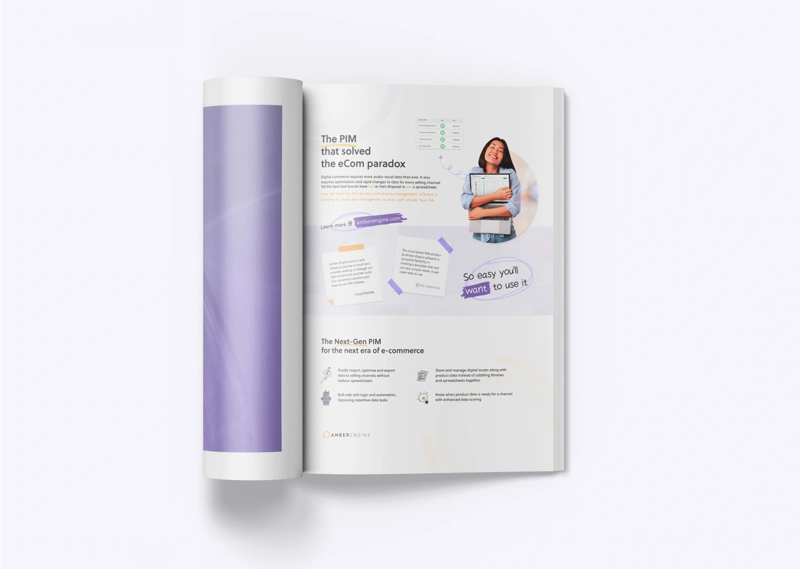
Magazine Ad
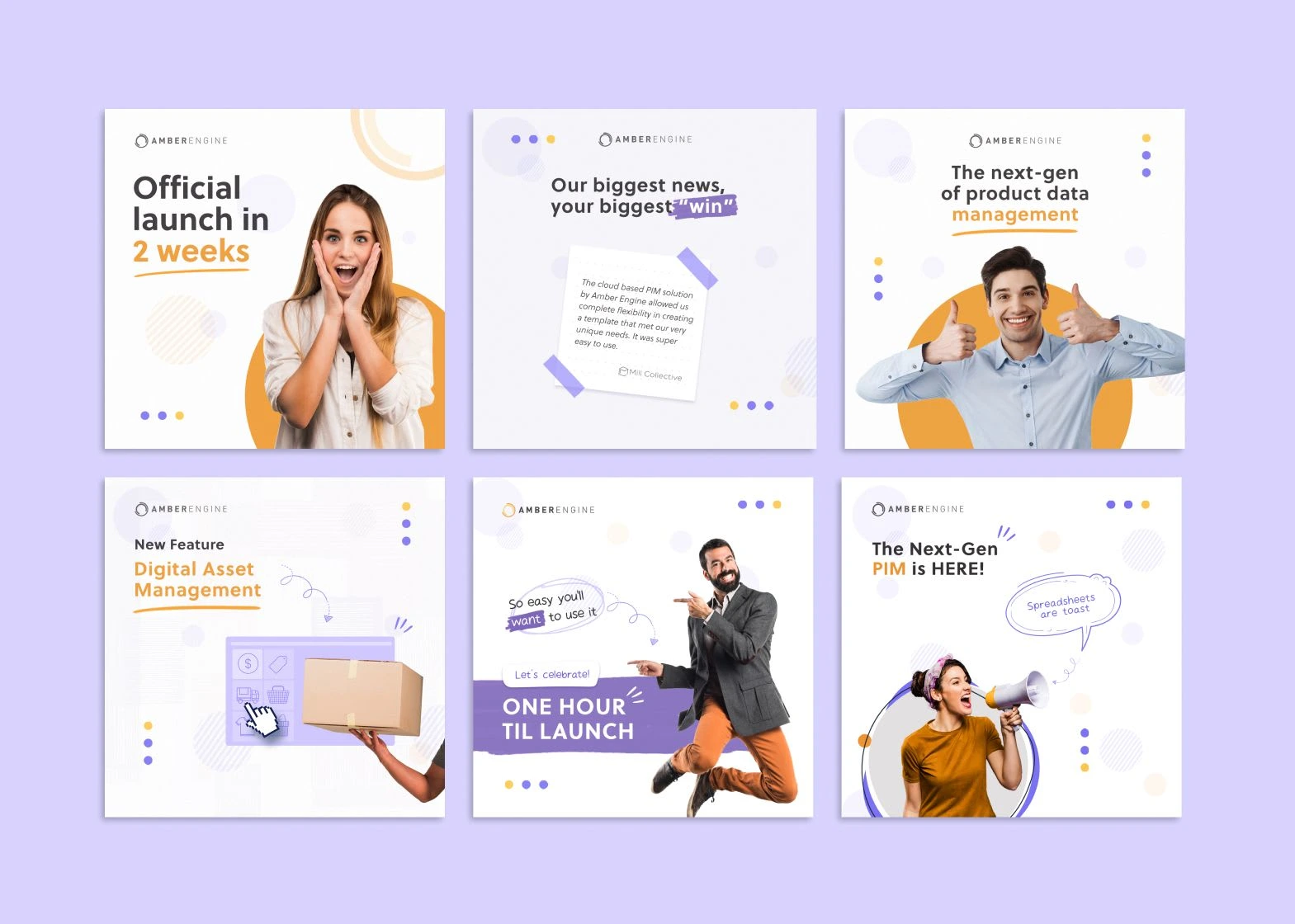
Social Media Graphics
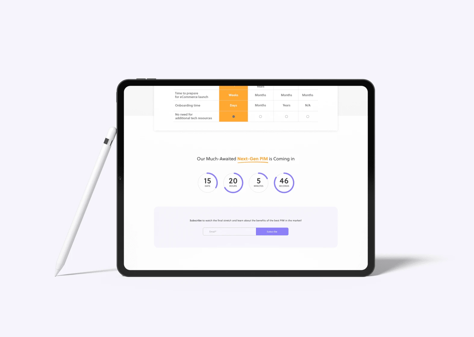
Launch Countdown
Retrospective
The website redesign project I worked on for Amber Engine was one of the longest and most complex projects I've ever undertaken. It wasn't a simple one-time redesign, but rather a continuous improvement of the website and the company's branding.
I'm pleased to say that my contributions helped the company succeed. Our work resulted in the company's first clients from ads, improved the success of corporate partnership initiatives, and the company was ultimately acquired within a year of our work together. It was gratifying to see the tangible impact of our efforts.
During the project, I had the opportunity to work with an agile cross-functional team, which taught me a great deal about teamwork. I learned how to communicate effectively with team members, manage timelines and priorities, and work collaboratively towards a shared goal.
This project also marked my first time hiring, guiding, and working with junior designers. It was an incredibly fulfilling experience to serve as a mentor and supporter, and I discovered a new passion for helping others grow in their design careers.
One of the most significant insights I gained from working with Amber Engine was the importance of collaboration between designers and developers. I realized that creating a better flow of communication between the two groups was critical to the success of the project. Additionally, I learned that providing feedback and working closely with the development team was essential to ensuring that designs were implemented correctly and effectively. Going forward, I know that I can improve in this area and continue to develop my skills as a designer and team player.
I am grateful for the support that I received from my Amber Engine colleagues, who gave me the freedom to practice lots of skills during our work together. I was able to work on various tasks, including research, ideating, branding, leading junior designers, creating low and high-fidelity wireframes, adjusting elements for the mobile version of the website, creating unique user flows for specific website sections, prototyping, and even directing certain marketing campaigns. The experience that I gained during this project has been invaluable, and I look forward to applying it to future projects.
Alex has been an absolute joy to work with. She's a self-starter and a strong communicator, and needs very little guidance to complete jobs successfully. She has a great eye for UX/UI and though her design skills are already very advanced she continues to learn, grow, and improve. I recommend her highly!
Whether you're a dynamic startup or an established company, a well-designed website is the cornerstone of your digital footprint. With our expertise in website redesign, we're here to help you stand out in the crowded digital landscape. Don't let your website be an afterthought — make it your strongest asset.
✨ Contact me today to explore how we can transform your website into a powerful tool that drives growth and engages your visitors. Let's create something remarkable together!
Like this project
Posted Feb 6, 2024
Revamped Amber Engine's UX/UI to attract partnerships and customers, leading to the startup's successful acquisition (2021 - 2023).
Likes
0
Views
14
Clients
Amber Engine