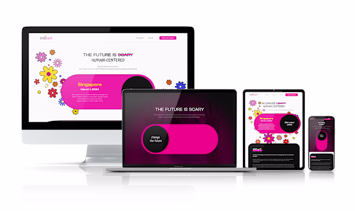
KOR Financial: Simplifying Complex Tasks Through UI Enhancement
Alexandra Mosnitska
I had the opportunity to design a multi-edit feature for a fintech B2B startup's software. The project was relatively short, but it required a lot of focus on usability and creating a user-friendly experience.
One of the main challenges was finding a way to simplify the complex software needs into an intuitive UX and UI. I'm proud to say that we were able to accomplish this and make the software more accessible to users.
As a result of the project, we were able to significantly reduce the number of clicks needed to get the job done. Even for the most voluminous tasks, users are now able to complete them in a maximum of 8 clicks, down from n*2 (where n = [1,∞]).
New feature for KOR Financial Software
Project Overview
My Role: Research, UX/UI Design, User Testing
Timeline: one week sprint, February 2022
Background
KOR Financial's software is designed to simplify the process of reporting to trade repositories. The software's interface is managed by an admin user, who can oversee different users across various entities and manage their permissions through the client portal. My task was to design a specific feature within the UI: the multi-editing function.
Problem
The client portal was missing a crucial feature: multi-editing. This made the software difficult to use for admin users who needed to edit hundreds of roles at once. Without this feature, it would take a significant amount of time and effort to complete these edits manually. This was a major issue because user-friendly reporting is the primary value proposition of KOR Financial, and not having this feature threatened the company's ability to retain clients.
My goal was to create a user-friendly and efficient solution for the multi-edit function that would make KOR Financial's software more valuable and easier to use for their clients.
Starting Point
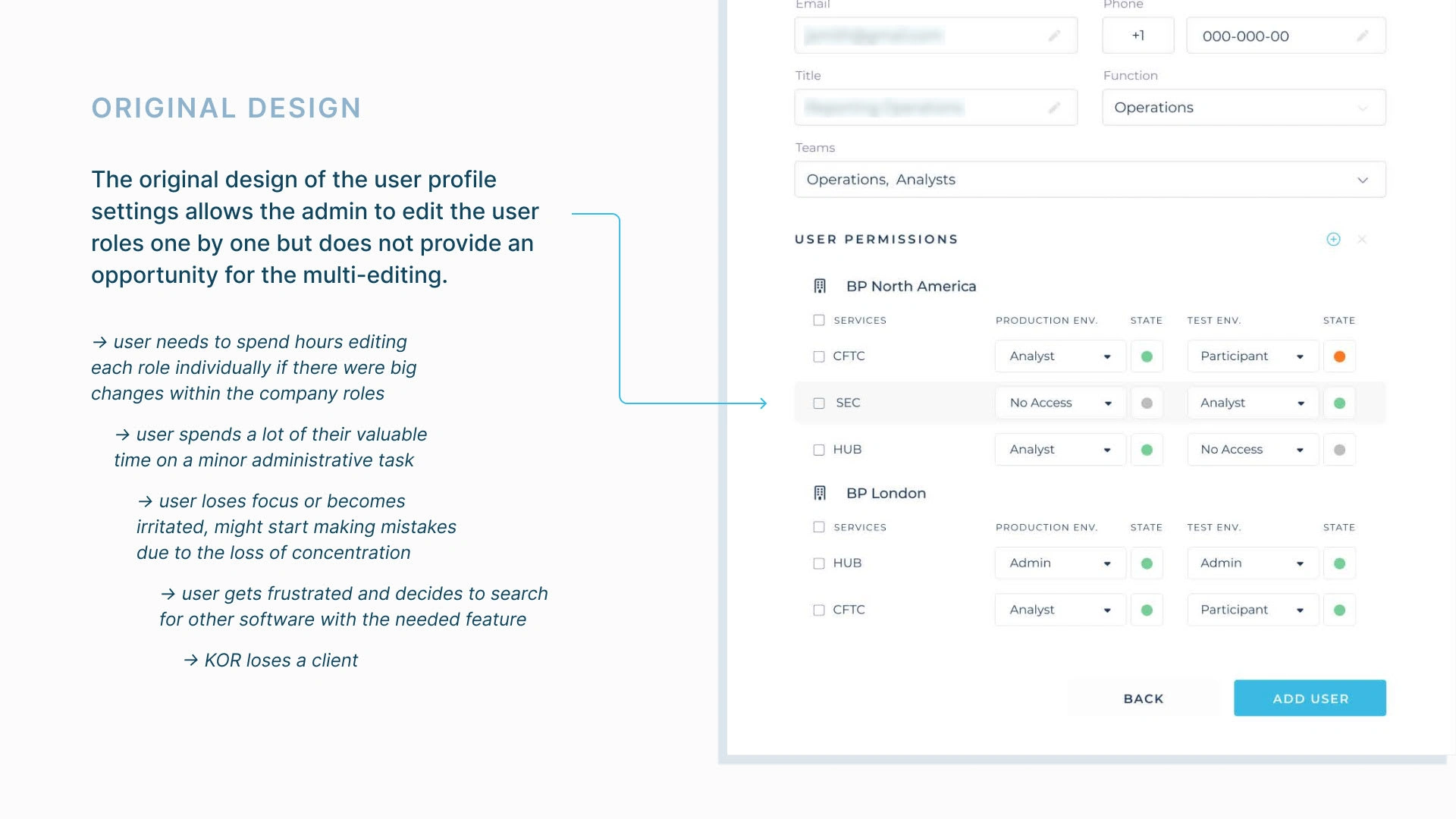
The original UI of the software without the bulk-editing feature
Part 1 - Understanding the User
To create an effective solution, I started by diving deep into understanding the user. This involved defining the user journey through the software and creating a user persona.
As the company was in its early stages and didn't have real users to conduct primary research on, I conducted secondary research on the demographics of potential users and their main pain points. This approach helped me better understand the users' feelings, values, and priorities.
Based on the research, I developed a user persona named John and mapped out his journey through the software. This process gave me valuable insights into how users would interact with the software and what features would be most important to them. By taking the time to understand the user, I was able to create a more effective and user-friendly solution for the multi-edit feature.

User research
User research
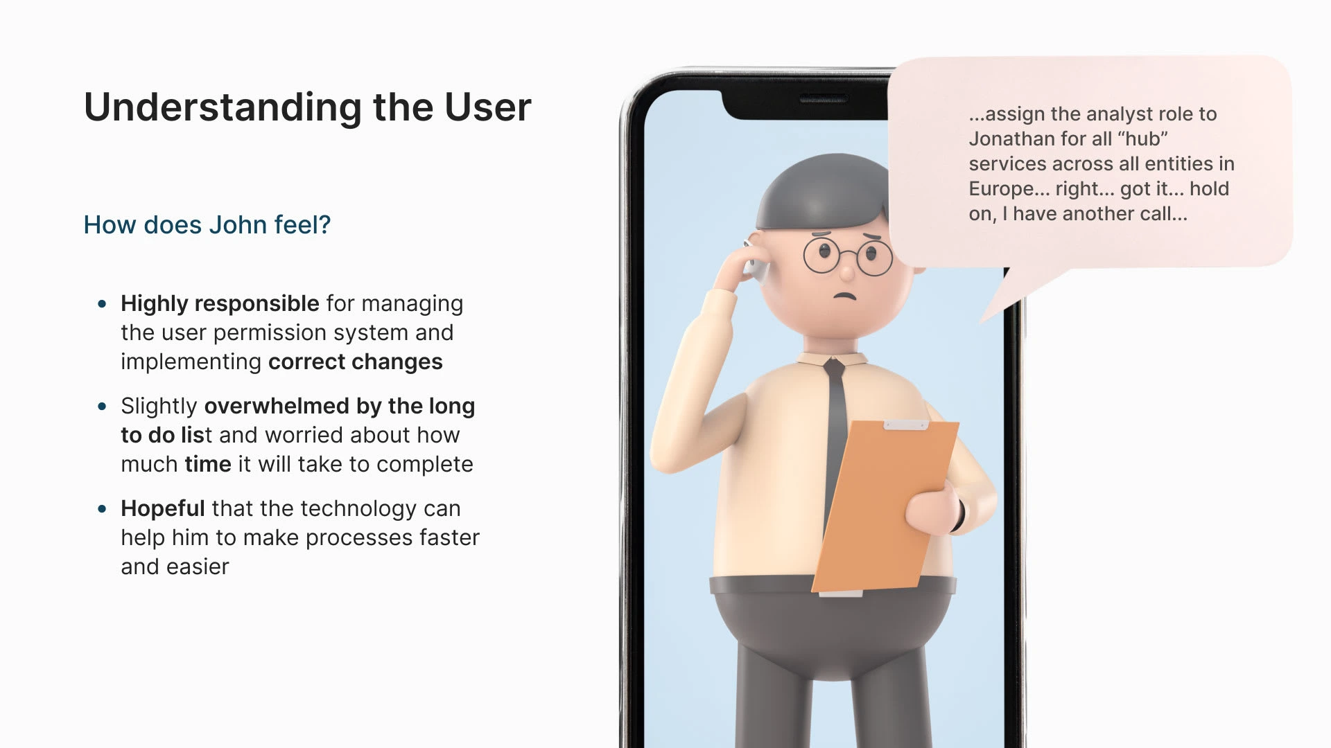
The research has shown that the most typical user of the software would be a 44-year-old white man with a Bachelor's Degree, and the most common struggle is to keep high productivity and efficiency while improving the processes and dealing with a mountain of reporting. According to the research, Operations Managers feel responsible for the overall success of the team. For them, the main challenge is to keep the quality and timelines both in order. Based on these findings, a user persona was created - meet John.
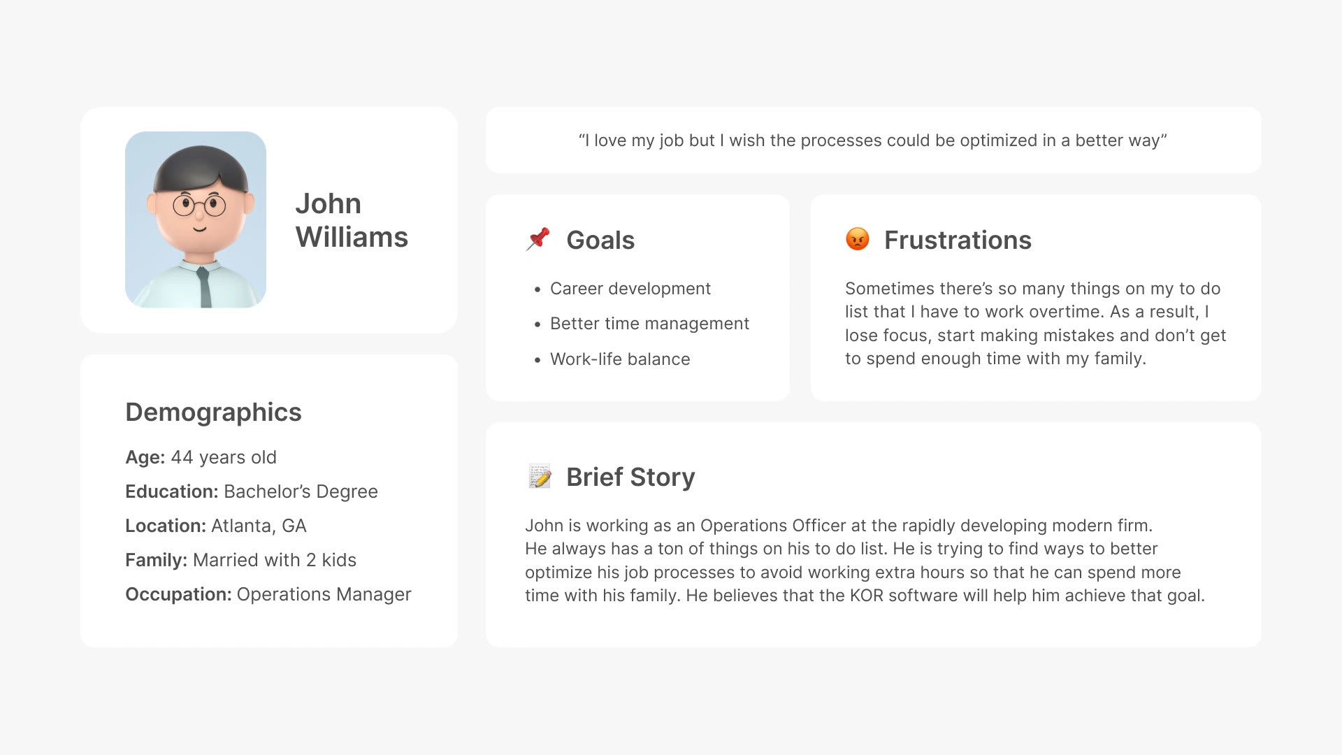
User persona
User persona
User persona
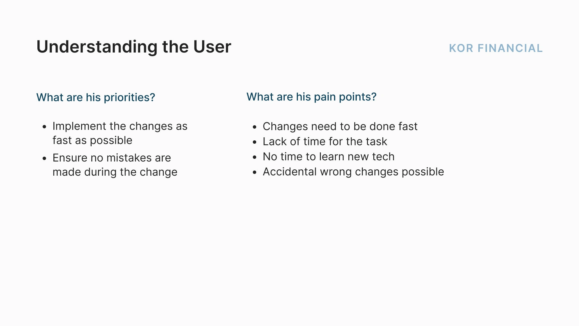
Based on the research and the user persona, I have defined John's main priorities:
Implement the changes as fast as possible
Ensure no mistakes are made during the change of user roles
And his main paint points:
Changes need to be done fast
Lack of time for the task
No time to learn new tech
Accidental wrong changes possible
The priorities and pain points are also based on the fact that reporting through KOR's software is not John's main daily responsibility. He is busy with a million other things, therefore, the main thing he needs is for the reporting to be done fast, easy, and save him from any extra headaches.
Next, I wrote down the user stories (predefined by KOR) and user journey. Already at the point of writing down John's journey, it became clear that he will need 2 main features in the software to be able to do the tasks: the feature of filtering out user roles by entities and services (so that he can focus on the roles that he needs to change), and the feature of multi-selection (so that he doesn't need to click on each role separately to change them, given that there might be hundreds of them). I then proceeded with designing the experience in detail.
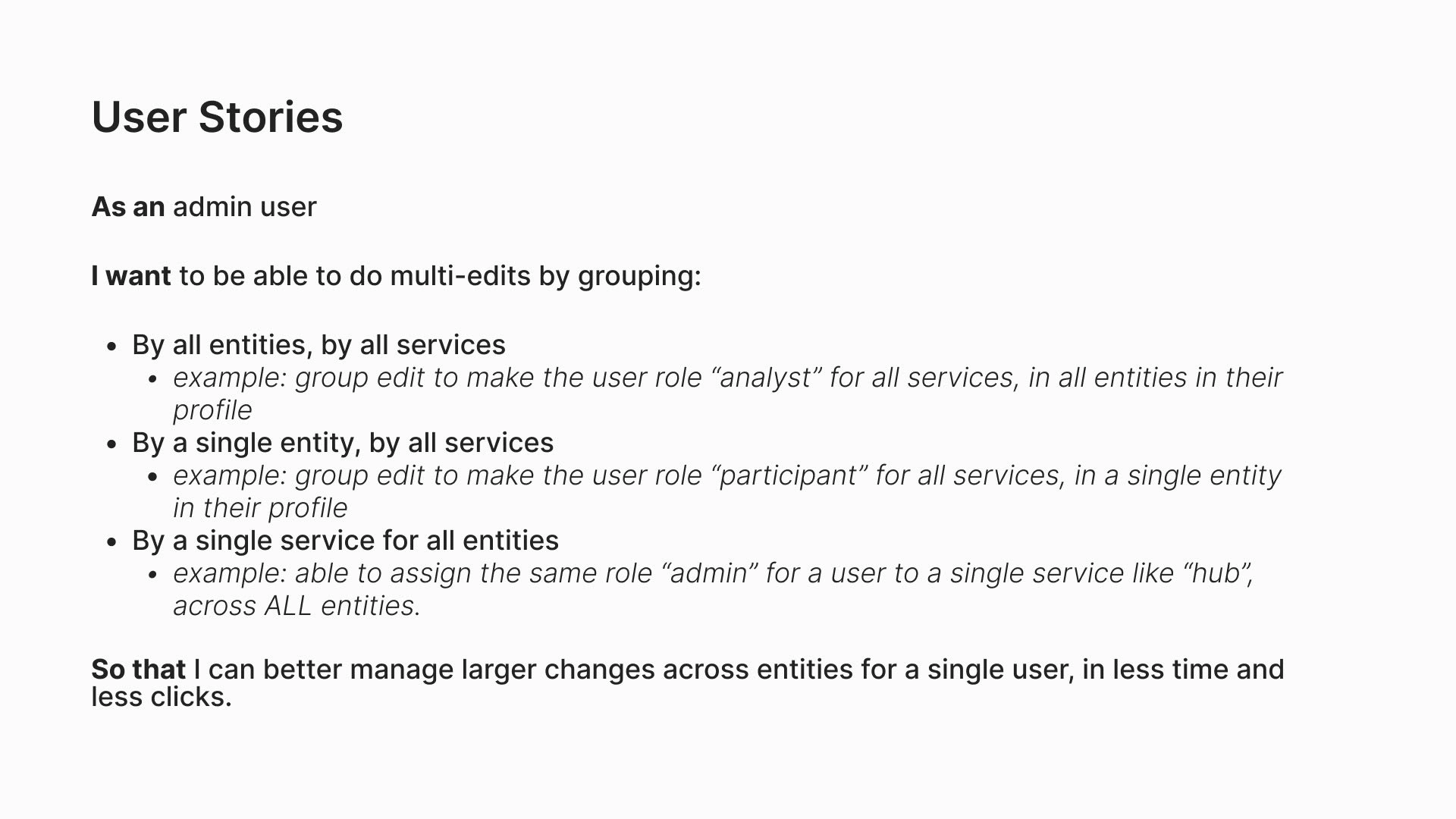
User stories
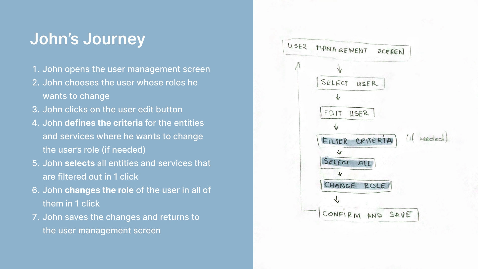
User journey
Part 2 - Designing the Experience
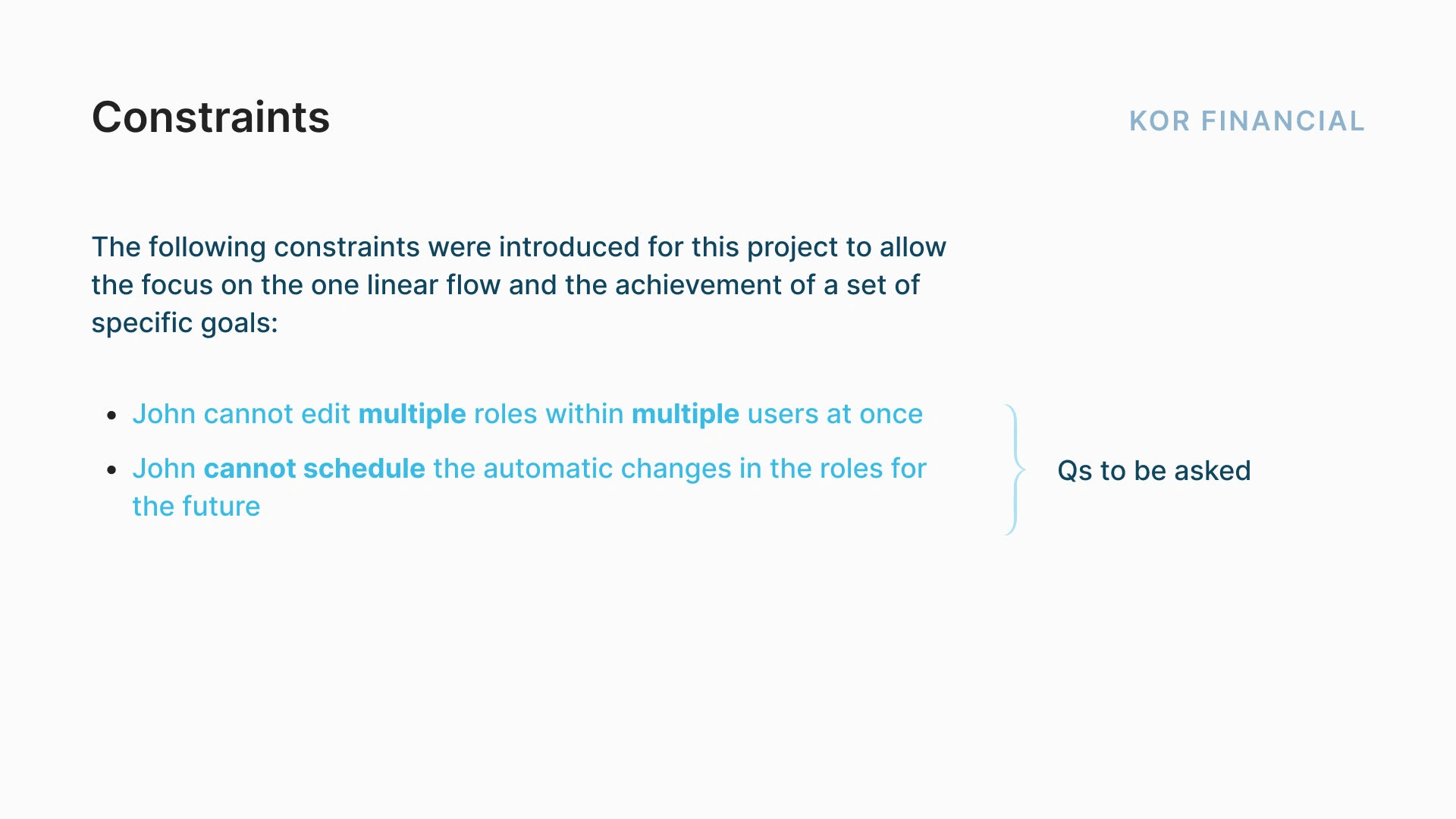
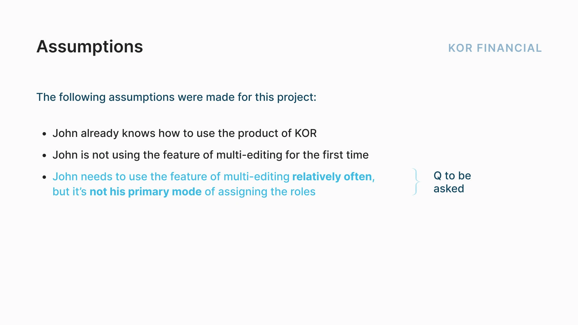
During this stage, I have created the user experience itself, while taking into account certain assumptions, requirements for the feature, constraints, and trade-offs.
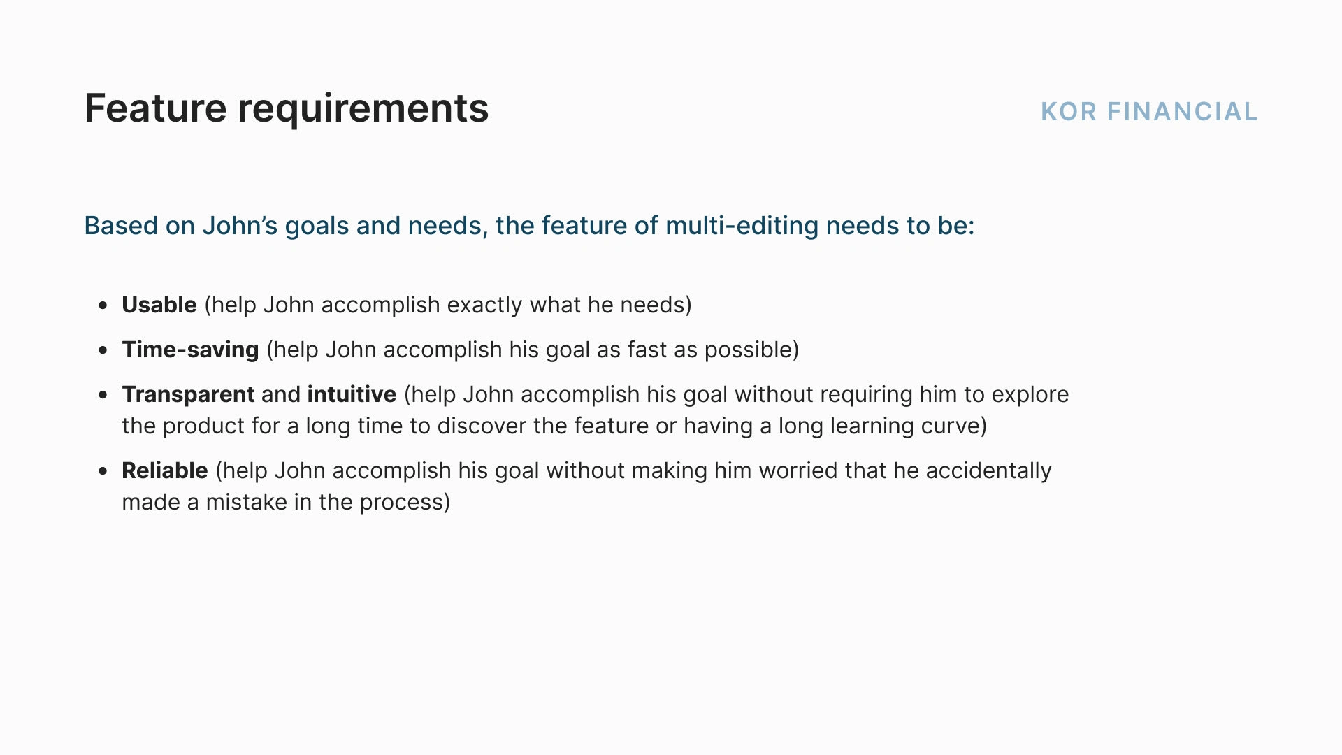
I defined the main requirements for the new feature, as well as my assumptions and some constraints that I've set for myself to be able to focus on the most important moments. I have also defined some questions that I'd have to further ask the users to make sure that I'm designing a solution that works best for them (highlighted in blue).
I now had everything needed to start translating UX into UI.
Part 3 - Wireframing
I started by sketching some low-fidelity wireframes in my notebook. I like to use a paper notebook at the ideation stage as it lets my creativity run free without any digital constraints and lets me go through dozens of options before I find the best one! The same story happened here, I sketched out a bunch of different versions of the feature, and then eliminated the unsuccessful ones, keeping in mind John's journey, priorities, and pain points. For example, one of the options contained the feature of global editing the roles of the user, but I felt like it required a change in the overall logic of the interface (introducing a completely new feature instead of creating a way to complete the needed tasks with an already existing interface with some additions), making the learning curve steeper for the user. I also tried out different placements for the "filtering" and the "selecting" buttons, and different ways of their design (e.g. an icon or text).
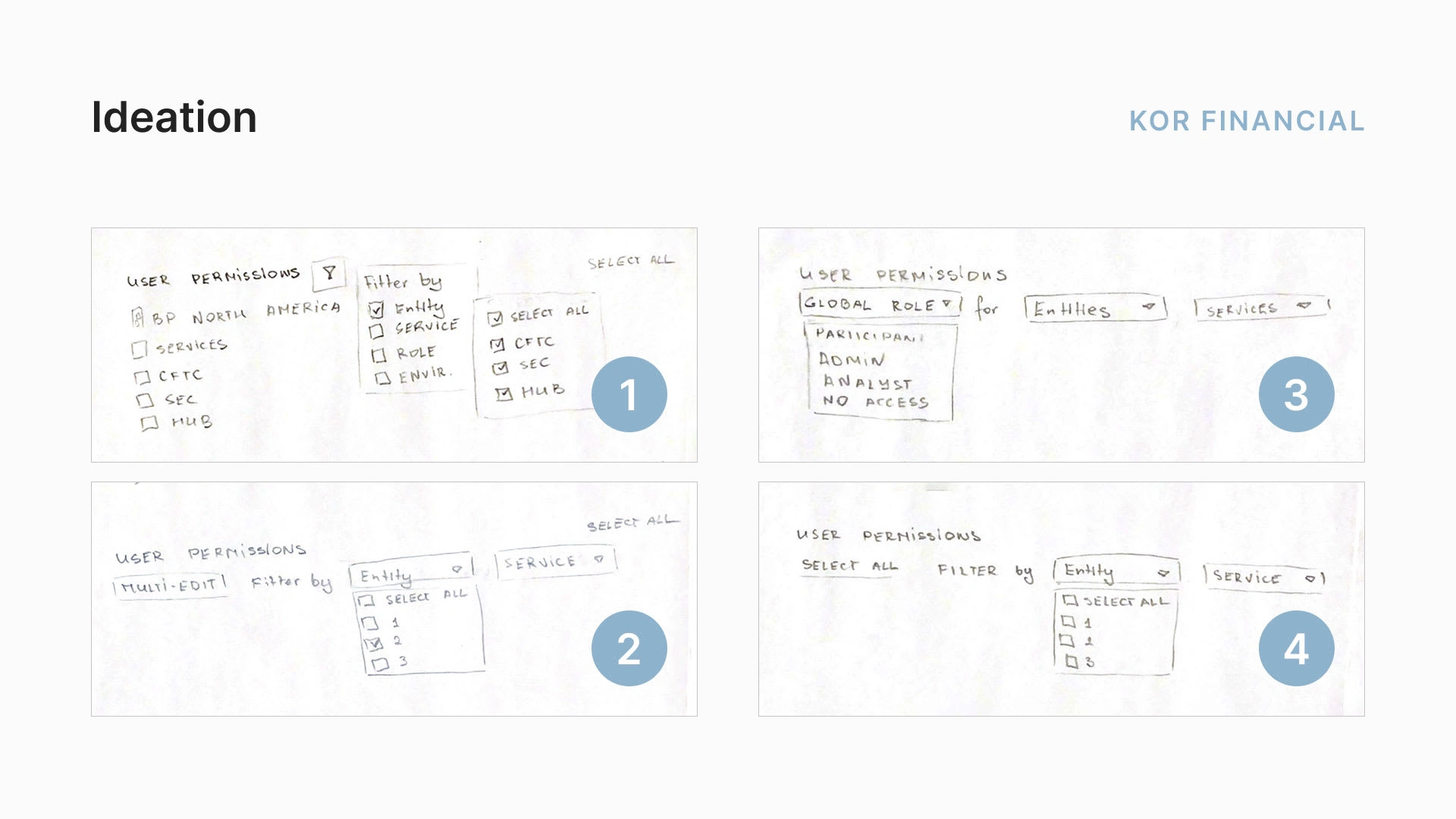
Ideating on paper
Part 4 - User Testing
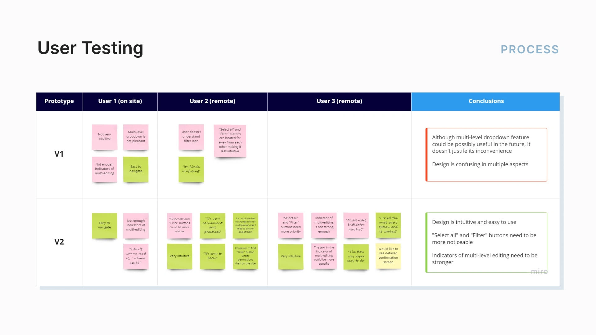
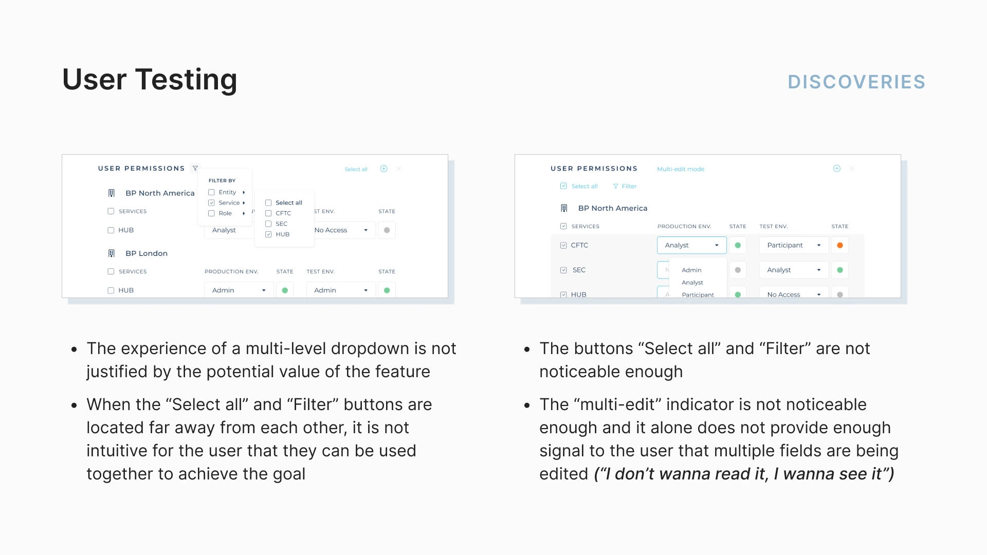
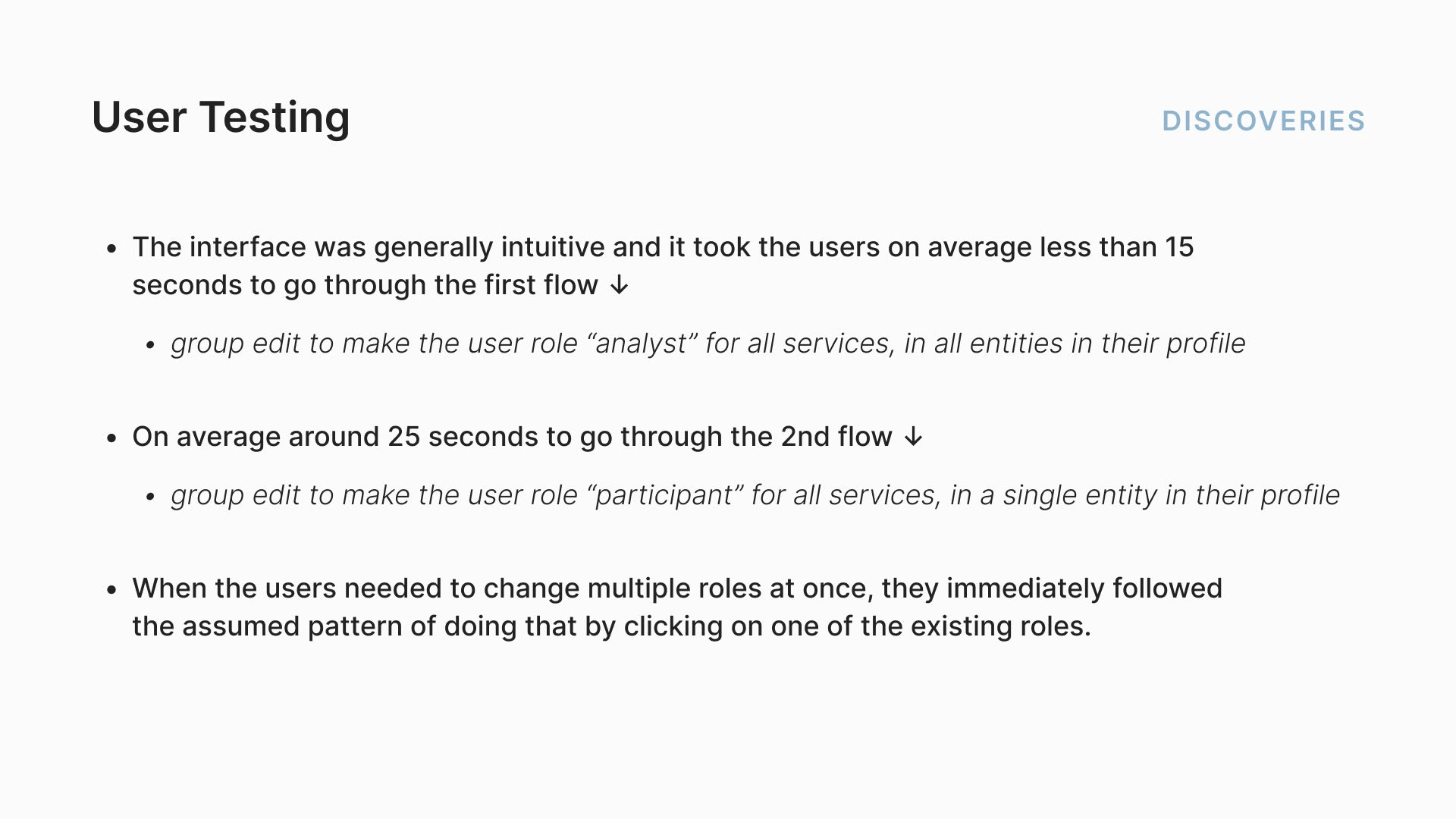
In the end, I created high-fidelity wireframes and prototypes for the 2 best versions of the design to conduct user testing. After testing the interfaces with 3 users (two remotely and one in-person) and noting their comments, it quickly became clear that the 2nd version of the design works much better. The 1st version was so clearly not a winner (what else did I expect with a multi-level dropdown menu? ugh...) that I haven't even tested it with the 3rd user (as I had very limited time to complete the sprint).
There were still some minor things to be improved, for example, the users commented that there were not enough indicators of multi-editing (thus making it easy to make a mistake with editing more roles than needed) and that the new buttons for filtering and multi-selection were not visible enough.
Nonetheless, even with those minor imperfections, the users managed to complete the tasks fast and without any difficulties and said that the interface was very intuitive. Success! 🙌
Final Flows
After making minor edits to the interface based on the comments of the users, the final design was completed. In the image below, you can see the key solution elements of the design and how they reflect the feature requirements that were previously defined.
The main solution for the project was the features of multi-selection and filtering. These two features were responsible for the main requirement of the design - they allowed the user to accomplish the needed task in just a few clicks instead of manually editing each role, therefore making the UI usable and time-saving. The features of multi-selection and filtering are present in most of the interfaces / apps / software nowadays, the users clearly understand how they work and there is no learning curve to using them. Therefore, the UI is also intuitive.
I have designed three indicators of multi-editing: an informational highlight with "Multi-edit mode" text, the change in the background color, and the stroke highlight on the edited fields. These were all designed to give the user a clear understanding of what they are currently doing (multi-editing the roles of the user at many Services / Entities) so that the user makes no mistakes in changing more roles than needed. The UI is therefore reliable.
The last step in the flow is saving the changes in the roles. There is no auto-save as it can lead to unnoticed mistakes which can have huge consequences for the user. The user needs to save the changes after making them, and this adds up to the reliability of the UI.
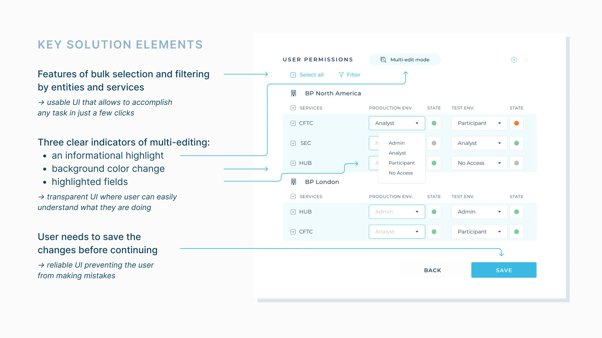
Key solution elements of the UX/UI of the new feature
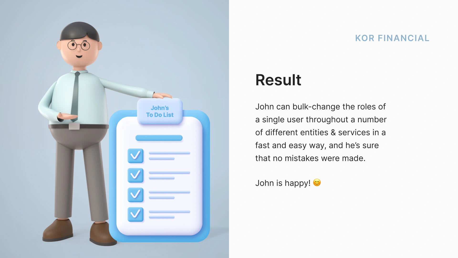
There are still questions to be asked and further improvements to be made, but I could definitely say that John is pretty happy with the current state of events already! KOR's software is now saving even more time in his schedule and makes the reporting easier. John will always be a loyal customer of this software and recommend it to all the fellow Operations Managers :)
Retrospective
Working on this project was such a great experience. The ability to multi-edit user permissions is a key feature of KOR Financial software, and making it more user-friendly was a great challenge. It was satisfying to know that our work could make a real difference for users.
The tight deadline meant that I had to prototype quickly to test my ideas with users before finalizing the feature. I learned a lot about prototyping during this project and got better at doing it quickly and efficiently.
One of the most interesting aspects of this project was figuring out how to make the multi-edit feature not just functional, but also secure and reliable. It required a lot of thought and planning to ensure that users would feel comfortable and confident using it.
One of the highlights of this project was conducting usability testing. It was an excellent opportunity to get hands-on experience and see firsthand how users interacted with the feature. It was also a great learning experience, and I hope to do more usability testing in the future and continue to improve my skills in this area.
Are you ready to take your software to the next level with a UX/UI design that not only looks stunning but feels intuitively right? For startups and seasoned enterprises alike, the user experience can make or break your product's success. It's time to ensure your software not only functions smoothly but also provides a seamless and engaging user experience.
✨ I'm dedicated to crafting interfaces that captivate and retain your users while boosting your product's performance. Contact me today and let's create something remarkable together!
Like this project
Posted Feb 6, 2024
Streamlined KOR Financial's software with a multi-edit feature, reducing task completion clicks and enhancing user efficiency (2022).
Likes
0
Views
15