CaptureRx: Landing Page Transformation
Alexandra Mosnitska
The redesign of the CaptureRx landing page showcases my expertise in enhancing the user experience while preserving the existing brand identity and messaging.
The final result is a landing page that seamlessly integrates the company's brand with a modern and engaging design, ultimately improving the user experience and driving conversions.
Project Overview
My Role: UX/UI Design
Timeline: 2 weeks, February 2023
Background: CaptureRx is a B2B healthcare company that specializes in 340B services. The company's mission is to help eligible healthcare organizations access discounted prescription drugs through the 340B program. The landing page of the company's website is targeted towards individuals and organizations who are interested in taking advantage of 340B services.
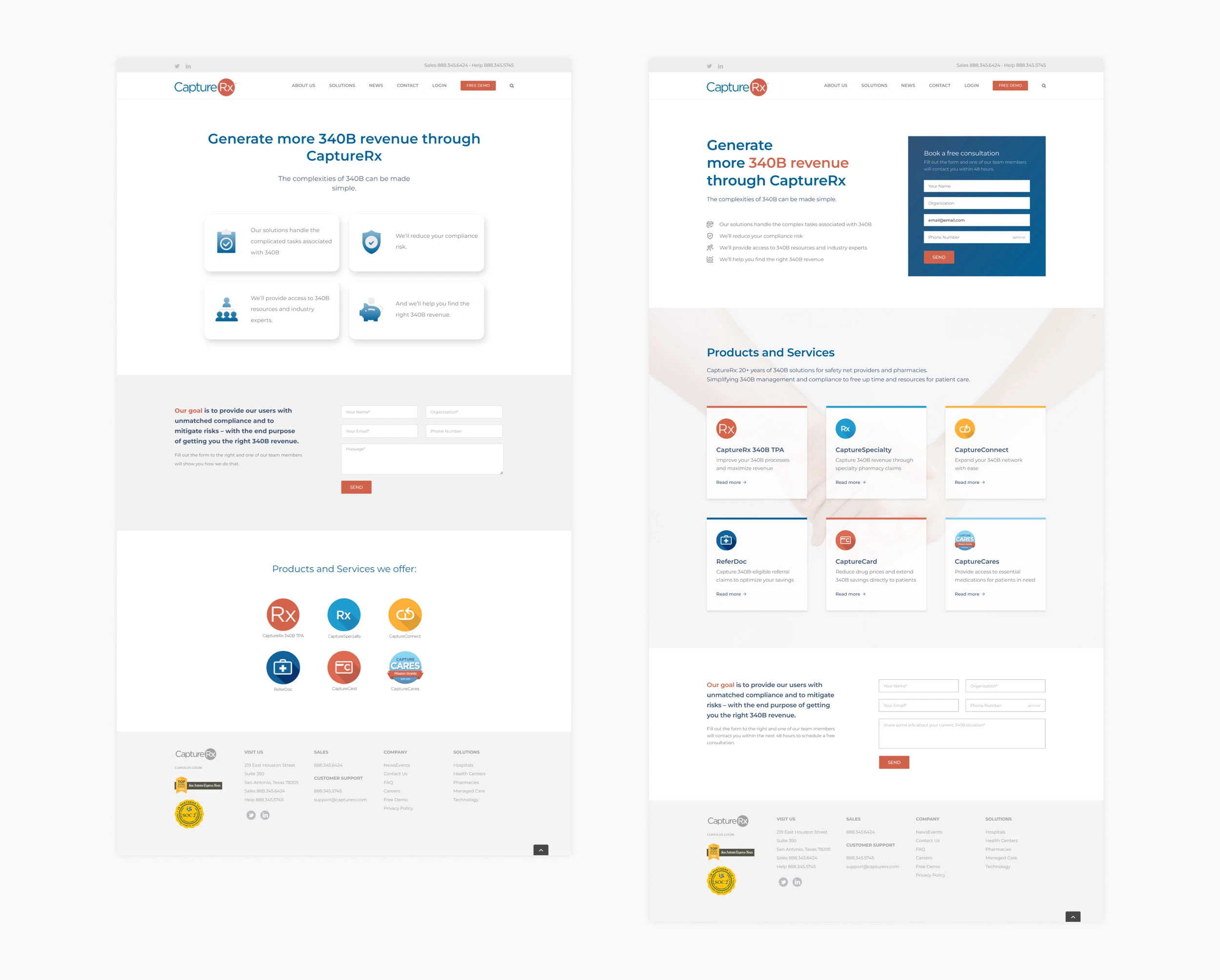
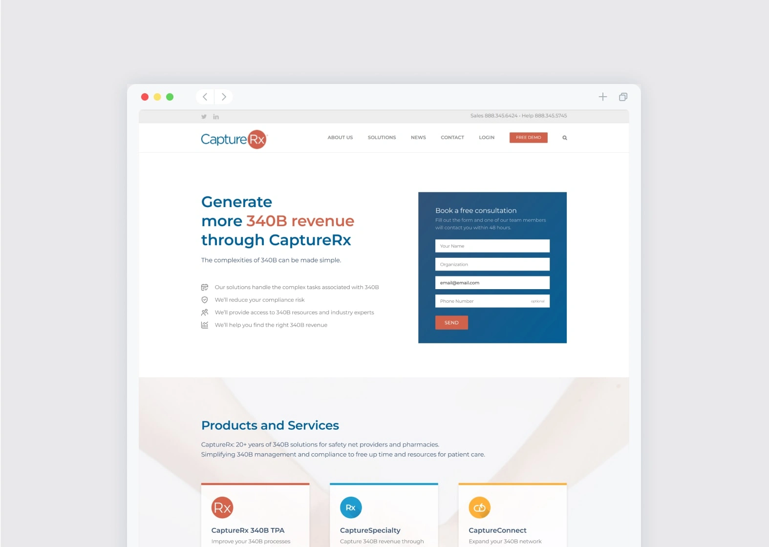
Original design → new design
New design, desktop and mobile versions
Part 1 - Analysis
At first, I analyzed the existing page to identify areas for improvement. I had to be careful not to change too much since I had to keep the original branding and copy. But I did notice a few things that could use some work.
Section 1: Hero
Insufficient Information: The first screen did not provide enough information for users, with important "value points" of the company not visible above the fold.
Lack of Call to Action: There was no clear way for users to take action if they were interested in contacting the company, such as a clear call to action (CTA).
Unreadable Text: The section was not visually appealing, with hanging words and centrally aligned text that was difficult to scan. The large spacing between the lines also made it hard to read the information.
Inconsistent Design: The "value point" cards had too much 3D effect, which was not repeated on the rest of the website, making the page look disconnected from the rest of the site.
Distracting Icons: The large, ornate icons stole attention away from the text, which was more important in conveying the company's value proposition.
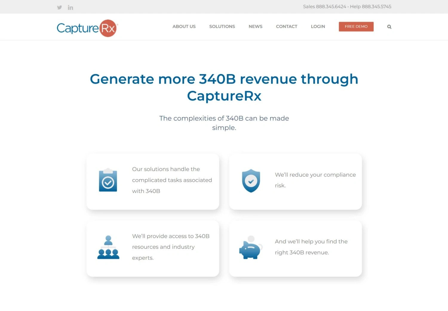
Section 1 of the page with the original design
Section 2: The form
Clarity in Wording: The form presented unclear wording, with no indication of a timeline for users and a vague statement regarding follow-up communication from the company.
Ambiguous Message Field: The inclusion of a "message" field was a positive aspect, however, providing suggestions or guidelines for users on the type of information to include would enhance its effectiveness.
Poor Visual Contrast: The form lacked visual contrast, making it difficult for users to easily identify and interact with it.
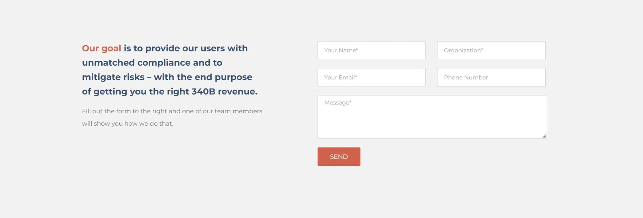
Section 2 of the page with the original design
Section 3: Products and Services
Too Much vs Too Little Info: The original presentation of the products and services was limited to a list with no accompanying descriptions. At the same time, the pages for individual products were filled with text and information, making it difficult for users to quickly scan and find what they were interested in. At the same time, the current page didn't provide any info at all. How could we help the users easily scan through a range of products to find what they're interested in?
No Link Indicators: Some of the items in the list were links, but there was no indication to users that these were clickable, leading to confusion.
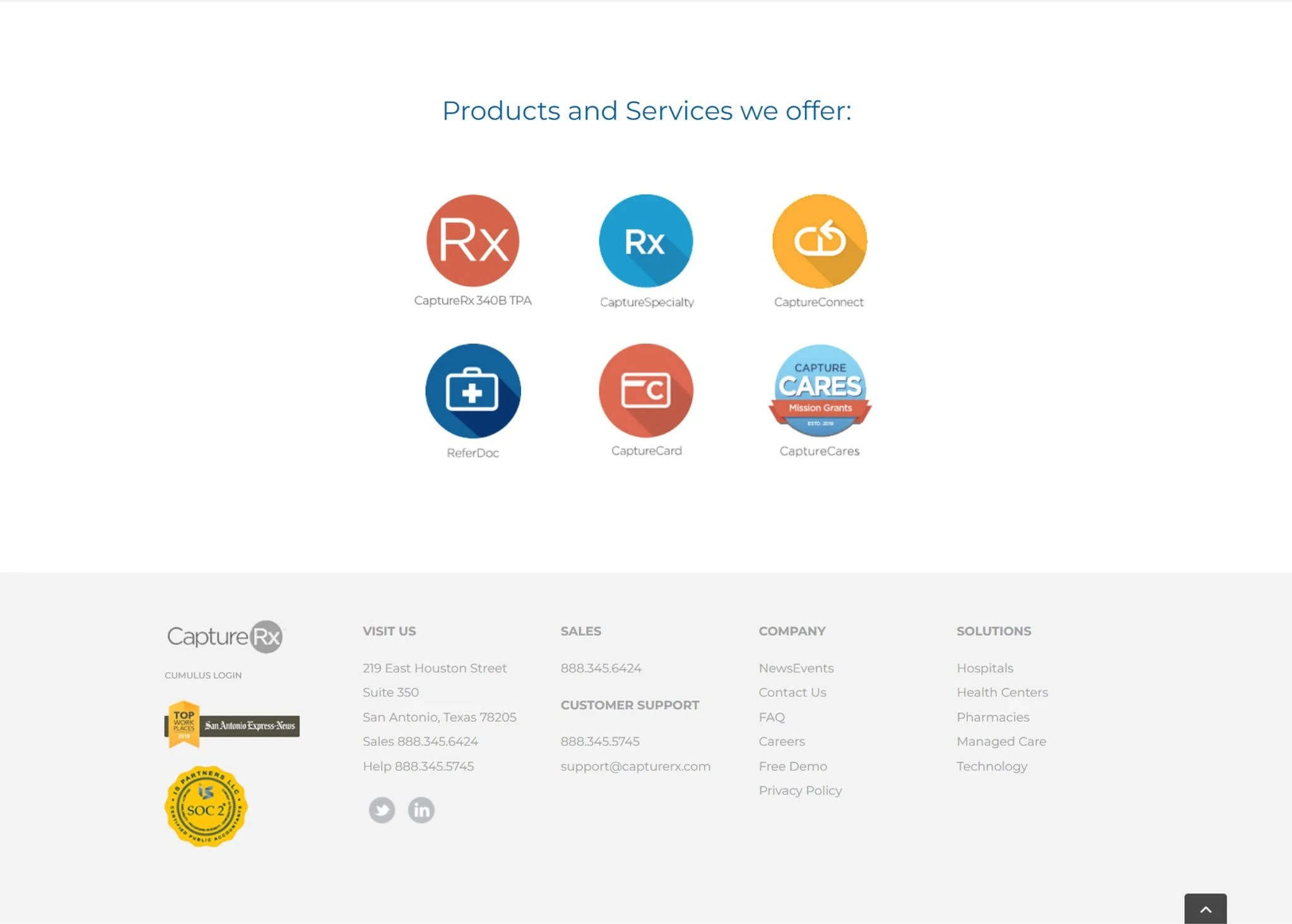
Section 3 of the page with the original design
Other general areas for improvement:
Lack of Emotional Connection: The page failed to create any emotional connection with the users. It was simply text-based and failed to connect with the brand archetype that calls for trust and reassurance.
Insufficient Company Information: The page lacked important information about the company, such as its unique selling proposition, value proposition, experience, or social proof. Users visiting the page may not be aware of the company's experience as a service provider.
Excessive Negative Space: The page appeared empty due to the excessive negative space, leaving the page feeling uninviting and dull.
Part 2 - Improving UX and UI
I redesigned the page to improve the user experience, addressing the various issues that I previously identified. These changes aimed to provide more clarity, engagement, and conversion opportunities for users visiting the landing page.
Here are some of the key improvements:
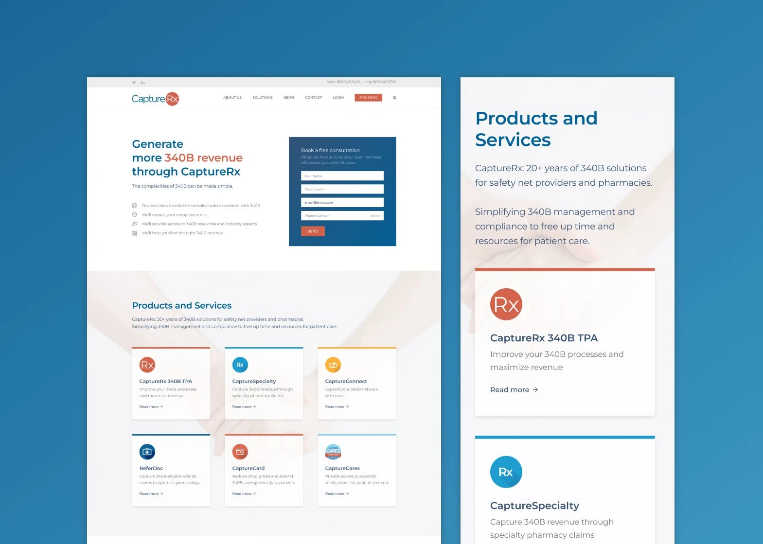
Section 1: Hero
Changed the layout to ensure that all the important "value points" were visible above the fold, providing users with all the necessary information.
Added a clear call to action in the form of a contact form on the right side, making it easy for users to quickly get in touch with the company if they're interested.
Replaced the distracting icons with minimalistic ones that served as guidance without taking away attention from the more important text.
Form:
Improved the clarity of the form's wording to provide a clear understanding of the timeline and what the user will receive after filling it out.
Made the form more prominent by adding an eye-catching blue color to increase visibility and encourage engagement.
Section 2: Products and Services
Created a visually appealing, easy-to-scan layout for the list of products and services, including descriptions.
Highlighted the links with a clear indicator to show users where they can find more information.
Incorporated emotional appeal through the use of photography to reinforce the brand archetype of trust and reassurance.
Added a little description about the company to provide context and background information on the company's experience.
Section 3: Form
Decided to keep the form section in the end of the page (even though we already have a form in the 1st section) in case the user wants to book consultation after reading through the page
Improved the form's description's wording.
Made suggestions for what users could write in the "message" field, providing them with guidance and direction.
Final Design
The final design was a huge improvement from the original design, addressing all of the main issues that were hindering the user experience. It is now user-friendly page that provides all the necessary information, inspires trust, and makes it easy for users to take action if they're interested. This project successfully improved the user experience, user interface, and conversion rate, and is a great example of how small changes can have a big impact.
New design
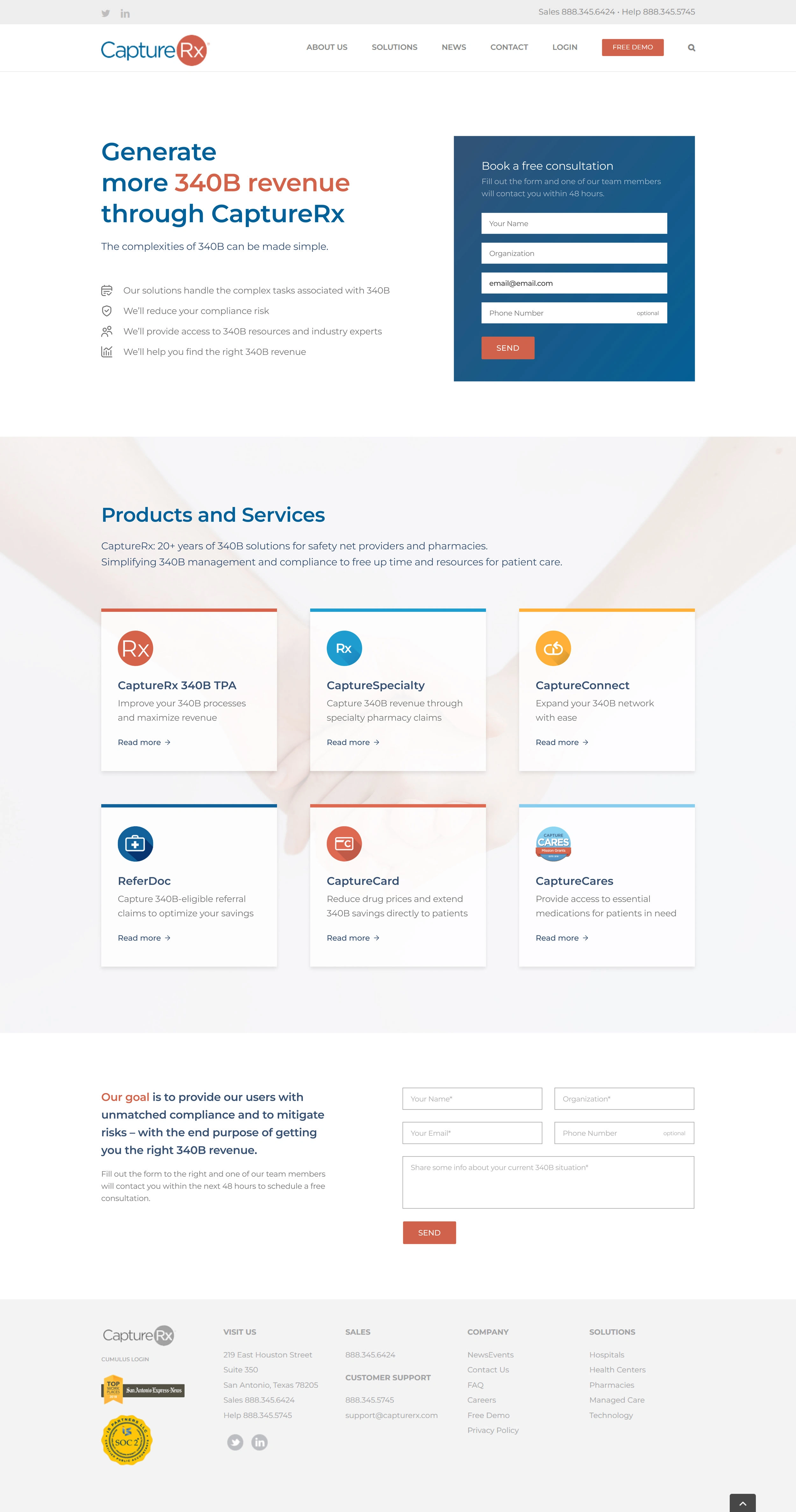
Redesigned landing page
Retrospective
This project was a great opportunity for me to practice my analytical skills and apply my knowledge of UX/UI design to improve the website's aesthetics and conversion rate. It was interesting to see how much value I could bring, since I had to work within the given branding and messaging, and the original design was already not that bad.
One of the highlights of the project was being able to focus solely on UX/UI design to improve the user experience and overall conversion rate. I enjoyed the process of analyzing the page and identifying areas for improvement, and then implementing those changes through design. It allowed me to grow in my understanding of what makes a website user-friendly and engaging.
Overall, I am very happy with how this project turned out. I am looking forward to seeing the tangible results that it will bring to my clients. This project has given me a lot of confidence in my abilities as a designer and has shown me the value of UX/UI design in creating a better user experience and improving conversions.
My client liked the result as well :)
Wow. You did amazing. Well done. I love it. Normally I have so many suggestions with a designer....but I don't have any. This is better than I could have thought through. You made me very upset though. Because, I realize how many landing pages we will probably need to redesign now! hahaha
Are your landing pages meeting the high standards of your clients? In a world where first impressions are vital, your digital entry point should be as professional and compelling as the services you offer. A strategic redesign can be the difference between a prospect and a loyal customer.
✨ Contact me today and let's collaborate to transform your landing pages into a conversion powerhouse!
Like this project
Posted Jul 14, 2023
Redesigned CaptureRx's landing page to improve UX/UI, enhancing clarity, engagement, and conversions within existing branding (2023).