Two Dots — Designing Elegant CTAs That Convert
Project Overview
Two Dots is a minimalist puzzle game known for its calm pacing and clean design.
However, its in-app purchase (IAP) CTAs were underperforming due to generic copy and poor alignment with player motivation.
I redesigned IAP messaging and placement to increase engagement and conversion without disrupting immersion or brand tone.
The Challenge
The problem wasn't that players didn't want to spend. It was that the copy wasn't meeting them at the right moment, with the right reason.
CTAs that blended into the background. Generic purchase prompts don't create urgency — they create habit blindness. Players learned to ignore them.
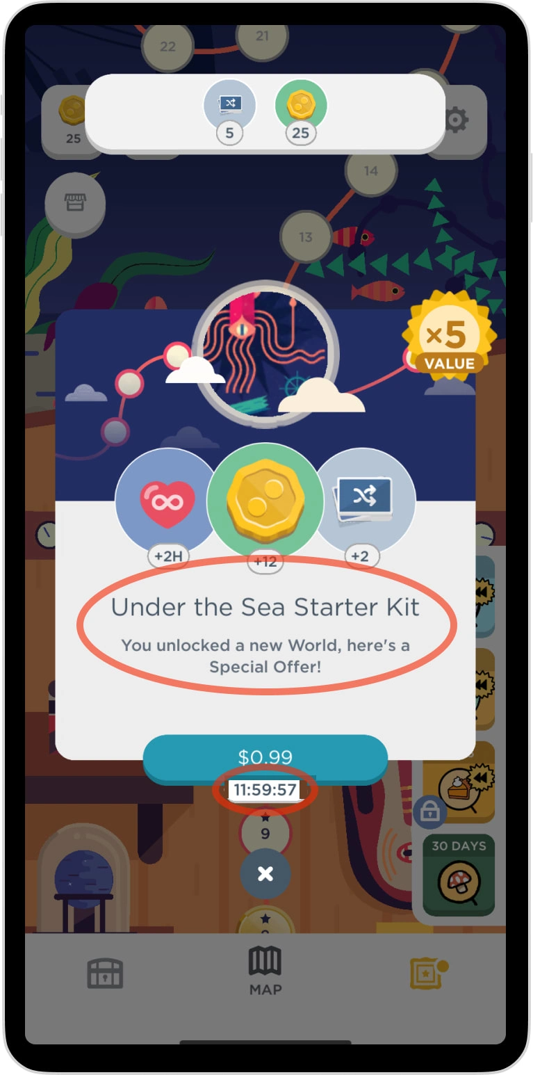
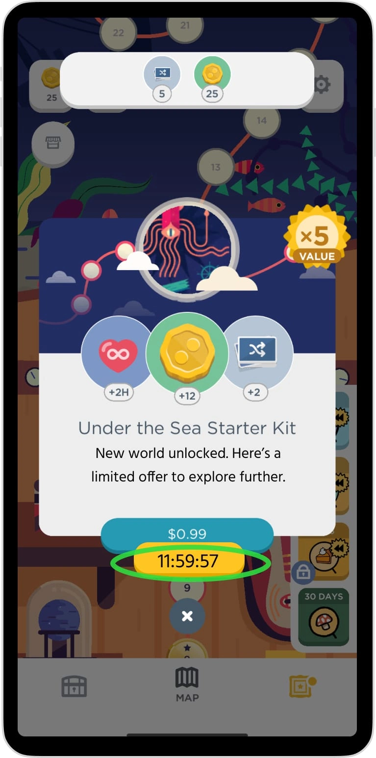
Time-limited offers that didn't feel urgent. If a player can't immediately understand what's being offered and why it matters now, the window closes.
A brand that couldn't afford to go loud. Two Dots' identity is built on calm. Any monetization copy that felt pushy, cluttered, or sales-y would damage the experience it was trying to fund.
My UX Writing Approach
Behavior-driven CTA timing
Generic placement was the first thing to fix. I mapped high purchase-intent moments in the gameplay loop — post-failure, boost depletion, near-completion — and repositioned CTAs to appear when a player already has a reason to consider spending. The offer meets the motivation instead of interrupting it.
Value-first copy
I rebuilt IAP copy around three questions every player is silently asking: What is this? Why do I need it right now? How long do I have? Answering all three, concisely, in Two Dots' voice — that's the rewrite.
Non-intrusive visual integration
Proposed text-led CTAs over button-heavy layouts, with contextual appearance tied to gameplay state. The goal was for purchase moments to feel like a natural continuation of the experience, not a commercial break.
Projected Outcomes
This approach reflects monetization patterns used in high-performing puzzle games and is designed to target:
Higher IAP click-through rates at intent-matched moments
Reduced abandonment after level failure (where purchase motivation peaks)
Improved player sentiment around fairness — copy that informs rather than pressures
Increased revenue per daily active user without increased ad load or aggressive prompting
Why It Matters
Monetization copy is where UX writing and business strategy overlap most directly. Done poorly, it erodes trust. Done well, it gives players a reason to invest in their own experience — at exactly the moment they're already thinking about it.
This project is evidence that conversion and player respect aren't in tension. They're the same goal, approached from the same direction.
Reflection
Two Dots already had the hard part figured out: a player base that trusted it. This project was about making sure the monetization didn't spend that trust carelessly.
The constraint I kept returning to: if a player feels manipulated, the copy failed — regardless of whether they converted. Writing that respects the player and writing that serves the business aren't opposites. Finding where they align is the job.
Like this project
Posted May 26, 2024
A sleek, engaging puzzle game with clever levels and strategic CTAs for in-app purchases, boosting sales and conversion rates effectively.
Likes
0
Views
35
Timeline
Feb 1, 2024 - May 1, 2024

