Concrete Cashmere Web Design
The Need
Concrete Cashmere needed a website do-over to refresh their brand image and online presence. Their website at the time was very static, had little content, and limited call to action. The site revamping efforts used those deficiencies and relevant user research to re-create a lasting and impactful design for this Vancouver-based design-build company.

The old website
The Challenge
The website re-design project was one of many assignments I completed during my time with Concrete Cashmere, so I had the opportunity to learn the company culture and really get to know the people working there. As such, the most challenging aspect of this project was designing something that reflected the personality of the people working there. Being a female-driven and dominated workplace, the design needed to maintain a certain elegant aesthetic while inspiring confidence and showing the company’s proven experience.
The Solution
Working with the marketing coordinator, I successfully designed the UX and UI for the updated website. This new design prioritized the user experience by improving readability, providing clear CTA’s, and promoting user interaction with the website.
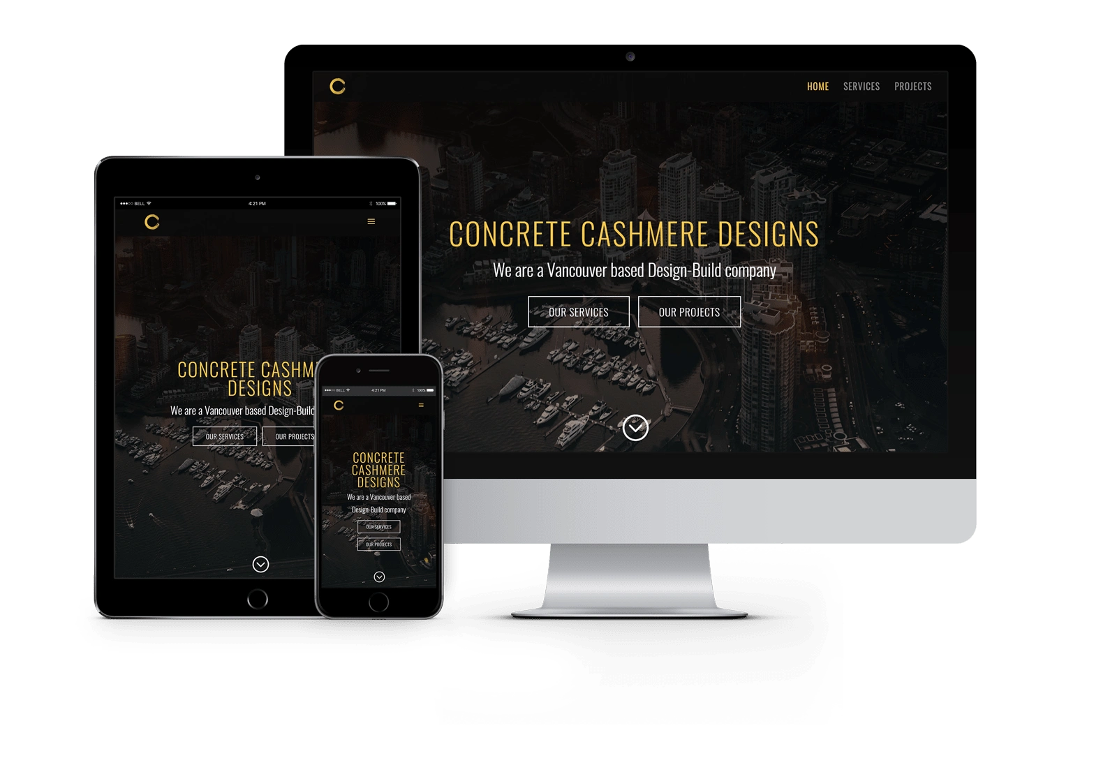
The new online presence
Tools
Sketch / Adobe CC / WordPress / Divi Theme & Builder
Team
Tea (UX/UI Designer) / Irish Pasao (Marketing Coordinator)

Team meeting
The Process 🛣
Defining
DefiningClient Interviews
I participated in client meetings at the beginning of the project with the CEO, marketing and engineering teams to understand the mission, vision and values of the company. Working with the CEO and marketing coordinator, we identified the direction of the website redesign.
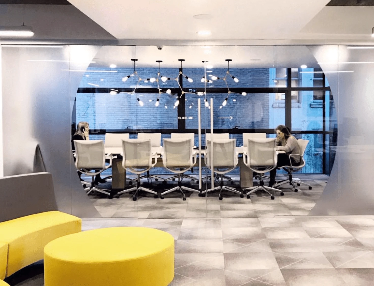
The office
Discovery
DiscoveryInternal and Competitive Research
I studied the old website and researched other design-build companies in Vancouver in order to learn common terminology and services provided. The marketing coordinator and I determined the major elements to include on the updated website.
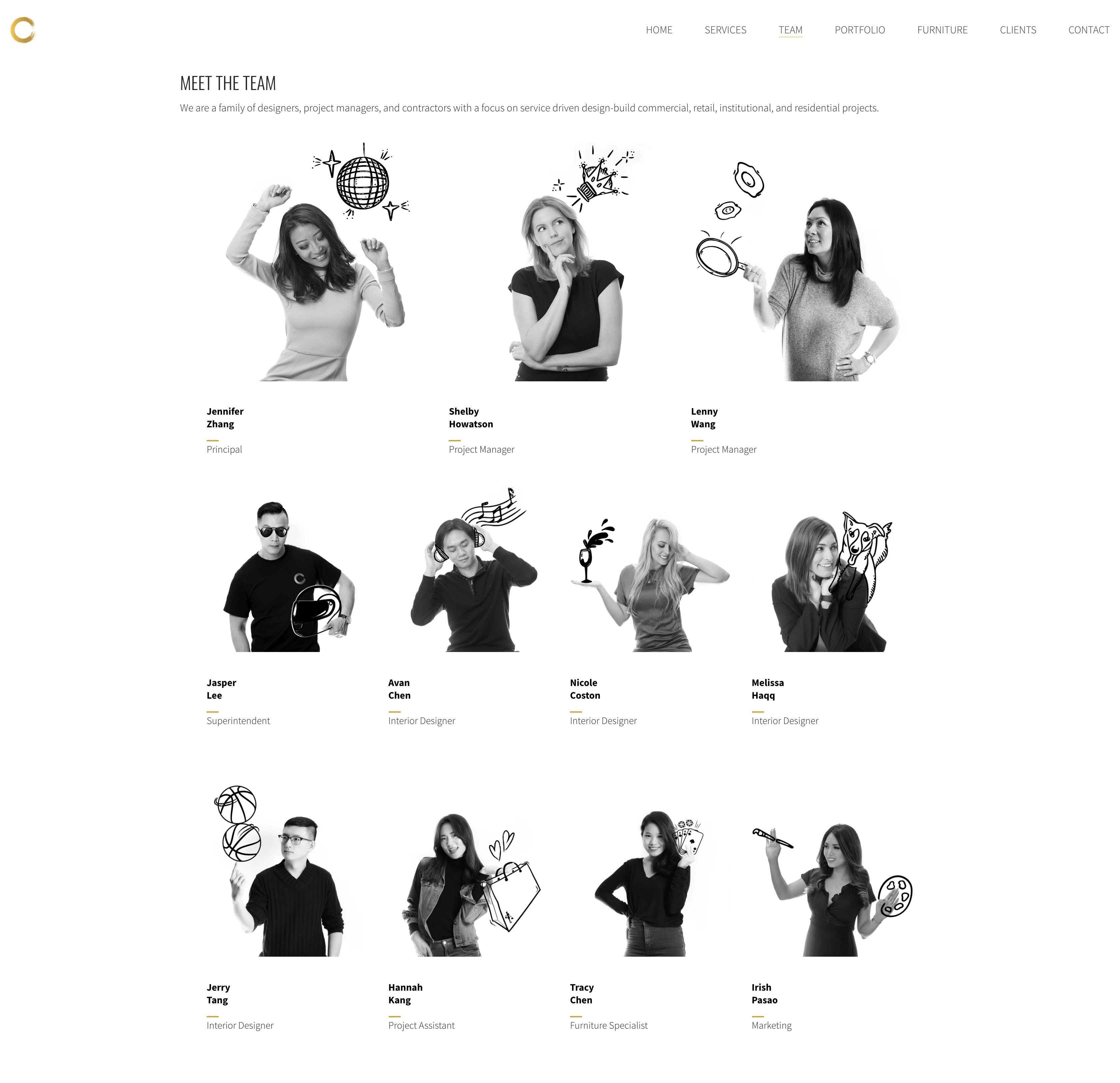
The team page
Design
DesignWireframes
I prefer starting out with low- and mid-fidelity wireframes to think through the structure of web pages. I used Sketch to iterate through the design process.
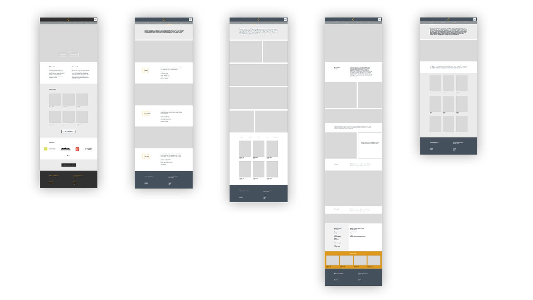
Website wireframes in Sketch
Client Demos
Every week, I presented the website progress to the client using Sketch and the maintenance WordPress site. These check-ins were helpful feedback at keeping up with design expectations.
Testing & QA
Testing & QAI tested the website on desktop, tablet and mobile in order to discover layout and other user experience issues.
Learnings
01
01I learned about the entire process of website redesign - from user research and early wireframing, to the engineering requirements and final design launch. Working so closely with the CEO and marketing coordinator was a very wholesome experience. I especially enjoyed the collaborative nature of this project, as the final design would not have reached the desired state without this highly iterative process.
02
02The main challenge was meeting the specific design requirements while ensuring the design would display properly on all devices and screen sizes. Testing and QA was definitely the most intensive phase of this project, and also well worth it to ensure the best possible UX for visitors.
Feedback
~ Jennifer Zhang, Principal (Concrete Cashmere Designs)
Like this project
Posted Jan 20, 2023
Website redesign for Concrete Cashmere Designs, a design-build company in Vancouver.
Likes
0
Views
40


