Product Designer with Data Visualisation Expertise
Orezi Mena
Verified
Project Context
In today’s data-driven environment, even the best insights lose their value if they are not communicated clearly. The challenge for this project was to transform complex datasets into visual stories that were both functional for decision-makers and accessible for everyday users.
The client needed more than static charts, they required interactive dashboards and visual systems that could adapt to varying use cases, from executive overviews to detailed operational breakdowns.
My Role
As the Product Designer, I led the design of the data visualisation layer:
Defined the structure and flow of dashboards to balance clarity with depth.
Created visual hierarchies that highlighted KPIs while making drill-down exploration intuitive.
Built design patterns and reusable components for charts, tables, and filters that would scale across different product modules.
Collaborated closely with product managers and developers to ensure feasibility and technical accuracy of visualisations.
Process
Research & Understanding
Analyzed how different stakeholders consumed data (executives vs. analysts vs. ops teams).
Mapped the pain points with existing reporting flows (over-cluttered dashboards, buried insights, low usability).
Information Architecture
Structured dashboards around top-level KPIs first, then enabled users to expand into system-level details.
Balanced aggregation with drill-downs, e.g., showing global totals but letting users break them down by year, system, or client.
Design Exploration
Iterated on chart types (line vs. bar vs. stacked vs. donut) based on which conveyed the story best.
Introduced color coding and interaction states to help users distinguish categories, trends, and thresholds at a glance.
High-Fidelity UI
Translated findings into clean, brand-aligned visualisations, ensuring consistency with typography, spacing, and brand colors.
Added expand/collapse and search functionality to enhance usability when datasets grew large.
Solution
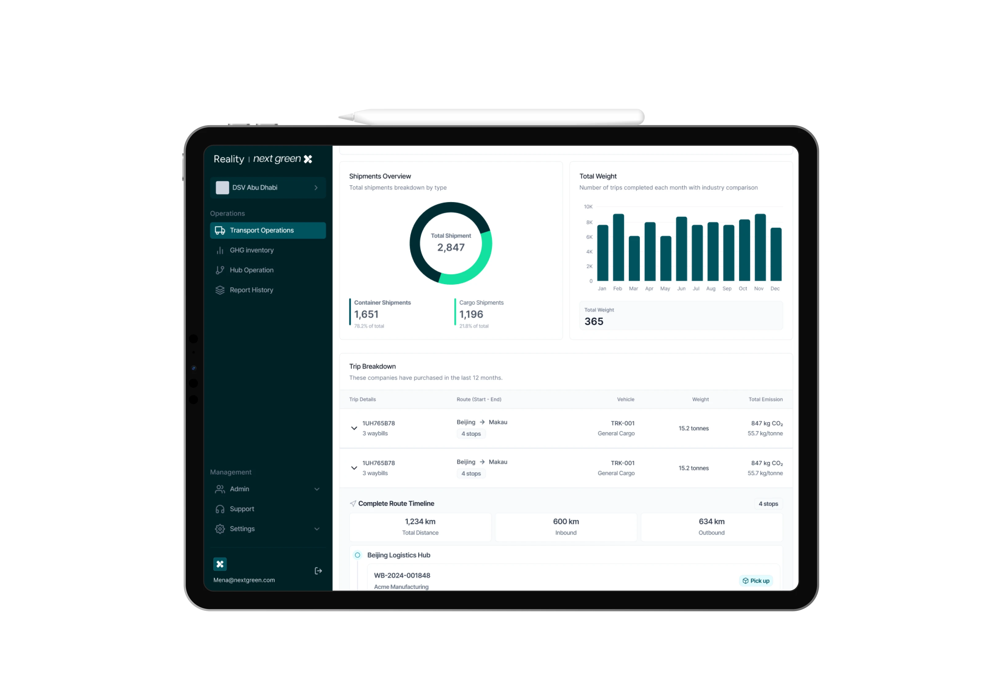
The final designs delivered a data visualisation framework that:
Allowed users to see summaries at a glance while still offering deeper exploration on demand.
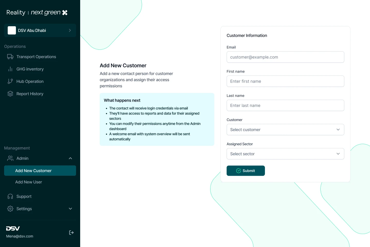
Simplified client vs. system ownership views, making attribution clear for administrators.
Integrated scalable design tokens for spacing, typography, and color systems ensuring future growth without design debt.
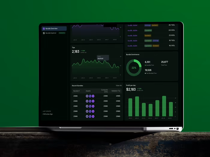
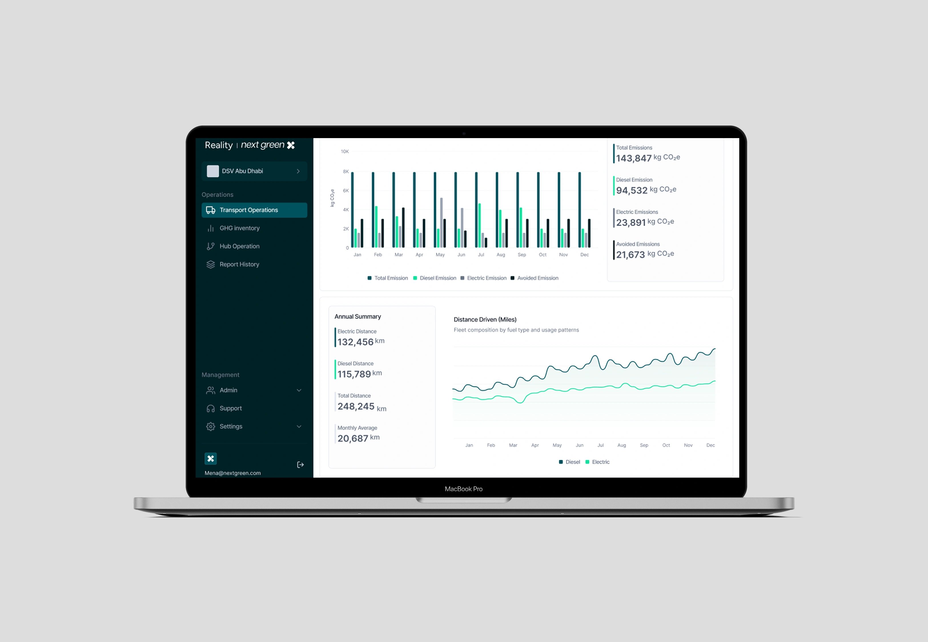
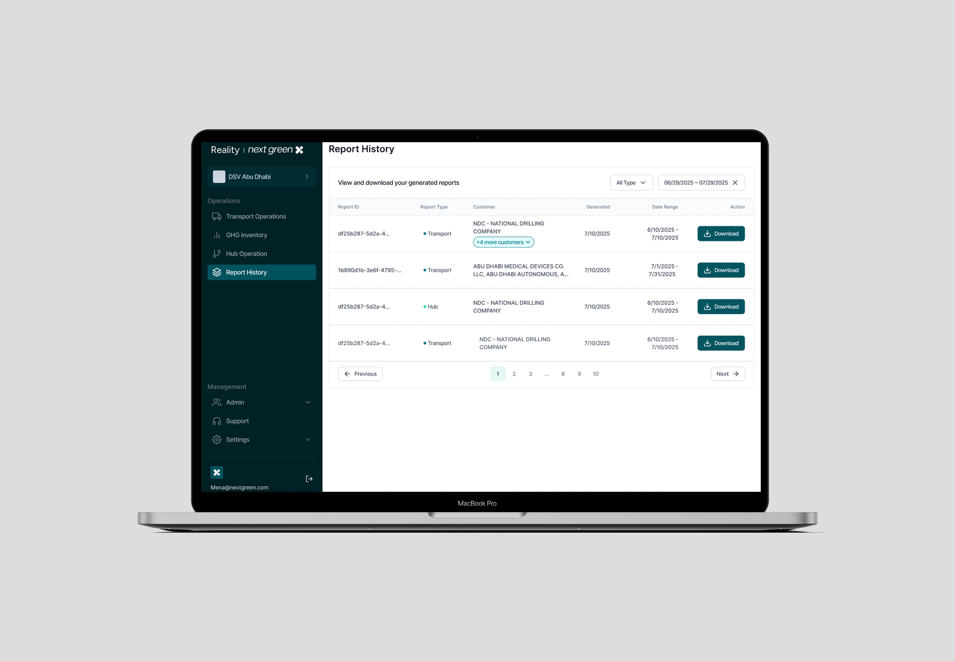
Screenshots (examples included above) illustrate:
KPI dashboards with system-by-system breakdowns.
Trend charts comparing aggregated vs. individual system performance.
Admin-level views that support search by client name and quick navigation to dedicated system pages.
Impact
Improved decision-making speed: stakeholders could move from top-level metrics to detailed drill-downs in fewer clicks.
Clarity & compliance: admins could generate client-specific views, aiding in audits and reporting.
Design scalability: established a reusable visualisation system that could be extended across future product modules.
Reflection
This project reinforced how design for data isn’t about decoration. it’s about precision and storytelling. By balancing clarity, flexibility, and brand coherence, I created a system that helps complex data feel intuitive and actionable.
Like this project
Posted Aug 29, 2025
Designed data-rich dashboards and visual systems for fintech and logistics apps—boosted user clarity, reduced support tickets, and improved decision speed.
Likes
0
Views
37
Timeline
Jun 11, 2025 - Ongoing
Clients
Anyday Design