Visual Identity for Amorita

Amorita is a natural fermentation artisan bakery with a light, simple and sensitive essence. Produced with qualower case reinforces the close and human nature of the brandd experiences with a taste of home.
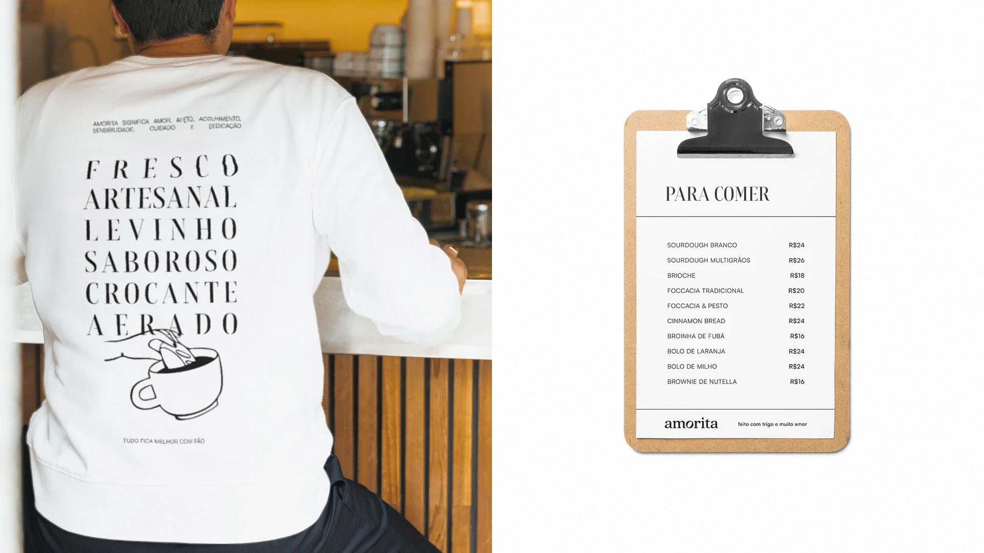

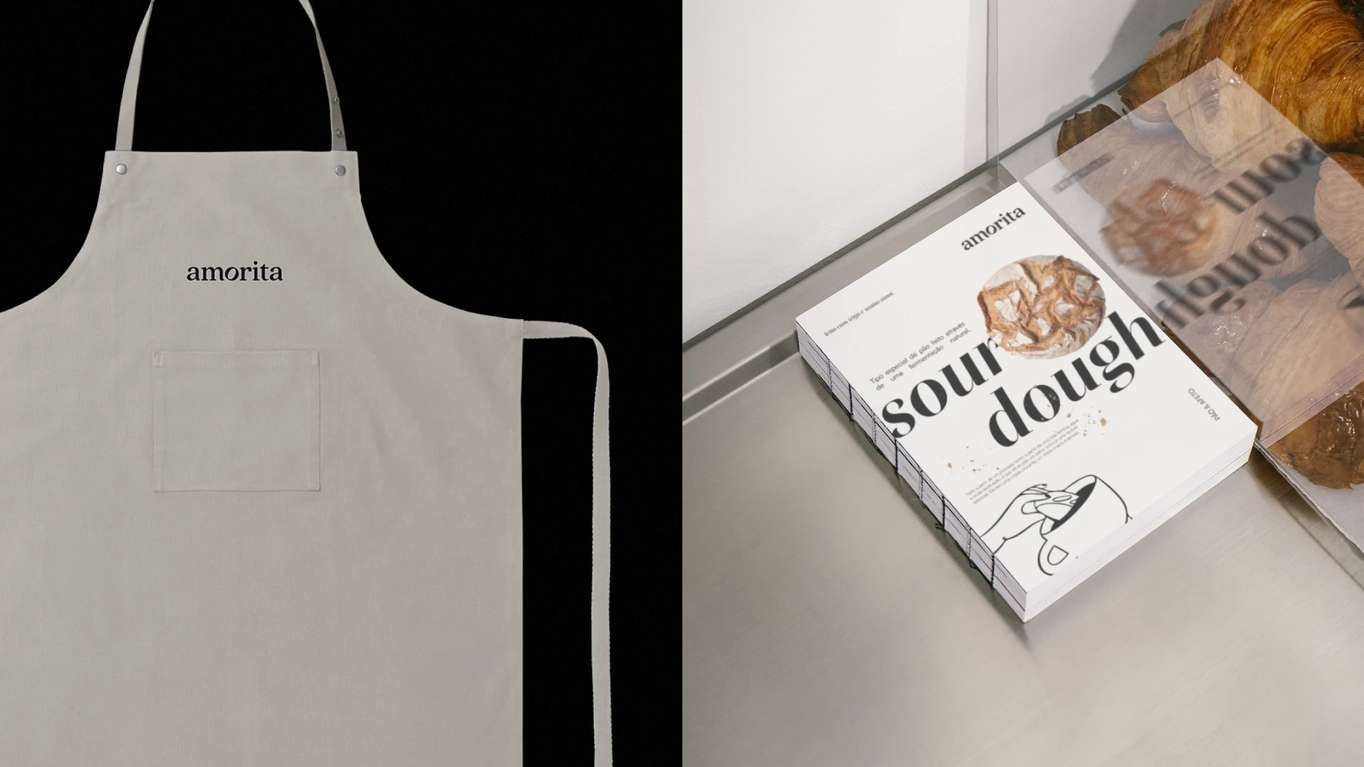
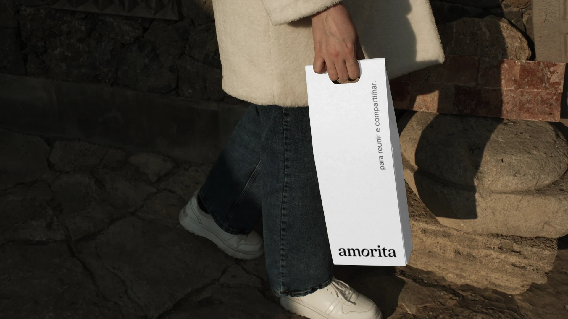
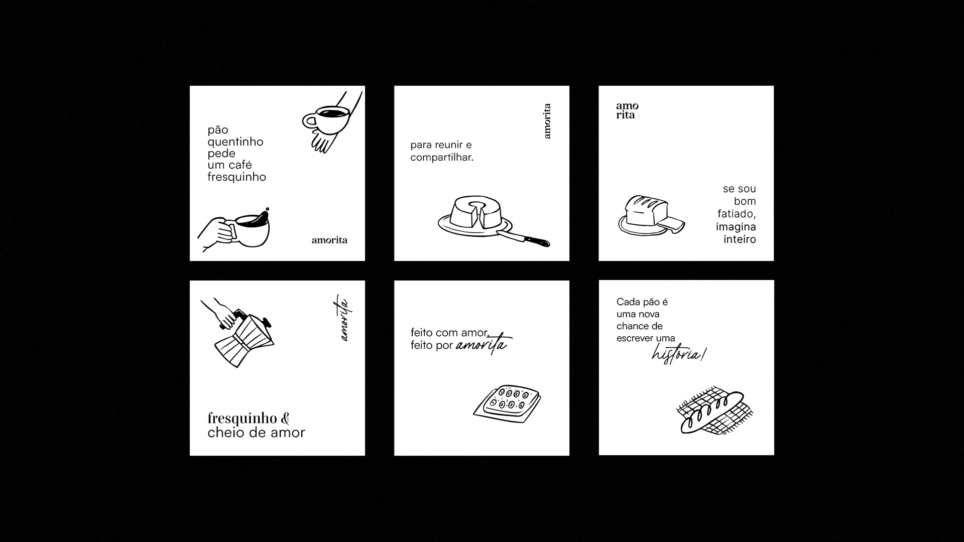
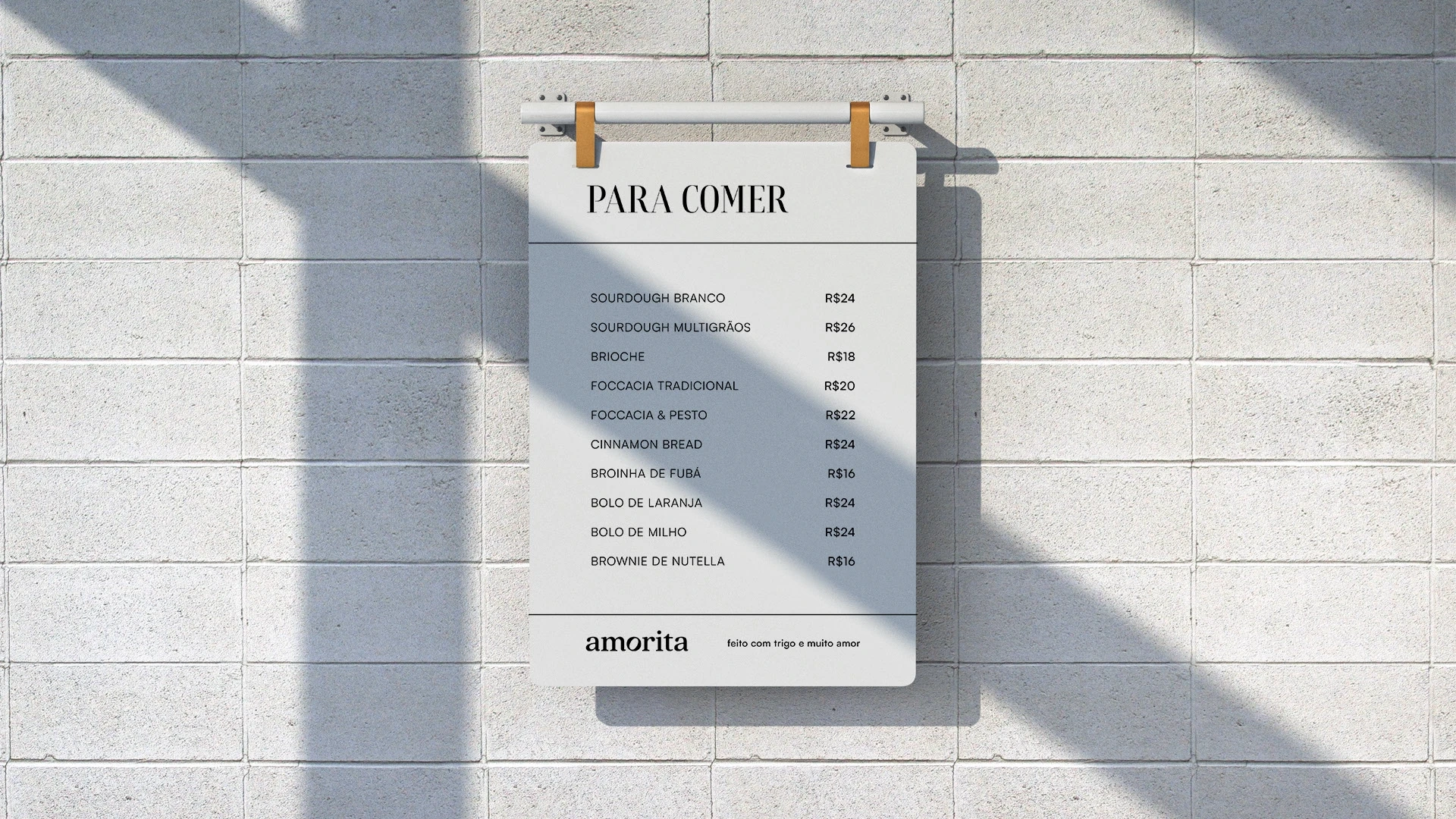
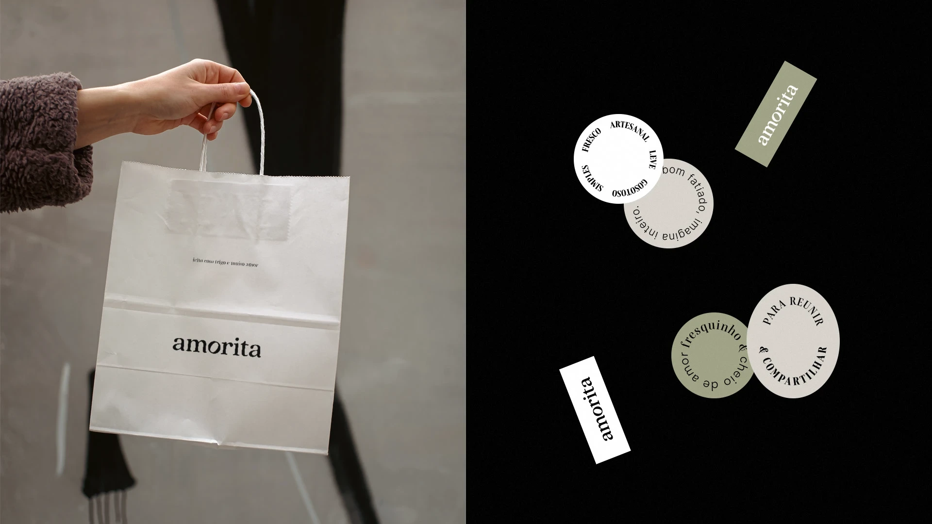
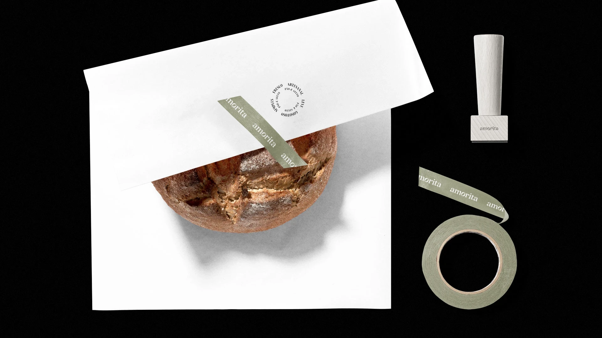
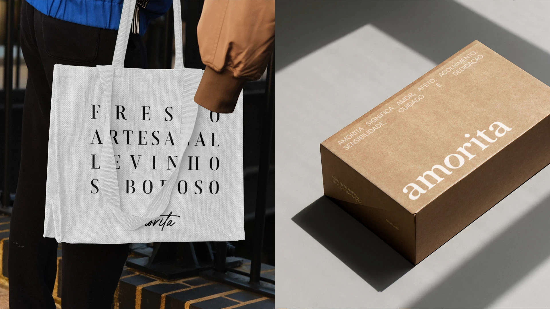
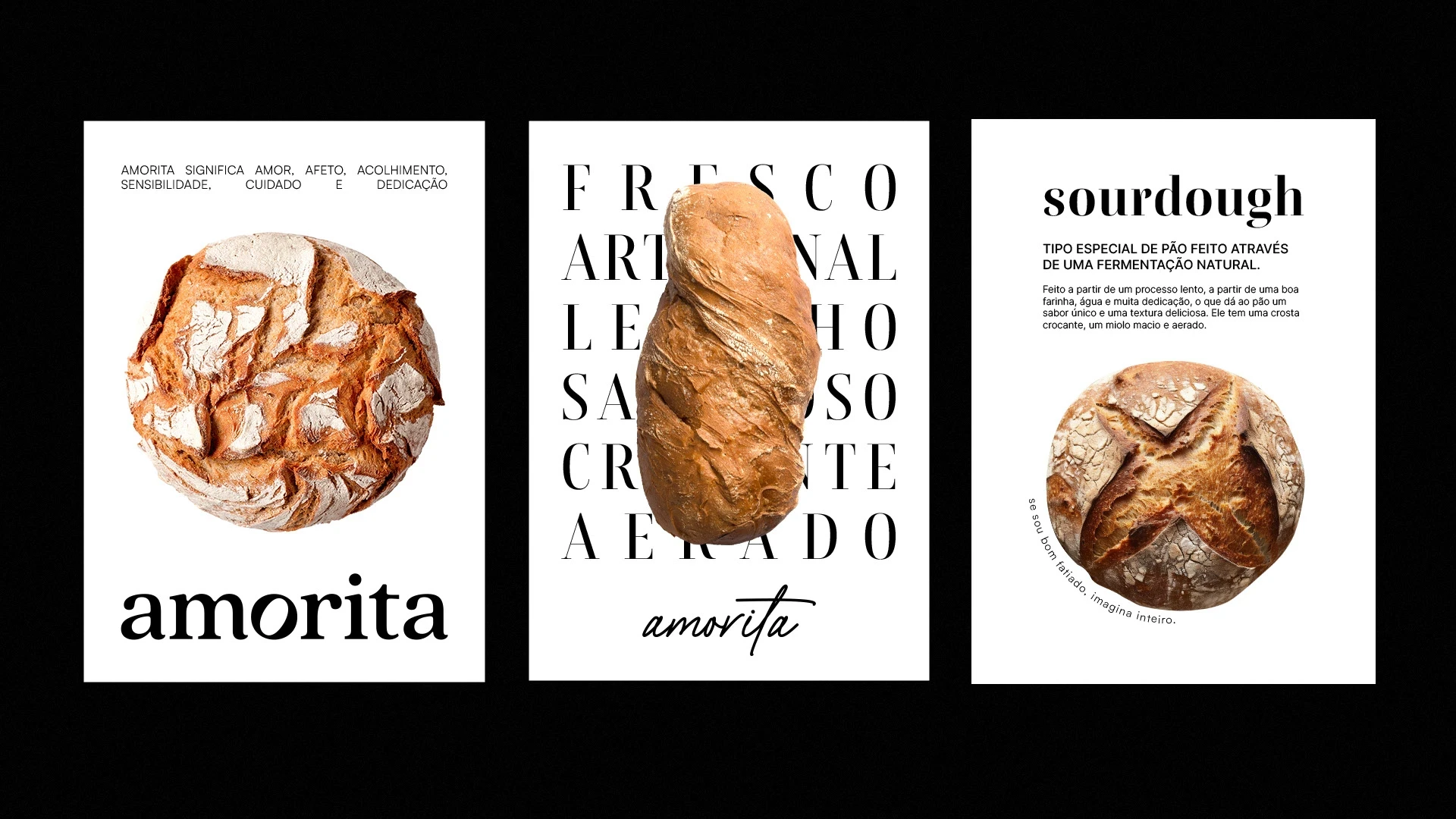
Amorita is a brand that seeks to create bonds and unique experiences through tasty, high-quality artisanal products. With a visual identity that reflects modernity and warmth, its color palette is composed mainly of white and black, bringing elegance, while shades of beige and light green highlight the human and passionate side of the brand.
The name Amorita translates as affection, welcome and care for food, and its logo reinforces these values. With a serif, rounded typeface that conveys movement, the highlight is the letter “O”, designed to discreetly resemble a loaf of bread, symbolizing the artisanal process with sophistication and simplicity. The use of a lower case reinforces the close and human nature of the brand.






Like this project
Posted Oct 28, 2025
Graphic Design, Branding, Logo Design, Adobe Illustrator, bakery, Brazil, coffee


