Visual identity for Le Pain Carioca
Nathalia Ultramar
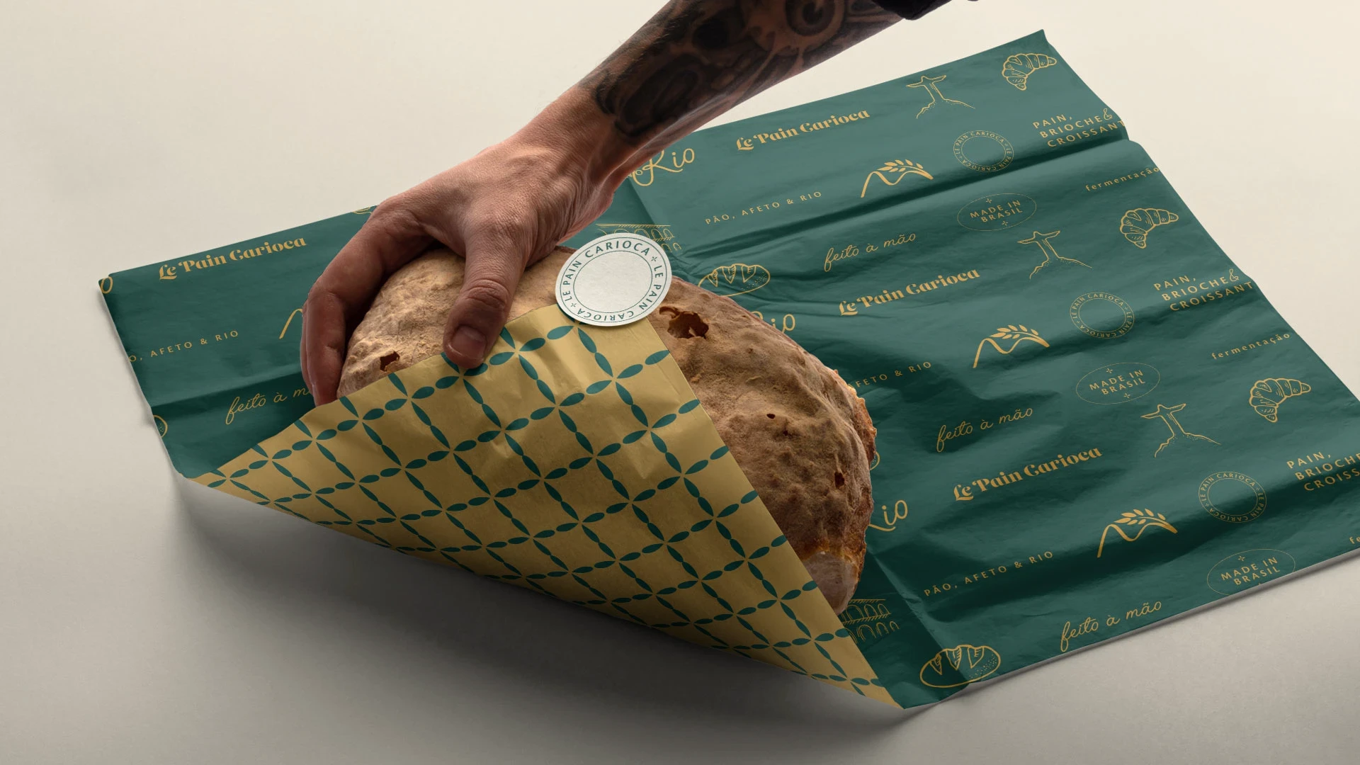

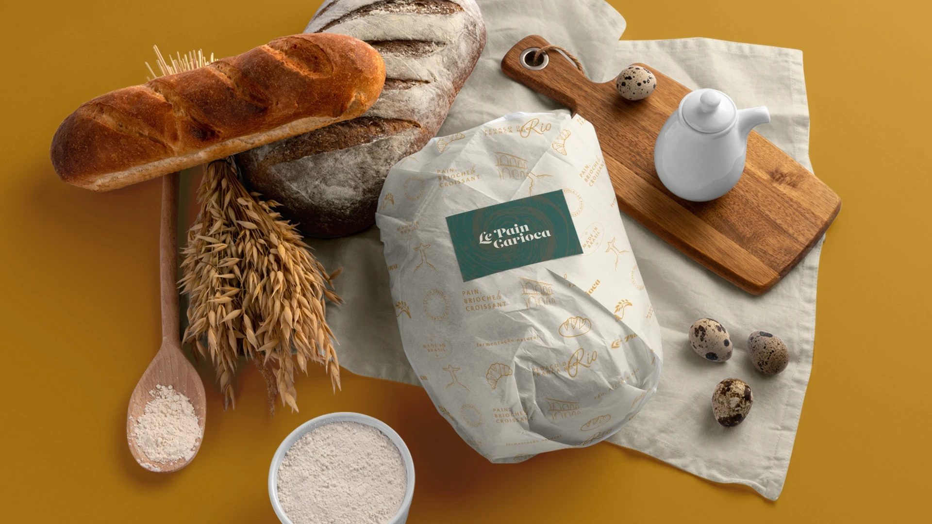
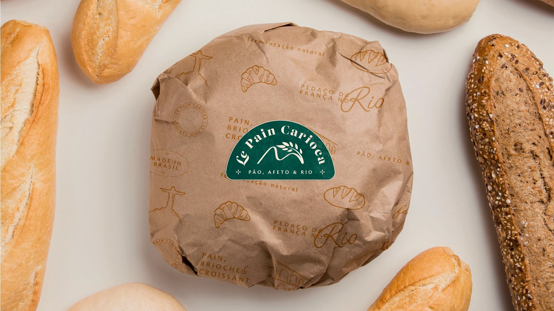
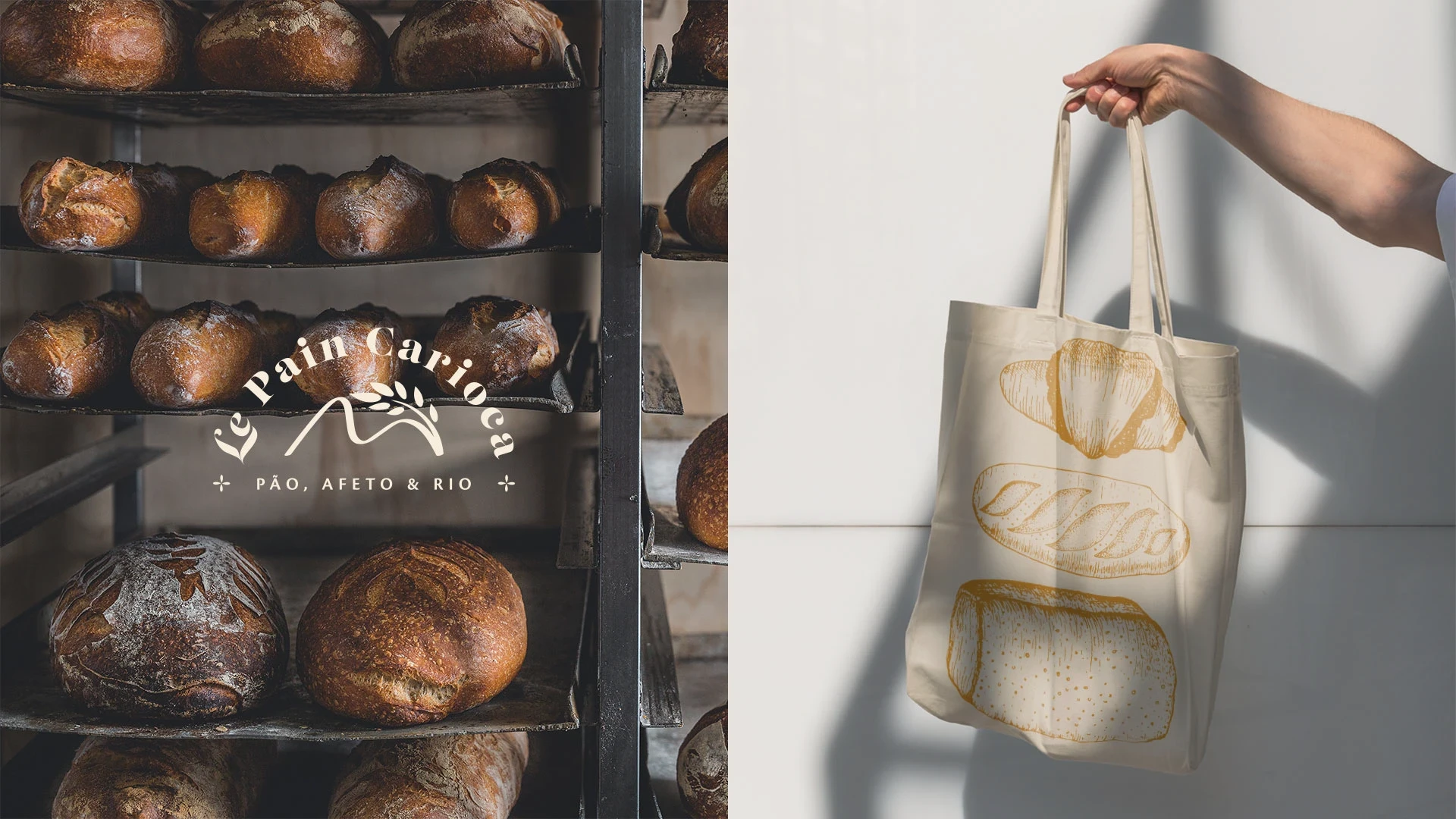
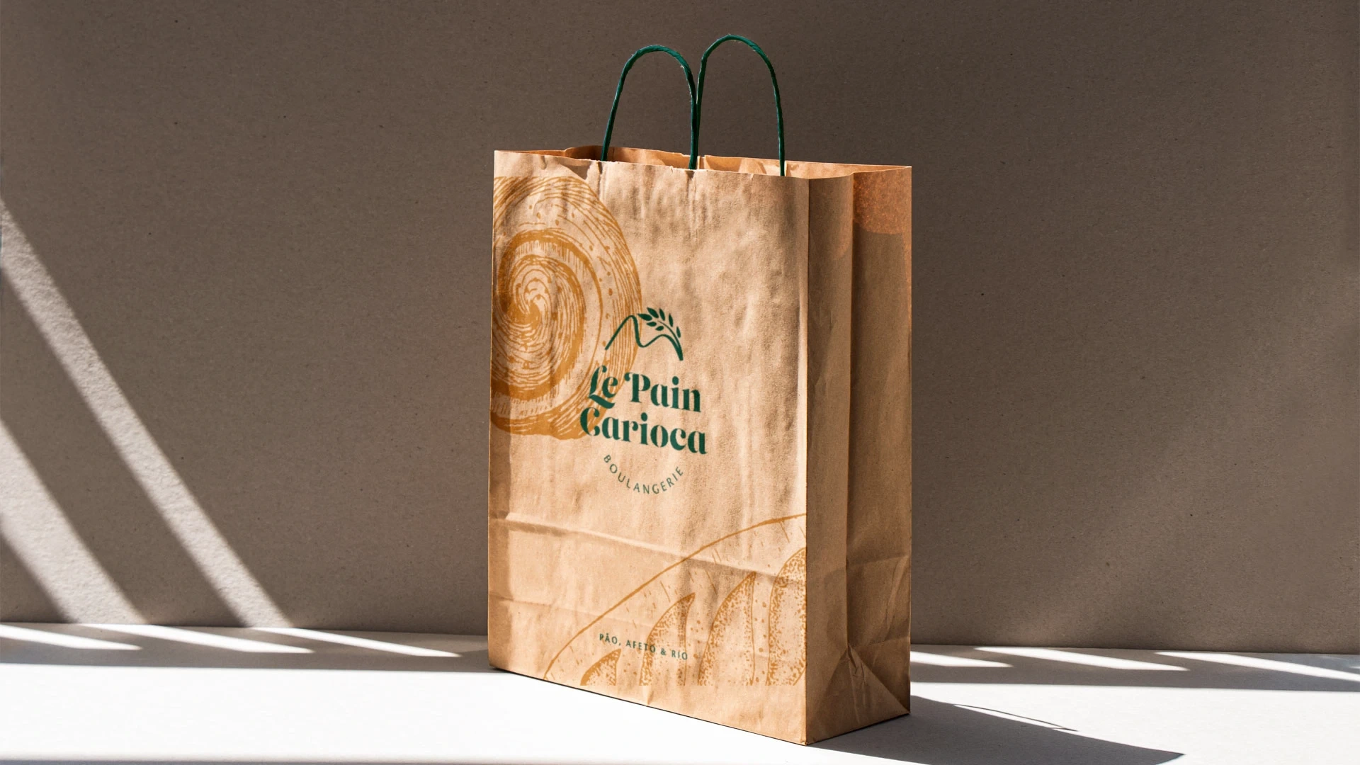
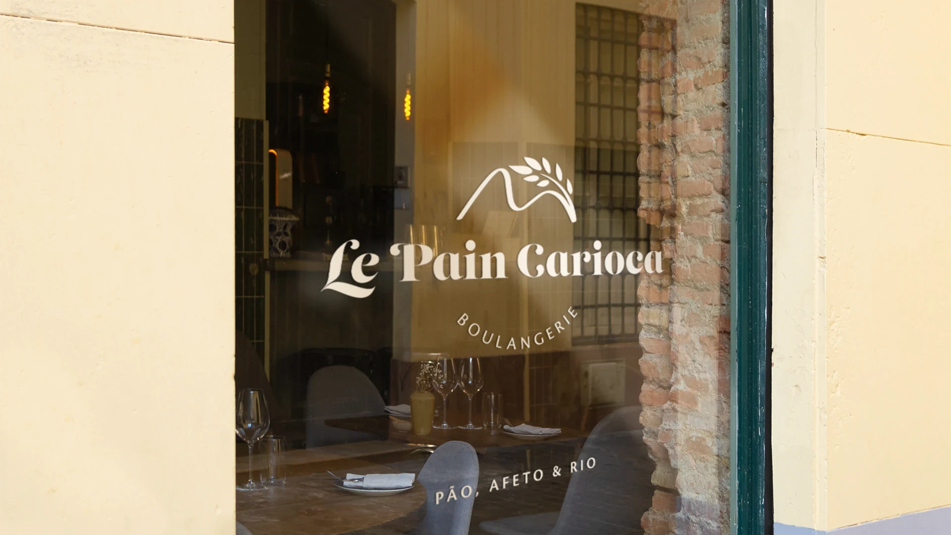
Le Pain Carioca is a bakery with French inspiration, located in the capital of Rio de Janeiro, which produces artisanal breads with natural fermentation following French techniques, with quality and excellence.
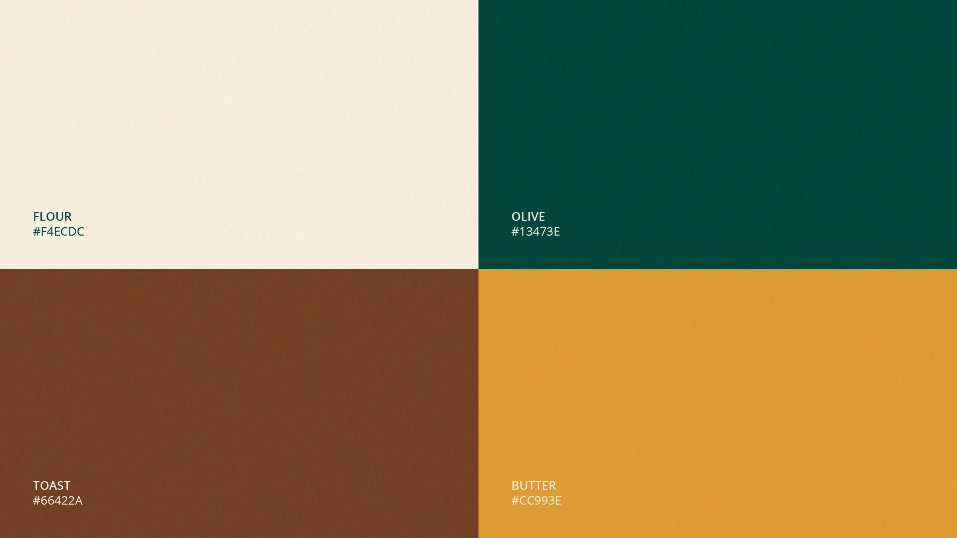
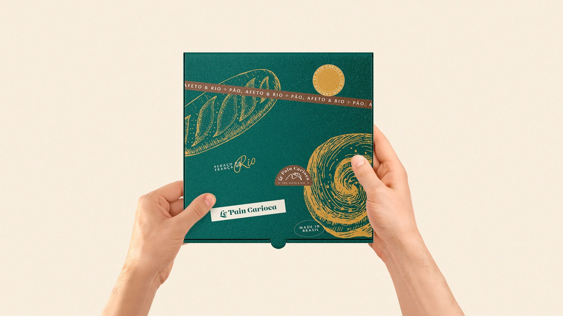
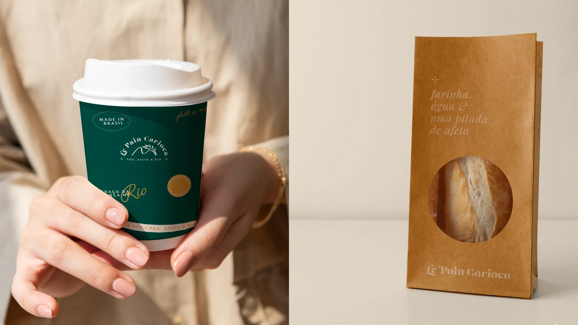
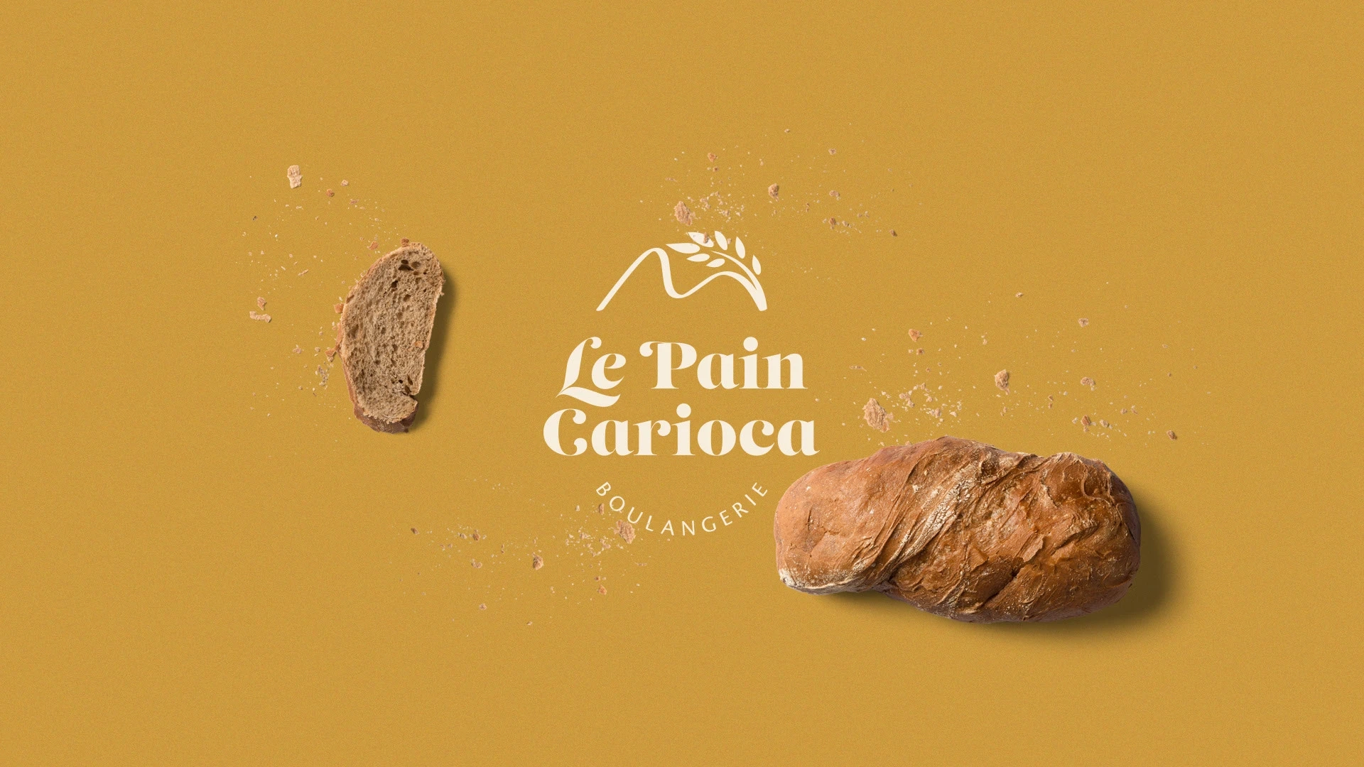
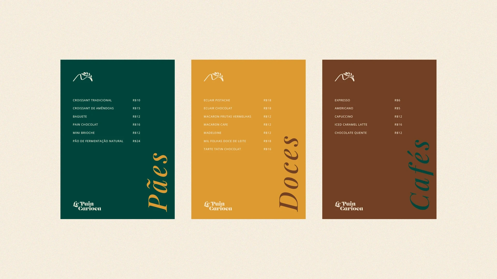
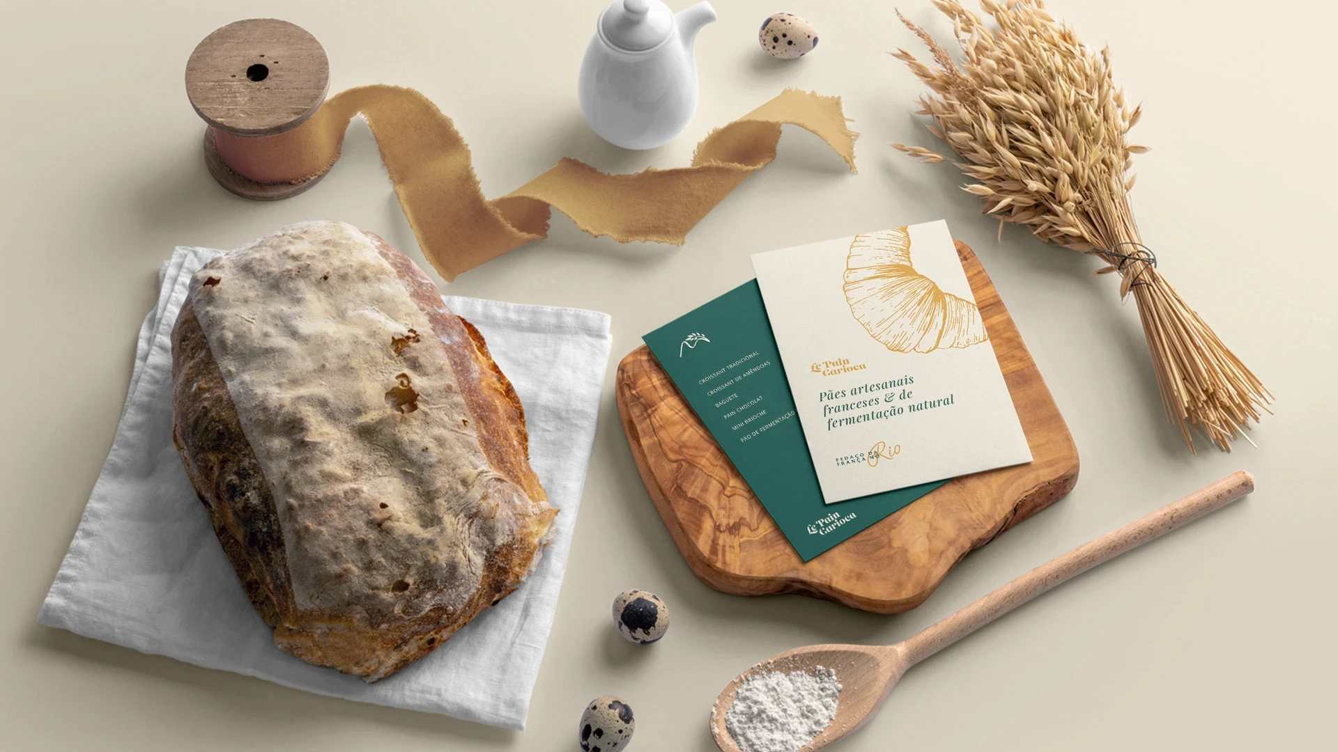
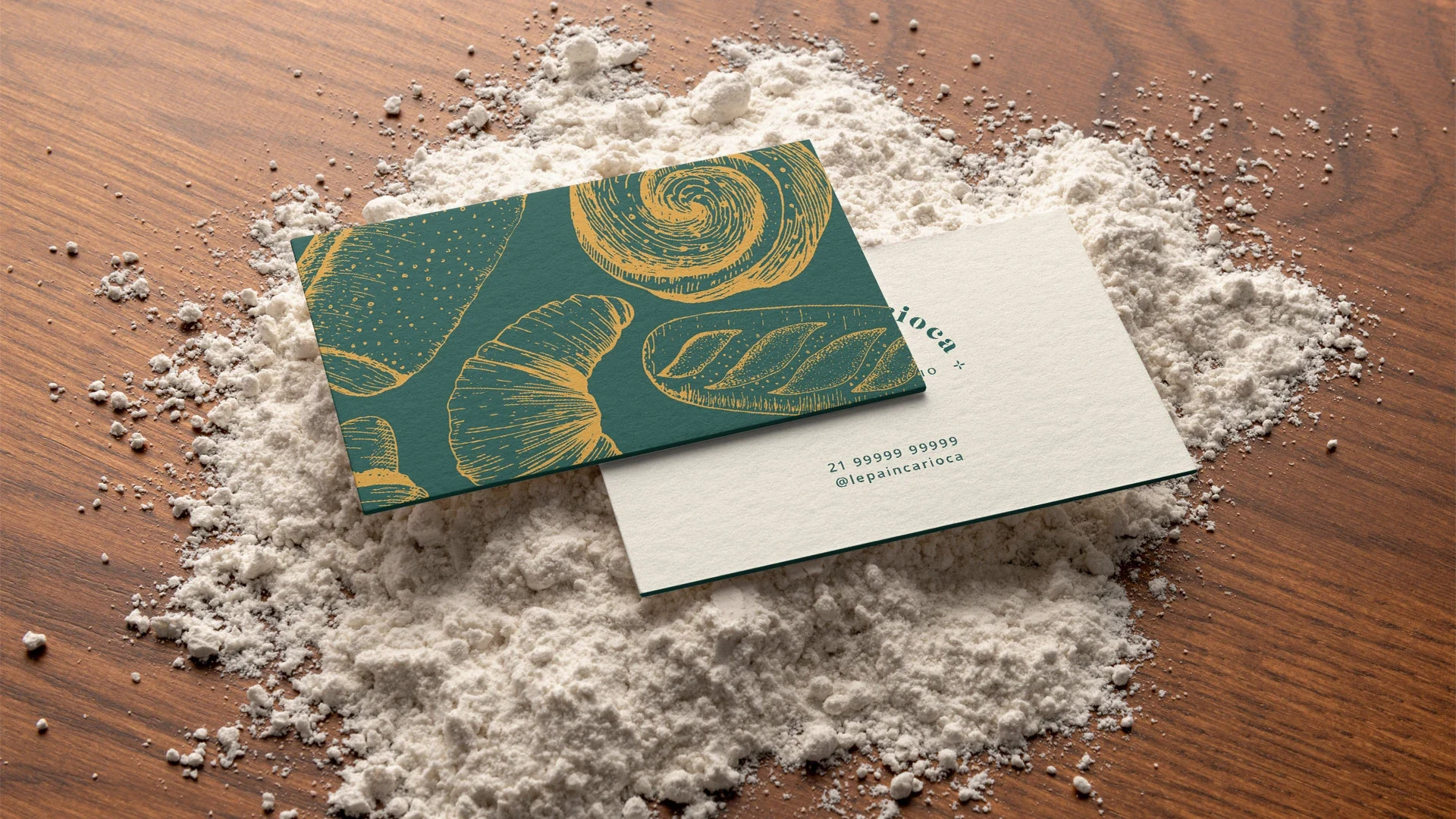
The project was guided by the mixture of French classic with the warmth of Rio de Janeiro. The brand symbol was inspired by the famous tourist spot Pão de Açúcar, which refers to the bread-making industry, alongside wheat - the main ingredient in the production of delicious bread. The elegant serif typography was chosen to refer to the romantic French side. The colors and graphic elements were designed to evoke even more the mixture of cultures and styles, bringing the best of Brazil and France.
Like this project
Posted Oct 28, 2025
Visual identity for a French bakery in Rio de Janeiro, Brazil.