Case Study: Re-designing an App
Brief:
Deadline: One Week;
Challenge: Redesigning an app by fixing its weakest points;
Goal: Pinpointing the elements that needed change through Heuristics Evaluation;

ReadEra on Google Play Store
Mistakes Found:
Overcrowded navigation menu;
Inconsistent reading theme;
Unrecognizable icons;
AAA contrast issues;
Changes Made:
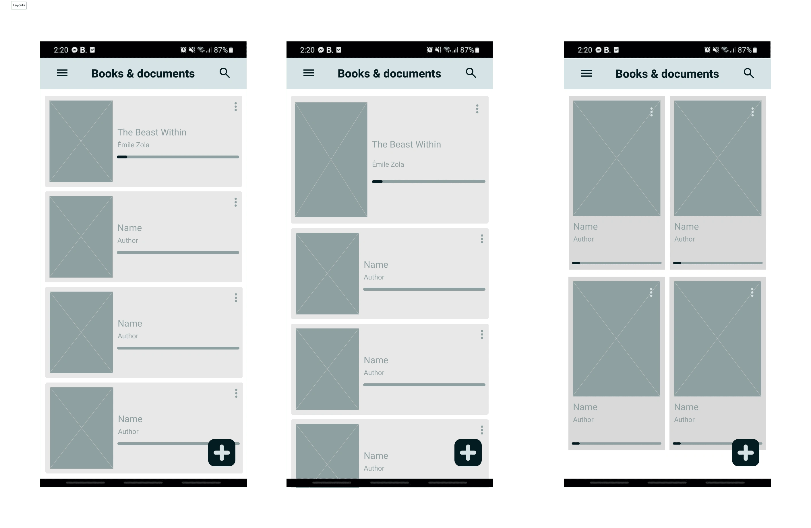
Tests of different layouts for the homepage
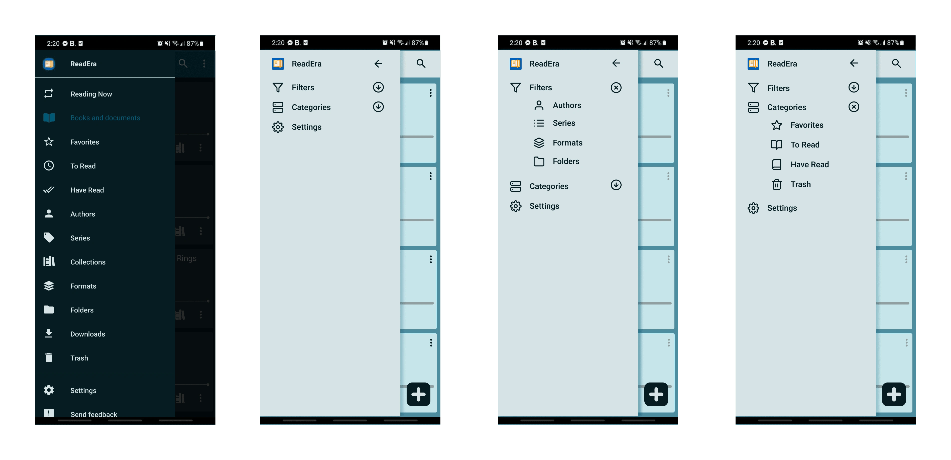
Before and After of the navigation menu
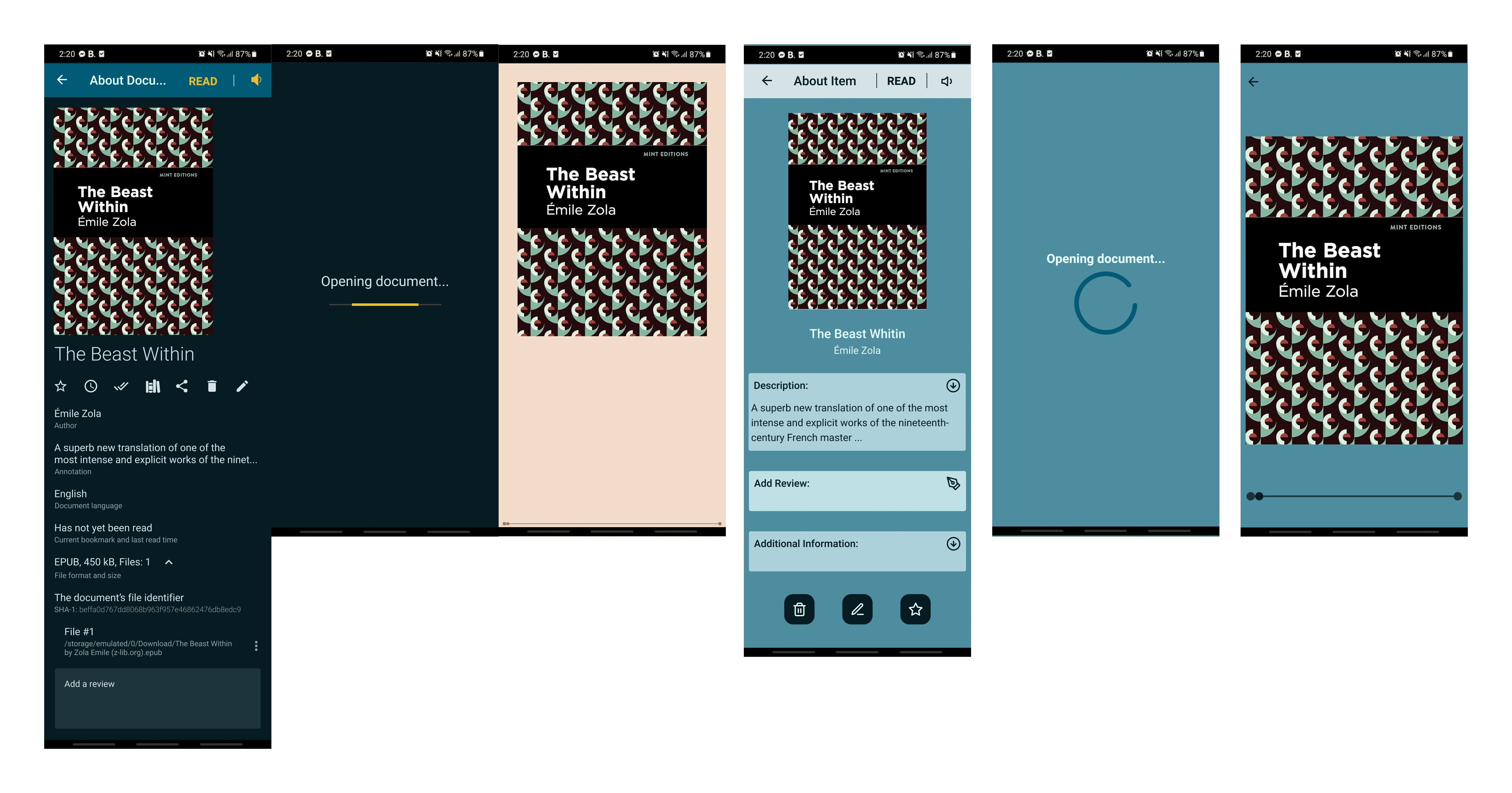
Before and After of the reading mode
Next Steps:
Exploring more color styles;
Adding a light and dark mode;
Experimenting with the menu and possibly making it a navigation bar;
For more information, you can read the full article on medium.
Like this project
Posted Nov 24, 2023
Re-designing an lesser known app with the deadline of a week, using heuristics as a baseline for the evaluation and design.
Likes
0
Views
37

