Kaymakci Consulting: Web Design
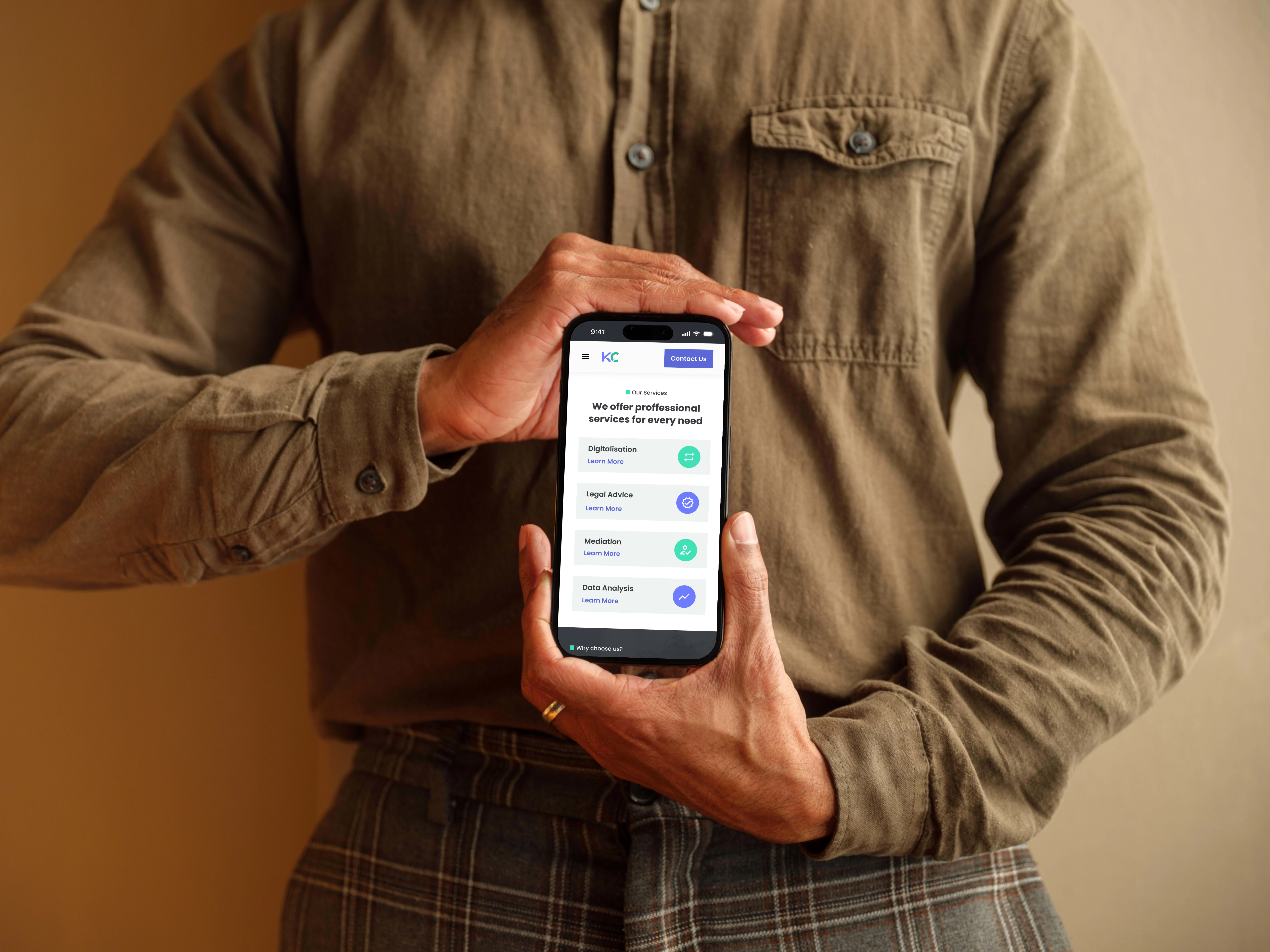
Kajmakci Consulting Services Breakdown on Homepage
Table of content
Table of content❇️ Project OverviewAbout the client: Kaymakci Consulting✨ Project Approach- Understand the problem, business goals, and technical constraintsWhat's the problem & why is it happening?What were the business needs and goals?Do we have any design constraints?🚀 The ProcessFirst step User Research > How did I achieve that with no budget?What were the user's needs, goals, and pain points?Heuristic Analysis - SummaryNext steps after heuristic analysis❇️ Main changes on the new redesignImproved Navigation:Highlighted value proposition & enhanced credibility:Improved consistency & accessibility of design elements:👩🎨 Branding & Style guide📸 Project Mockups❇️ Project Outcomes❇️ Project Status✴️ Project Takeaways🤩 Impressed? Want me to build a website for you? 📊 Stats for a similar project✦ Timeline: ~1-4 weeks✦ Budget: $2,000+✦ Number of components: 30+✦ Deliverables: Research, Full Responsive Web , Branding / Design System & Logo💖 Click to book a service here or book a 15 min call with me here 💖
❇️ Project Overview
About the client: Kaymakci Consulting
Kaymakci Consulting is a B2C & B2B consulting company specializing in government, technology, and financial sectors. The consulting firm is seeking a comprehensive website redesign. With a commitment to delivering top-tier consulting services to both individual and business users, Kaymakci Consulting aims to enhance its online presence, user experience, and overall brand representation.
✨ Project Approach- Understand the problem, business goals, and technical constraints
What's the problem & why is it happening?
Decreased Site Traffic and Client Acquisition due to having an outdated website and weak branding
What were the business needs and goals?
The CEO of Kaymakci Consulting, wanted a complete website redesign to attract new and existing clients, emphasizing increased conversion rates and reduction of abandonment rates.
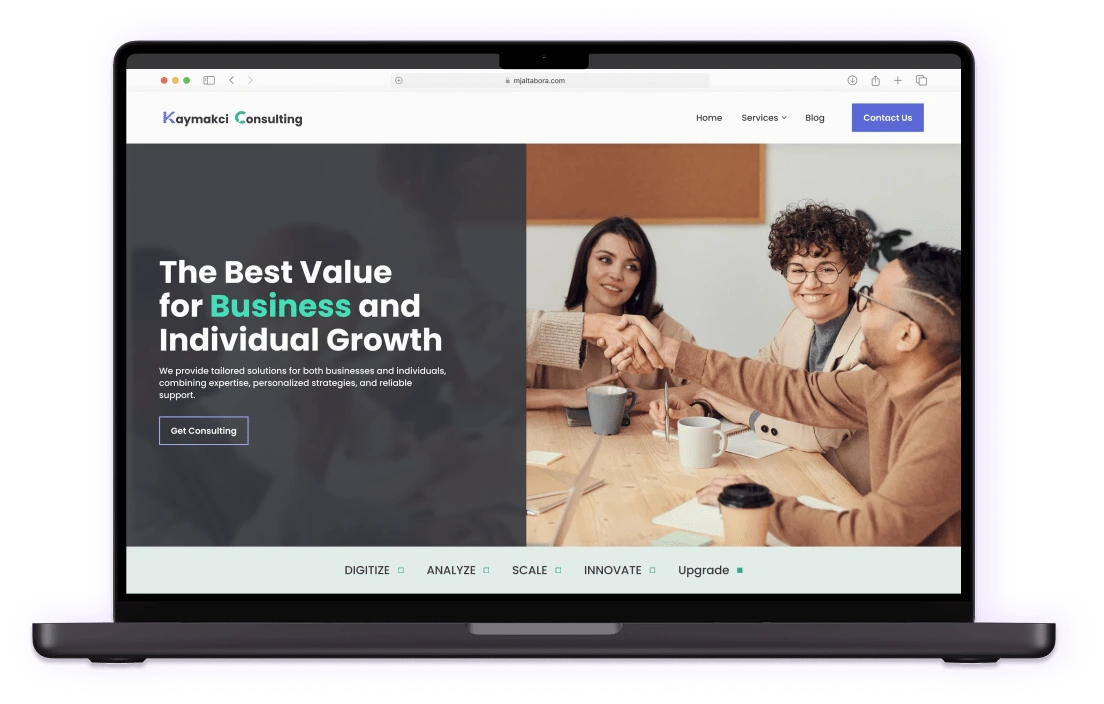
Kaymakci Consulting Final Hi-fi Design / Section: Header
Do we have any design constraints?
No budget for User Research - Mitigation Strategy:
Use existing user research data and conduct secondary research
Conduct usability testing with internal stakeholders
Heuristic Analysis / Website Usability Audit
Short time Frame - In 4 weeks I had to:
Conduct secondary research, heuristic & competitor analysis, style guide, start wireframing, lo-fi & hi-fi prototyping & initially present to stakeholders
🚀 The Process
I completed the project in the following steps:
First step User Research > How did I achieve that with no budget?
Leveraged previous user testing data
Conducted secondary research
What were the user's needs, goals, and pain points?
Business Users:
Needs:
Goals:
Pain Points:
Individual Consumers:
Needs:
Goals:
Pain Points:
Heuristic Analysis - Summary
Overview: As part of the website redesign project for Kaymakci Consulting, a heuristic analysis was conducted to assess the site's usability, accessibility & visuals. The analysis involved inspecting the live website, capturing screenshots of all pages, and evaluating the design based on Jakob Nielsen's 10 Usability Guidelines and best practices.
1.
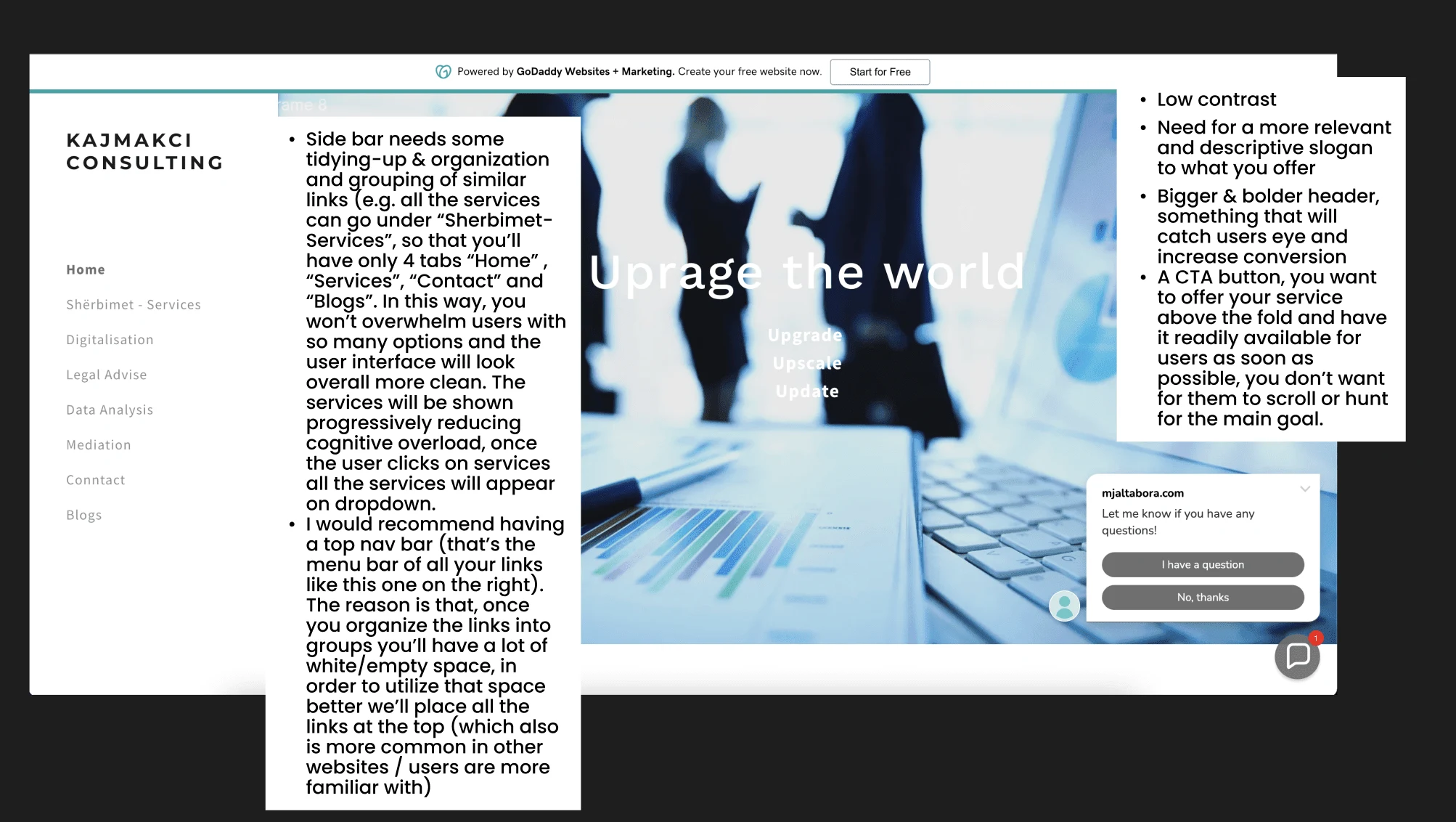
Old website usability audit
Match Between System and Real World - Sidebar & Navigation:
Add/hide services under the "Services" tab and then display them progressively in a dropdown menu / nested navigation, to reduce cognitive overload.
Implement a horizontal top navigation bar for a cleaner interface and to optimize space.
Visibility of System Status - Low contrast:
Improve accessibility & readability of the header by increasing the contrast ratio between the background and heading to at least a 4.5:1.
2.
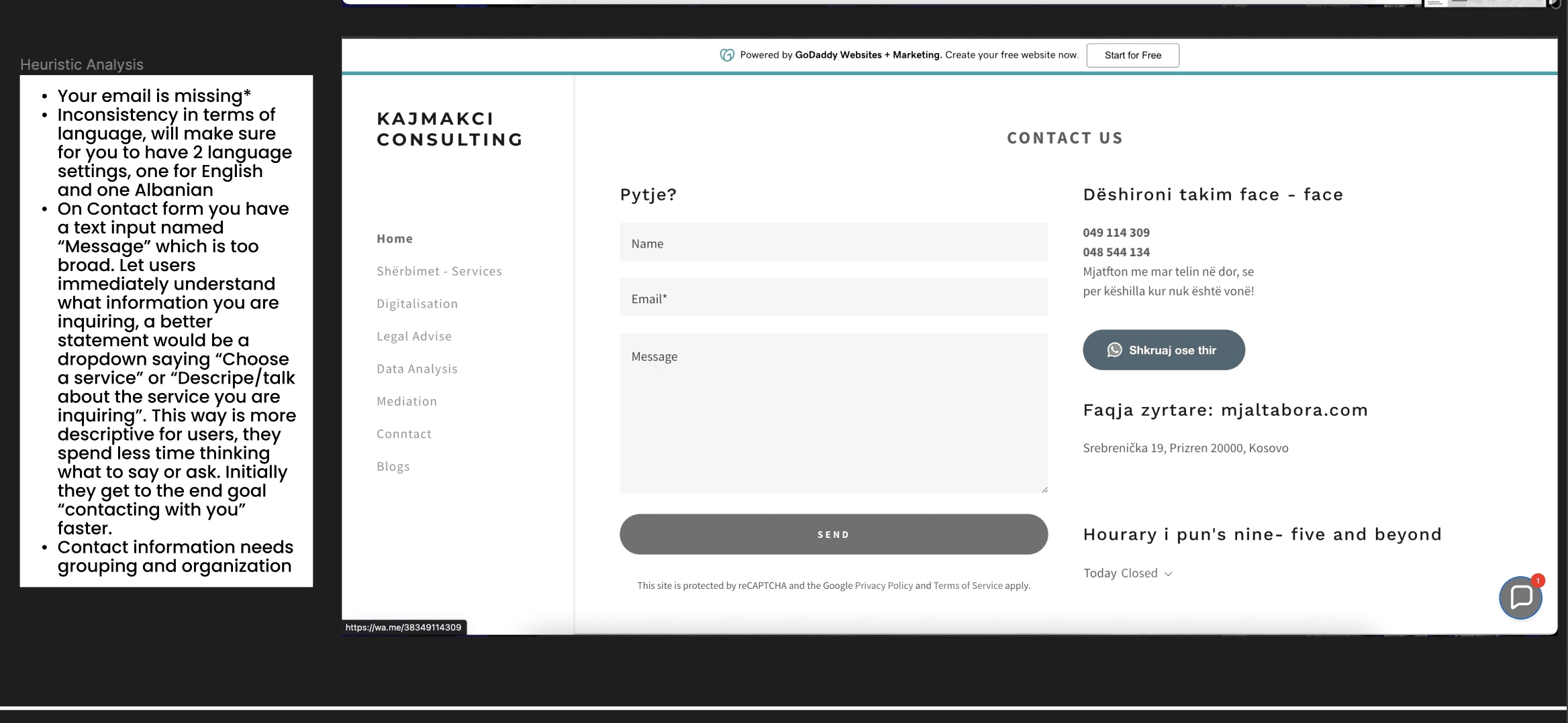
Old website usability audit
Recognition rather than recall & Aesthetic and Minimalistic Design
Name, email, and message should be outside the text input/text box so that when user clicks inside to type they don't have to remember what text input/text box they initially selected
Group and organize contact information by providing a clear and logical arrangement
Use one language for consistency
3.
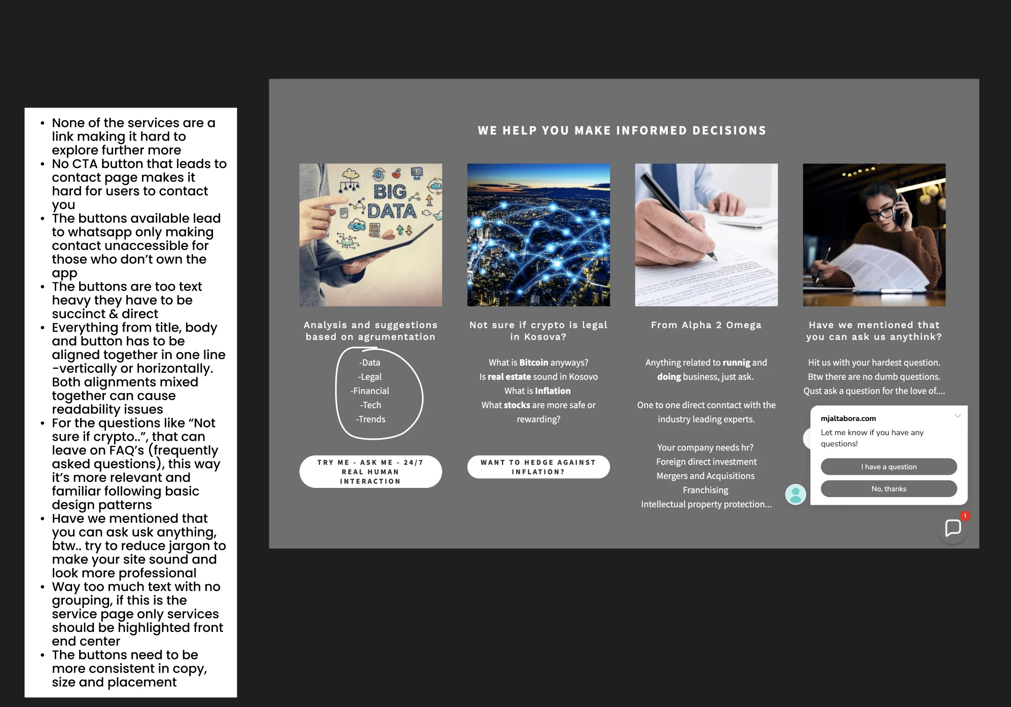
Old website usability audit
Visibility of system status
All the services should be easily accessible to users, transforming them into links
None of the "call to action" buttons lead to a contact form, making it hard for users to reach you
User Control and Freedom
The buttons available lead to WhatsApp only, making contact inaccessible for those who don't own the app.
Aesthetic and Minimalistic Design
Text-heavy buttons, inconsistent cards, and no grouping on card descriptions transform the overall UI into a crowded and un-polished look and feel, causing cognitive overload.
Next steps after heuristic analysis
Style guide update for a more modern, consistent, and accessible system. Addressing gaps from the competitor and heuristic analysis.
Transition to scalable components for cross-platform responsiveness.
Incorporate a more strategic way of CTA (call to action) button usage to increase conversion & include client reviews for social proof.
Conduct moderated usability testing with internal stakeholders
From Wireframe to Hi-fi Mockup
❇️ Main changes on the new redesign
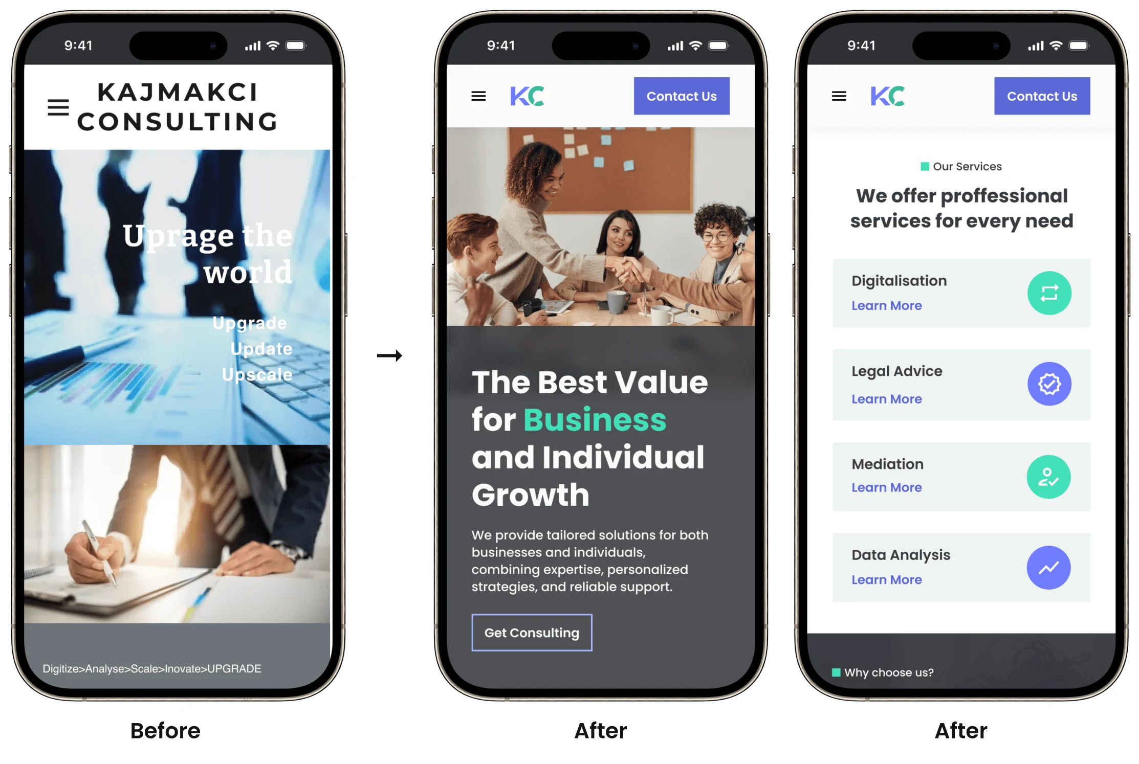
Kaymkaci Consulting Before and After Designs
Improved Navigation:
To enhance user experience and reduce cognitive overload, services on the website have been grouped under a "Services" tab with a dropdown menu. The dropdown menu presents services in a progressive manner, minimizing clutter.
After organizing and minimizing what we have on the side nav bar, we were left of with a lot of empty vertical space. Hence, to optimize the layout, the side nav was relocated to the top, allowing for the incorporation of additional design elements in the header.
The main pages now feature strategically placed CTA (Call to Action) buttons serving as links to key destinations such as the contact, services, and blog pages. This approach facilitates easier navigation and encourages user interaction with essential sections of the website
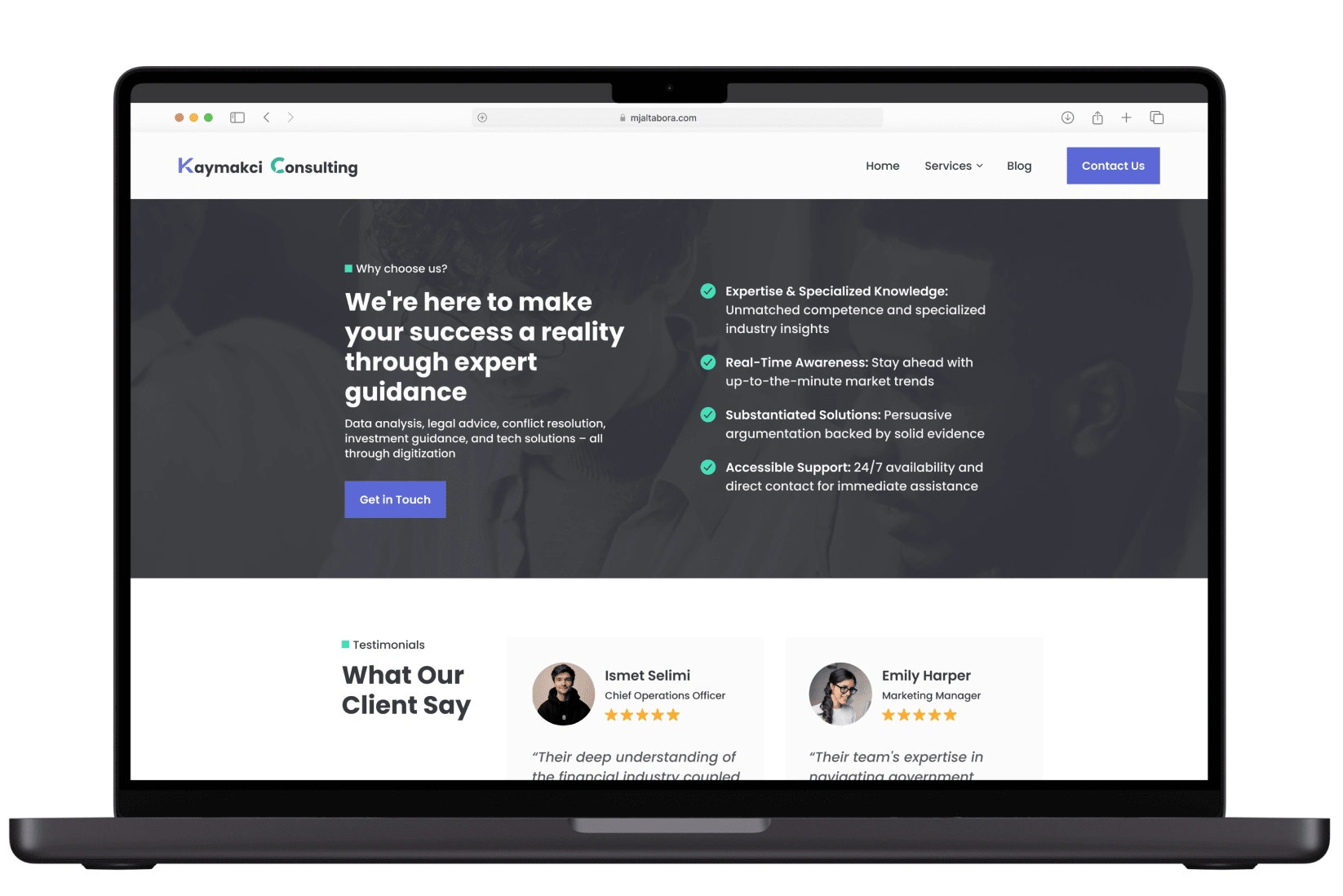
"Why Choose us?" & "What our clients say" was introduced on the homepage redesign
Highlighted value proposition & enhanced credibility:
Added client reviews to add social proof and further enhance credibility.
“Why choose us section” to effectively communicate the unique value proposition and strengths of our services
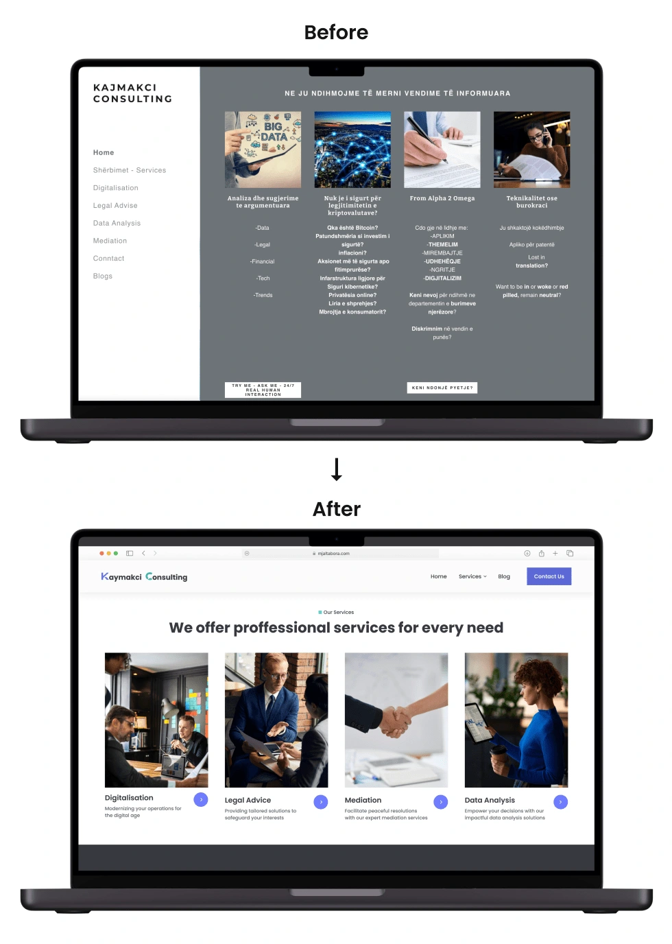
Services on Homepage Before & After
Improved consistency & accessibility of design elements:
To achieve a more unified and consistent look, I transformed various elements like cards and buttons into standardized components, which were then organized into variants.
This approach fixed inconsistencies and ensured that buttons, cards, and other design elements maintained a cohesive appearance throughout the site. The goal is to provide users with a visually harmonious experience
All the colors on buttons, cards, backgrounds & all other design elements now pass a 4.5:1 contrast ratio, aligning with web accessibility standards, making content more readable and usable for a broader audience, including those with visual impairments.
👩🎨 Branding & Style guide
By constructing expandable components, I've ensured a foundation that makes system growth remarkably straightforward.
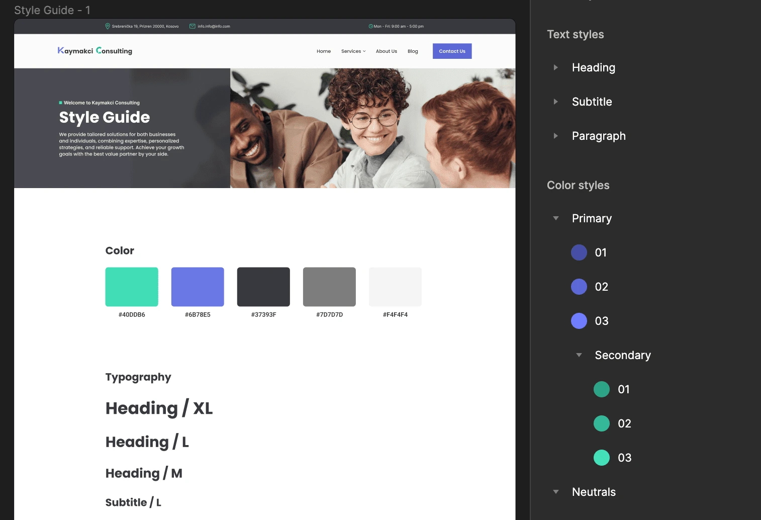
Kaymakci Consulting Styleguide and Component Styles

Made components expandable using variants
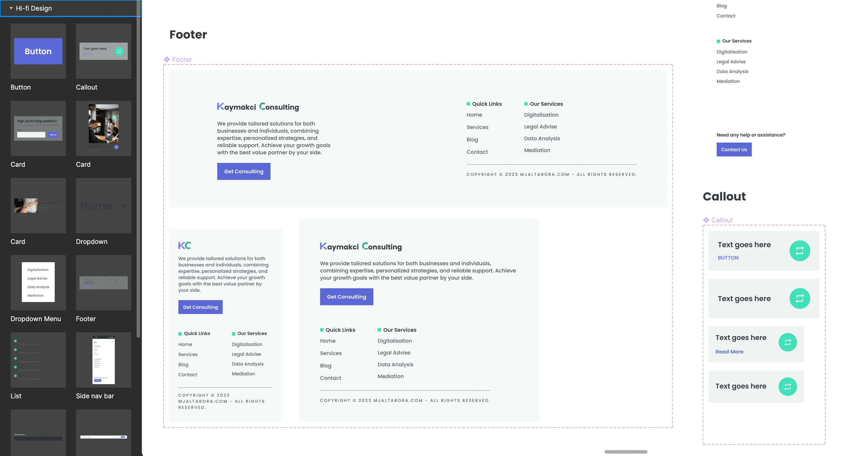
Kaymakci Consulting components
📸 Project Mockups
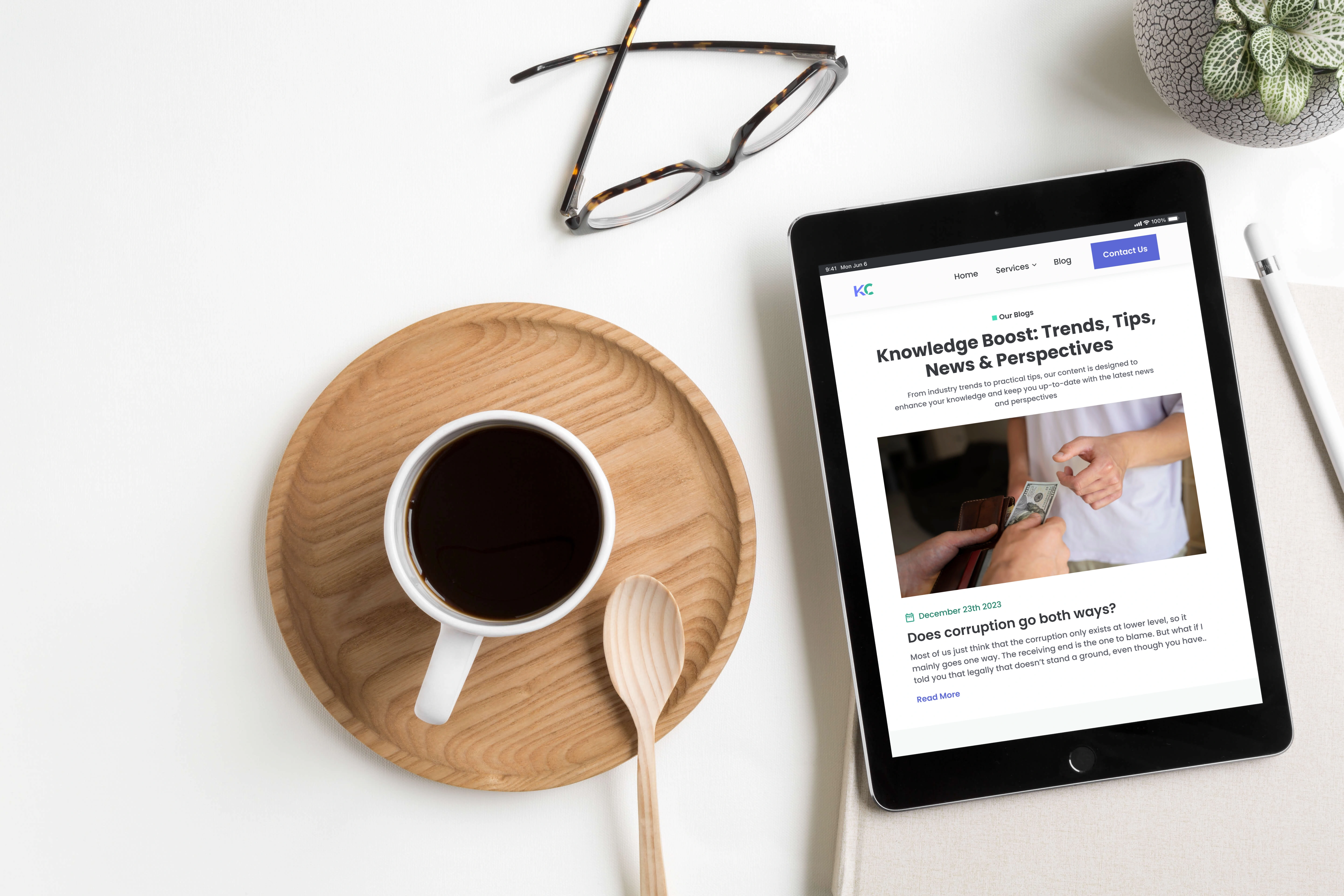
Kaymakci Consulting Blog Page

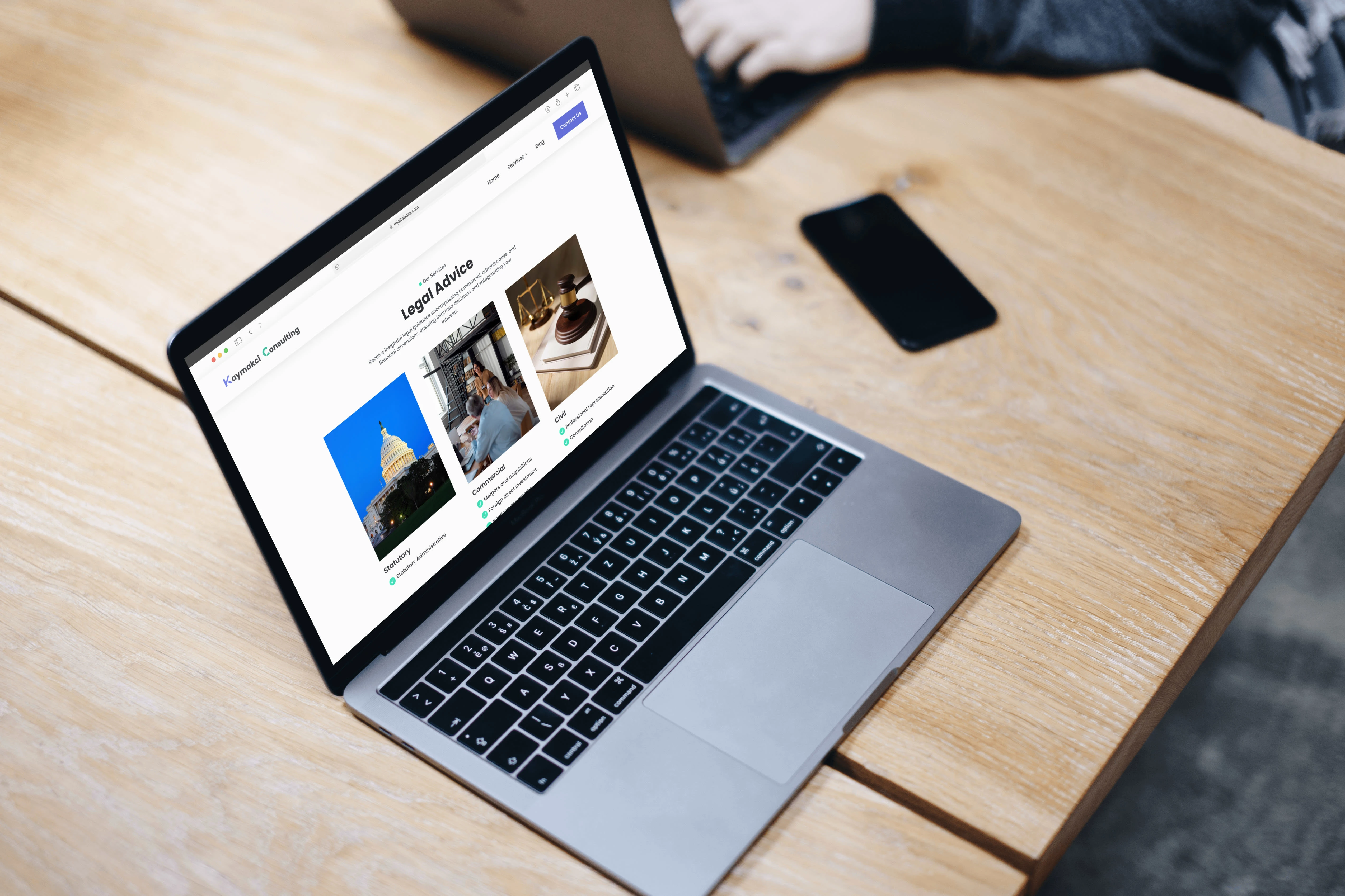
Kajmakci Consulting Services Breakdown on Homepage
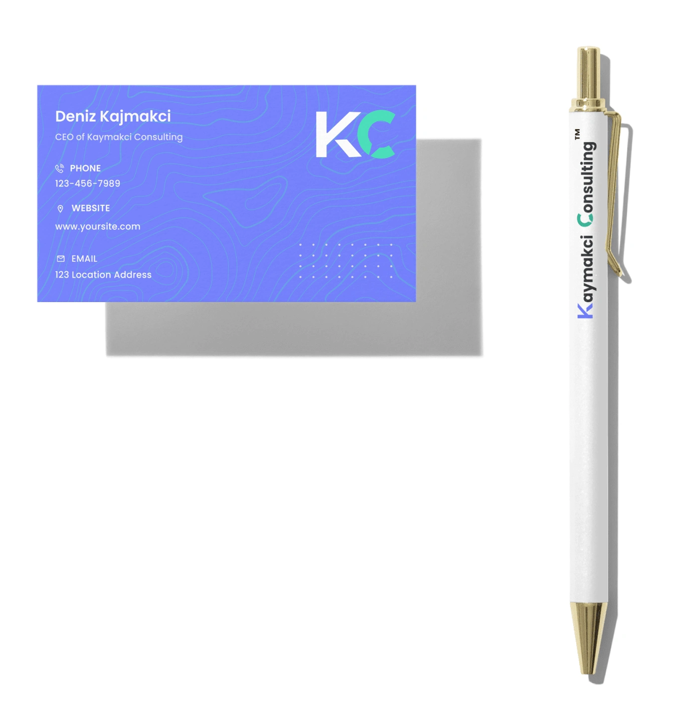
Revised logo to match the website color system - Full Logo & Wordmark
❇️ Project Outcomes
Successfully navigated the constraints to deliver a user-friendly design within the specified time frame.
Demonstrated adaptability and resourcefulness in the absence of a dedicated user research budget.
Prioritized critical design elements to ensure a streamlined and cohesive end product.
❇️ Project Status
🔨 Under construction but meanwhile you can view the hi-fi prototype here 😊
✴️ Project Takeaways
Adaptability: Navigating constraints requires adaptability and the ability to make strategic decisions swiftly.
Resourcefulness: Utilizing available resources, whether data or internal research, is crucial in the absence of dedicated budgets.
Collaboration: Internal collaboration proved valuable for quick validation and feedback
🤩 Impressed? Want me to build a website for you?
📊 Stats for a similar project
✦ Timeline: ~1-4 weeks
✦ Budget: $2,000+
✦ Number of components: 30+
✦ Deliverables: Research, Full Responsive Web , Branding / Design System & Logo
Like this project
Posted Jan 22, 2024
Revamping Kaymakci Consulting's online vibe with a chic redesign. Think smooth navigation, eye-catching visuals, and smart content.
Likes
0
Views
51

