Responsive Web Design for a Nursing Company in Switzerland 🇨🇭

Spitex Final Responsive Designs

Table of content
Table of content❇️ Project Overview✦ About the client: Spitex Plus24 gmbH🚫 The Problem: Non-responsive and outdated design is impacting service bookings❇️ The Solution: A platform that is accessible, user-friendly, easy to navigate, and responsive across all devices❇️ The Process: Defining our project goals & business constraints + user research summary❇️ Main Changes after Hi-fi Usability Study❇️ Extensible Design System❇️ Project Mockups❇️ Key Takeaways - What I learned❇️ Next Steps: Recommendations for Future Features🤩 Impressed? Want me to build a website for you? 📊 Stats for a similar project✦ Timeline: ~1-4 weeks✦ Budget: $2,000+✦ Number of components: 30+✦ Deliverables: Research, Full Responsive Web , Branding / Design System & Logo💖 Click to book a service here or book a 15 min call with me here 💖
❇️ Project Overview
✦ About the client: Spitex Plus24 gmbH
Spitex Plus24 gmbH is a home nursing provider that serves elderly citizens in Switzerland. They provide tailored care and support to their clients in the convenience of their homes.
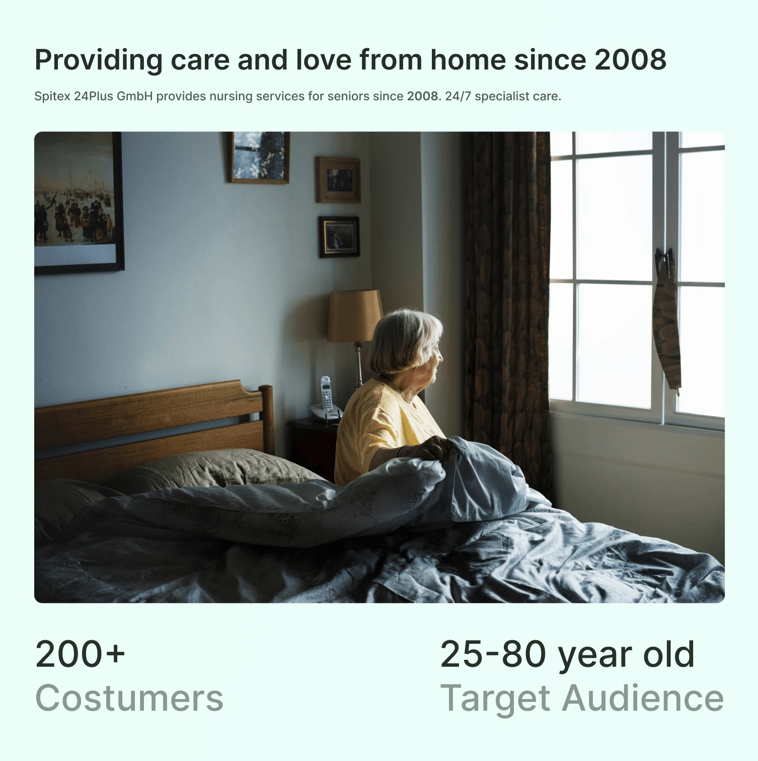
About Client
I was assigned to revamp their website, which was outdated. I took charge of creating a comprehensive set of responsive web designs and also developed a scalable design system. Furthermore, I closely collaborated with a front-end engineer to ensure that the design was implemented seamlessly.
🚫 The Problem: Non-responsive and outdated design is impacting service bookings
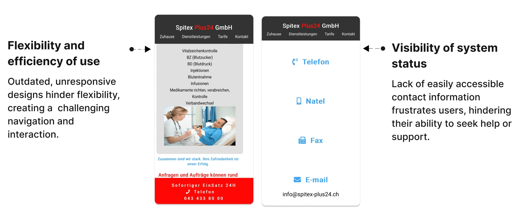
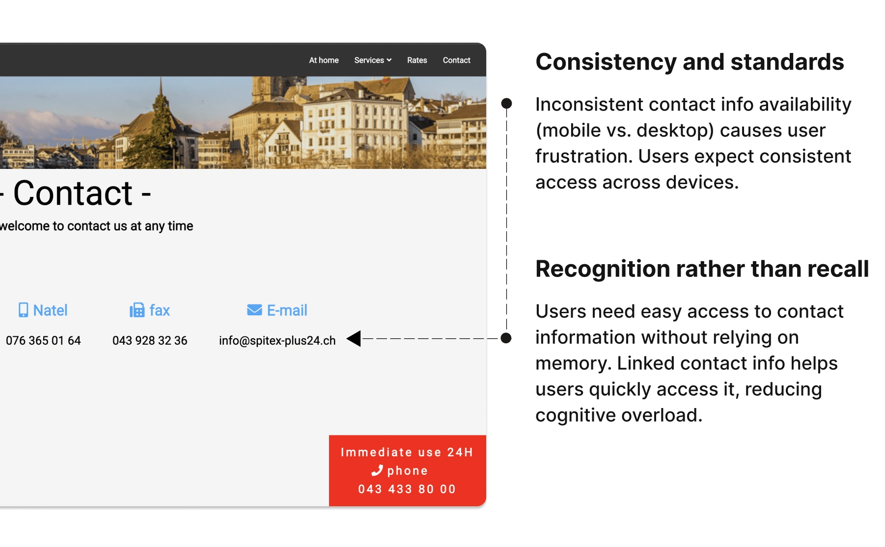
After conducting a heuristic evaluation of Spitex's website, I gathered some key issues that majorly affected the usability of the website:
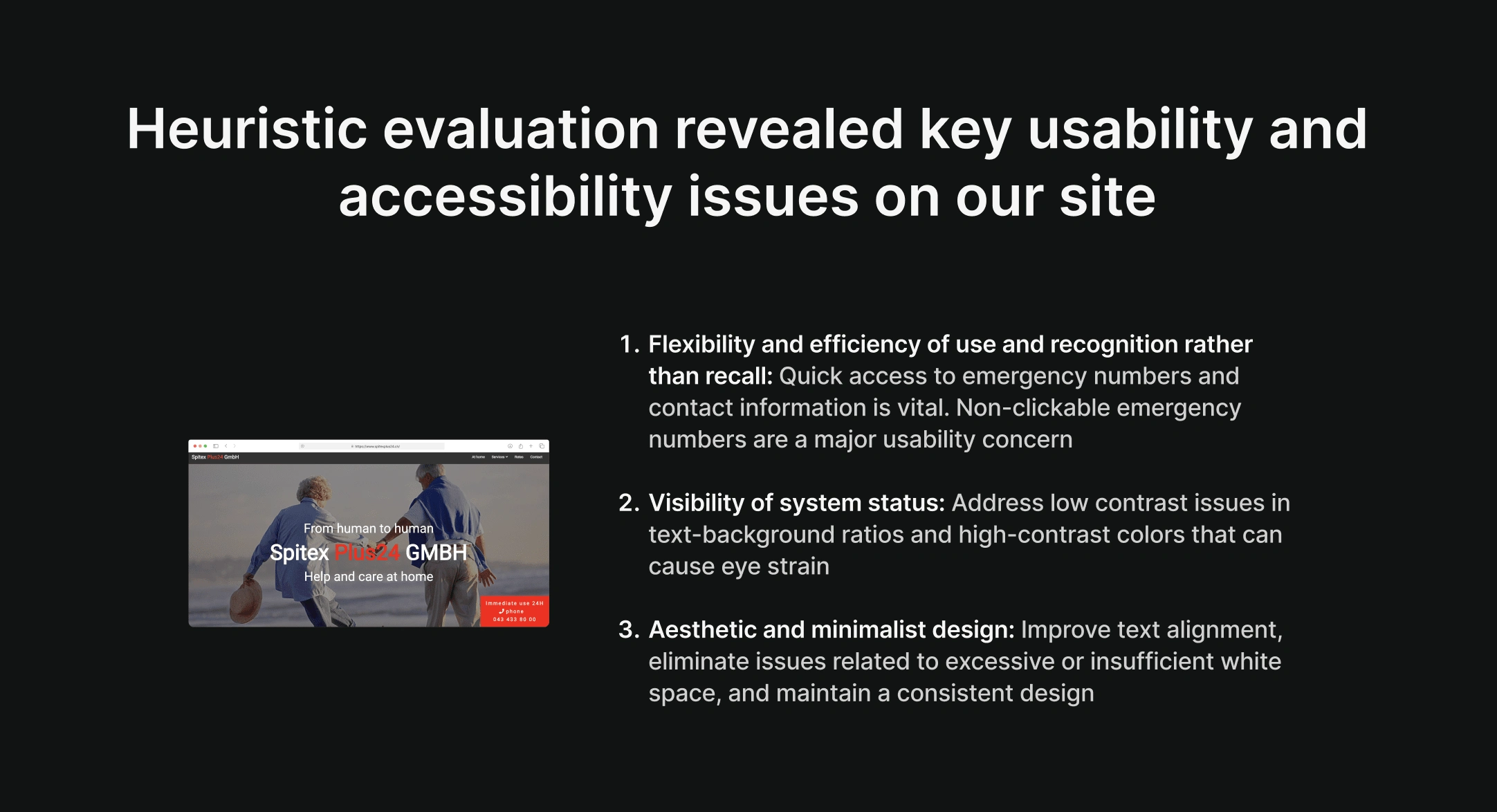
Key Usability & Accessibility issues on Spitex Plus 24 GmbH's site
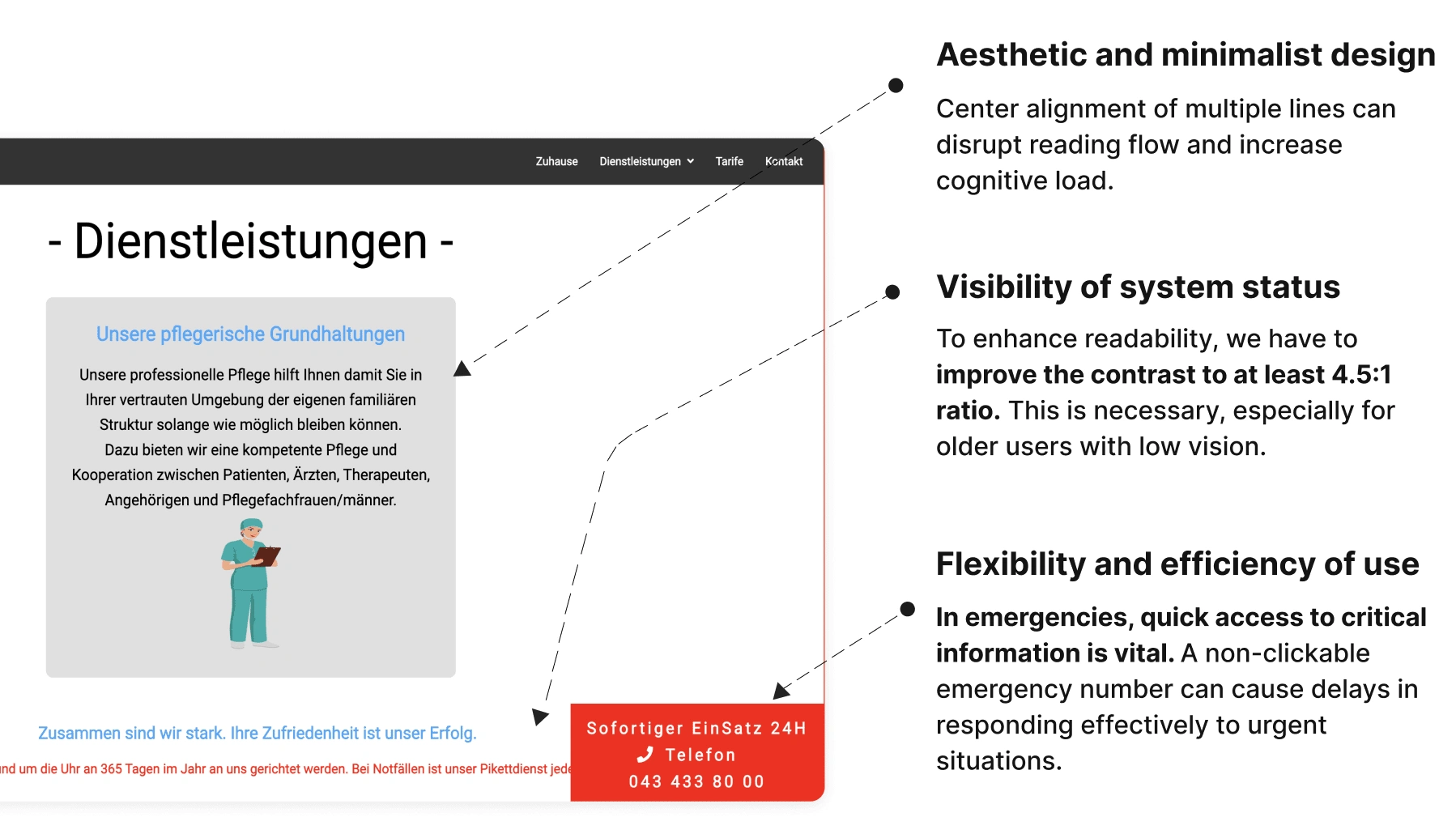
Heuristic Analysis 01
Heuristic Analysis 02
Heuristic Analysis 03
❇️ The Solution: A platform that is accessible, user-friendly, easy to navigate, and responsive across all devices
Ensured its responsiveness on all devices, aiming to provide users with easy access to information and seamless navigation
Fixed the inconsistencies in the design elements and color contrast by implementing a scalable design system that follows the WCAG guidelines
Created an about us page to show social proof and boost credibility & a contact form to allow users to easily contact Spitex Plus24 gmbH without leaving their browser
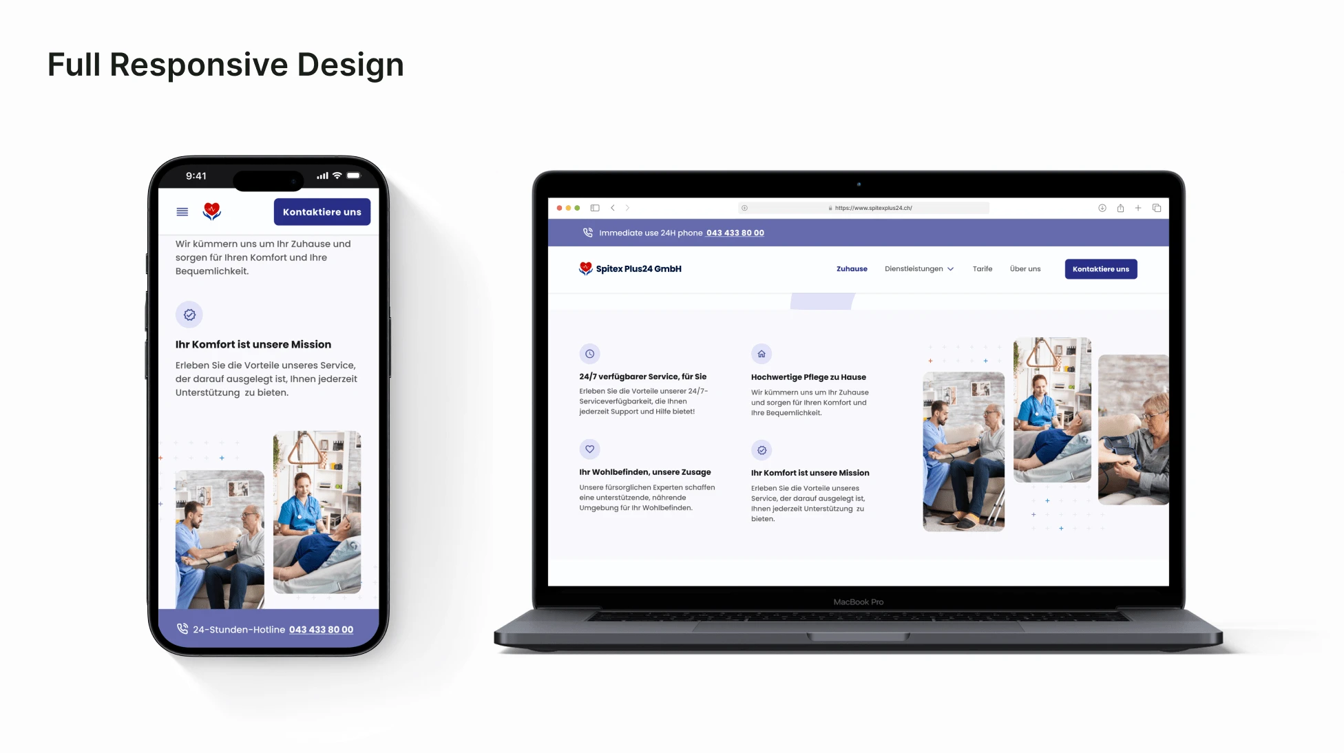
Responsive Design Screens
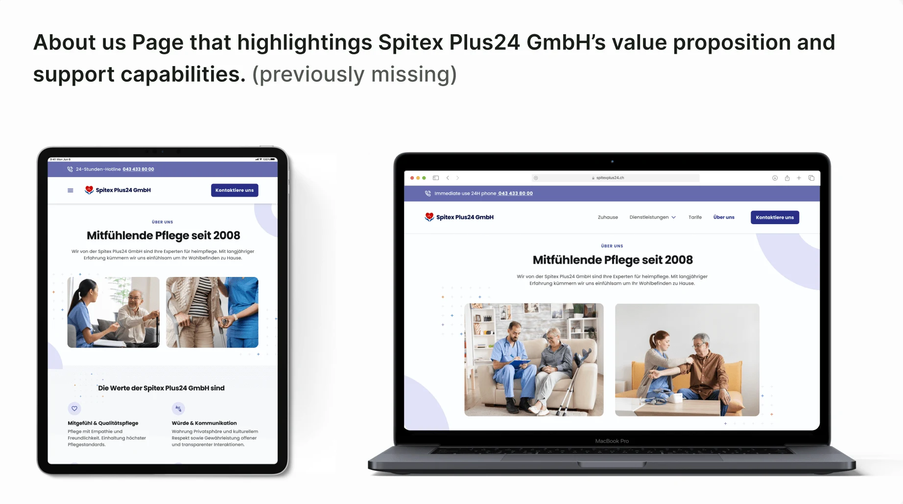
About Us Page Responsive View
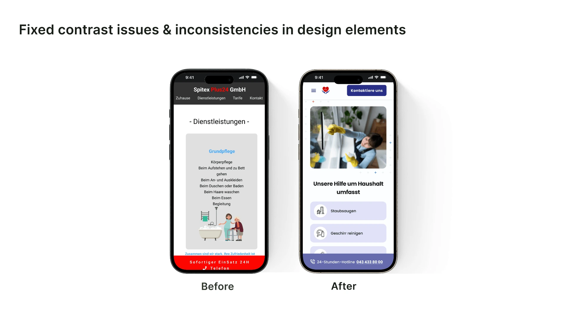
Before / After screens on how I fixed issues & inconsistencies in design elements
❇️ The Process: Defining our project goals & business constraints + user research summary

"How did we achieve the desired goal?" photo alongside our desktop view mockup
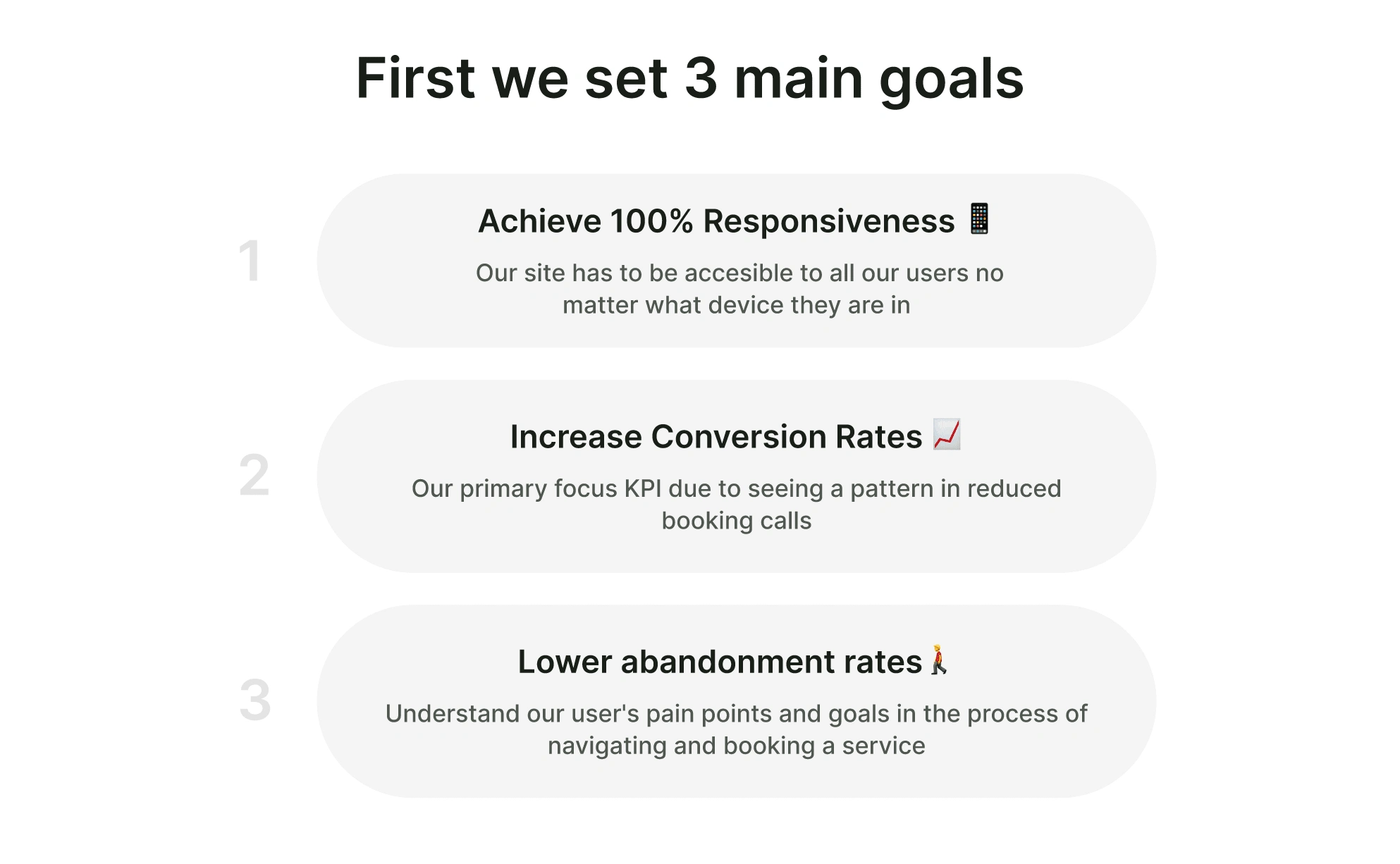
3 Main Project Goals

3 Business Constraints

The company lacked previous user research
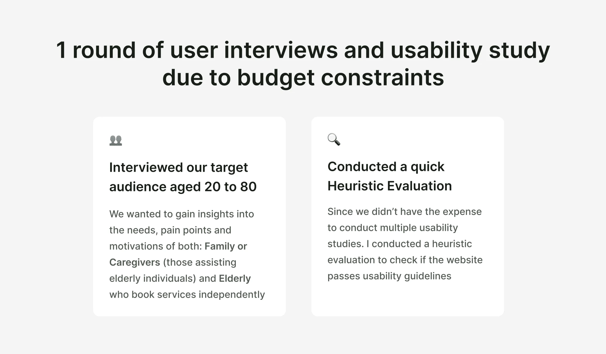
1 round of Usability Study due to budget constraints
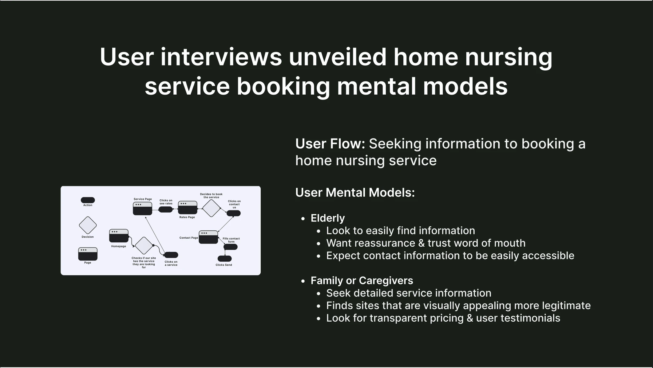
User Interviews unveiled user mental modals

Themes & Insights gathered from the usability study
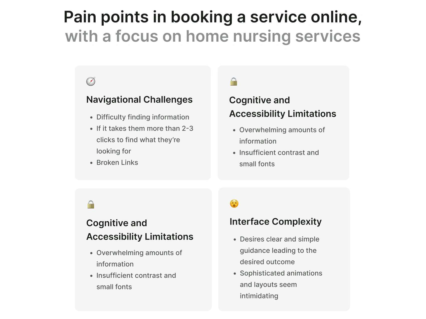
User Pain Points based on the usability study
❇️ Main Changes after Hi-fi Usability Study
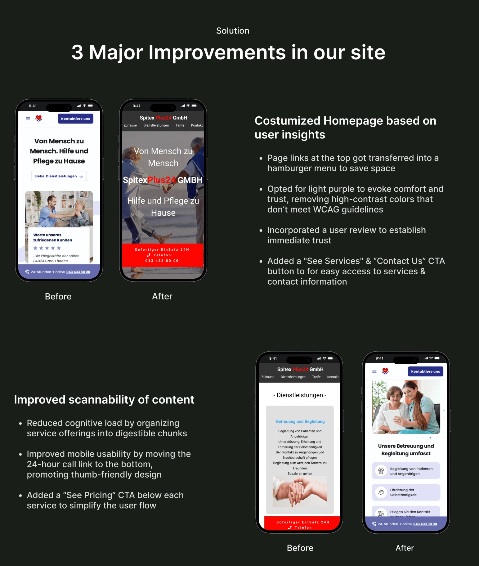
Design Improvement based on usability study- 2/3
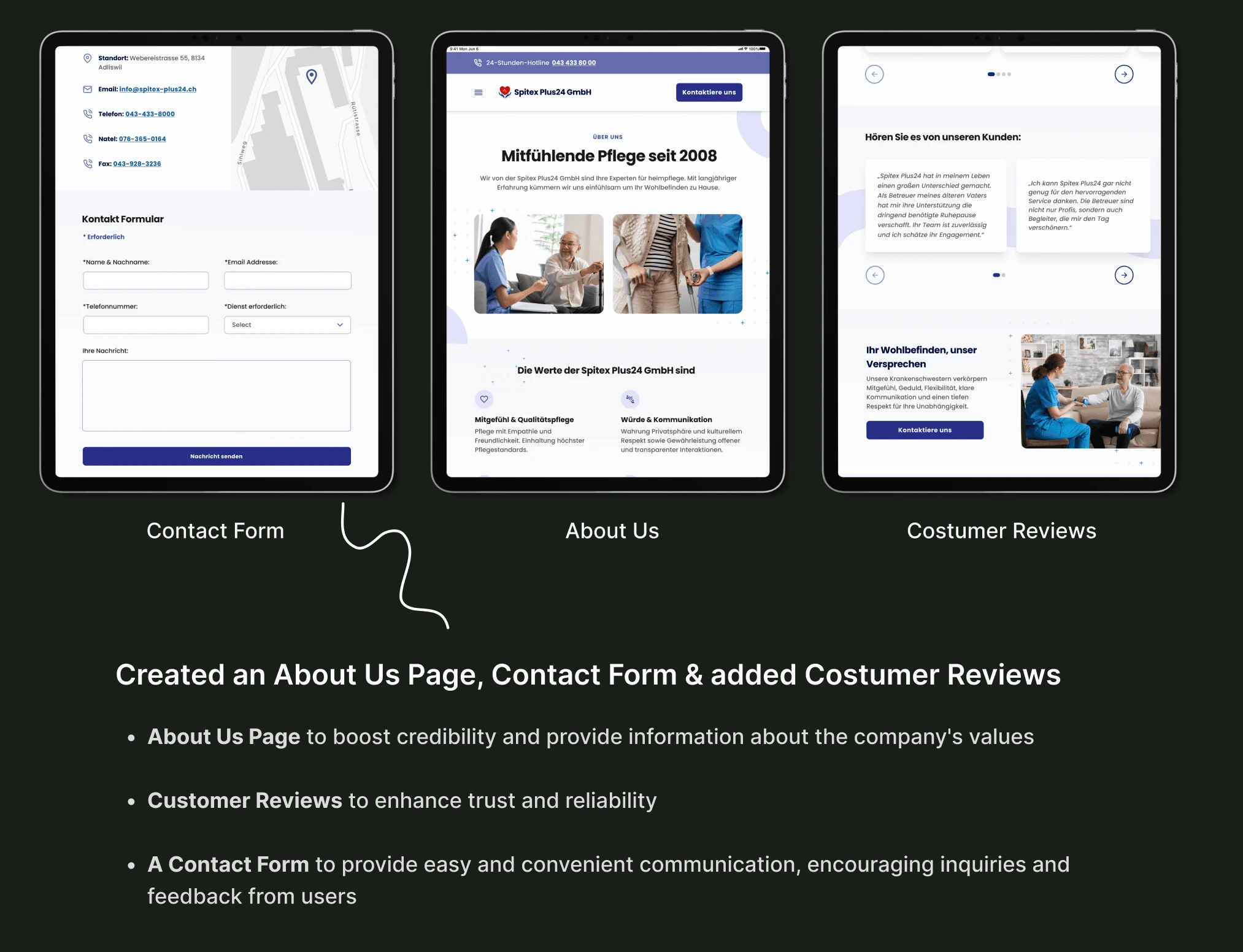
Design Improvements based on usability study - 3/3
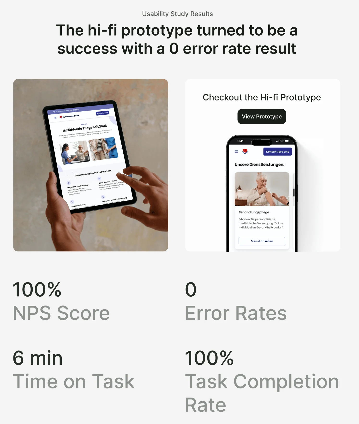
The hi-fi prototype turned out to be a result with 0 error rates
❇️ Extensible Design System
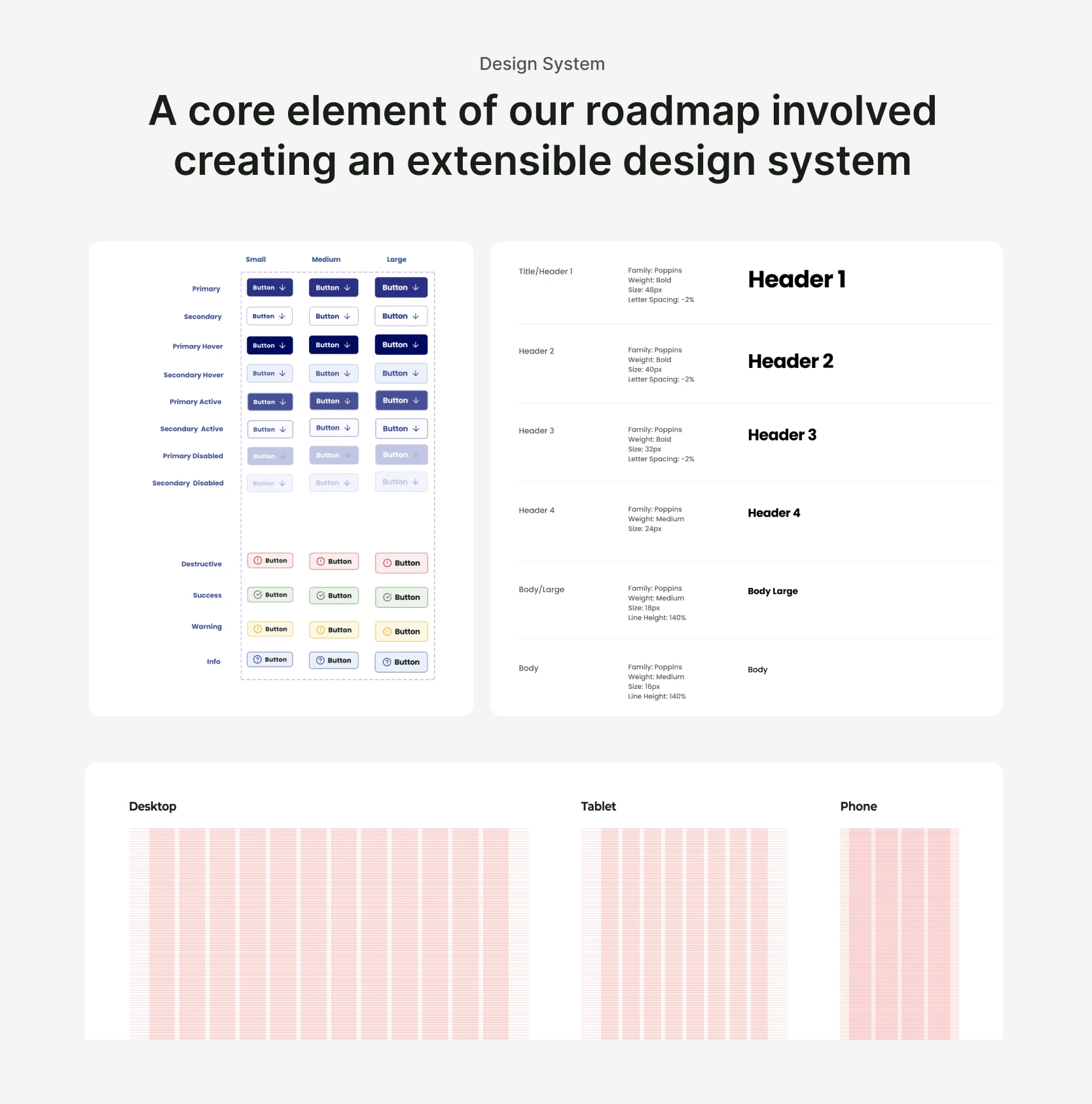
Spitex Design System
❇️ Project Mockups

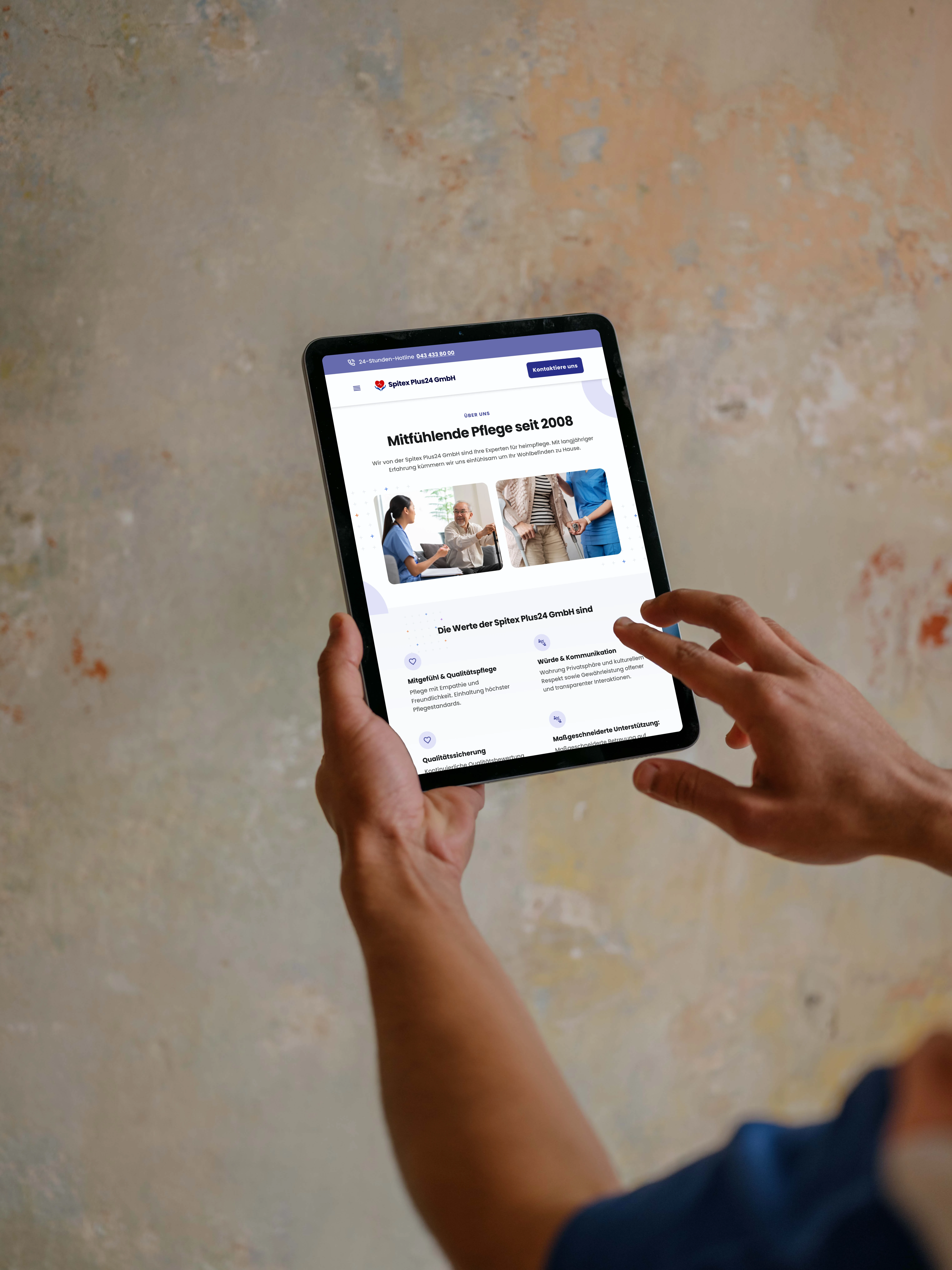


Spitex Final Responsive Designs
❇️ Key Takeaways - What I learned
Keep iterating and listening to your users and you'll find the right answer
Strong teamwork = Successful product - Engaging and collaborating with the stakeholders and the front-end engineer helped shape the final product and highlighted the significance of effective communication and teamwork in delivering successful design solutions.
❇️ Next Steps: Recommendations for Future Features
Text Enlargement and Contrast Enhancement: Considering the diverse range of users and their varying visual capabilities, it would be beneficial to incorporate a feature that allows users to enlarge text and adjust contrast. This would ensure that the content remains easily readable for individuals with visual impairments or those who prefer larger text sizes, improving overall accessibility and inclusivity.
🤩 Impressed? Want me to build a website for you?
📊 Stats for a similar project
✦ Timeline: ~1-4 weeks
✦ Budget: $2,000+
✦ Number of components: 30+
✦ Deliverables: Research, Full Responsive Web , Branding / Design System & Logo
-
Like this project
Posted Jan 24, 2024
Seamlessly merging style, function, and user feedback to create a digital space that stands out from competitors.
Likes
0
Views
68


