Brand Identity & Mascot System for Community Minds

Mya Nguyen


01 The brief
Community Minds is a New York mental wellness practice built by community members, for their community. It offers psychiatry and therapy, online and in person, seven days a week, and it believes compassionate care is a fundamental right, not a privilege.
For many people, the hardest part of mental health care is the first step: finding a place that feels safe enough to reach out. Most brands in the category don’t help. They are either clinical and cold, or so soft they say nothing at all. Community Minds needed a brand credible enough for psychiatric care and insurance, and warm enough that someone on a hard day would still press “book.”
02 The direction
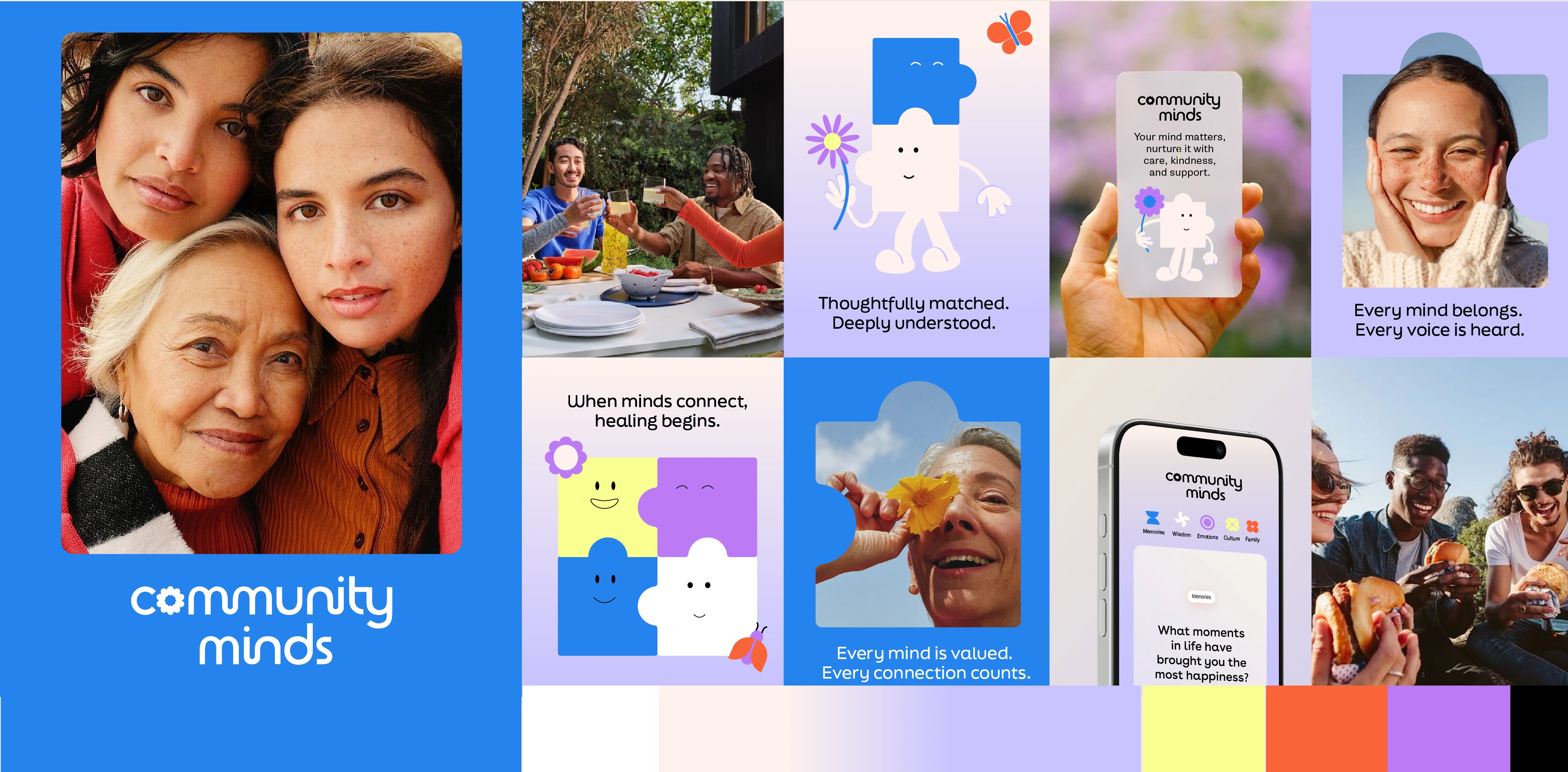
Before designing a single character, we built the world they would live in: real people in open air, faces turned to the sky, caught mid-laugh with the people they love. Soft gradients that move from morning light to lavender dusk. Bright accents of lemon and coral, like small good moments in an ordinary day. Hopeful, never forced.
03 The concept
Mental health has often been framed around fitting in: getting back to normal, smoothing out the edges. We turned that around. Your edges are what connect you to other people.
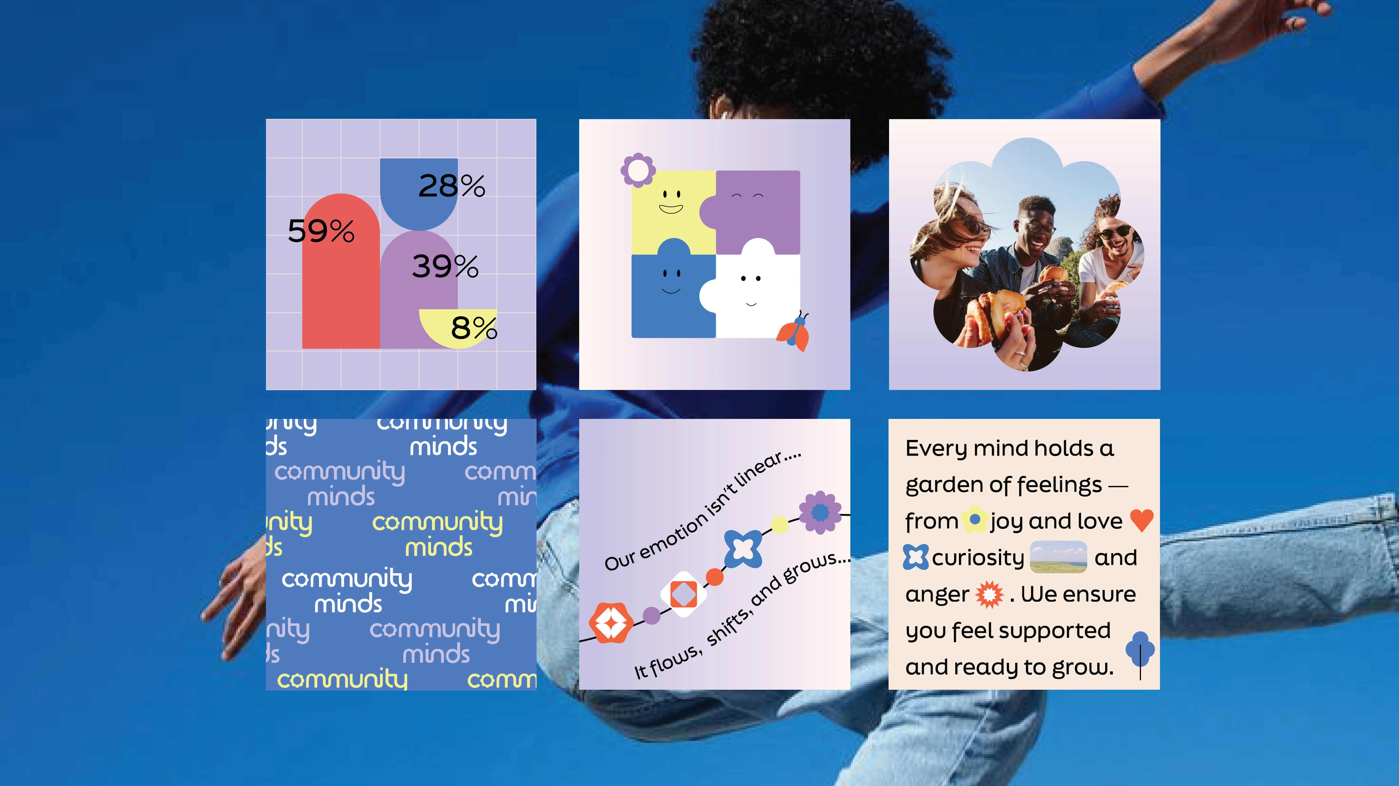
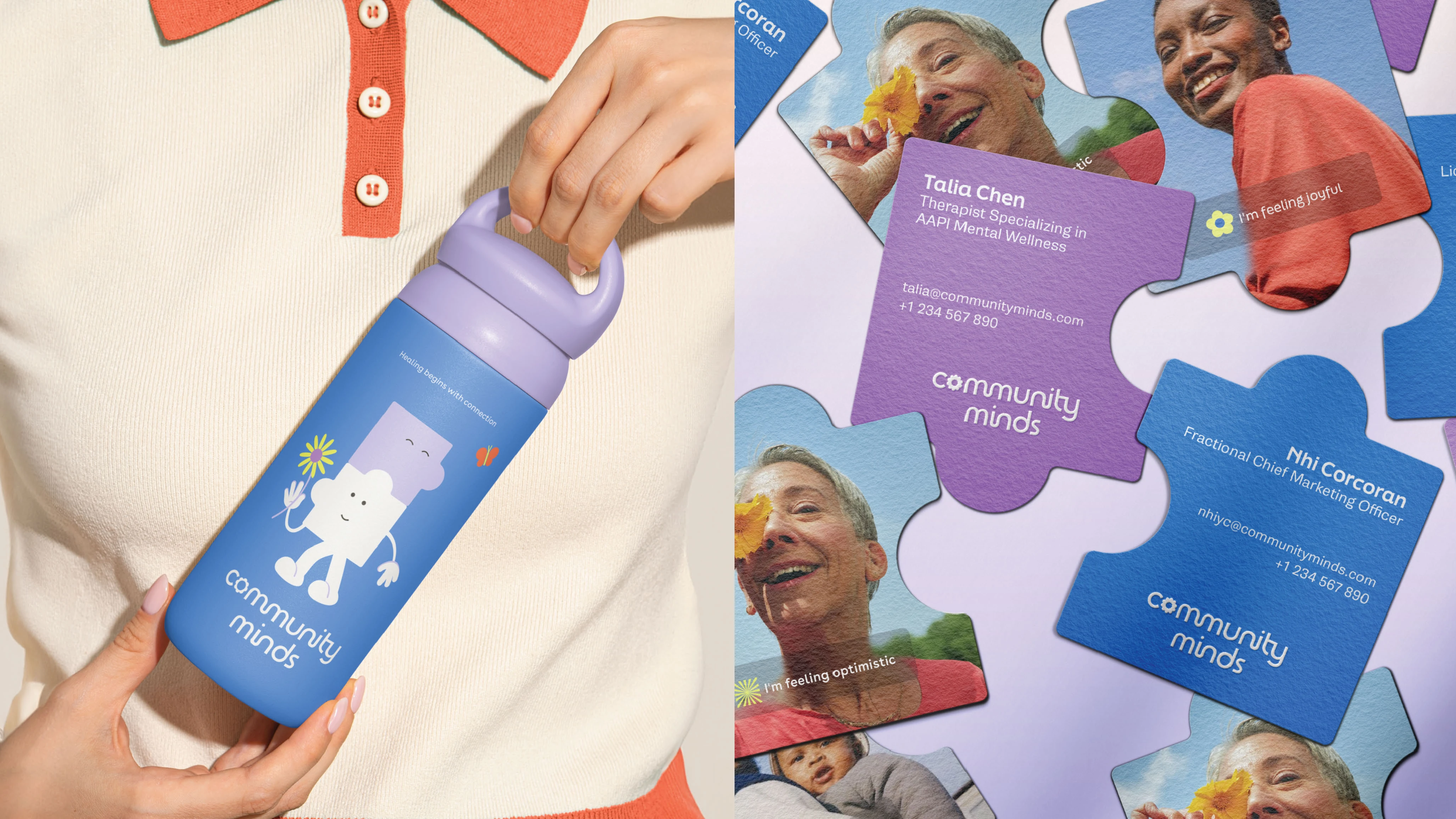
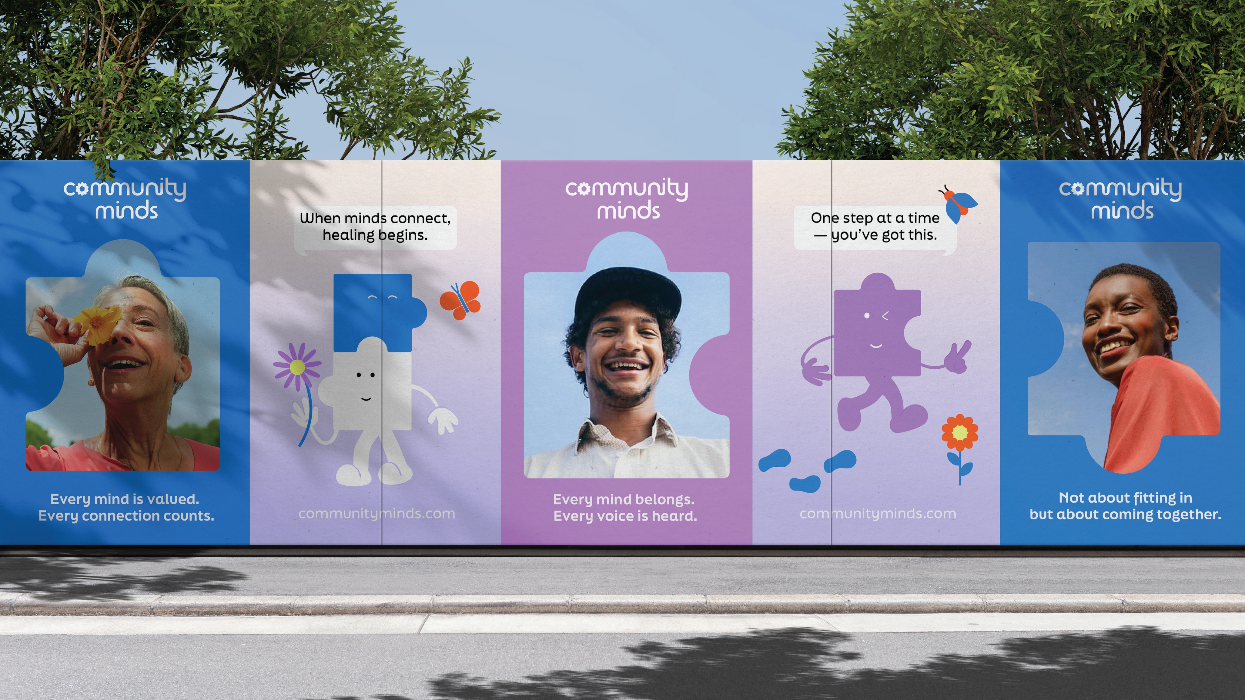
That became the line the whole brand stands on: not about fitting in, but about coming together. Every shape in the system, from the characters to the photo frames to the business cards, is a puzzle piece. Different on its own, complete together.
04 The identity
A rounded, friendly wordmark with one quiet detail: a flower blooming in the “o,” a small sign of growth at the heart of the name. The palette pairs a confident sky blue with lavender, lemon and coral, so the brand feels like a good day without pretending every day is one.
05 The mascots
We gave the brand a cast instead of a single logo character, because no single person represents a community.
A purple piece who winks, strolls and throws up a peace sign. A white piece and a blue piece that join to become one character, the brand idea in physical form. A yellow piece who stands still, hums and holds out a flower. Each one carries a different mood, so the brand can meet people on a joyful day and a heavy one.
The characters do what clinical language can’t: they make hard conversations feel approachable, without making them feel small.
06 The system
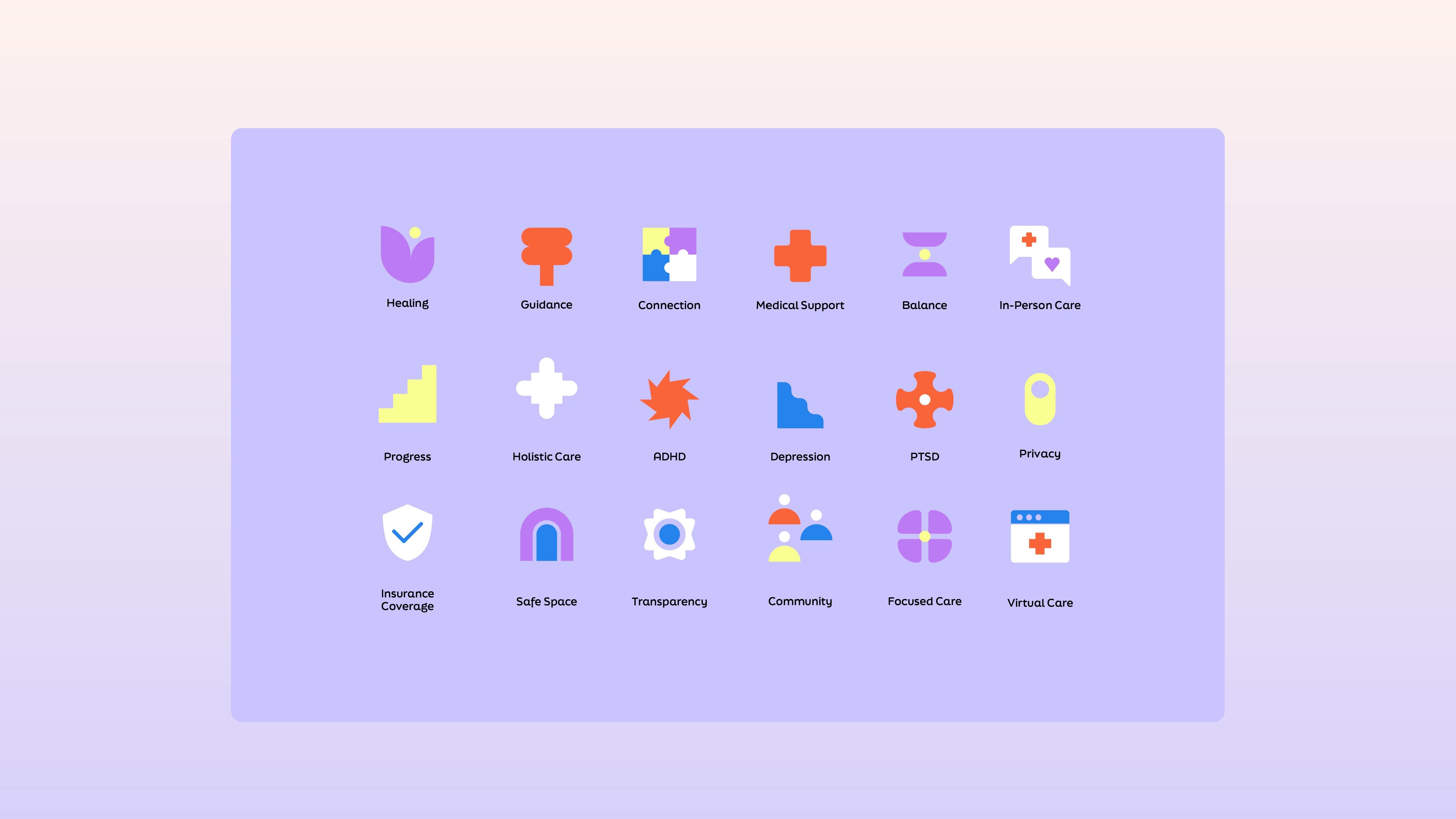
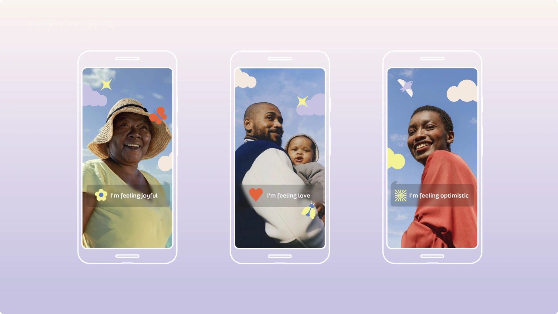
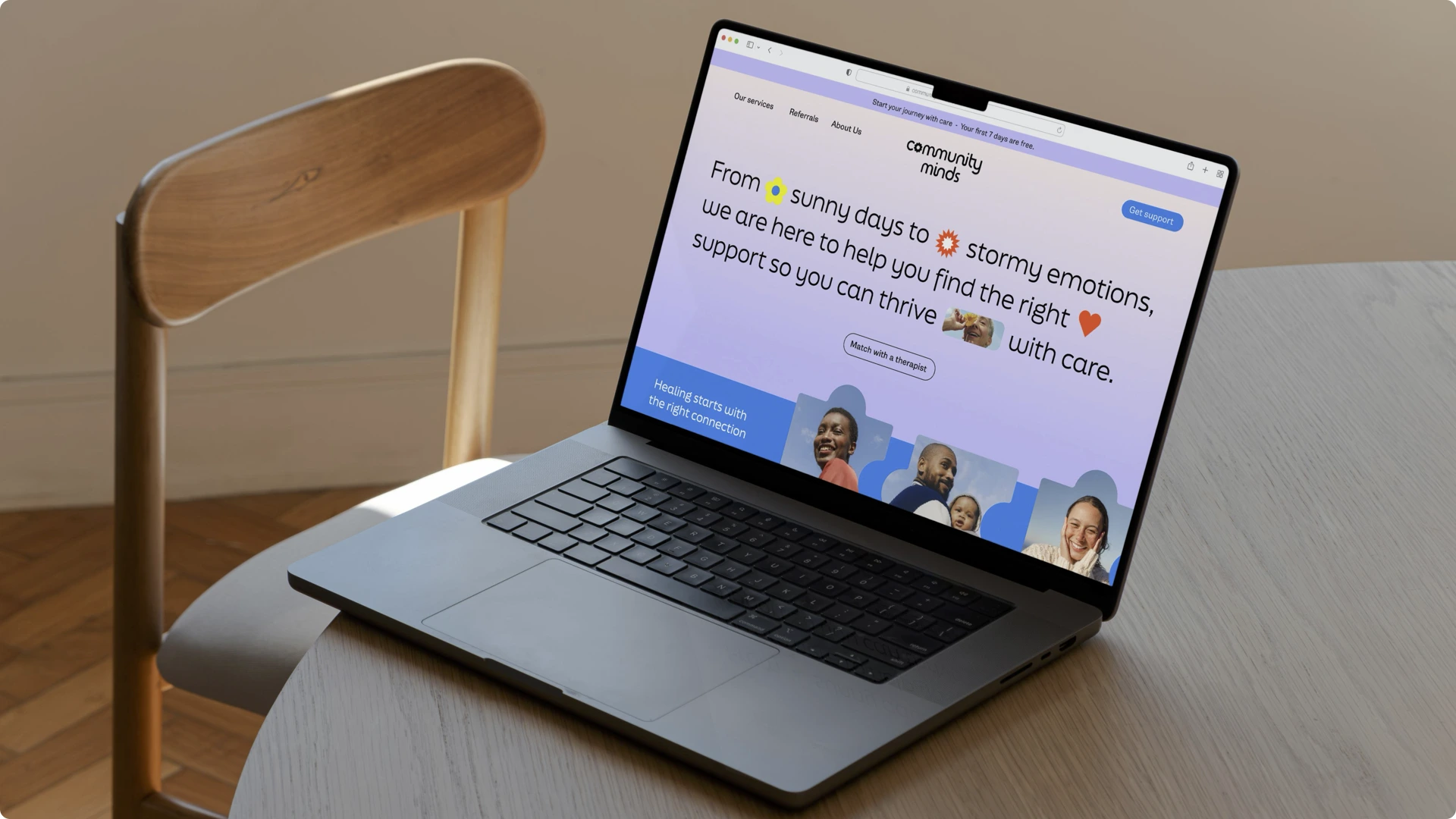
An icon set that names real needs plainly, from ADHD, PTSD and Depression to Insurance Coverage, In-Person Care and Virtual Care, because clarity is also a form of care. Photography cropped into puzzle-piece frames. Emotion-led social stories like “I’m feeling joyful” and “I’m feeling optimistic.” Street posters, puzzle-shaped business cards, merch and illustrations and assets for their website. One system that works on a phone screen, a city wall and in someone’s hand.
Credits
Creative Direction, Brand Strategy, Brand Identity, Mascot System, Iconography: Rare Eye (Mya Nguyen & team)
Client: Community Minds
Client Project Lead & CMO: Nhiyc
Tags: Brand Designer, Creative Director, Illustrator, Adobe Illustrator, Figma, Healthcare, Wellness
Like this project
Posted Oct 29, 2026
Brand identity and mascot system for Community Minds, a community-built NYC mental health practice. Four puzzle pieces, one idea: we all fit differently.

