Brand Identity & Packaging Design for Lion Pose

Mya Nguyen


01 The brief
Lion Pose is a skincare brand built for skin of color, founded by Madhu Punjabi and Nisha Phatak and developed with dermatologists who study the full range of skin tones. Its first product, Unspotted 4X, is a treatment serum for hyperpigmentation.
The category was full of brands adding "for dark skin" to a label and calling it inclusion. Lion Pose was doing the harder work in the lab. The packaging had to make that obvious from across a Sephora aisle.
Brand identity and award-winning packaging for Lion Pose, a science-backed skincare brand made for skin of color. Nine bottle concepts, three rounds, one orange icon. 2nd Place, Dieline Awards 2024.
02 The direction
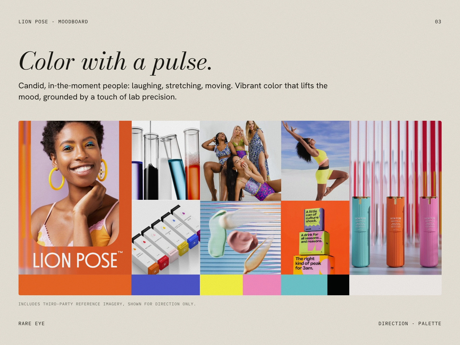
Before any bottle, we built the world it would live in: candid, energetic people caught laughing, stretching and moving, set against vibrant color that lifts the mood. A touch of lab precision keeps it grounded in the science. Color with a pulse.
03 The concept
Every brand has a hero. We gave Lion Pose a nemesis: Neutrality. Beige, muted, safe, and quietly saying that one kind of skin is the default.
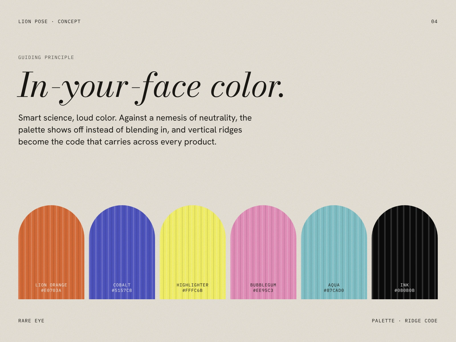
That set the guiding principle: in-your-face color. Smart science, loud palette, and a brand that shows off instead of blending in. Vertical ridges became the structural code, a texture that could carry across every future product in any color.
04 The identity
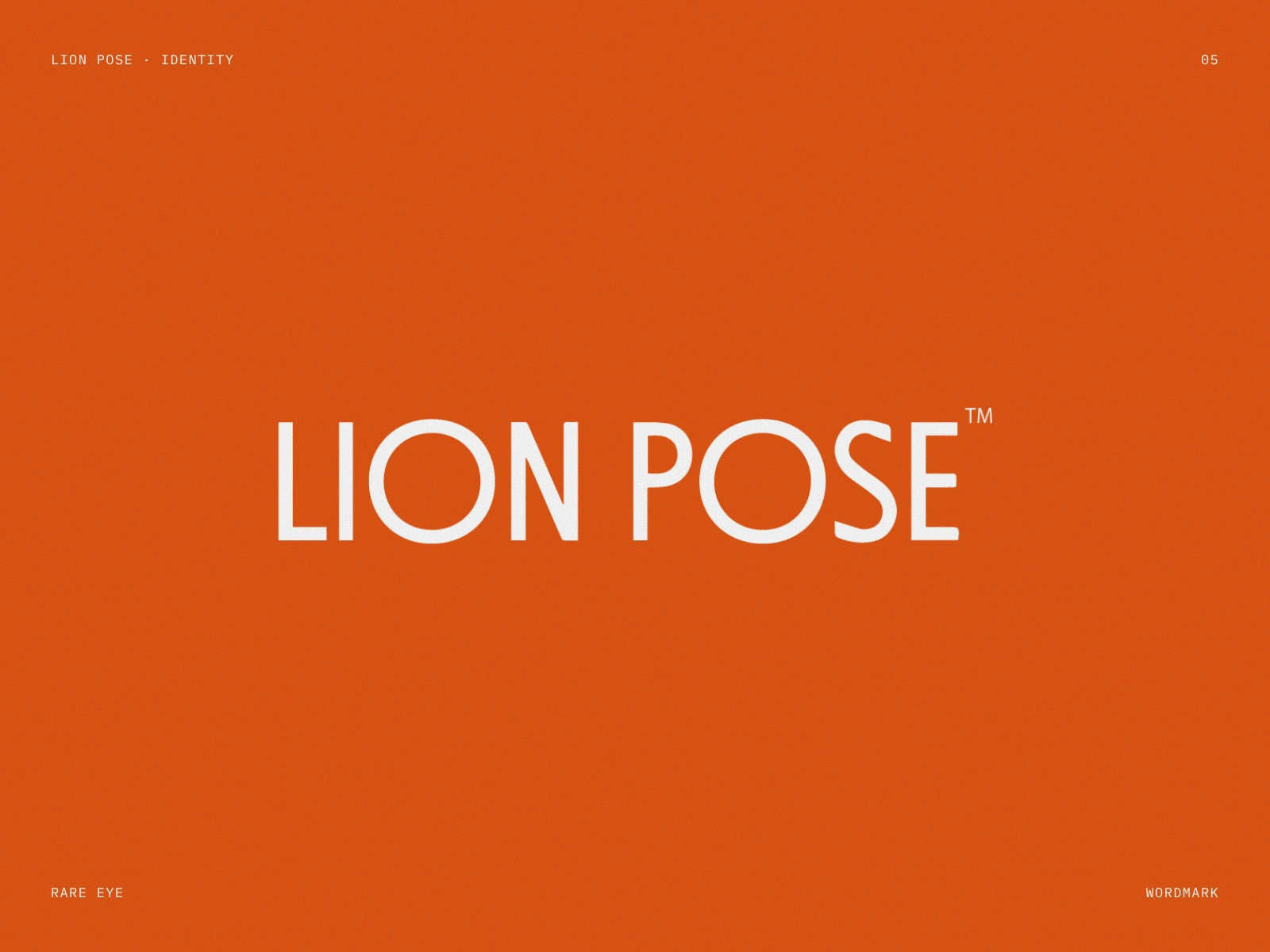
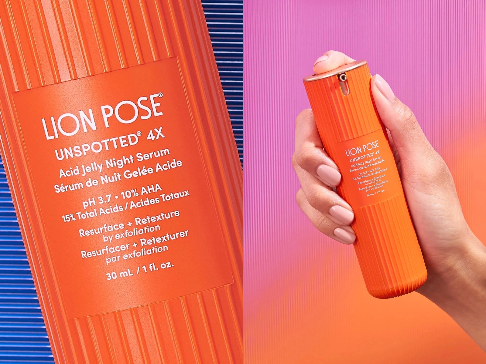
We designed the wordmark and the original identity system. A clean, tall wordmark that holds up at 30 mL and on a billboard, set in white against Lion Pose orange. Simple on purpose, so the bottle could be the loud one.
05 The packaging: three rounds, nine bottles
We didn’t arrive at the orange bottle on the first try, and we’d be suspicious of anyone who did.
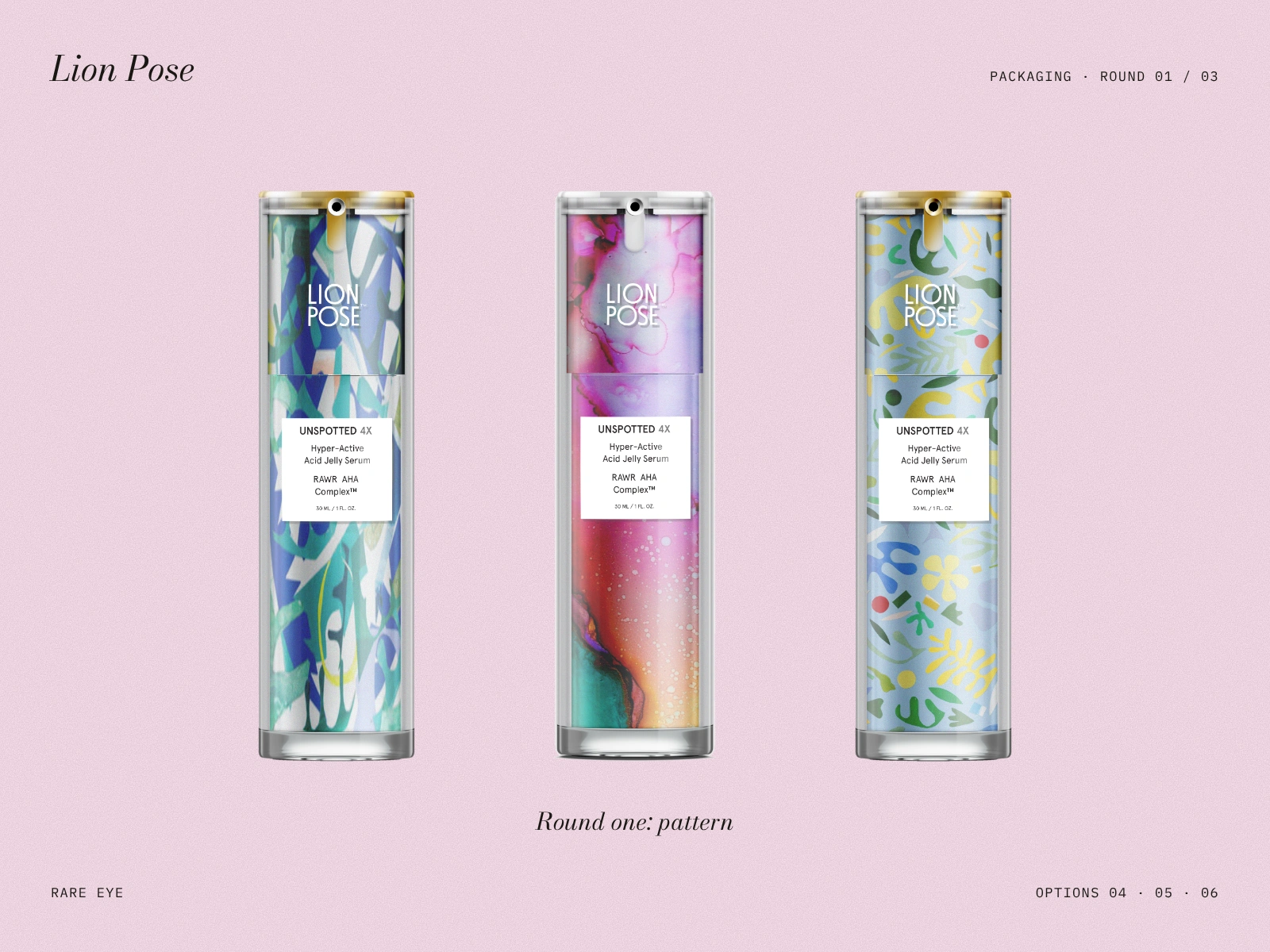
Round 1 explored pattern: painterly, botanical and marbled wraps on a clear outer shell. Beautiful, but the pattern was doing the talking and the brand was whispering.
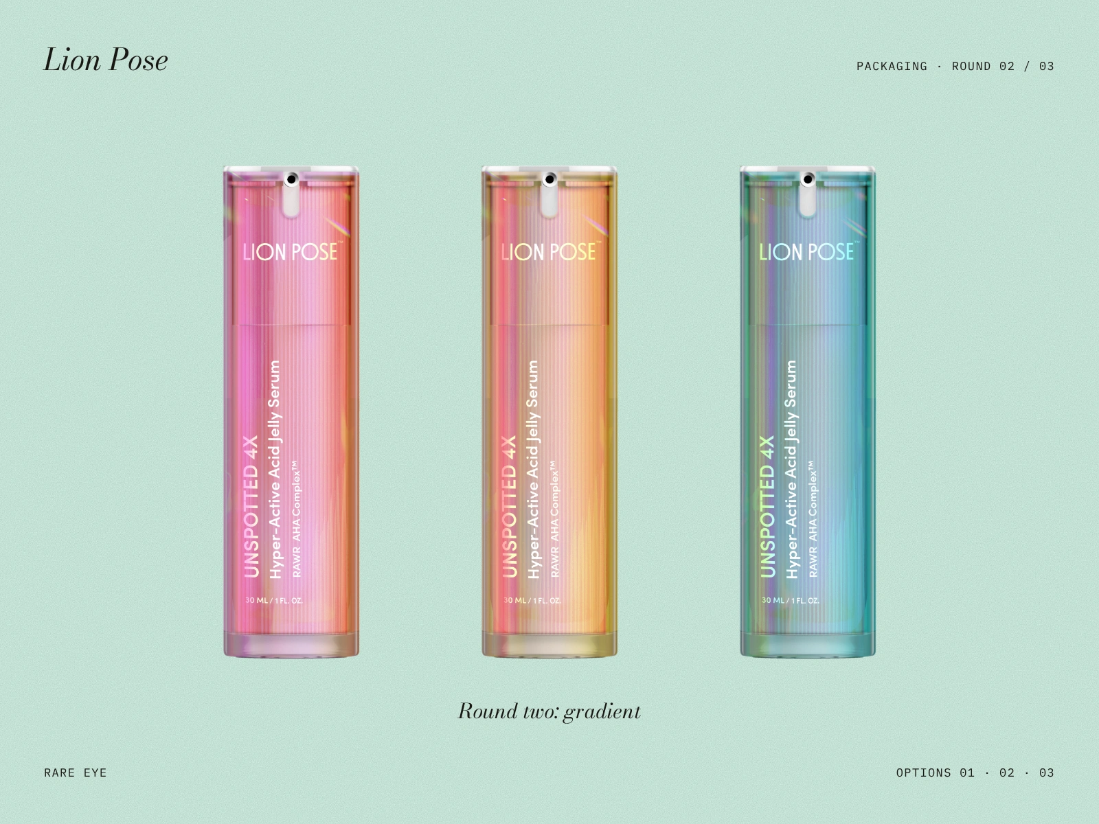
Round 2 moved into iridescent gradients with the product name running vertically. Closer. Energetic, but still more “beauty trend” than “brand.”
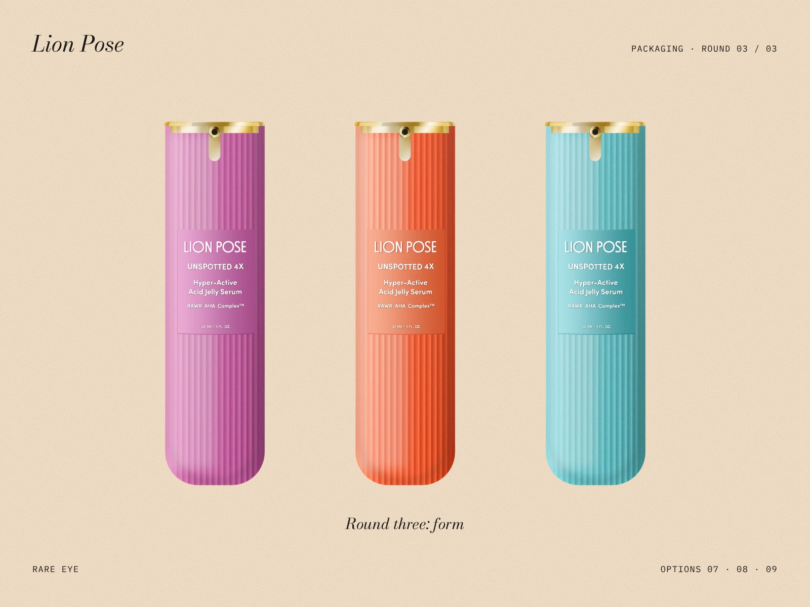
Round 3 stripped it back to a single color, a rounded base and the ridges from the concept. That’s where it clicked.
Why ridges
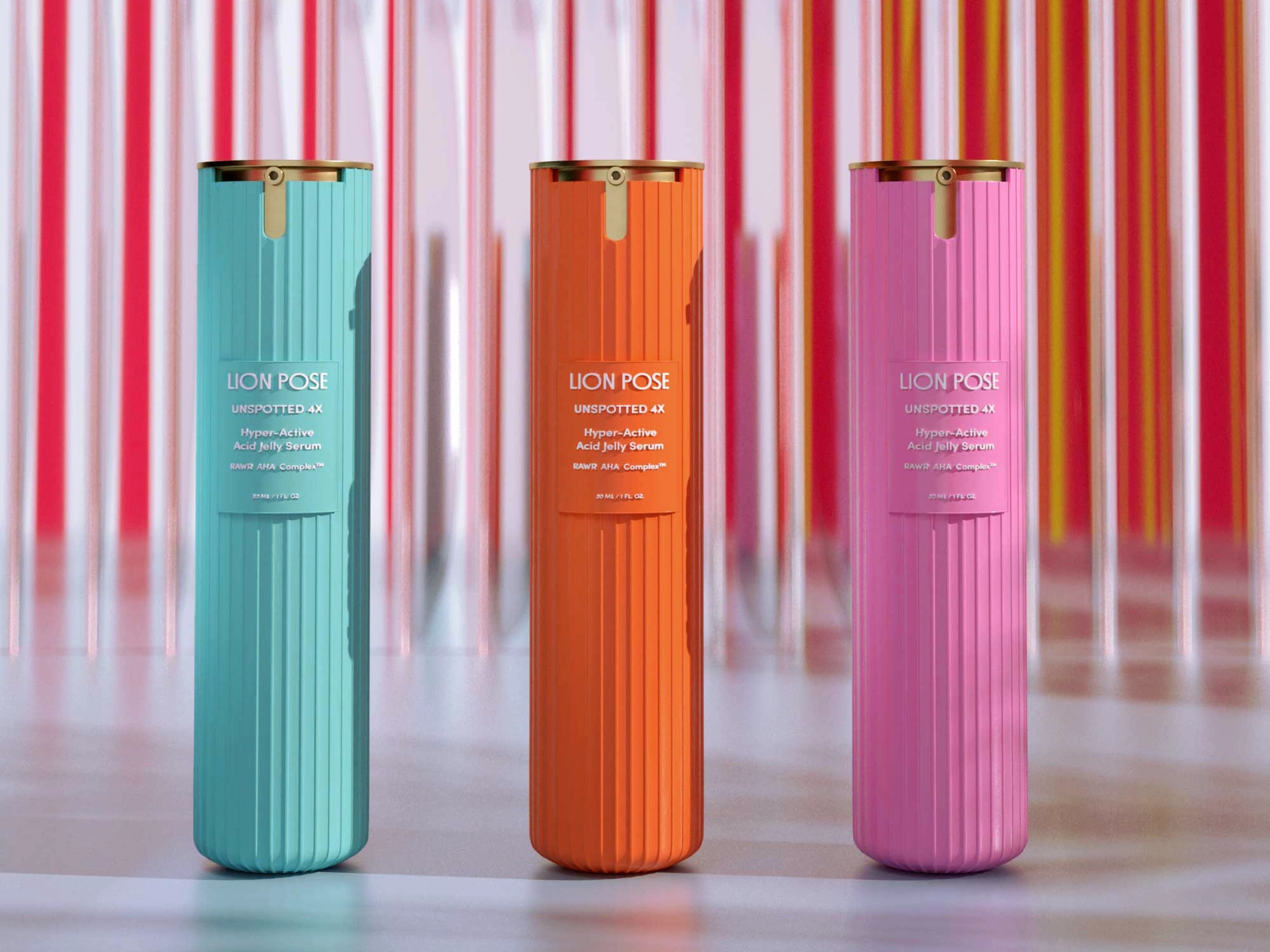
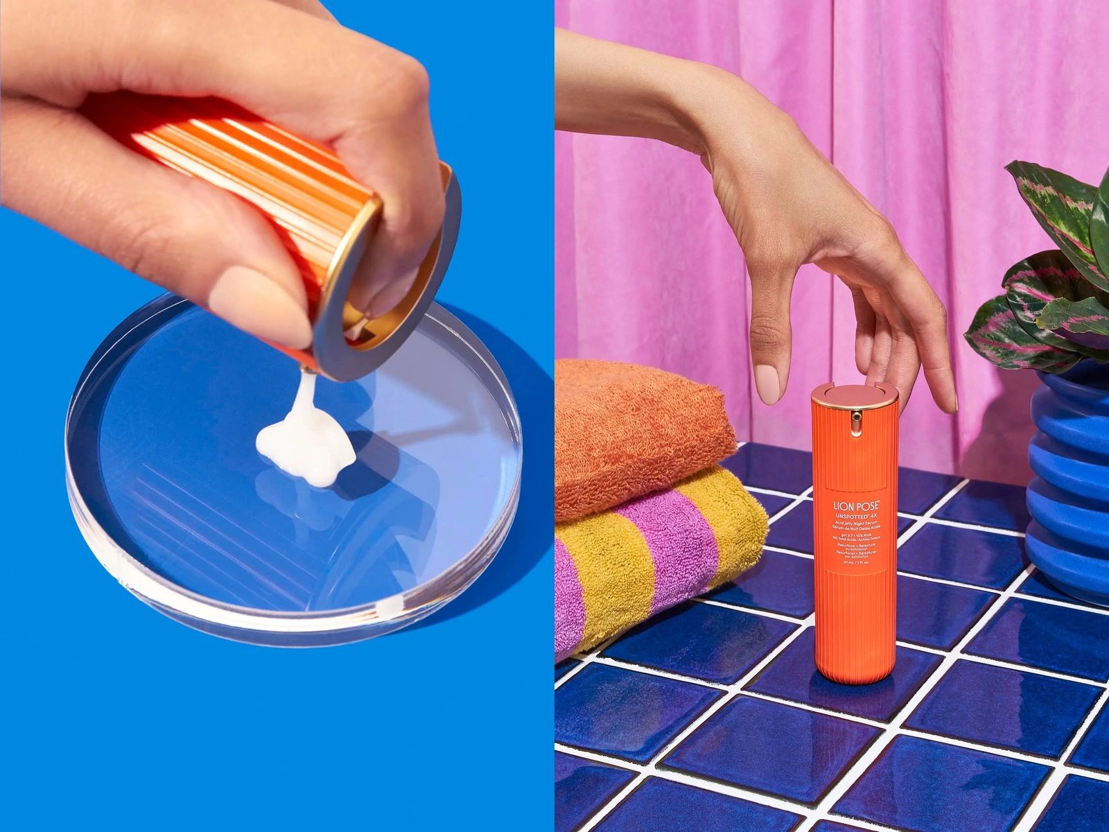
The ridges started as an architectural reference and ended up doing a lot of jobs. They catch light and pull the eye upward. They give the bottle grip when your hands are wet from washing your face. And they let the brand grow into new colors without losing its silhouette.
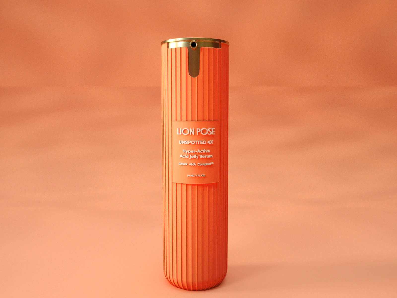
The rounded base sits in the palm. The gold cap and pump borrow a little from fine jewelry, so the brightness reads as confident rather than cheap.
From screen to factory
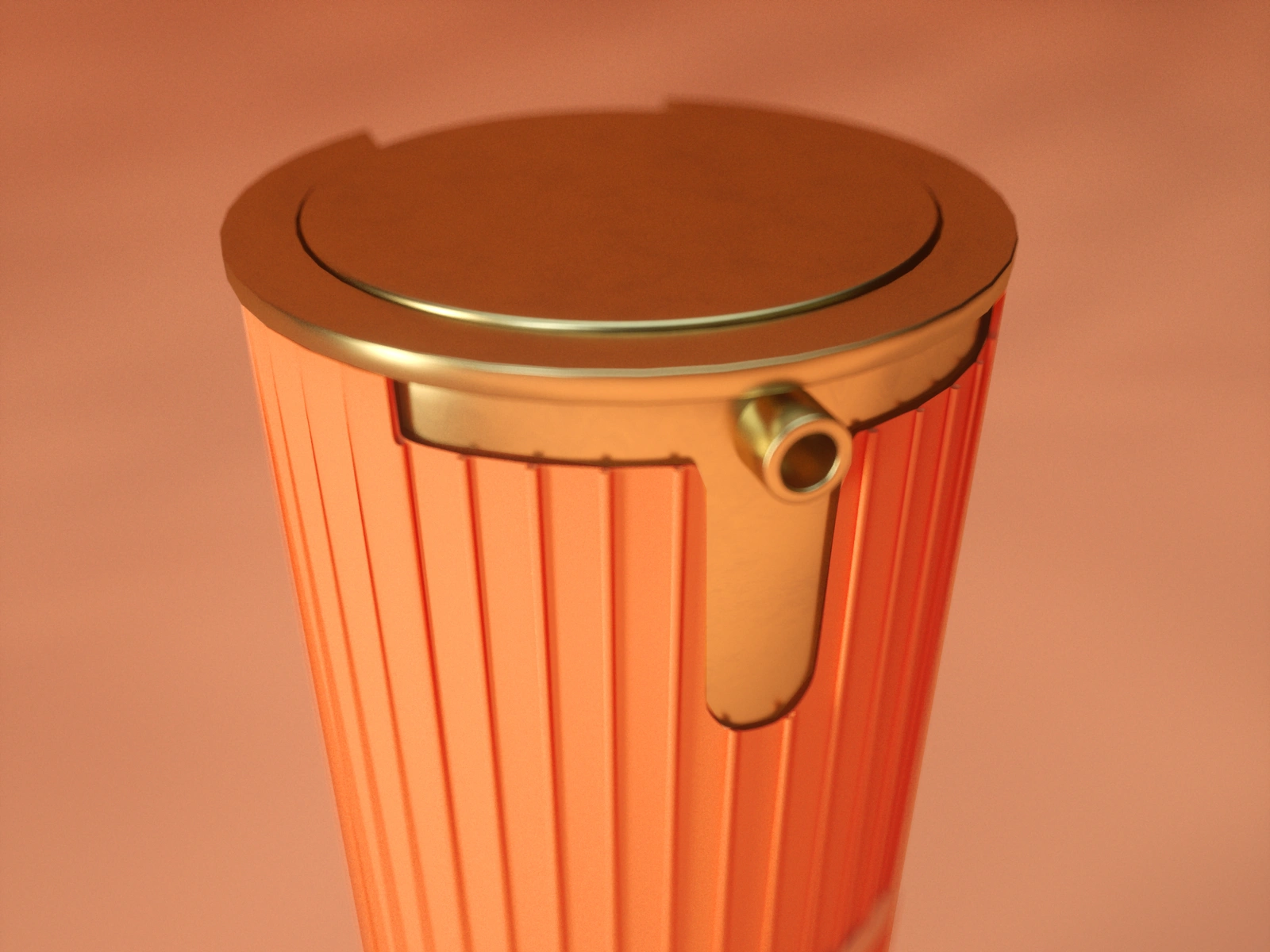
We built precise 3D renders to test proportions, ridge depth and the cap mechanism before anything was tooled. The renders became the shared language between the founders, us and the manufacturer, and we stayed on through production with detailed specs and support.
06 What happened next
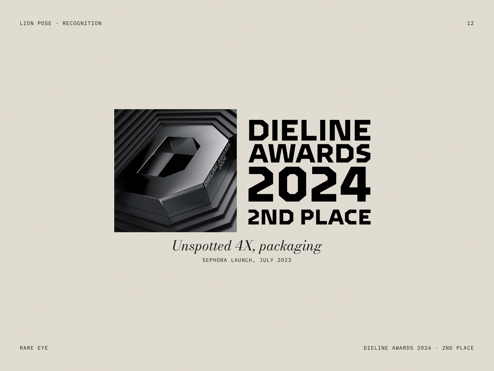
Lion Pose became a finalist in the Sephora Accelerate program and launched at Sephora in July 2023, with Mindy Kaling as brand ambassador. The packaging took 2nd Place at the Dieline Awards 2024.
Credits
Creative Direction, Logo & Original Brand Identity, Packaging Design: Rare Eye (Mya Nguyen)
Identity color refresh & Photography: Casa Gato
Brand Strategy: Kimberly Brizzolara
Client: Lion Pose (Madhu Punjabi, Nisha Phatak)
Like this project
Posted Oct 23, 2026
Brand identity and packaging for Lion Pose, skincare made for skin of color. Nine concepts, three rounds, one orange icon. 2nd Place, Dieline Awards 2024.
Likes
1
Views
9
Clients
Lion Pose

