
This is a personal project & I was not associated with Lenskart while working on this project.
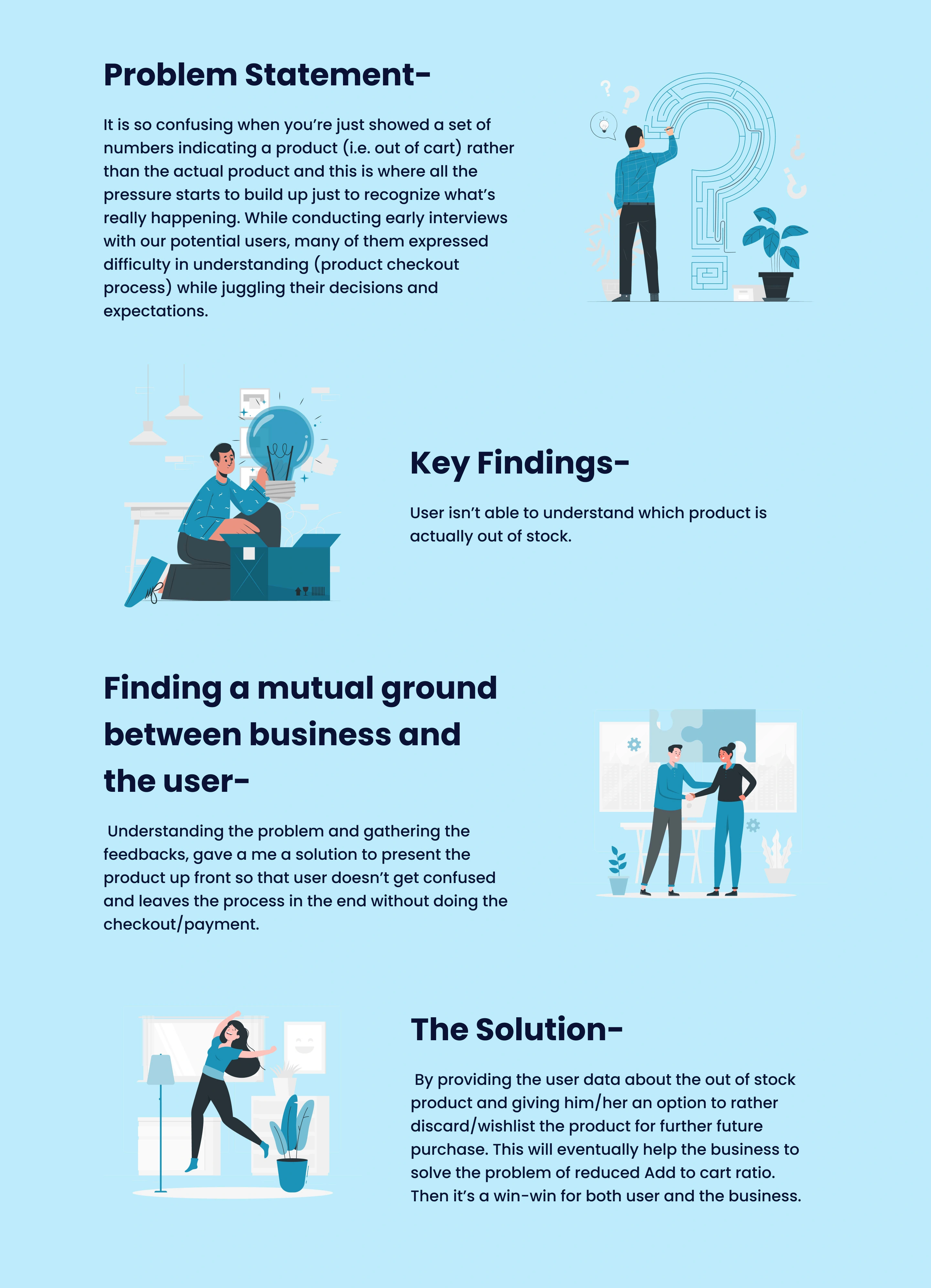
Fig 1- The Problem Statement, Key Findings & Solution
Wireframe
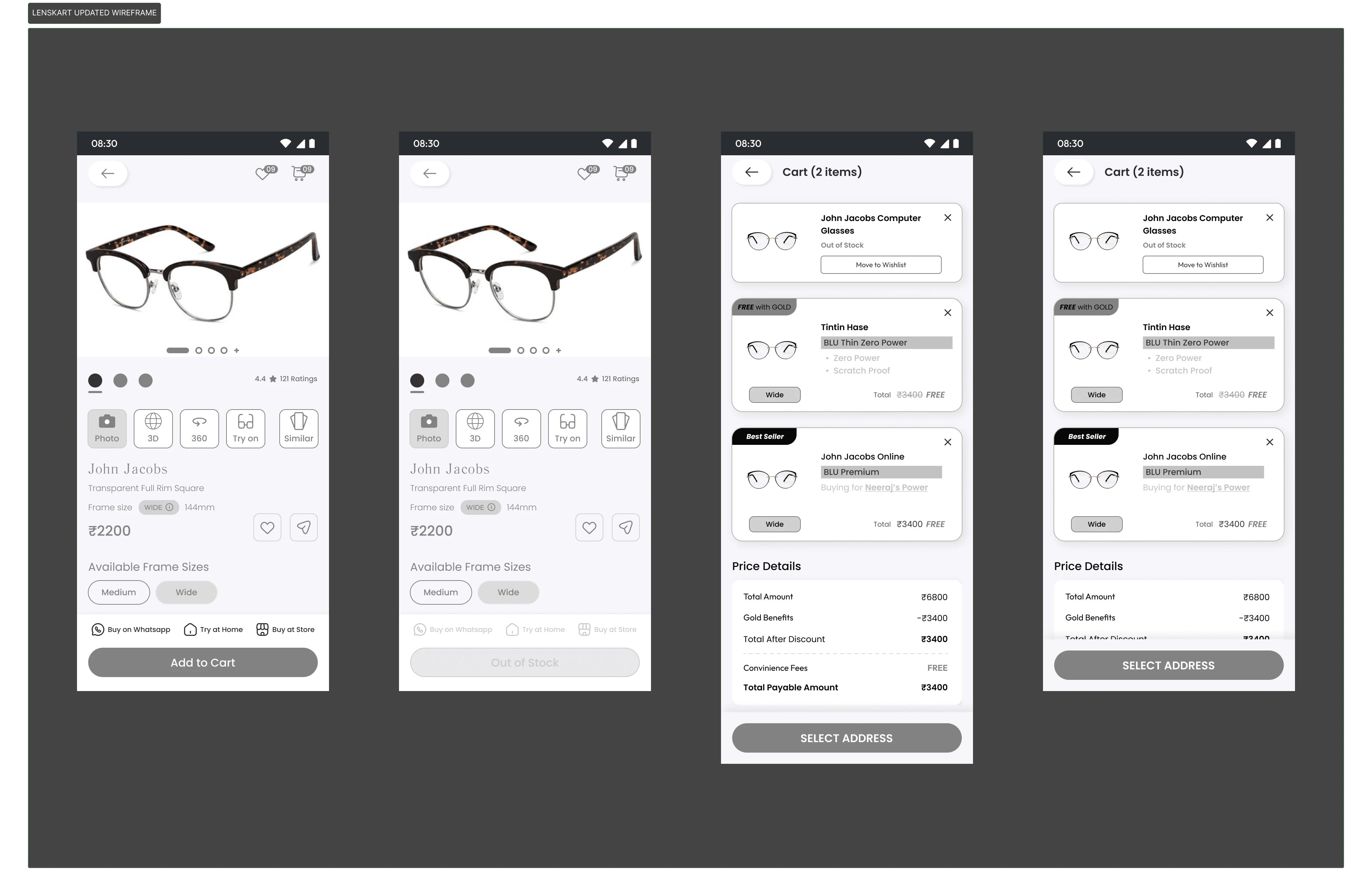
Fig 2- These Wireframes show the initial design updates I made during my research. (Image by Author)
Solution
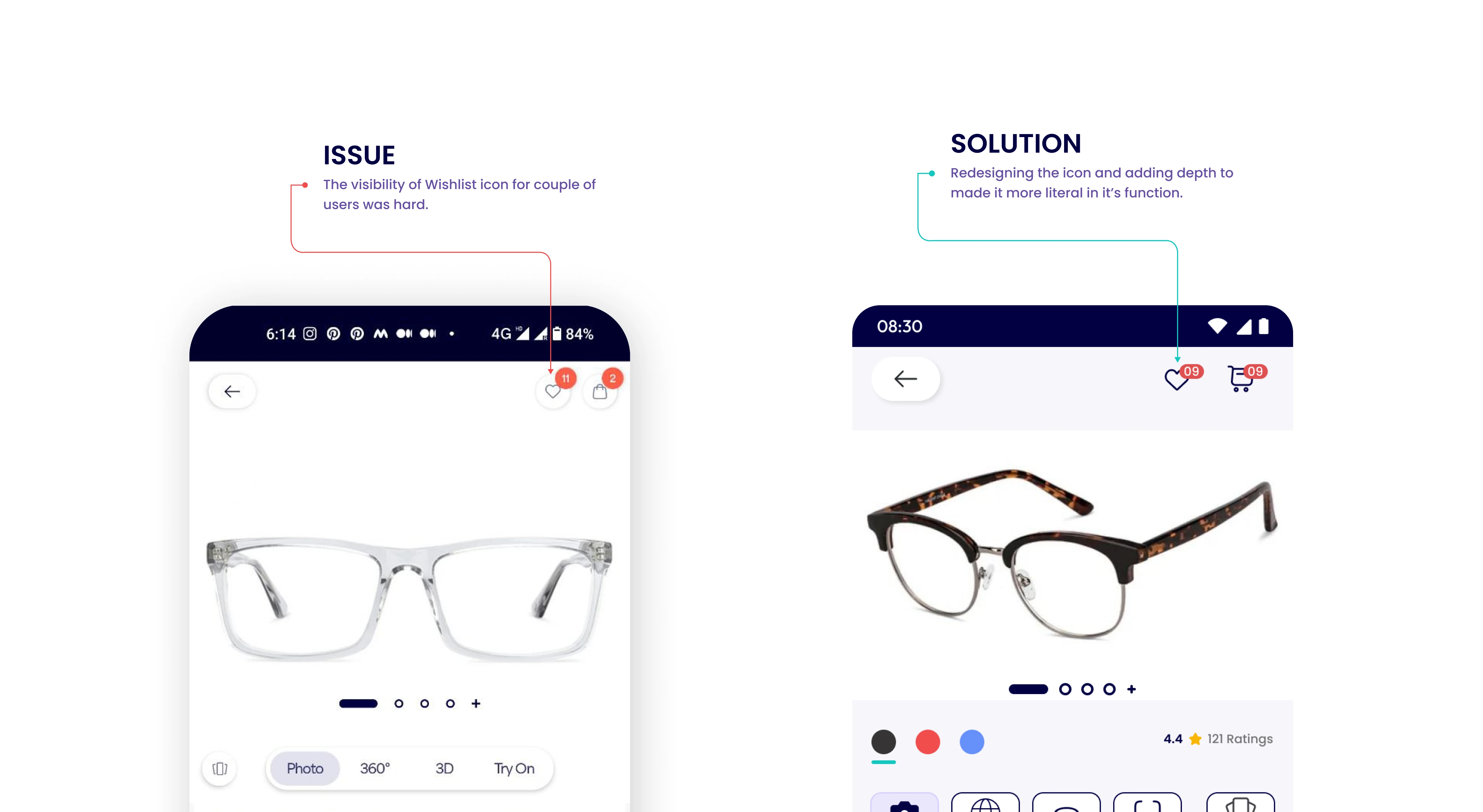
Fig 3- Enhancing the Wishlist Icon to make it more accessible. (Image by Author)
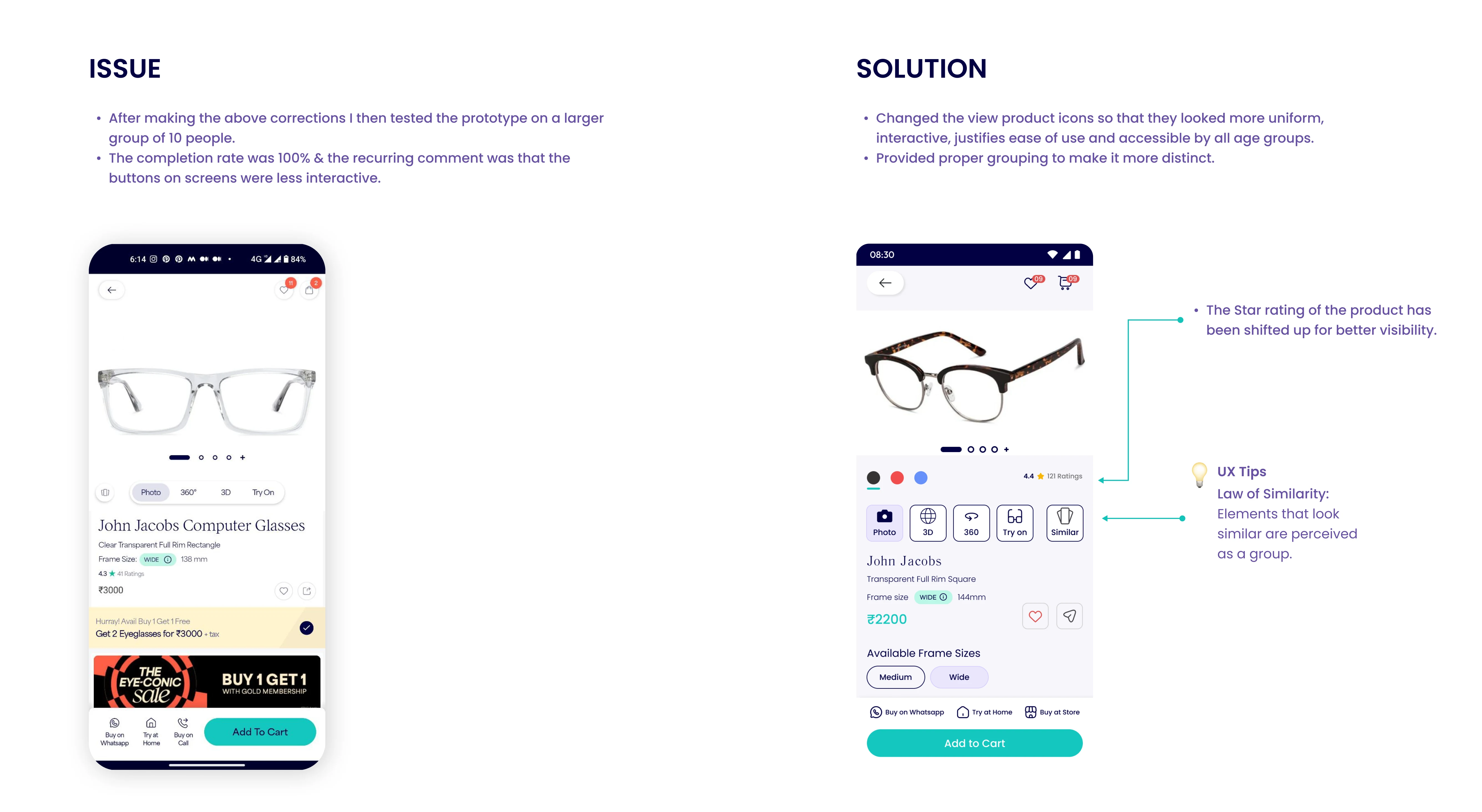
Fig 4- The Law of Similarity. (Image by Author)
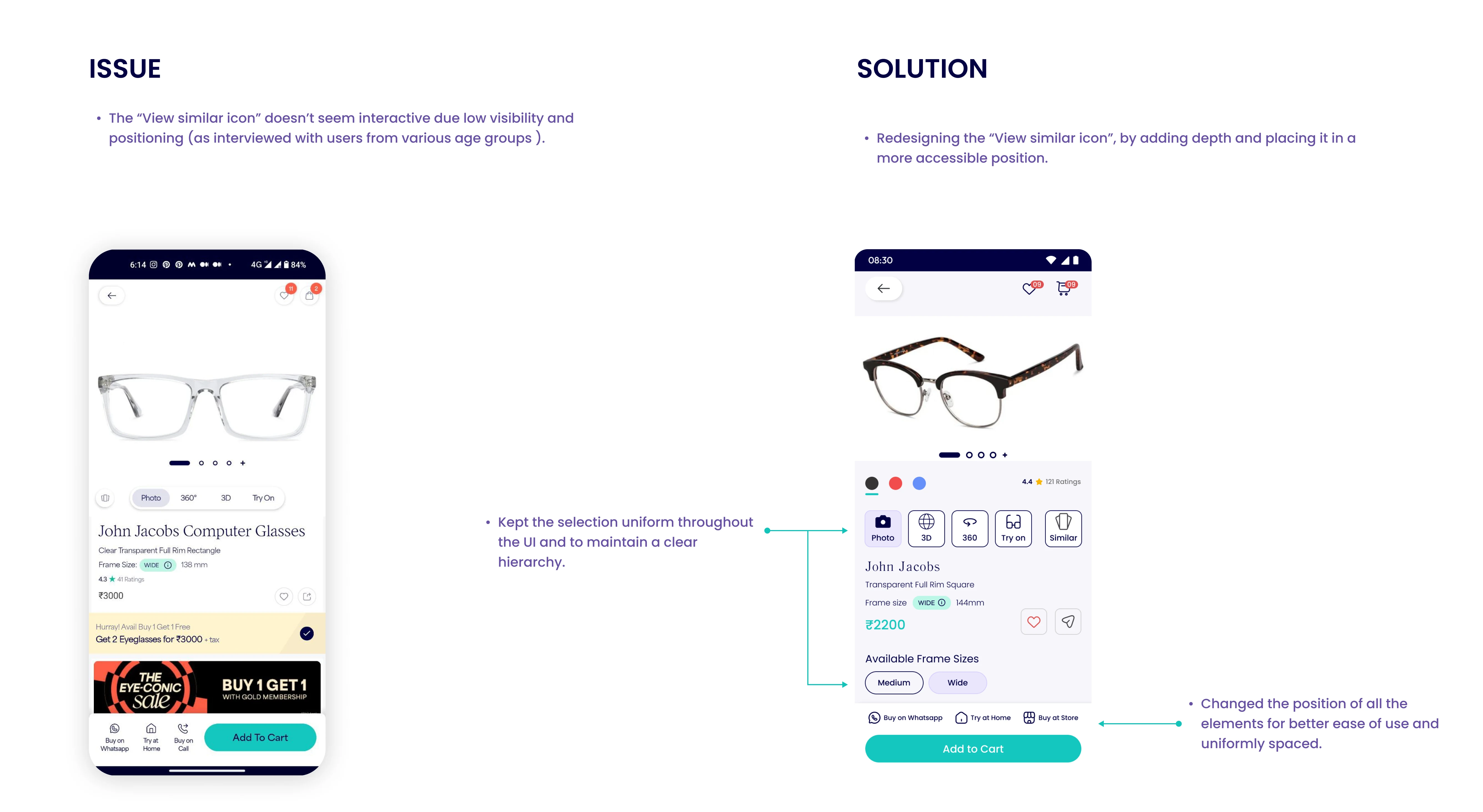
Fig 5- Maintaining Uniformity throughout to maintain a proper hierarchy. (Image by Author)
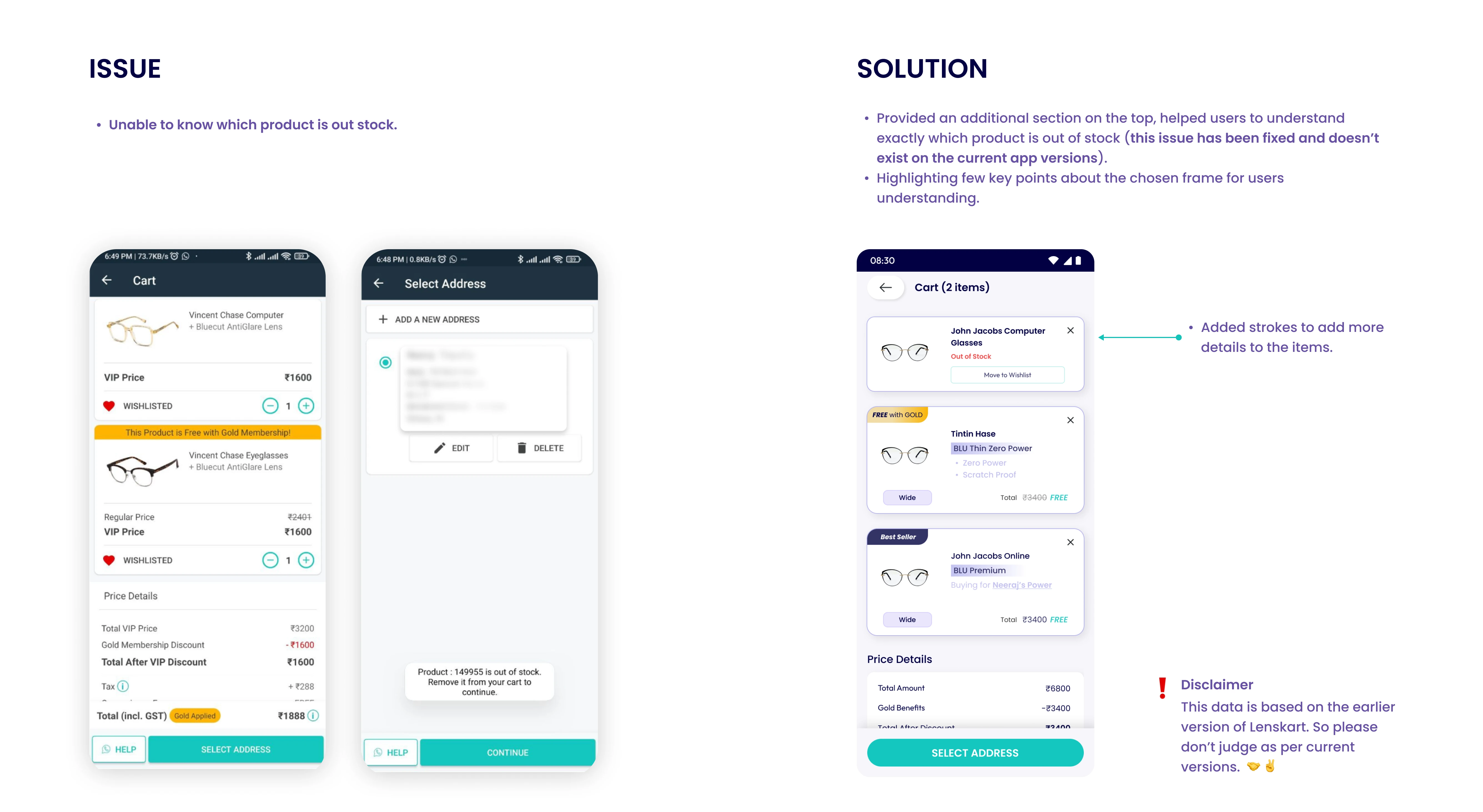
Fig 6- I added the out-of-stock (OOS) product to the cart to notify the customer. (Image by Author)
Mock-ups
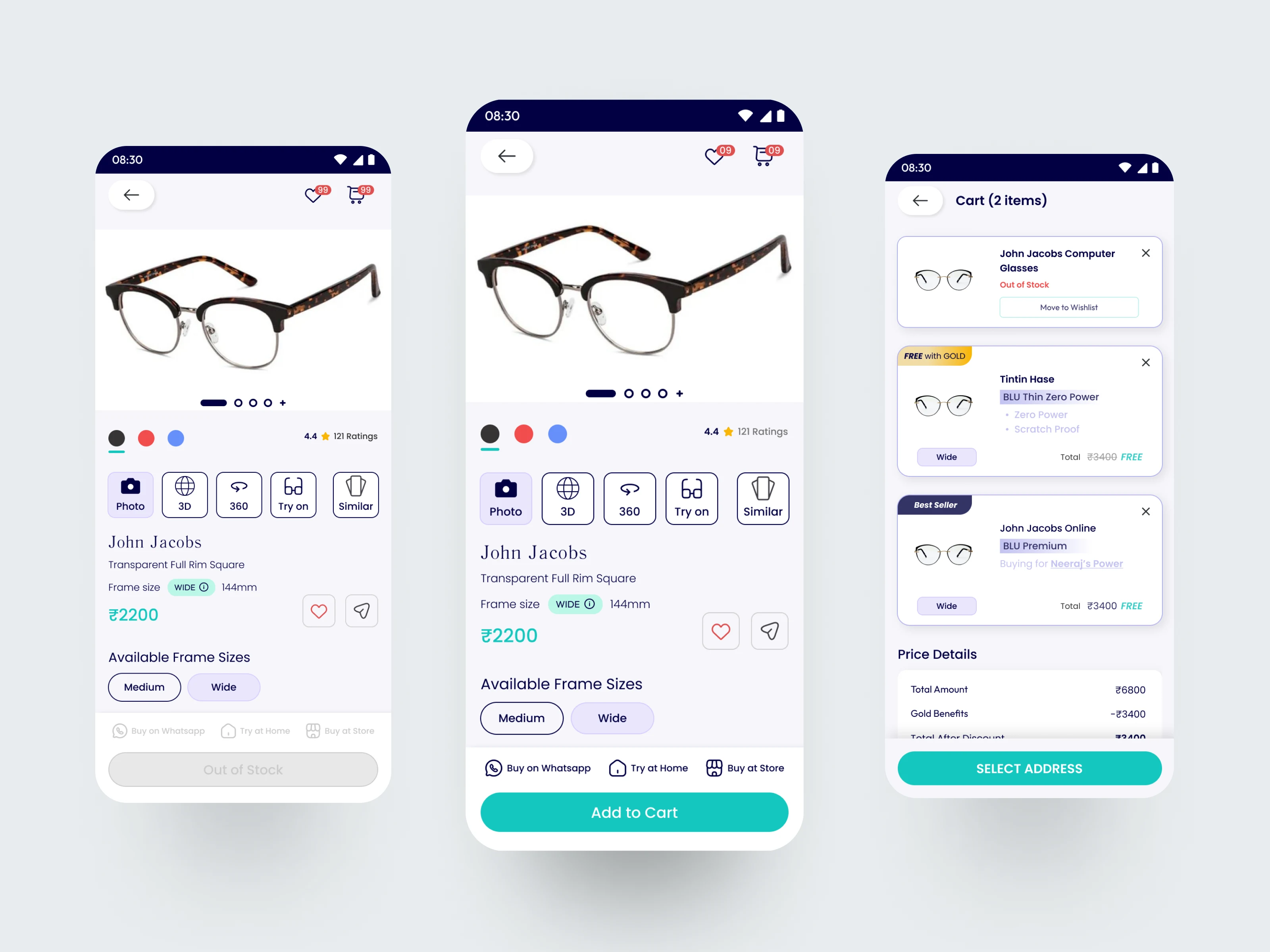
Fig 7- Mockup for redesigned screens. (Image by Author)
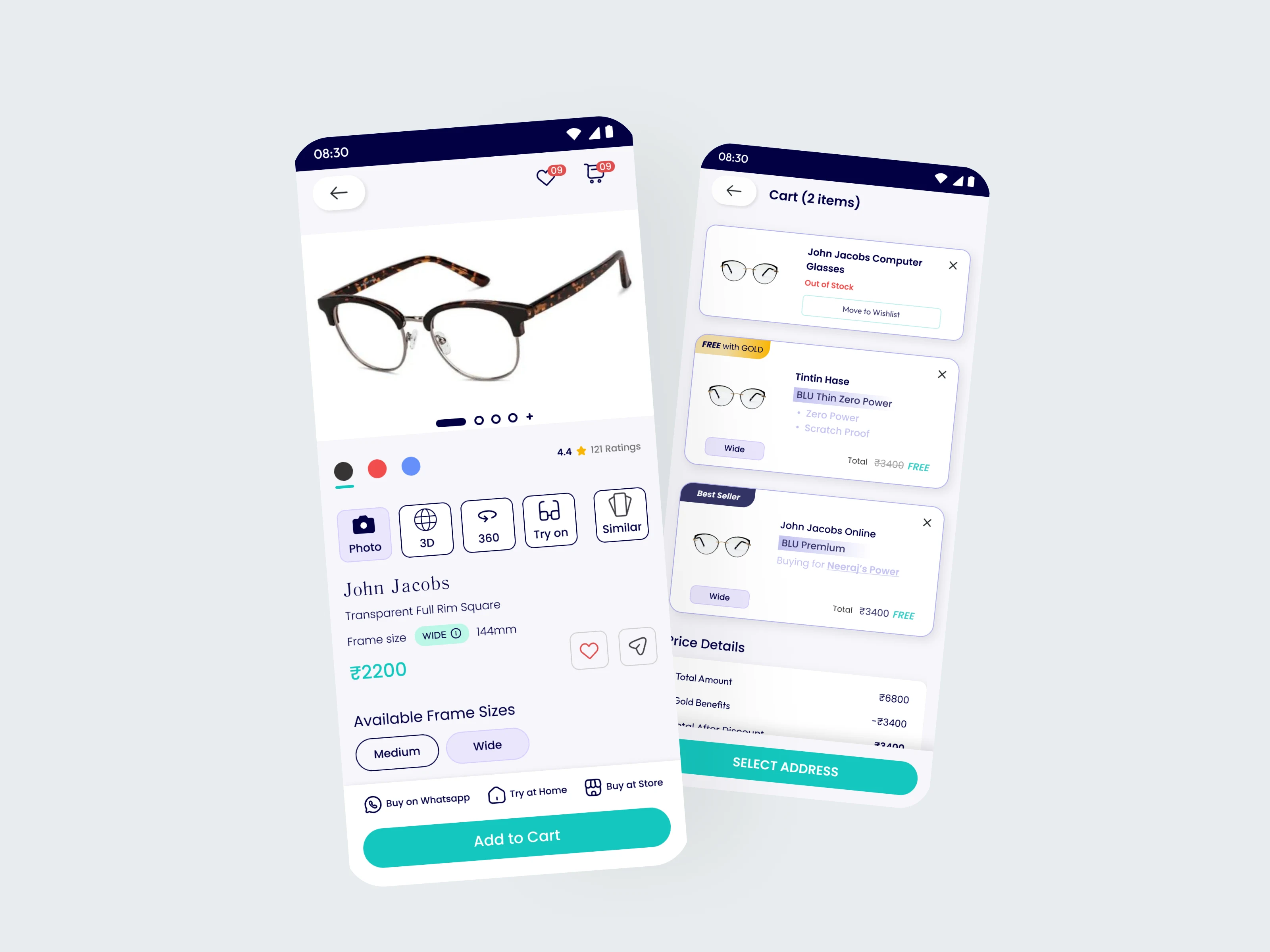
Fig 18- Mockup for redesigned screens. (Image by Author)
Key Takeovers
The redesigning of the user flow helped users interact with the app UI flawlessly.
Enhanced the overall user experience and helped users to reach the end goal without any confusion.
Here’s a hypothetical statistical representation of the impact based on the case study:
Before UX Improvement:
Conversion Rate: 2%
User Drop-off at Checkout: 70%
Add to Cart Ratio: 5%
After UX Improvement:
User Drop-off at Checkout: Expected to decrease significantly
Add to Cart Ratio: Expected to increase due to clearer product availability information
0 likes · 85 views · Feb 29, 2024
How I ran a design sprint to help users complete product purchases (efficiently) and improved the customer drop-off score by 55%.
