MOTIC: Skincare Packaging Design
Maria Nowicka
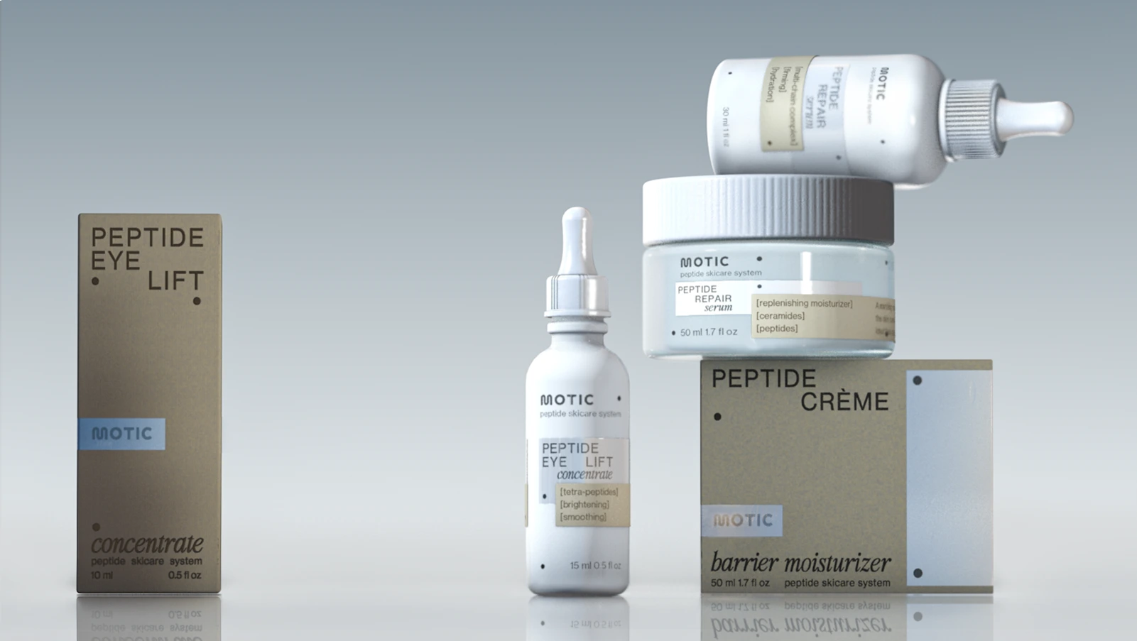
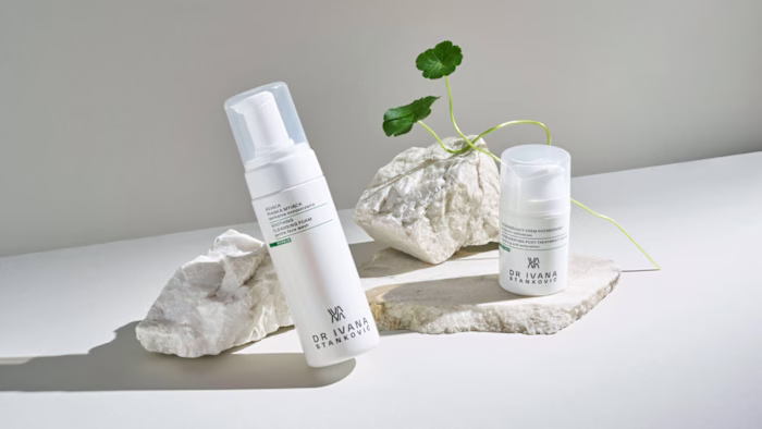
Motic — Peptide Skincare System
Case Study: From Early Vision to Packaging Reality
“We want it to feel clinical... but not sterile.”
When the founders of Motic reached out, they weren’t just looking for “pretty” packaging.
They were building a serious skincare system rooted in biotech, and needed a visual identity that could carry the weight of science while still feeling elegant, desirable, and emotionally resonant.
We began with a founder workshop - a space to map out their goals, fears, competitors, and future aspirations.
Phase 1: Strategy & Moodboard Exploration
I translated the brief into three visual directions;
Industrial Surrealism: surreal, bold, emotional, almost pharmaceutical luxury
French Morning: light, soft, clinical through a romantic lens
Zen Normcore 2030: modern restraint, quiet richness, matte tech + spa calm
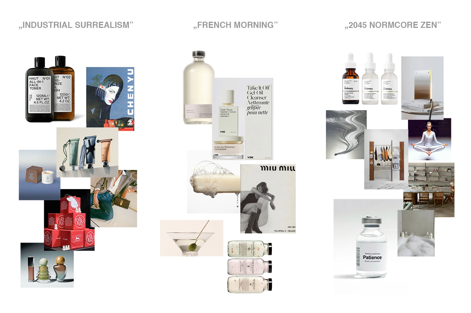
The client resonated most with Zen Corpcore 2030. It felt timeless, scalable, and fresh without being overly loud. The challenge was not to make it look like every other brand in that category.
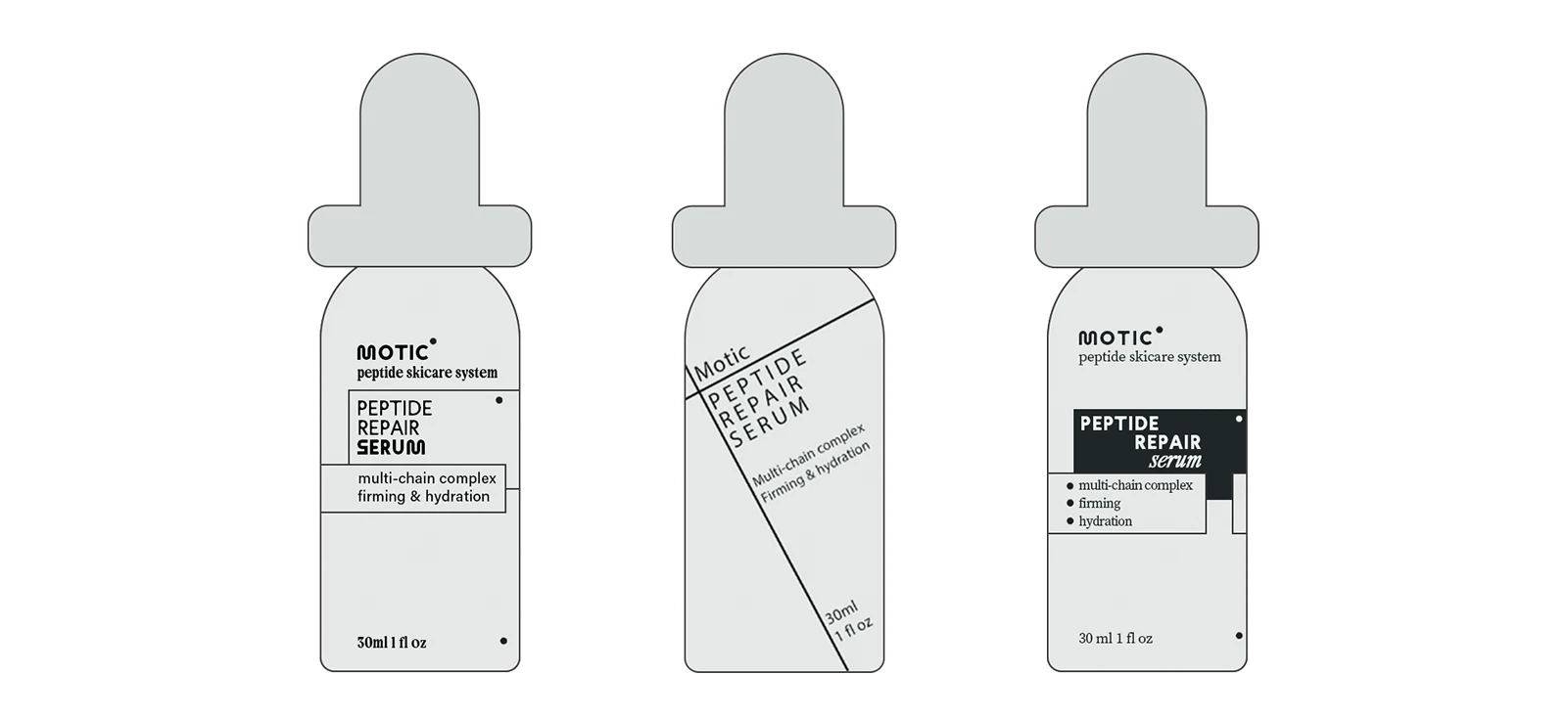
Phase 2: Early Sketches & Packaging R&D
At this stage, the goal was clarity and restraint - a readable product architecture, clean typography, and a smart language hierarchy. We played with logo size, metallic finishes, dot systems, and layout styles.
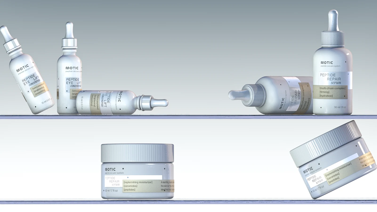
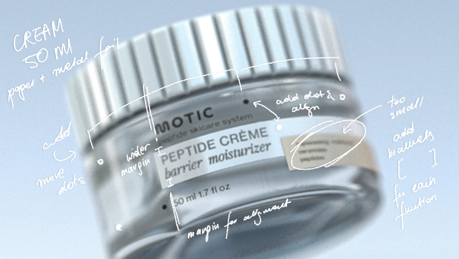
Then, we moved into 3D.
This part is often overlooked, but crucial: the way a jar sits on a shelf, the way light hits a label, or how tall a bottle feels in the hand — all of it affects perception. Using mockups and simulations, we tested everything from label placement to outer box alignment.
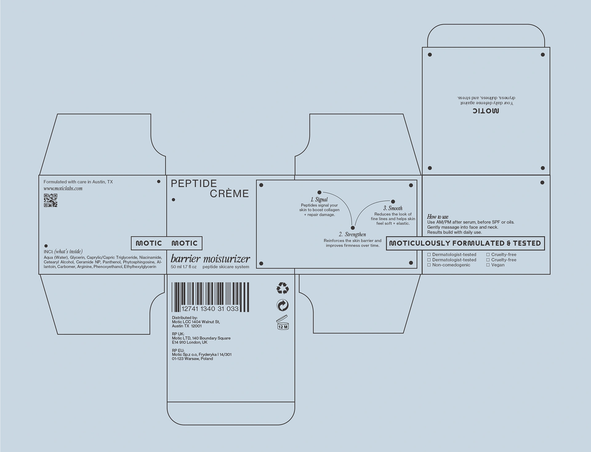
Phase 3: Finalization & Pre-Production Files
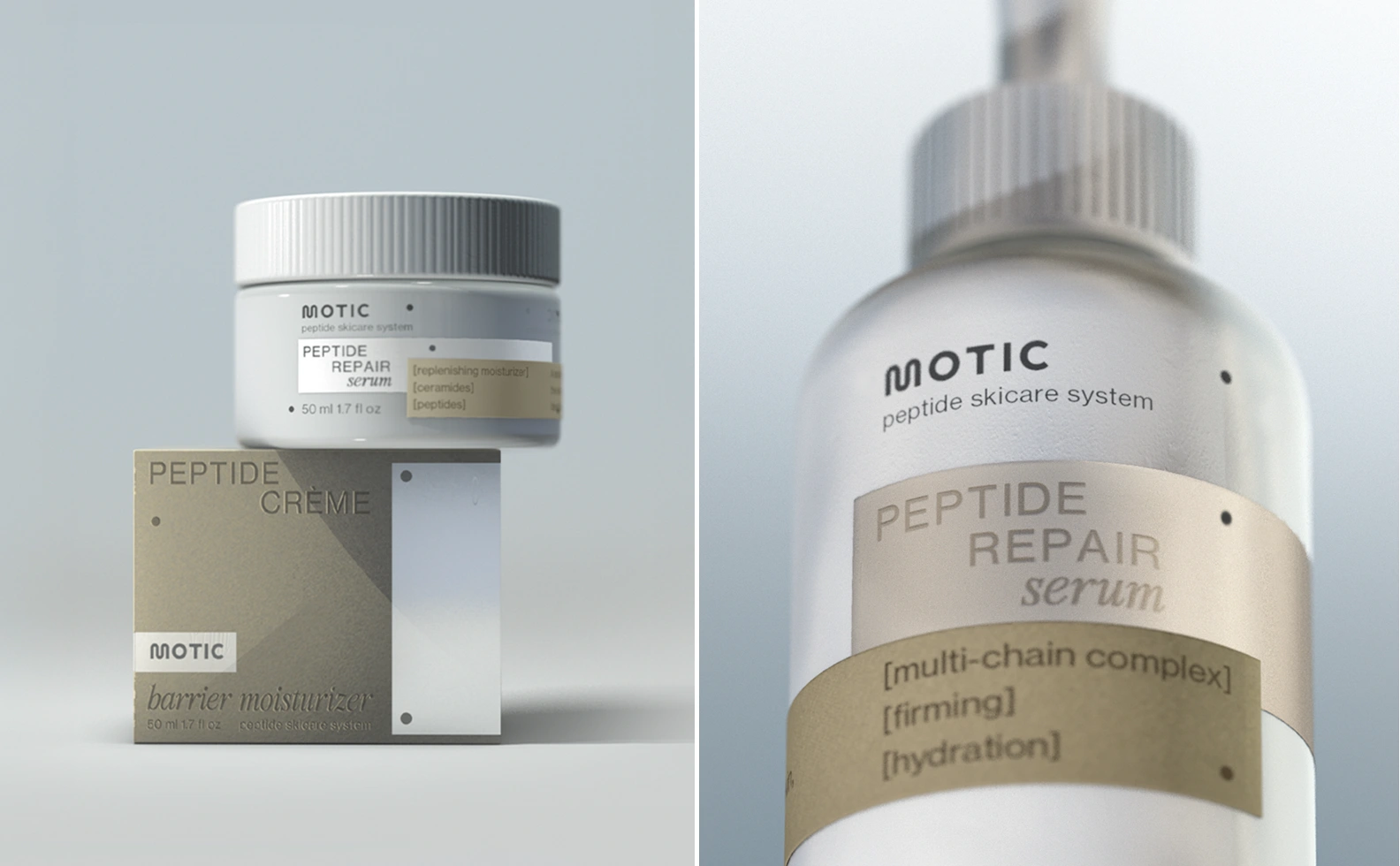
After three rounds of iterations, the Motic line came to life with:
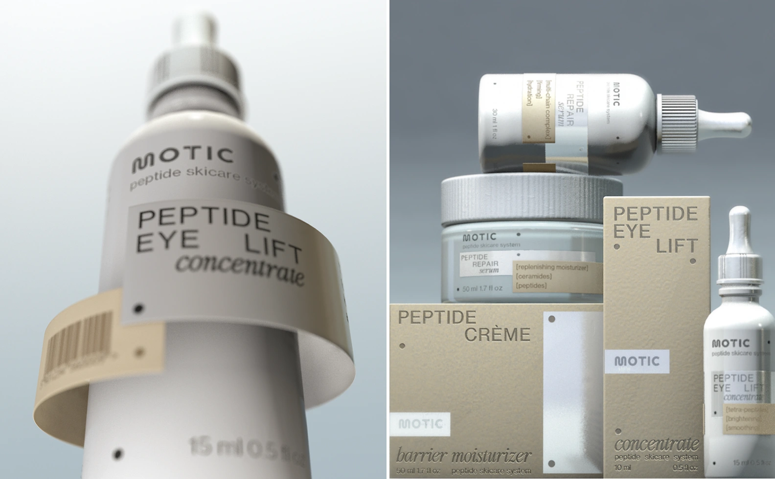
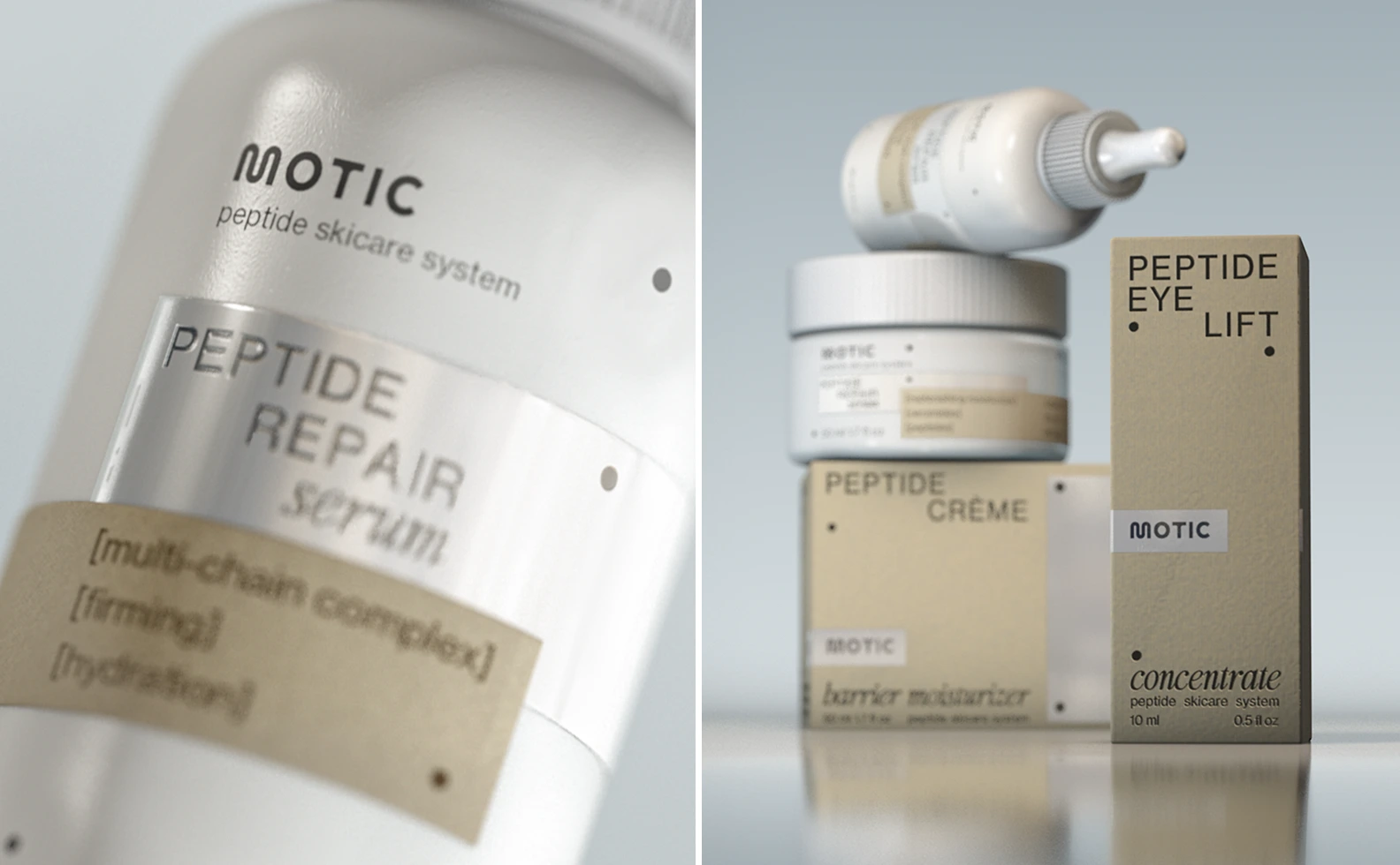
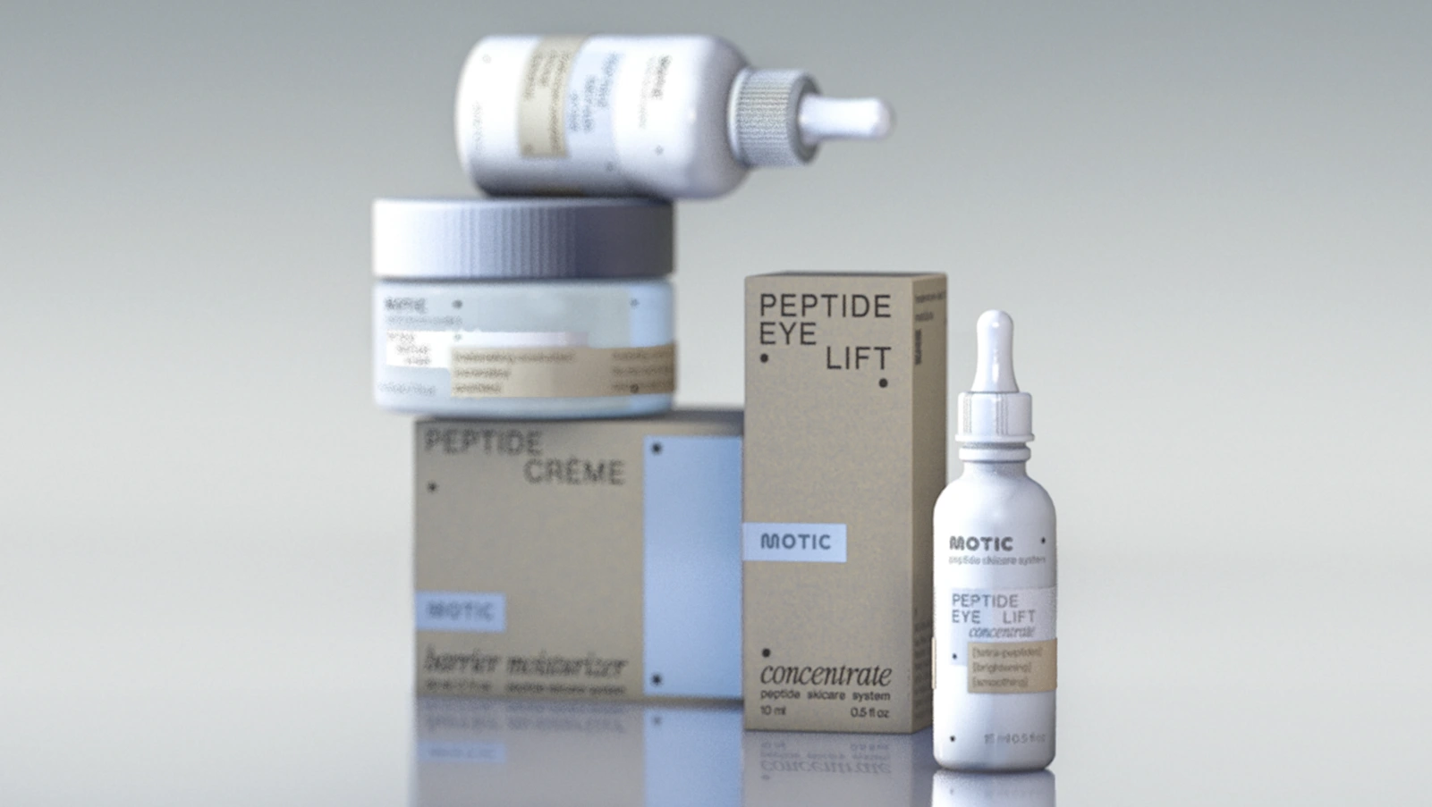
A modular, scalable packaging system with unique "dot" pattern decoration
Intriguing, but easy-to-manufacture "layered" label approach
Strong, but timeless brand image that will work for years
Clear ingredient callouts and product functionality labels that inform without overwhelming
Modern+premium positioning that builds trusts and justifies the price
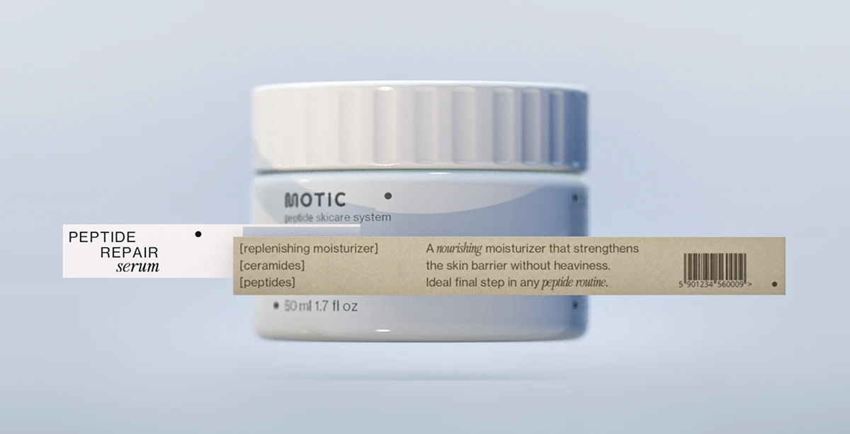
Modular labelling system:
print on the bottle + silver label strip + paper label strip
Marnovya Process
Founder Workshop
We mapped Motic’s biotech positioning, aesthetic goals, and long-term vision to align the packaging with both science and emotion.
Moodboard Exploration
Three distinct directions were developed - Industrial Surrealism, French Morning, and Zen Corpcore 2030. The chosen route blended clinical calm with modern elegance.
2D Packaging Design
We created modular layouts with clear hierarchy, refined typography, and unique visual details like the “dot” system.
3D Testing & Mockups
Through simulations and mockups, we tested proportions, label placement, and shelf impact to ensure real-world precision.
Final Artwork & Production Prep
The result: a scalable, premium packaging system ready for manufacturing -visually distinct, yet cost-efficient and timeless.
Project Summary
🧬 Brand strategy rooted in biotech positioning
🎨 Visual direction development (3 distinct moodboards)
🧴 Packaging system design (2D layouts, visual hierarchy, “dot” motif)
📦 3D mockups + physical behavior testing (shelf presence, ergonomics)
🎯 Art direction for clinical but calming brand tone
📁 Final artwork prep for scalable manufacturing
This project was about translating scientific precision into something emotionally compelling. We didn’t just “design skincare.” We helped build a biotech beauty brand that feels calm, modern, and deeply credible - without looking like everyone else.
Client: MOTIC
Design: MARNOVYA
Date: 2025
Like this project
Posted Jul 4, 2025
Designed a skincare brand from strategy to shelf. Modular, premium packaging that blends clinical credibility with quiet elegance.
Likes
1
Views
34
Timeline
Feb 1, 2025 - Apr 1, 2025