Dr Ivana Stanković: Post-Treatment Dermocosmetics
Maria Nowicka
Dr Ivana Stanković
Post-Treatment Dermocosmetics
From Clinical Vision to Tangible Trust
“We want it to feel professional, but deeply human.”
When Dr. Ivana Stanković reached out, she wasn’t chasing trends - she was building a skincare line rooted in real dermatological expertise.
With over two decades of experience and a loyal client base, her goal was to create a product system that patients could rely on immediately after procedures like lasers, peels, or microneedling. The formulas were precise, medical-grade, and intentionally calming.
My job was to make the packaging do the same: evoke clarity, care, and quiet confidence - without overdesigning or diluting its purpose.
Phase 1: Strategy & Visual Direction
I began with a collaborative workshop to map out her clinical vision, patient expectations, and long-term goals. From there, we explored three early visual directions:
Medical Purism: transparent, clinical, pharma-like precision
Soft Authority: gentle textures, minimal typography, natural accents
Modern Heritage: a nod to old apothecaries, updated with contemporary restraint
We landed on the Soft Authority approach, as it best-balanced trust and intimacy. The goal was not to make it “luxury”, but rather "high-quality and professional".
Phase 2: Design System & Layout Exploration
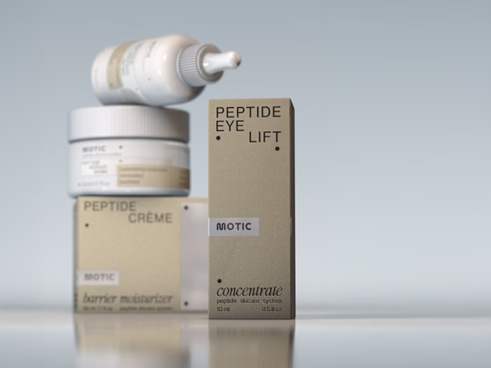
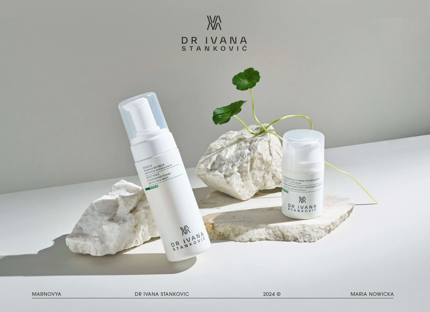
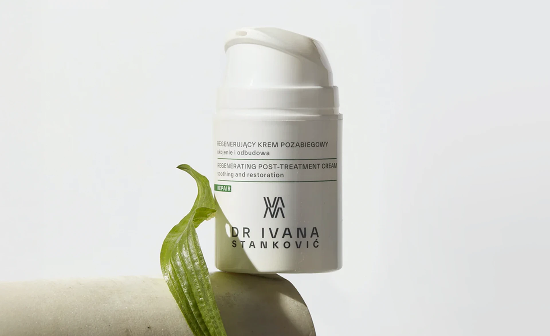
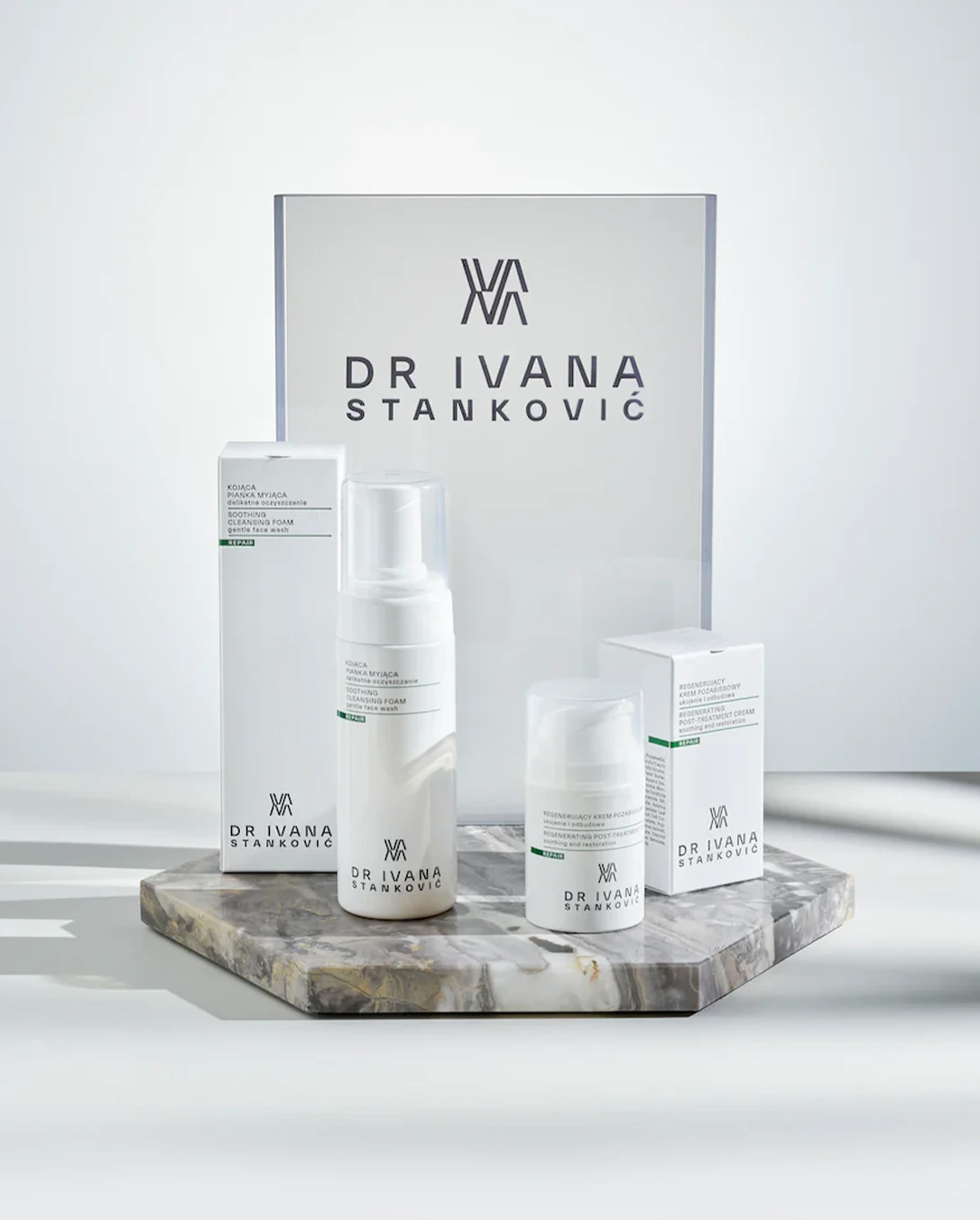
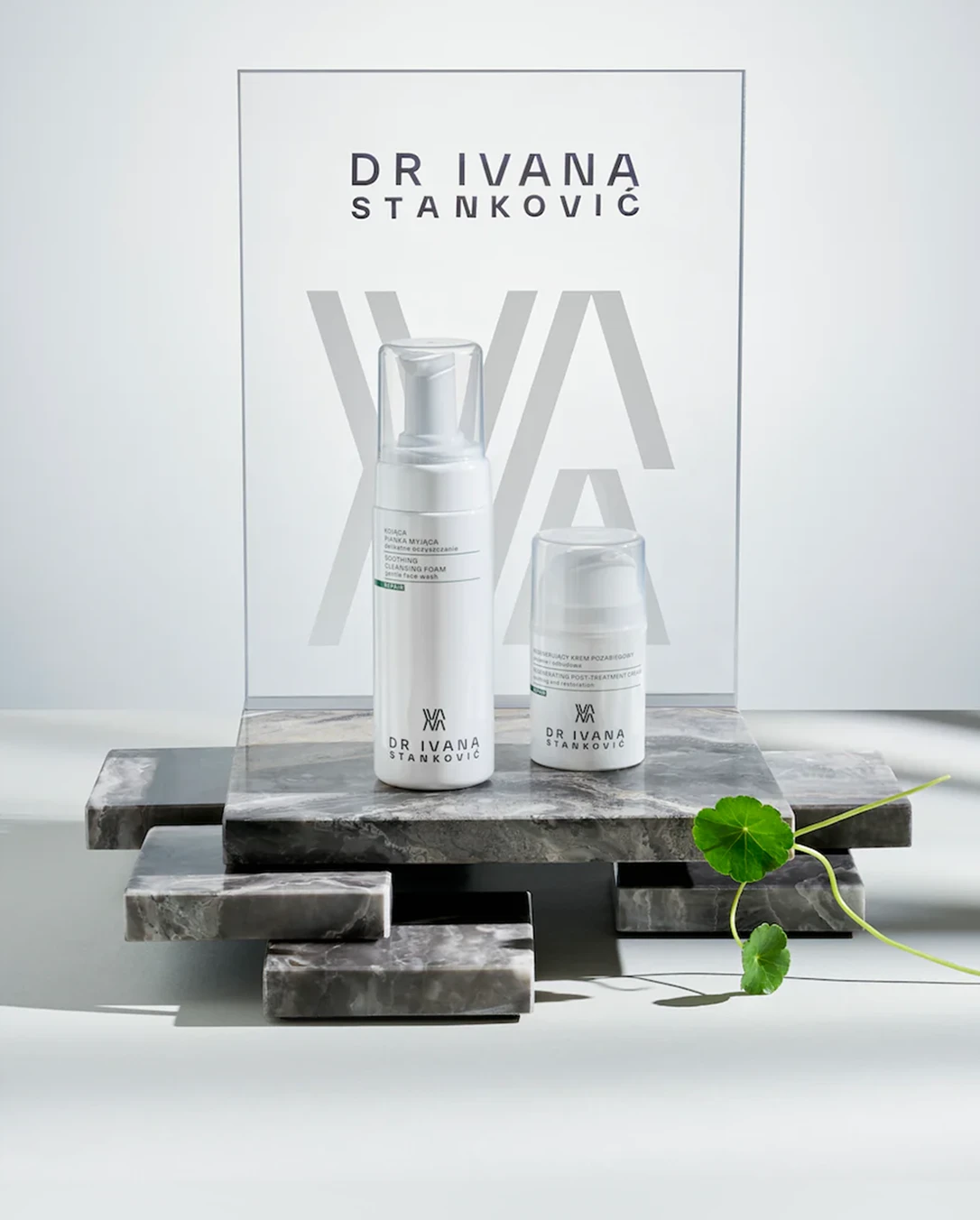
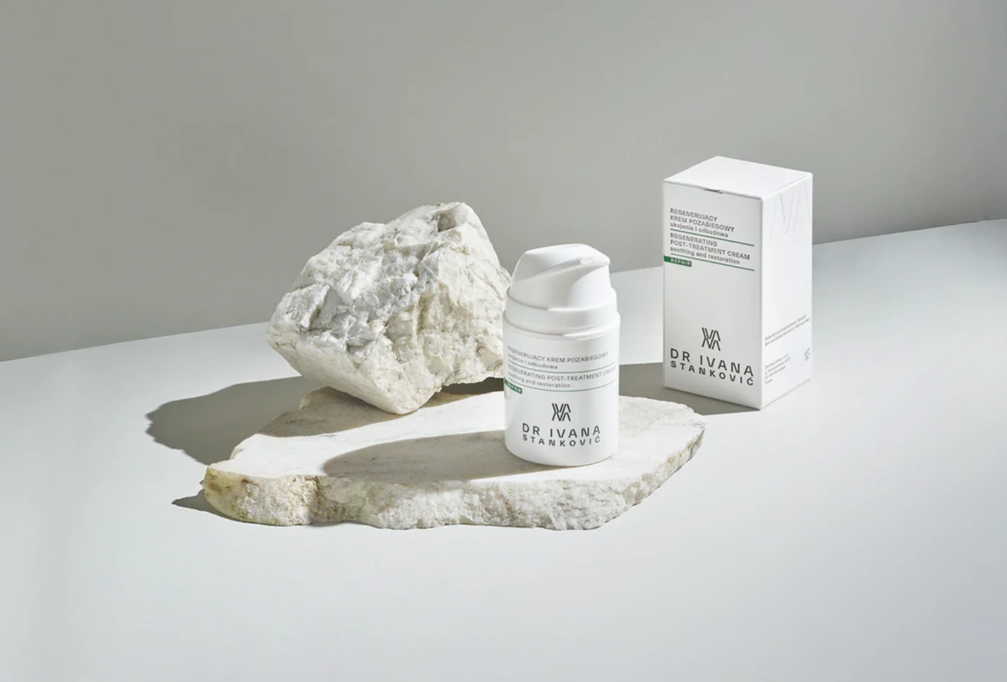
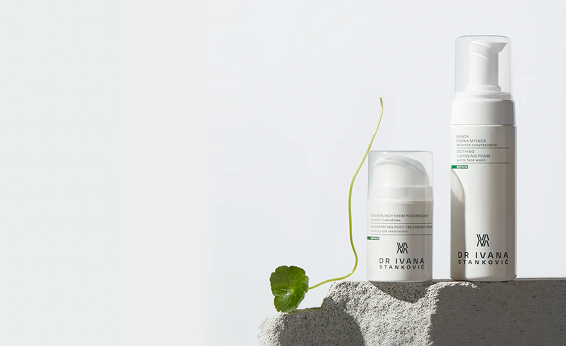
We developed the core packaging concept around a single green “REPAIR” stripe - a subtle, but powerful visual anchor. It communicated the product’s function in one glance and created a clear visual thread across all SKUs.
Typography was structured for legibility and calm: pharma-inspired, but softened through spacing, tactile materials, and proportion. The result: packaging that feels like an extension of the clinic’s care.
Phase 3: Prototyping & Display Design
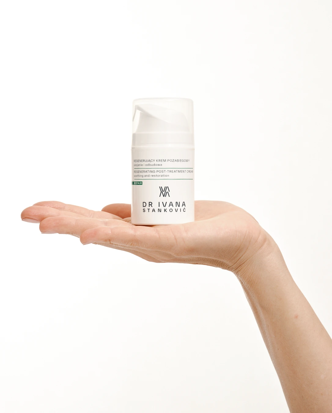
After testing 2D label compositions, we moved into physical mockups and 3D simulations, evaluating everything from how the bottles read on a shelf to how they feel in the hand post-treatment.
We also designed a modular display system made from real marble and glass, mirroring the materials used inside the clinic. These stands were first tested as 3D models, then built with local craftspeople to ensure every detail felt intentional, not improvised.
Phase 4: Photography & Brand Storytelling
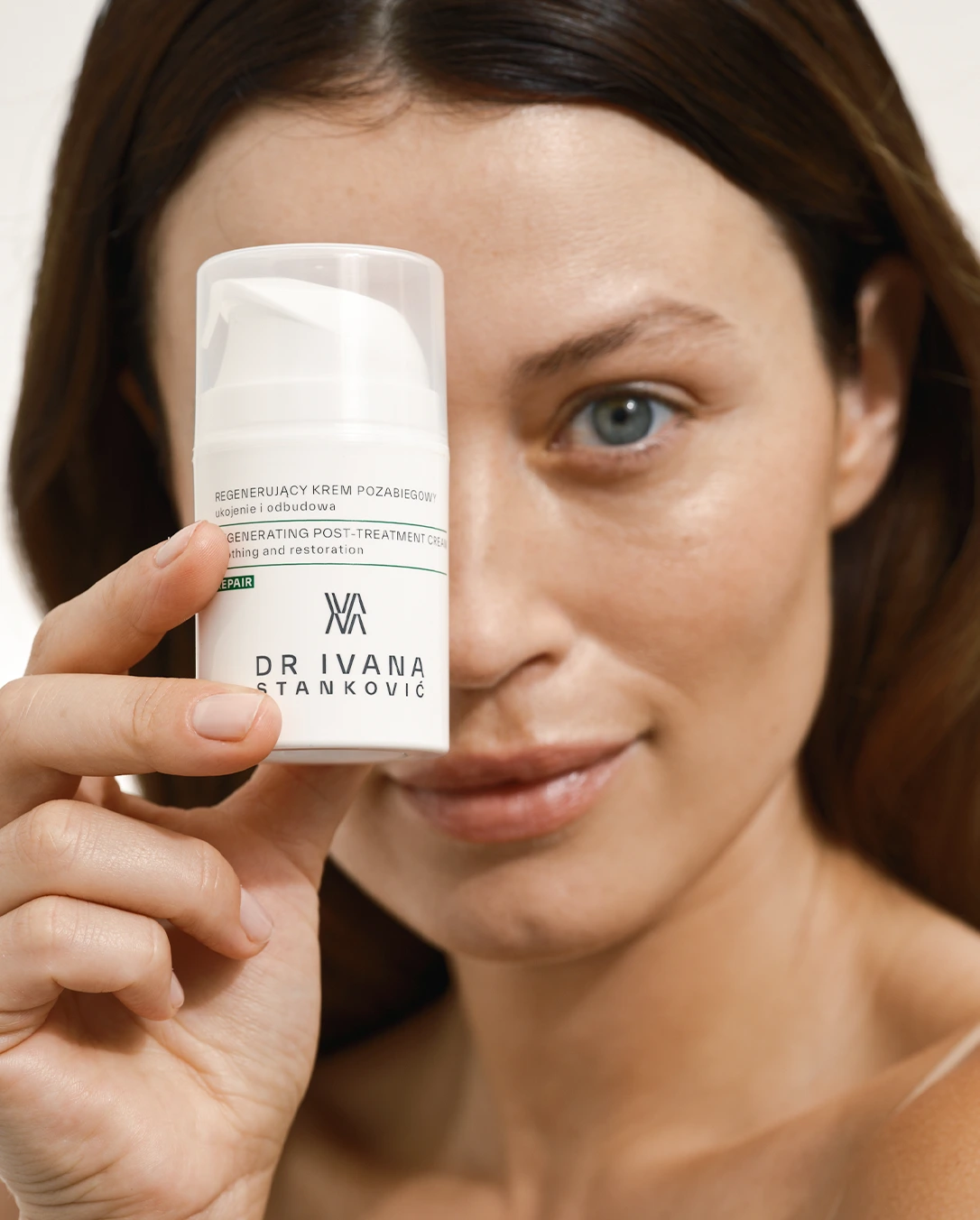
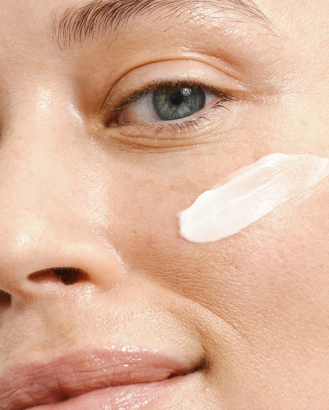
Our photoshoot strategy was rooted in honesty.
We used a real woman in her 30s, with unretouched skin. Lighting was natural and restrained, highlighting both product and care.
Key ingredients like centella asiatica (tiger grass) weren’t just listed—they appeared in the shoot, reinforcing the sensory link between science and nature.
Final Impact
The result was a launch that translated clinical trust into visual design - quietly, but powerfully. Products were instantly adopted into post-treatment protocols.
The display system elevated in-clinic visibility and brand perception.
The visuals sparked interest online and helped expand the clinic’s reach.
What started as a small line became a growing skincare platform.
Services Delivered
🌿 Visual identity & ingredient storytelling
🧴 Packaging system design & artwork prep
🧱 Display stand design (3D prototyping + physical production)
🎯 Art direction for model, props, and photoshoot style
🛍️ Print collateral for clinic rollout
Client: Dr Ivana Stankovic
Design: MARNOVYA, WarsawLabs, Warsaw Creatives
Date: 2023-2024
Like this project
Posted Jul 4, 2025
Designed packaging for Dr. Ivana Stanković's post-treatment skincare line, focusing on clarity and care.
Likes
1
Views
10
Timeline
Feb 1, 2023 - May 1, 2024