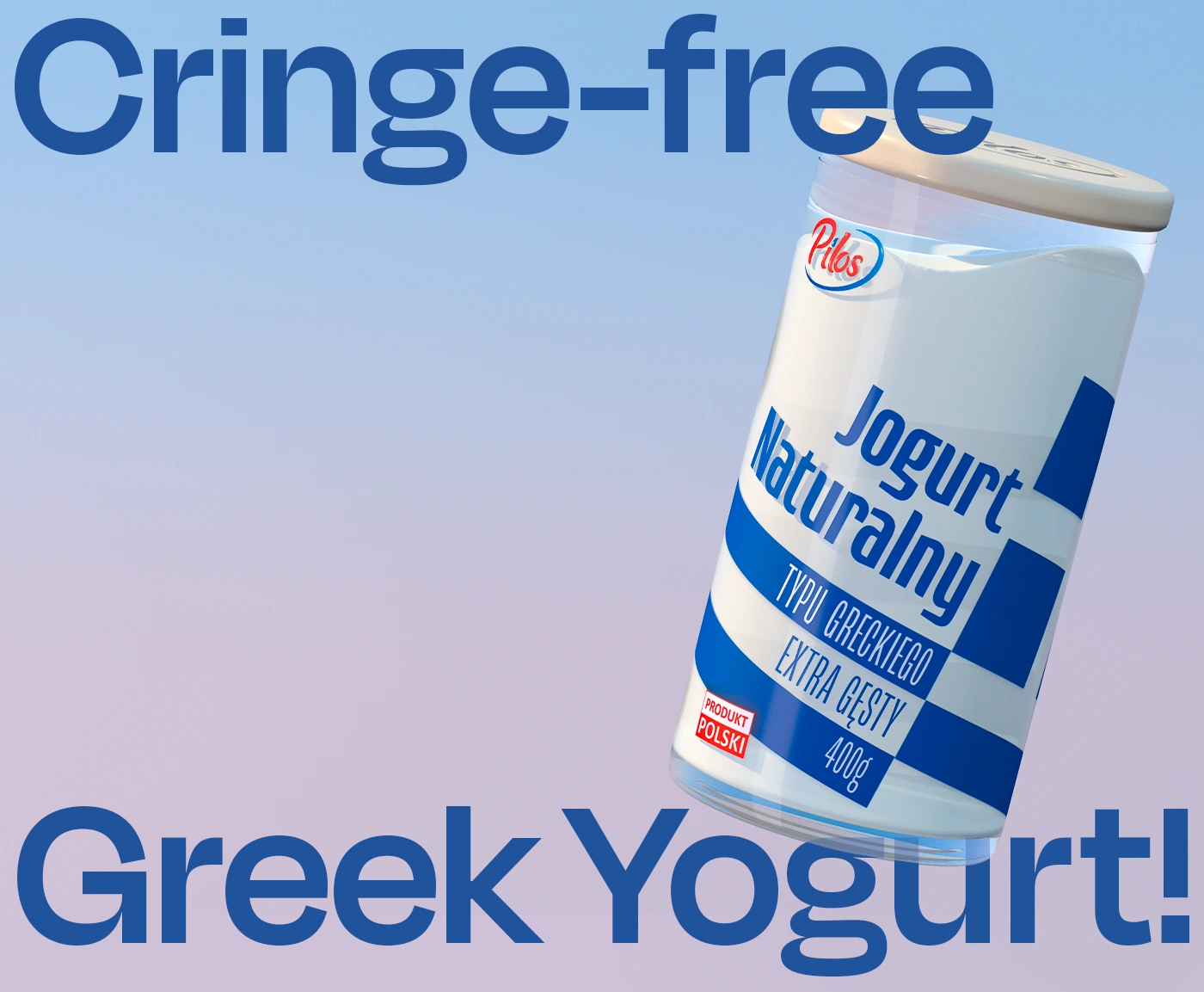
Pilos: Greek Yogurt Cringe-Free Rebrand
Maria Nowicka
Pilos - Greek Yogurt Rebrand
“We don’t want it to look Greek.
We want it to look good.”
Greek yogurt is beloved for its thickness and protein-rich texture — but on the shelf, it’s buried under an avalanche of cliché. Outdated fonts, mythology kitsch, and awkward visual metaphors dominate the category. The result? Young consumers feel alienated.
This redesign was about repositioning the product as culturally aware, design-forward, and visually clean, without losing the clarity of its function.
Phase 1: Market Analysis & Cultural Audit
I looked closely at the Polish dairy aisle and saw the same trend across brands: tired “Greek” aesthetics: blue columns, ancient script fonts, gods, and urns.
Not only was it visually noisy, but it risked being culturally tone-deaf for younger, design-conscious audiences.
Phase 2: Packaging Redesign Strategy
The goal wasn’t to remove Greekness — it was to reinterpret it.
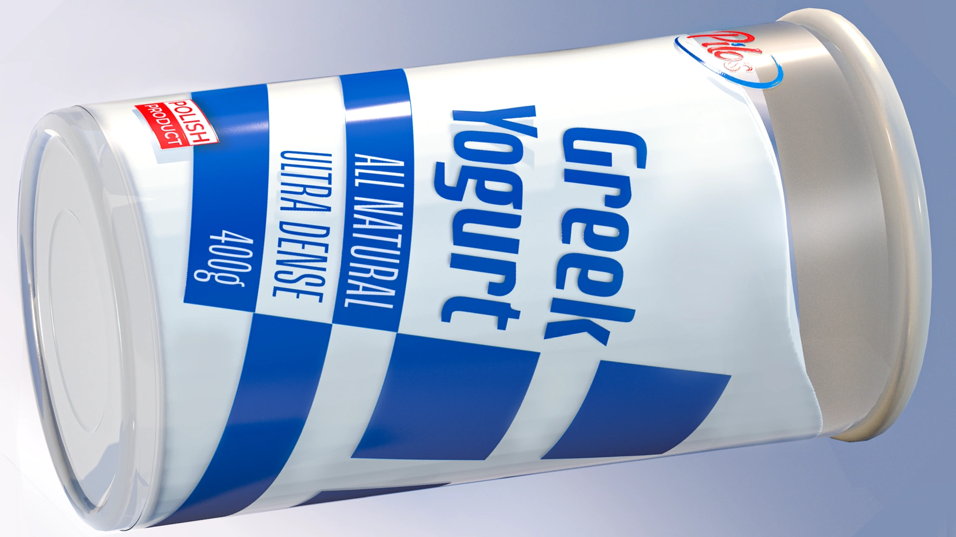
We kept the blue-and-white palette, but stripped away the visual clutter.
Sans-serif typography replaced caricature fonts
The flag motif was abstracted into bold, dynamic diagonals
Transparency in the pack lets the product speak for itself
A tall, reusable jar form modernized the format while hinting at premium quality
Phase 3: Visual Language & Typography
The new visual identity leaned into minimalism and clarity:
Modernist typography with a slight italic slant evokes movement and lightness
The Polish language version (“Jogurt Naturalny”) mirrors the same brand tone
“Cringe-free” became the internal design motto - everything had to pass the Gen Z test
This was packaging you wouldn’t be embarrassed to pull out of your fridge.
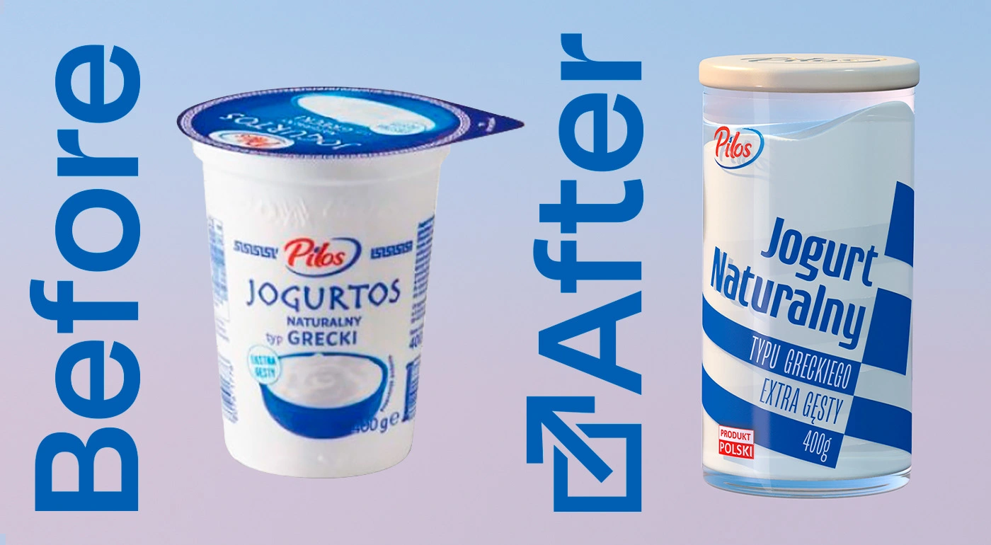
Phase 4: Before/After Impact
The result? A packaging system that feels clean, updated, and quietly premium.
It speaks to a new kind of consumer - one who values taste, yes, but also tastefulness.
We took it from “tourist gift shop” to “aesthetic supermarket staple.”
Project Summary
🧠 Strategic cultural repositioning of a mainstream product
🎨 Packaging redesign with new structure, layout, and graphics
🏛️ Cliché-free visual identity (no mythology, no blue columns)
🧴 Premium-feel jar format replacing disposable cup
🛍️ Designed for shareability, shelf presence, and brand perception shift
Marnovya Process
Cultural Reset
We removed outdated Greek clichés and reframed the design to resonate with younger, urban consumers.
Modern Structure & Layout
A tall, jar-style pack replaced the disposable cup, with bold diagonals and calm color balance.
Visual Repositioning
Typography, layout, and tone of voice were designed to feel fresh, neutral, and proudly uncringe.
Shelf-Ready Impact
The final design elevated the product from generic to confidently minimal, ready to compete beyond price.
Client: Pilos
Design: Marnovya
Year: 2022

Like this project
Posted Jul 4, 2025
Designed the ultimate cringe-free Greek yogurt - clean, confident, and modern packaging that repositioned Pilos as the cool kid in the dairy aisle.
Likes
1
Views
9
Timeline
Jun 1, 2022 - Oct 31, 2022