THRIX: Organic Hair Care | Sustainable Packaging Design
Maria Nowicka

THRIX - Organic Hair Care
From Label to Object, From Packaging to Possession
“Can a label be more than...just that?”
That’s where THRIX began: with a question, not a product.
This wasn’t just about shampoo. It was about rethinking how everyday items can become tactile, circular, and strange in the best way.
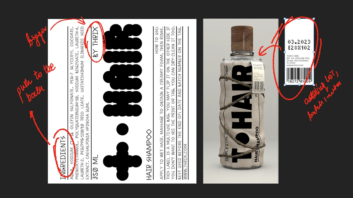
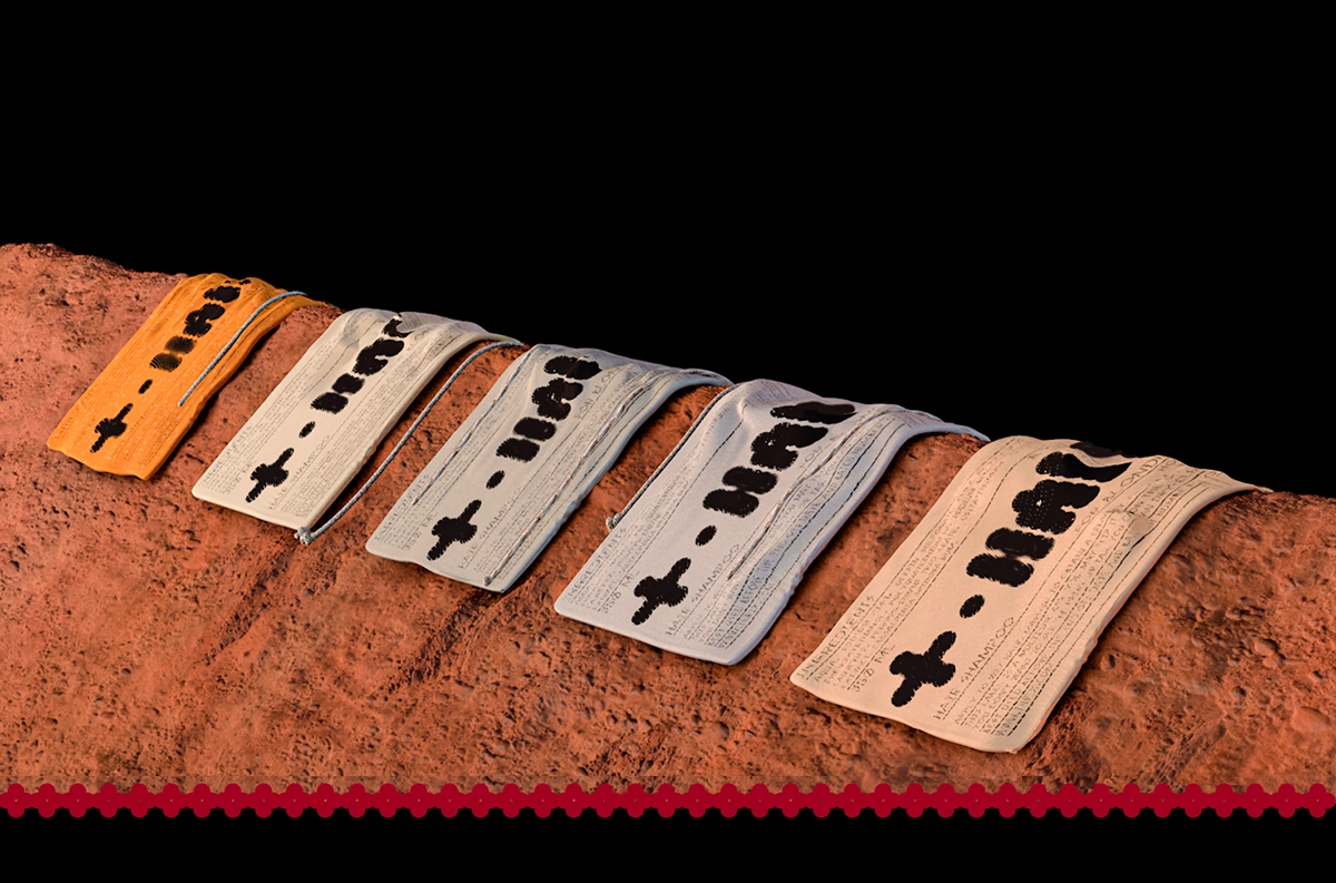
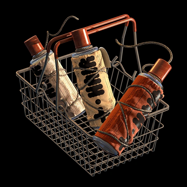
Phase 1: Rethinking the Label
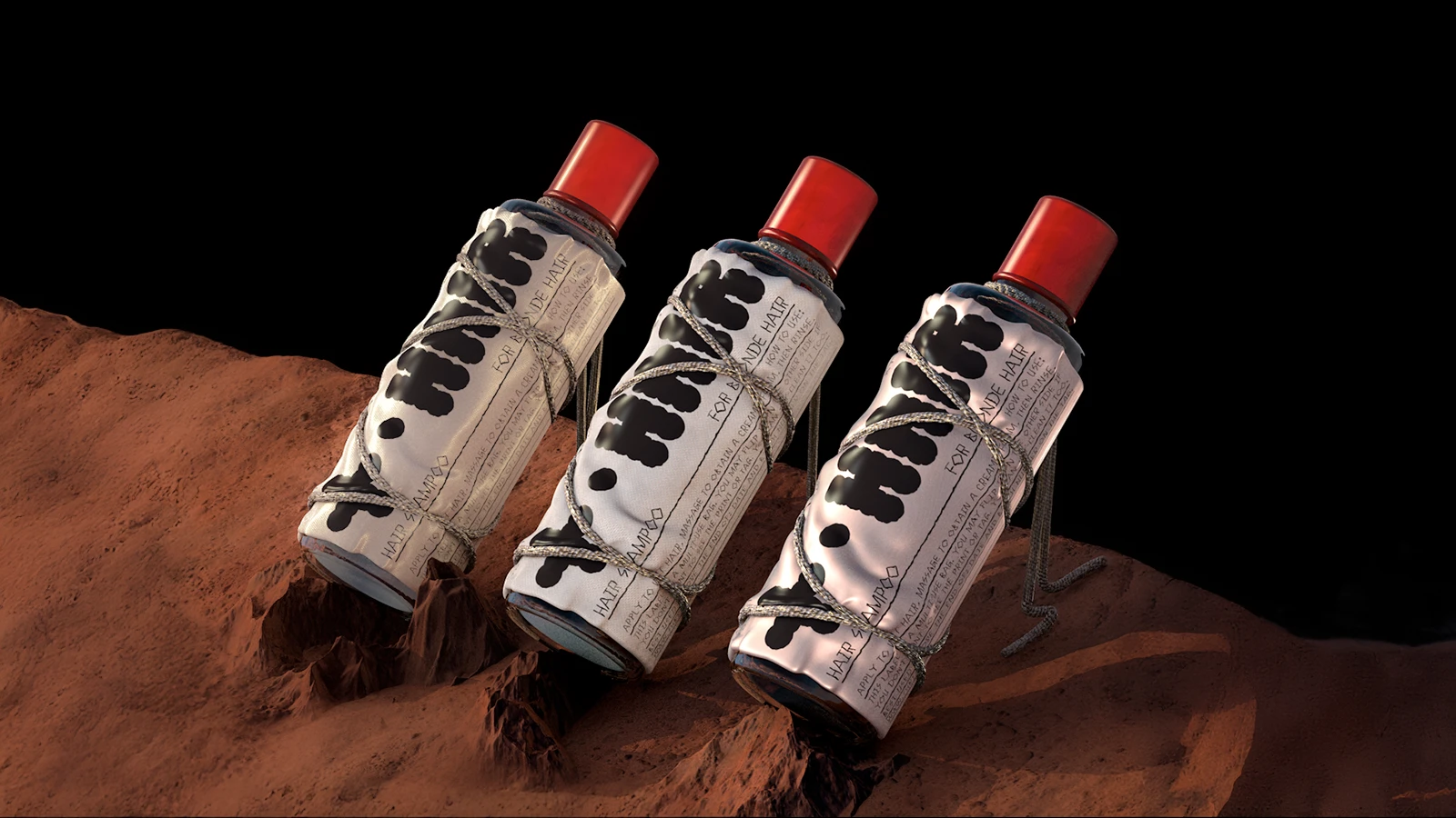
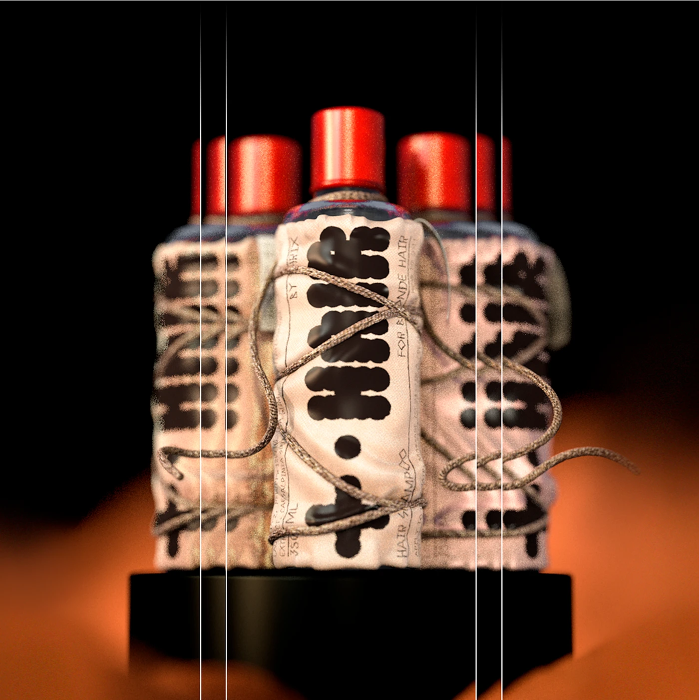
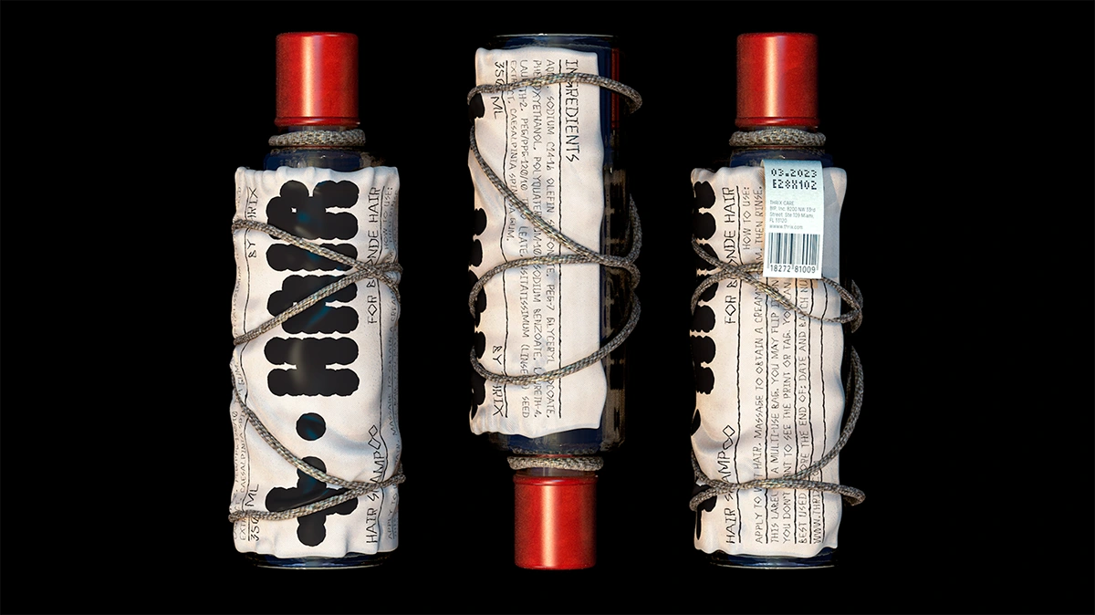
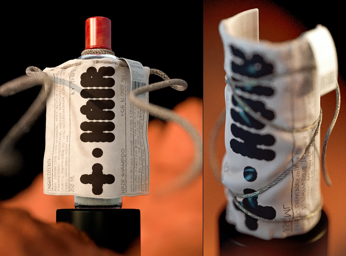
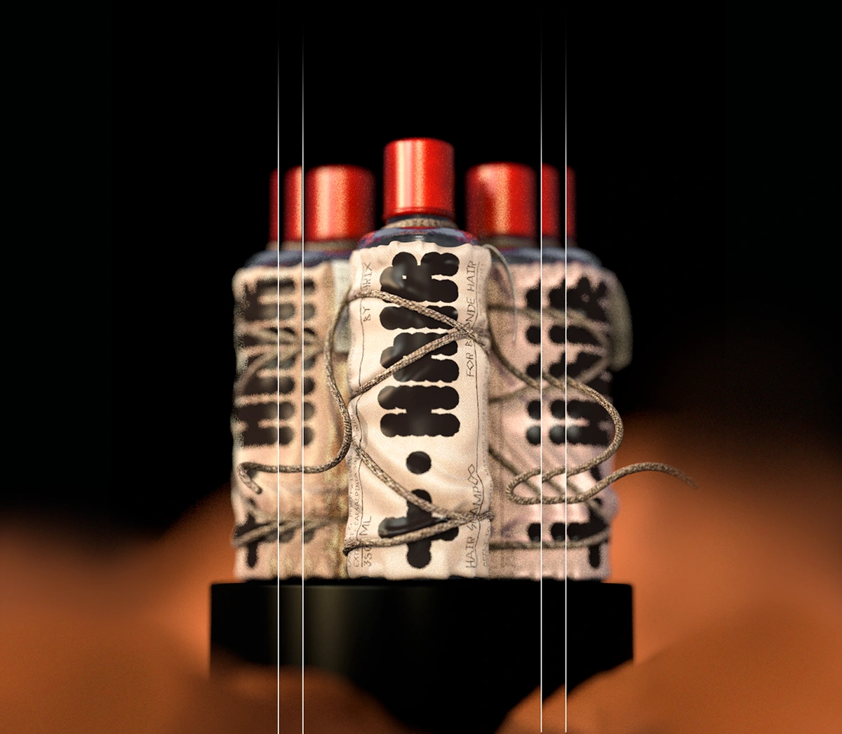
Instead of a printed sticker or shrink wrap, each THRIX product features a detachable fabric label. These labels are sewn into small drawstring bags, wrapped around the bottle, not glued or fixed.
Each bag is:
Removable
Reusable
Printed on textile instead of paper
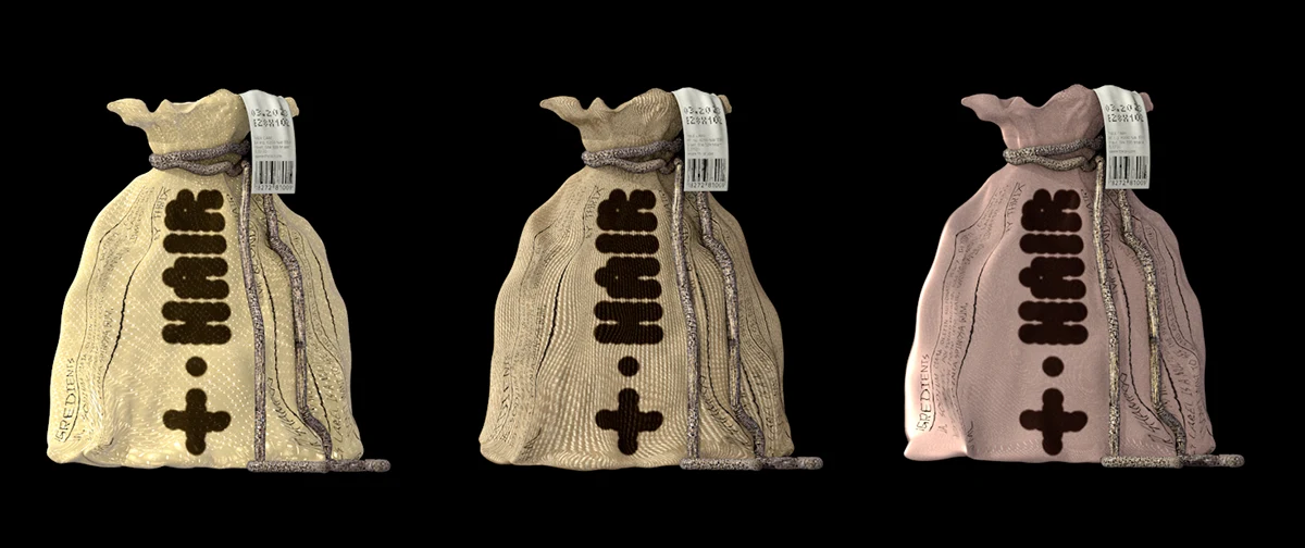
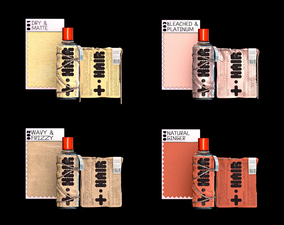
Designed to mirror the texture or personality of the hair it’s meant for
For example, dry and bleached hair products use a pale yellow, semi-transparent material, like dehydrated strands of hair made tangible.
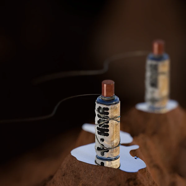
Visual Mood & Design Language
THRIX draws from East Asian minimalism, tactile craft, and quiet intensity.
🌫️ Textures & Materials — Misty landscapes, raw fabrics, and soft lighting create a sense of intimacy and depth.
🖋️ Calligraphy & Form — Bold brushstrokes and embossed details reflect both precision and raw energy.
🧵 Packaging as Ritual — References to furoshiki wraps and ceramics evoke care, intention, and reuse.
The result: a brand world that feels restrained yet rebellious — equally at home in a design book or on a bathroom shelf.
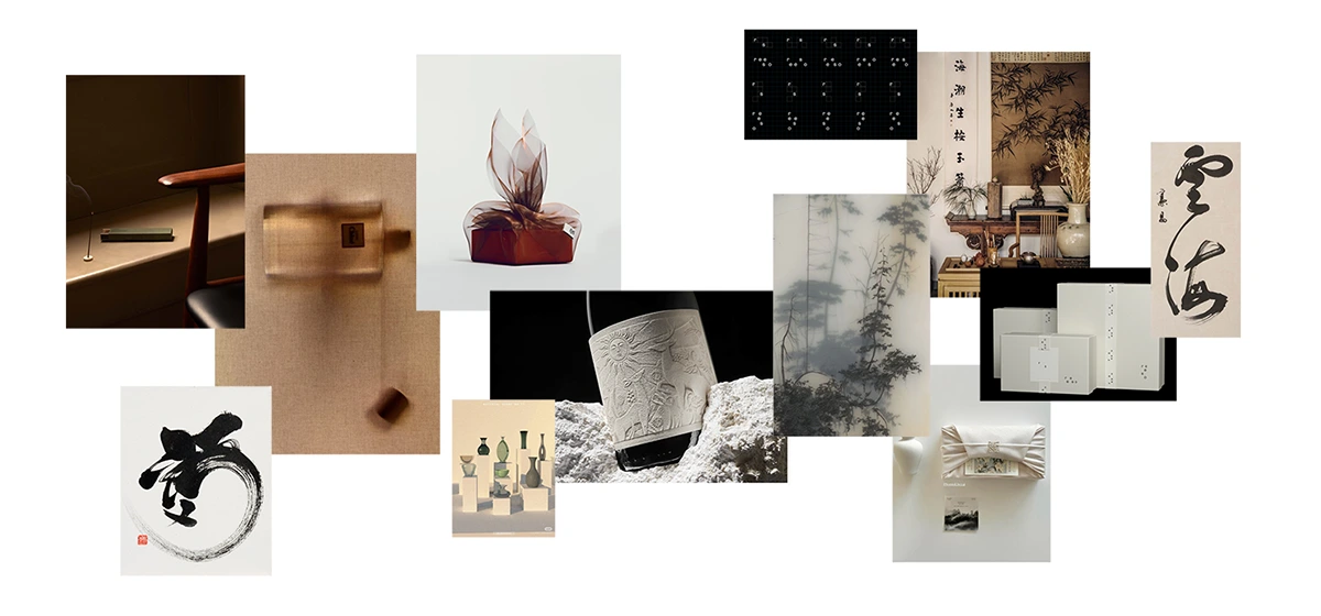
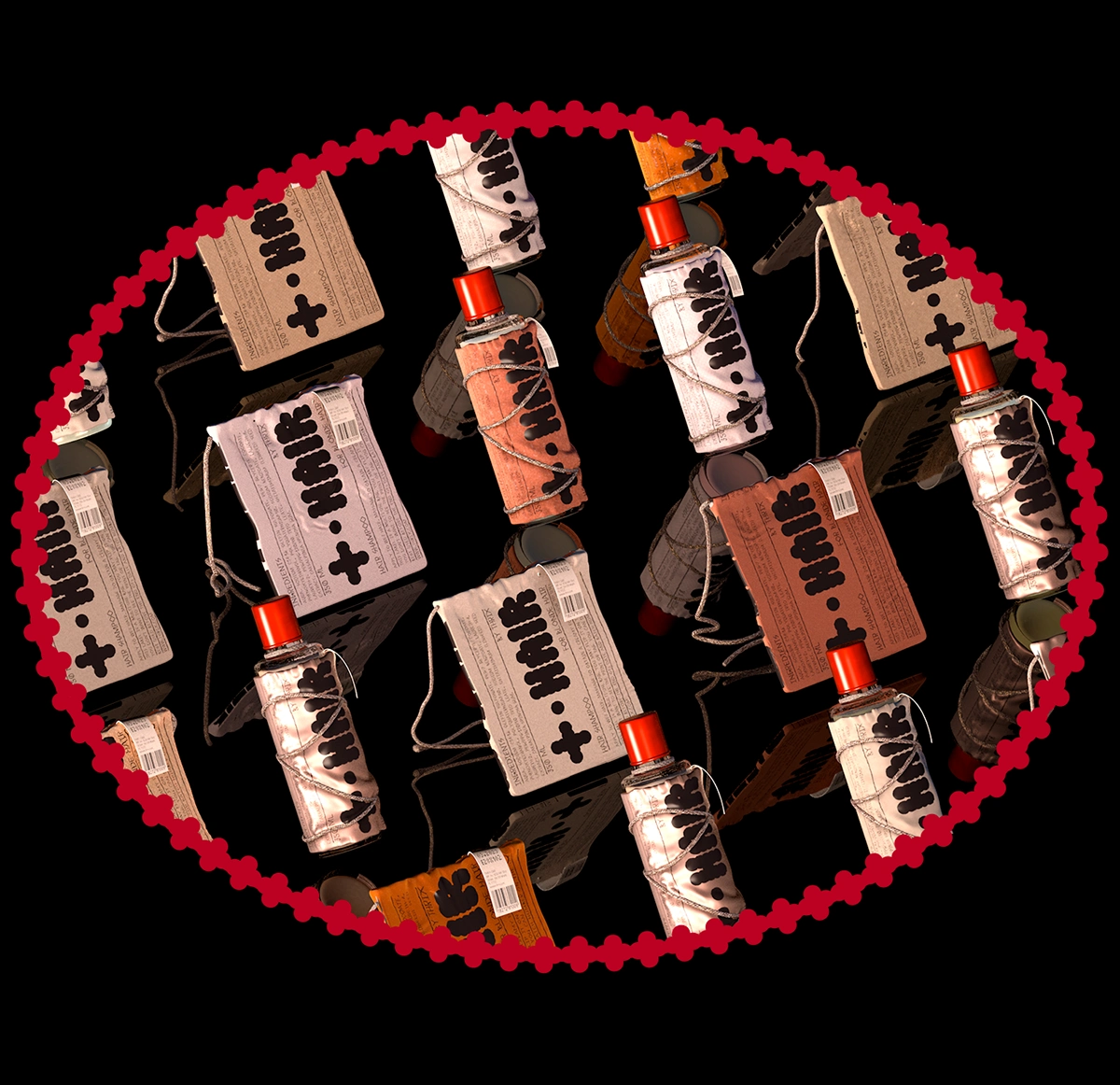
Brand Moodboard
Phase 2: Form, Function & Zero Waste
Once removed, the label turns into a usable accessory bag, while the bottle itself becomes a minimalist, unbranded object.
Two functional items. No leftover trash.
A full product identity, without single-use components.
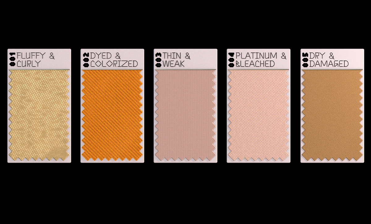
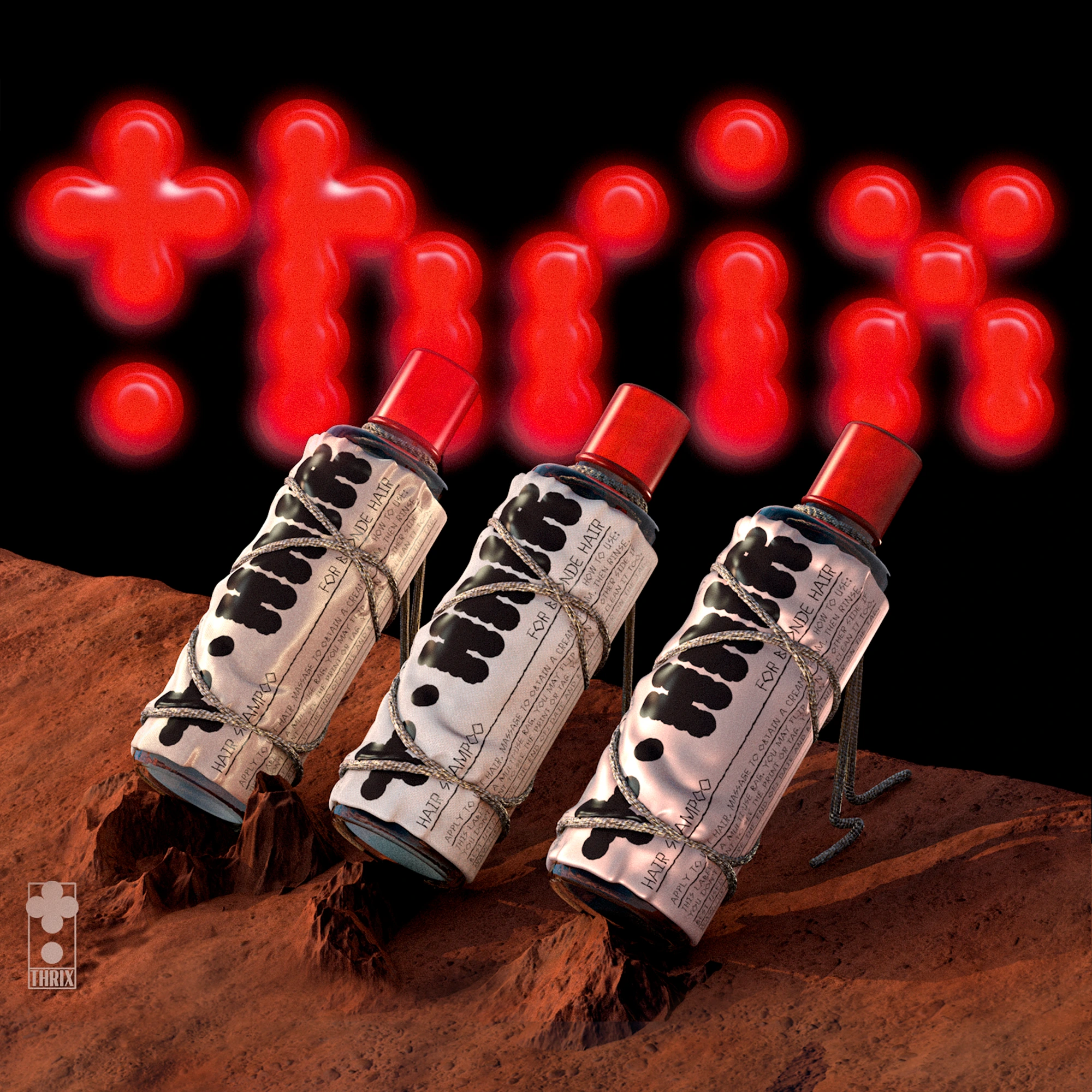
Phase 3: Visual Identity & Material System
The name THRIX comes from the Greek word trikhos, referring to the science of hair and scalp (trichology). The branding leans into that clinical yet bold space, with font systems that feel both para-medical and expressive.
🧵 Font Pairing:
Tiny 5x3: weird, pixelated, synthetic
Anthony Bold: structured, experimental, vaguely humanist
🎨 Color Palette:
Orange, peach, cherry, dusty red — representing both bodily warmth and raw minerals.
Key words:
raw-sultry-hearty-intimidating-turbulent
Brand Positioning
THRIX rejects the overused pastel aesthetic dominating “natural beauty.”
Instead, it aims for green chic - a brutalist take on sustainability.
Unapologetically vivid. Functionally weird. Emotionally fierce.
Because in today’s world, maybe sustainability isn’t soft.
Maybe it’s sharp, loud, and memorable.
Marnovya Process
Material Innovation
We replaced disposable labels with printed textile bags — tied, not glued — to transform packaging into a reusable object.
Tactile Storytelling
Each fabric was chosen to reflect the hair type it serves, creating a physical, intuitive connection between texture and function.
Modular Product Experience
The bottle becomes a minimalist object; the label, a small accessory bag — both items fully usable post-purchase.
Visual & Verbal Identity
We crafted a bold, non-pastel brand world rooted in trichology, using fierce colors and expressive typography to challenge the "soft sustainability" cliché.
Project Summary
🧵 Fabric label system (detachable, reusable, waste-free)
🧠 Brand concept & narrative positioning
🎨 Custom visual identity (fonts, palettes, naming)
🧴 Packaging design + material research
🧰 Collectible label bags as part of the product system
Client: THRIX
Design: Marnovya
Year: 2023
Like this project
Posted Jul 4, 2025
I designed a zero-waste packaging system using reusable fabric labels — turning haircare into a bold, tactile brand experience that stands out and sells.
Likes
9
Views
42
Timeline
Mar 1, 2023 - May 15, 2023