Covid-19 Interactive Dashboard for Los Angeles
Johnny Aaron
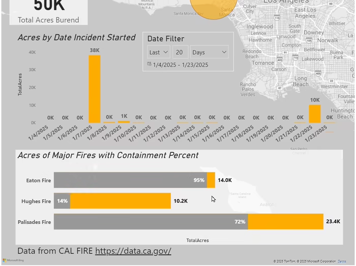
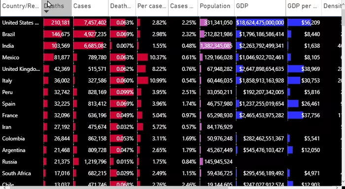
I created an interactive dashboard from public databases displaying where in Los Angeles Covid-19 was spreading during the early days of the pandemic. From the article written for it: ". . .it appears coronavirus may be nearing a saturation point in some of the more central areas in Los Angeles, according to data provided by the LA County Department of Health. . . . . . . In Hollywood, Melrose, and West Hollywood, the curve of total cases is steady, with some signs of leveling. . . . . . .In Westlake, Pico-Union, and Temple-Beaudry, there were some recent increases, but appears steady. . . ."
Like this project
Posted Feb 7, 2025
I created an interactive dashboard from public databases displaying where in Los Angeles Covid-19 was spreading during the early days of the pandemic.