Brand Identity for SAVIA Sports Nutrition

Franco Vidal


SAVIA: Brand Identity for Fruit-First Sports Nutrition
The category sells fruit flavour and contains no fruit. I built the brand that prints the percentage on the front of the pack.
01. OVERVIEW
Fruit flavours
Fruit flavours account for roughly half of all new sports nutrition launches. Almost
none of those products contain fruit. "Natural mango flavour" is an aroma compound extracted with solvent. It is legal, it passes every clean-label standard, and it is not mango.
SAVIA is a brand built in that gap. Every product contains a declared percentage of
real freeze-dried fruit, and that percentage is printed on the front of the pack, in
the most legible space on it. The number is the product, the proof and the brand's
primary asset at the same time.
I took this from category analysis through to a finished campaign: consumer research and positioning, naming and brand architecture, a custom-drawn logotype, a colour system validated against WCAG, a four-typeface system, packaging across five SKUs, a social content engine, a Shopify storefront design, and the film work.
02. THE OPPORTUNITY
Passion Fruit
Sports nutrition is a $52.8B market in 2026, and the growth is not coming from the old core. Three shifts rewrote who the customer is.
The shake became a drink. Clear whey went from specialty to mainstream, and a clear, juice-like protein is something people carry around and photograph.
Fruit took the shelf. Fruit flavours now lead roughly half of new launches, but the
industry pivoted to fruit flavouring, not to fruit.
Clean label became the price of entry, not a premium tier.
The category followed all three shifts right up to the point where following them would have cost money. That gap stayed open for a boring reason: freeze-dried fruit powder costs six to twenty times what a flavour system costs, it clumps, its colour shifts between harvests, and it ties you to agriculture, which has seasons.
For a commodity brand those are four cost problems. For a brand with a story they are four assets. Harvest variance becomes batch character. Seasonality becomes scarcity.
The supply chain becomes origin. The thing that makes it hard is the thing that keeps competitors out.
03. FINDING THE POSITION
The category sorts into four territories. Three are occupied.
Girlie-pop wellness is held hard by Bloom and Alani Nu, on roughly 37,600 sponsored TikTok posts in twelve months across about 5,600 creators. The most proven lane and the
most crowded.
Hypebeast gym bro belongs to Ghost and Ryse, built entirely on licensed candy and cereal flavour IP. Structurally the opposite of a real-fruit brand.
Clinical transparency belongs to Momentous and Legion. Correct and charmless. Wins the spreadsheet, loses the feed.
Fruit-first performance was empty. That is the position.
The primary audience is what I called the aesthetic athlete: 20 to 32, unisex, urban,
global. They train four to six times a week as an identity rather than for a sport.
They will check your protein per serving, and they will also refuse to buy something
that looks bad on their kitchen counter. Both filters are real, and the category keeps
assuming it has to pick one.
04. THE NAME
SAVIA is Spanish and Portuguese for sap: the fluid that carries sugar, water and
minerals from root to leaf and keeps the tree alive. Biologically, it is nutrition in
transit.
The name is the product metaphor rather than decoration, and it pays for itself
immediately, because a whole product architecture falls out of it. ROOT is the
pre-workout, where it starts. FLOW is hydration, the fluid in motion. PULP is the
protein, the flesh. CANOPY is night recovery, the shade. The range tells you when to use each product without a usage chart, and it scales: a future greens product is LEAF, a future creatine is HEARTWOOD.
It also travels. Five letters, three syllables, no sounds that break in English, German, French, Portuguese or Arabic transliteration. Familiar in Spain, Mexico and Brazil, unfamiliar enough to own in the US and UK.
I flagged one risk before drawing anything: SAVIA reads premium and botanical, and a lazy execution lands in skincare. I answered it in the design rather than avoiding it in the name.
05. IDENTITY
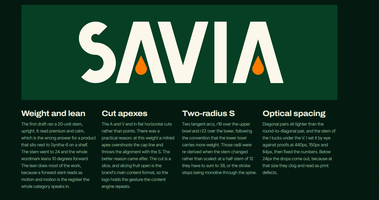
The A of SAVIA is a lambda with a drop of sap in its counter. One silhouette reads four ways: the letter, a leaf, a tree, and a drop. The standalone symbol is that same
letterform, so the monogram and the wordmark are one object rather than two things that need reconciling. A brand whose symbol is a letter of its own name never has the problem where nobody recognises the icon without the name beside it.
The letterforms are drawn as outline paths on a 100-unit grid, not set in a licensed
font. The first draft ran a lighter stem, upright, and it read premium and calm, which
is the wrong answer for a product that sits next to Syntha-6 on a shelf. The stem went heavier and the whole wordmark leans ten degrees forward. The lean does most of the work, because a forward slant reads as motion.
The A and V end in flat cuts rather than mitred points. That started as a technical fix, since a mitred apex at this weight overshoots the cap line and breaks alignment with the S. The better reason arrived afterwards: a cut is a slice, and slicing fruit open is the brand's main content format, so the logo carries the gesture the content engine repeats.
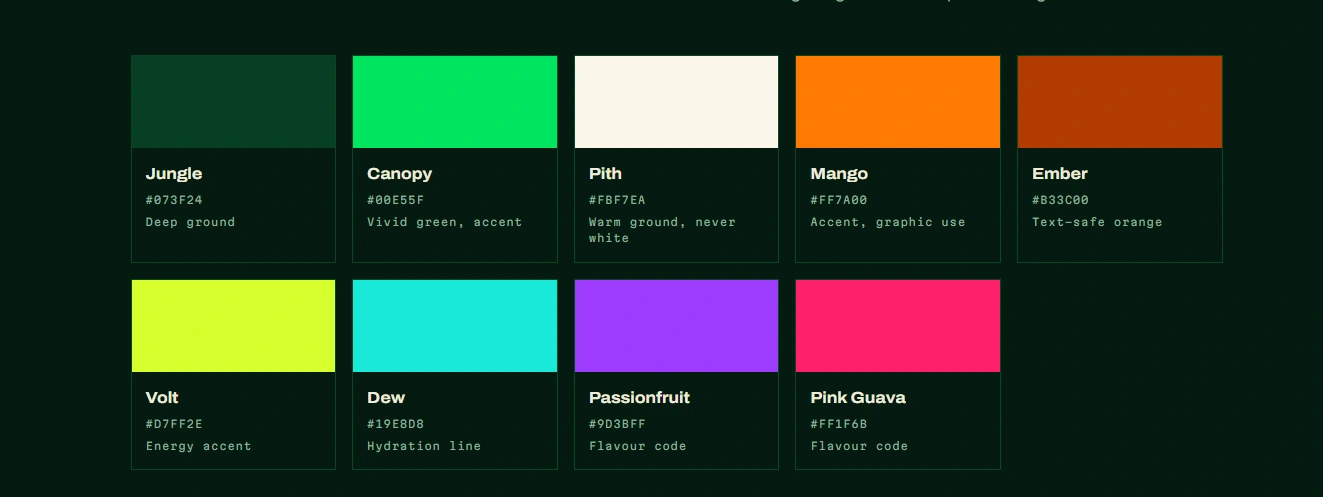
Green carries the plant, orange carries the charge. They sit near opposite on the wheel, which gives the loudest pairing available that is not a hazard sign. The specific green is a competitive decision, since Bloom owns bright lime, so Jungle sits deep and shadowed and cannot be confused at thumbnail size.
Every pair ran against WCAG 2.1 before entering the system, and one result changed the palette: the brand's own accent fails as text on its own light ground at 2.44:1. So the system carries a second, deeper orange whose only job is to stop a production team making that mistake.
06. PACKAGING
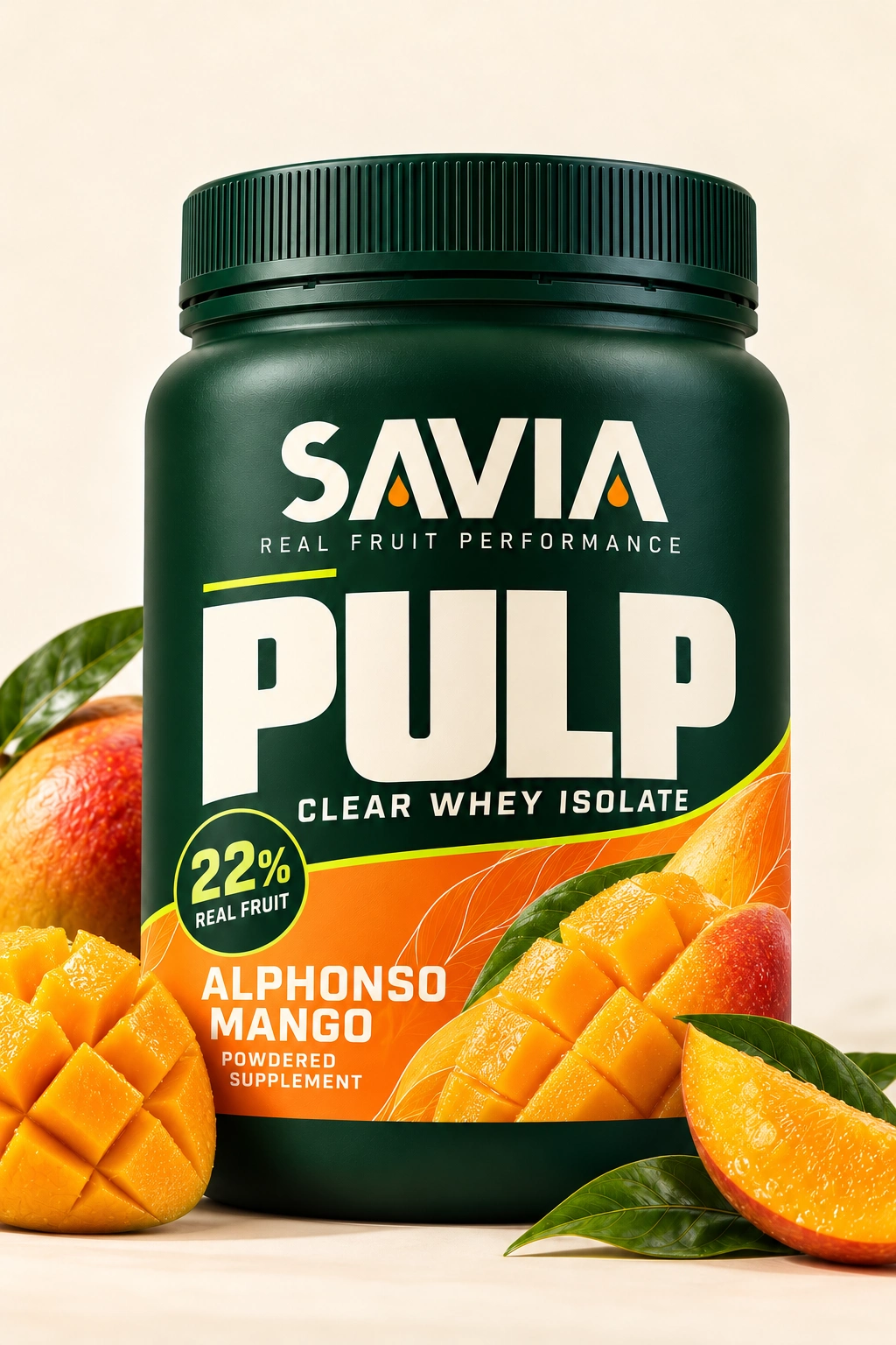
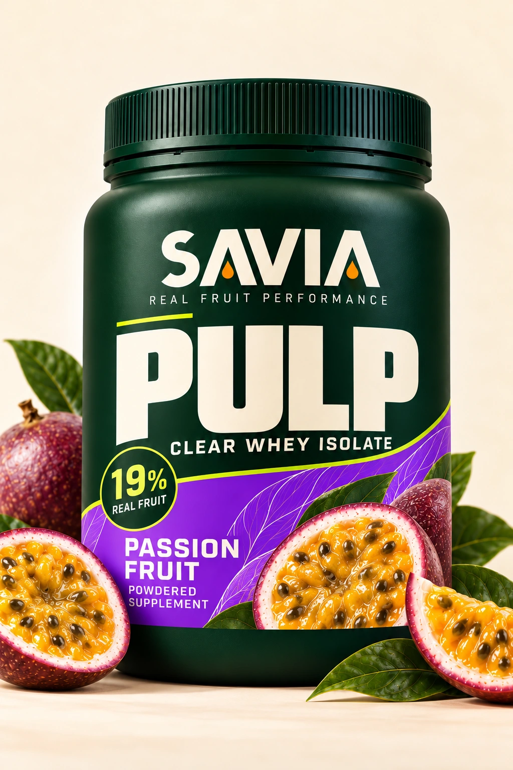
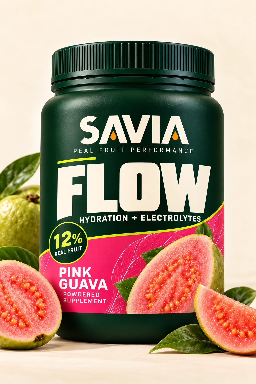
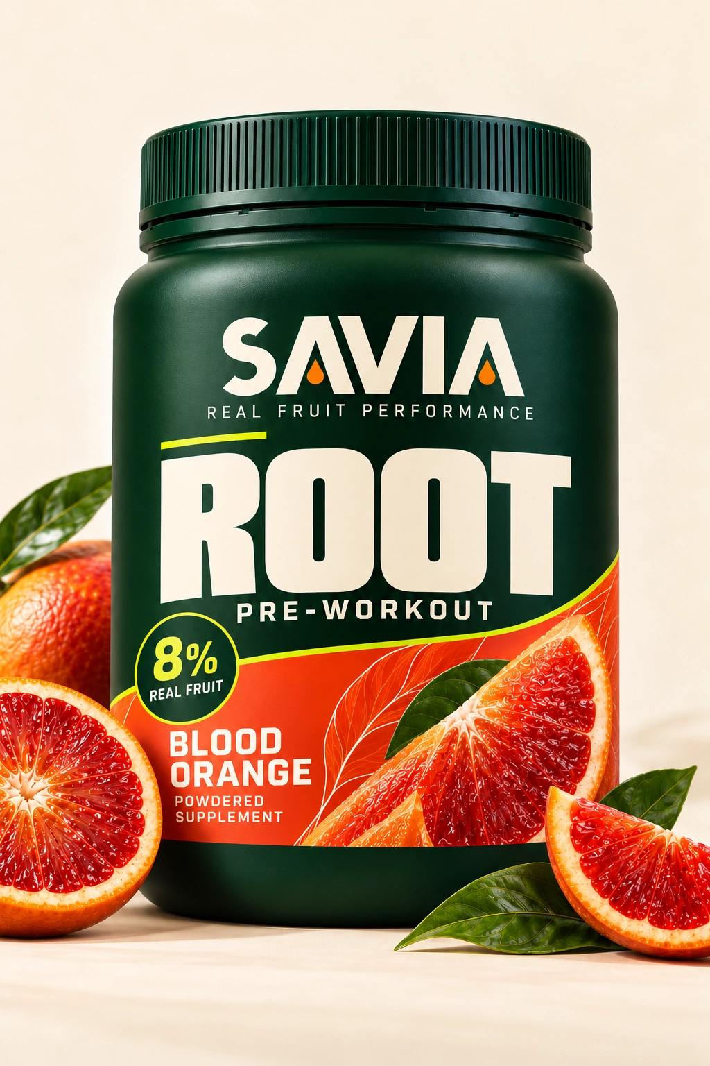
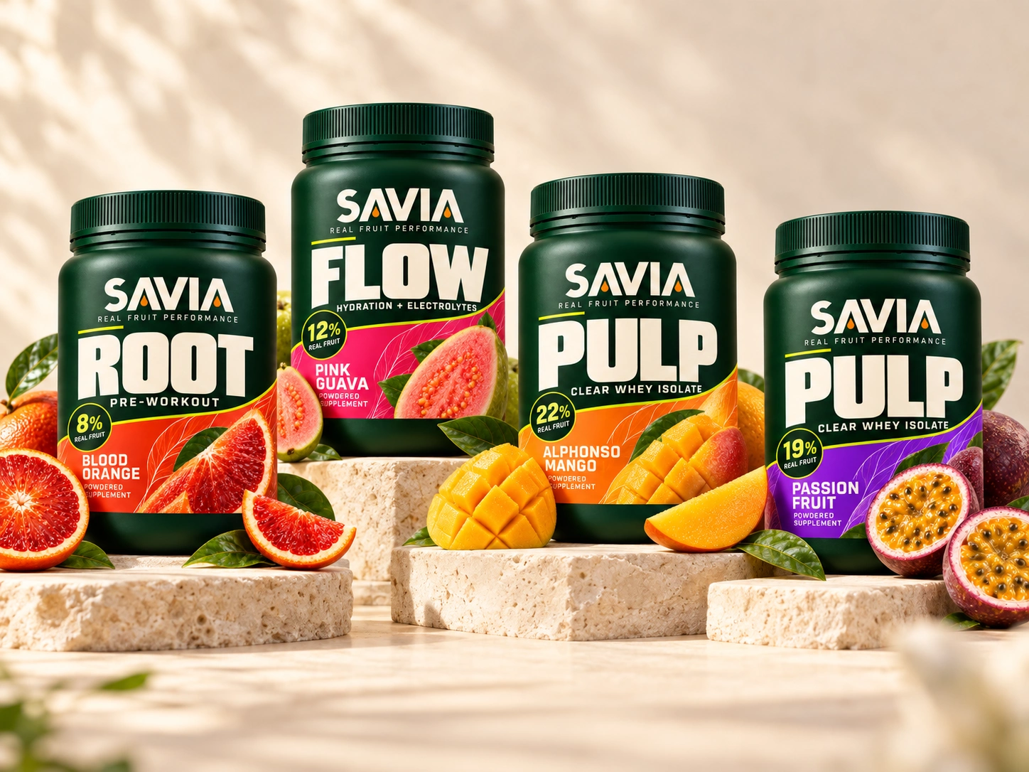
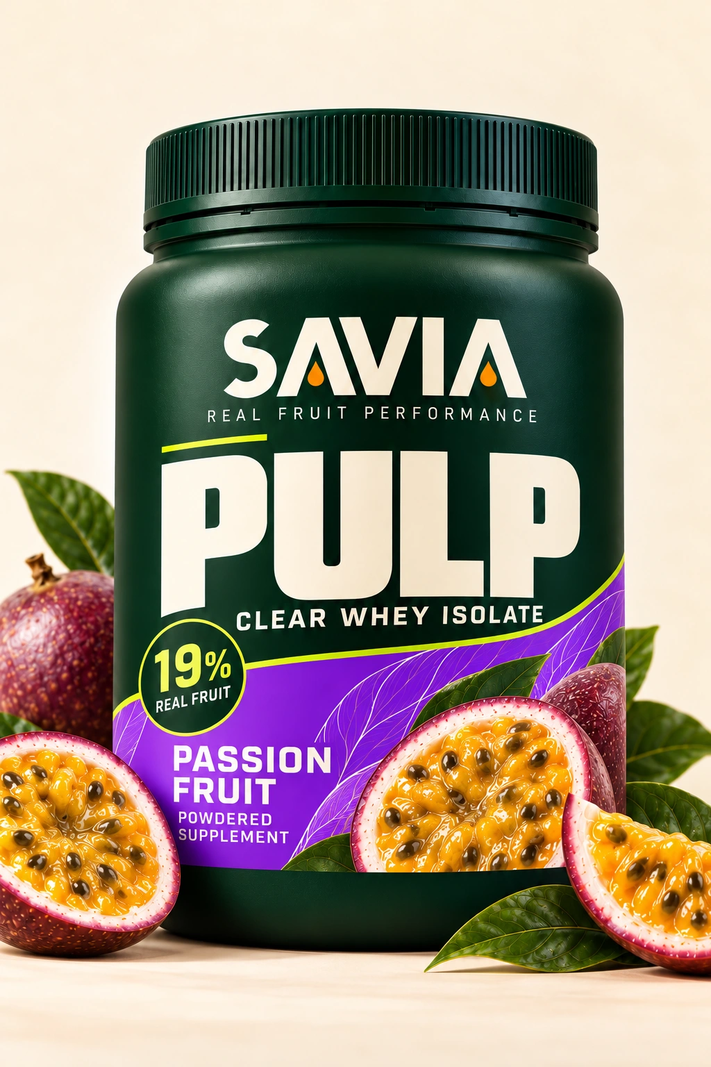
The front panel follows the anatomy every serious supplement tub uses, because shoppers read that shelf fluently and fighting the convention costs more than it wins. Brand zone, product name at display scale, format descriptor, a circular claim badge, and a diagonal flavour panel carrying a photograph of the fruit itself.
What changes is what sits in the badge. On every other tub in the category that disc holds a protein number. Here it holds the percentage of real fruit, which is the one figure no competitor can print.
The body stays the same deep green across all five SKUs and the flavour lives entirely in the diagonal panel. An earlier route put the flavour colour on the whole body, which was louder on a single pack and much weaker as a range: five loud tubs read as five brands. Holding the green and letting one panel carry the colour is what makes the set read as one.
07. SOCIAL
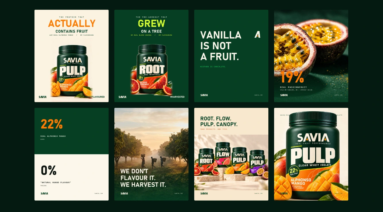
Bloom's run gets read as "go viral." It was not. It was roughly 37,600 sponsored posts across about 5,600 creators in twelve months. Ten thousand competent videos in a proven format out-earn a handful of perfect ones, so the system is built as repeatable formats rather than one-off ideas.
The Cut is the primary one: a real fruit sliced open next to the scoop, same light, same setup, different fruit, forever. After four or five exposures the lighting alone
identifies the brand, and a flavour-based competitor cannot copy it without lying. Bloom has the shake and sip. SAVIA has the cut.
The others are The Percentage, where the number is read aloud in the first two seconds; The Harvest Drop, which releases by season and origin and turns a supply-chain problem into scarcity; and The Hero Drop, the paid format that has to work at thumbnail size with the sound off.
08. STOREFRONT
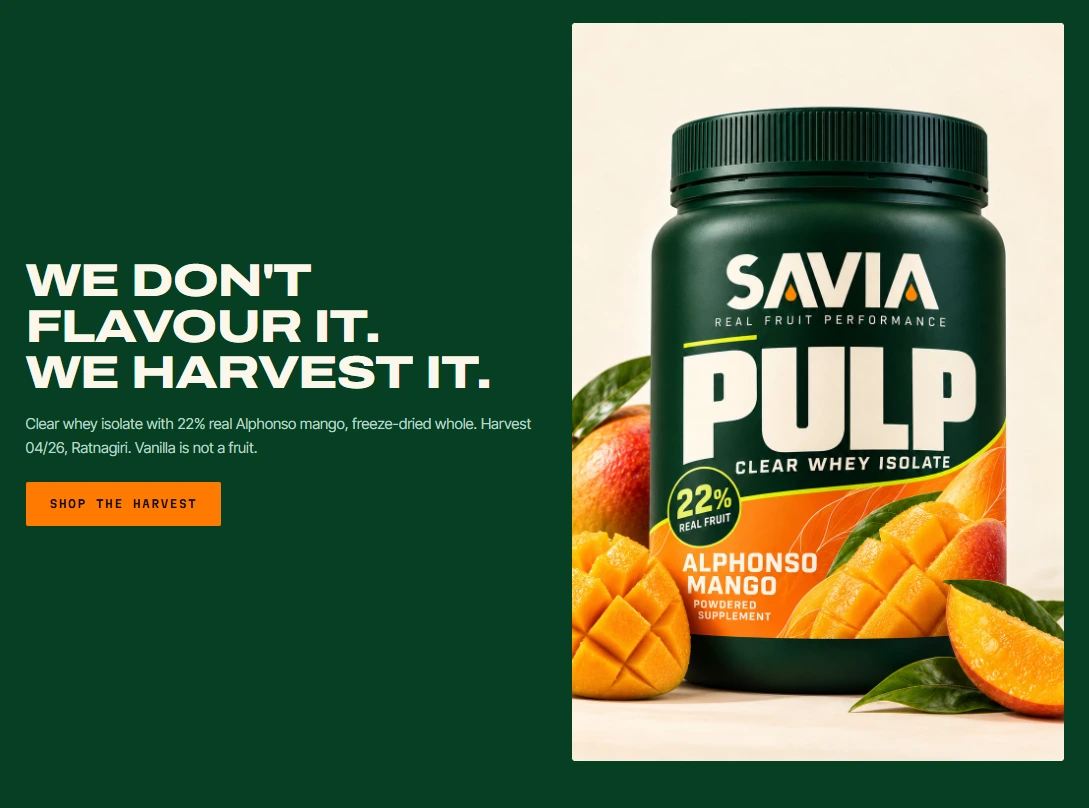
On a premium Shopify theme, the components are organised around the claim instead of around a product grid. The percentage is the filter, the sort, the badge and the hero.
Shoppers can browse the range by how much fruit is in it, which no competitor can offer, because all of their products would return zero. It is the rare case where a brand's distinctive asset and a genuinely useful piece of UX are the same object.
09. CAMPAIGN
SAVIA is a self-initiated project, built to show a full identity engagement end to end.
The market data comes from published industry sources. The brand, its products and its origins are fictional.
Available for brand strategy and identity work with CPG, wellness and consumer brands that want a position worth defending rather than just a logo.
Like this project
Posted Oct 9, 2026
The category sells fruit flavour and contains no fruit. SAVIA prints the percentage of real fruit on the front of the pack. Strategy, identity, packaging, film.
Likes
0
Views
4
Timeline
Oct 2, 2026 - Oct 9, 2026