Interactive Landing Pages for Sund Goggles

Franco Vidal


Two ways to sell a lens.
Sund makes vintage-cut goggles for the playa: sun, sand, and the dust storms that come with them. I built the same single-screen site twice. One direction explains why the goggles work. The other refuses to explain anything and simply shows you. This is a record of both, and of the question I am putting to the room.
A) Hover a lens
tells you the lens works
B) Look through it
lets you look through it.
The brief
One product, one photograph, one screen, no scroll. The goggles have exactly two selling points and both are about what they keep out: dust and glare. A landing page that lists two benefits is a solved problem and a boring one. The interesting question is what the interaction should be doing while the visitor is there.
So rather than iterate toward one answer, I built two that disagree with each other on purpose, and kept every other variable fixed. Same photograph, same single screen, same product, same amount of screen time. Only the argument changes.
The two directions
Direction A:
Focus pull
Hover either lens and the site zooms into it. The benefit resolves into focus inside the glass, as if the lens itself were bringing the words in.
0 msThe goggles slide sideways so the hovered lens lands dead centre, then scale 1.9× about that lens.
0 msBackground pushes in, darkens and blurs. The headline blurs out. Its twin lens dims.
110 msThe benefit title arrives out of focus with its tracking wide open, then sharpens and closes up.
250 msThe body line repeats the move, a beat behind, so the two never land together.
exitLeaving the lens resets in 200 ms. Slow in, fast out.
The argument is legibility: two clear claims, one per lens, delivered with enough theatre that reading them feels like a discovery rather than a chore.
Direction B:
Through the lens
The goggles hang fixed and the desert moves behind them. Outside the glass the playa is a blown-out whiteout. Inside the glass it is the sunset you actually paid for.
restTwo grades of the same photograph, stacked. The amber one is clipped to the two lens ellipses.
moveThe cursor pans the world ±46 px across and ±23 px down, eased toward the target at 0.09 per frame.
alwaysThe lens windows never move. The landscape travels behind them, so the glass reads as glass.
touchNo cursor to follow, so the world drifts on a slow sine of its own.
The argument is evidence: not one word about dust or glare, because the difference between the two grades already makes the case faster than a sentence can.
The grade is the product
Direction B lives or dies on one thing: whether the two versions of the photograph are believable as the same moment seen two ways. Both come from a single source frame, graded in opposite directions.
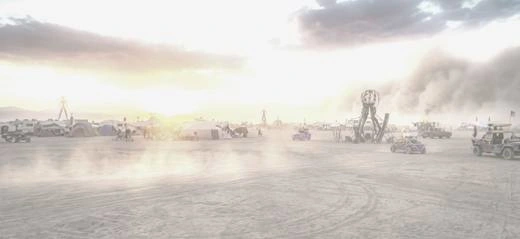
Naked eye - exposure lifted, highlights bloomed, colour pulled down, dust haze laid over

Through amber glass - warm tint, contrast raised, shadows recovered, micro-contrast added
The first pass of the amber grade was far too saturated and read as a photo filter rather than as glass. Pulling saturation back from 1.26 to 1.10 and letting some blue survive in the shadows is what made it look like something you could put on your face.
Measure the lens, never estimate it
Both directions depend on knowing exactly where the glass sits inside the frame. I estimated it by eye first, and it was wrong three times in a row in ways that were obvious on screen: copy sitting off-centre in the lens, amber spilling over the brass rim.
The fix was to stop guessing. I scanned rows and columns of the cut-out and classified every pixel as pale desaturated brass or warm glass, then read off where each run of glass starts and ends. The numbers came back symmetrical around the centre line, which is the tell that they are right.
Two traps worth naming, because both are invisible until they are not:
The bright part of a lens is not its centre
My first method took the centroid of the amber highlight inside each lens. But the sun in this photograph comes from the left, so the highlight sits off to one side of the glass it lives in. Every measurement built on it was pulled inward by about two percent, and at 1.9× zoom that is a visible offset.
Zoom multiplies your errors
Direction A scales about the lens centre. I had the transform origin at 50% vertically when the true centre is 49.6%. On a still image nobody would ever see 0.4%. Multiplied by the zoom factor and measured against fixed text, it became a gap you could not stop looking at.
A clip path belongs on a still element
The bug that took longest to see. In Direction B I put the two lens holes on the same layer that pans, and
clip-path resolves in the element's own local space. So the holes inherited the layer's 1.16× scale, which made them spill over the brass, and they travelled with the pan, which made the glass appear to smear as you moved.Splitting the two responsibilities fixed it: the clip now lives on a wrapper that never moves, and the world pans inside that window. Obvious in hindsight, and a good reminder that a transform and a clip on one element are two ideas fighting for the same coordinate system.
What I am actually asking
Not which one looks better. Both look fine, and looking fine is table stakes. The question is which argument a stranger believes faster.
A is safer. It says two specific things and a visitor leaves able to repeat them. B is riskier: it says nothing, so it depends entirely on whether the difference between the two grades reads as a product benefit rather than as a nice picture. If it does, it is far more persuasive than a sentence about polarised amber glass. If it does not, it is a pretty screen that sold nothing.
That is the trade I want a second opinion on.
Build notes
PlatformFramer, two pages, one project. Each effect is a single self-contained code component with its copy, colour and motion exposed as properties.
Lens geometry Left cx 27.23%, right cx 72.64%, cy 49.6%, ry 30%. Measured from pixels, not estimated.
A - zoom1.90× about the measured lens centre, 620 ms on a custom ease.
A - revealTitle blur 14 px → 0 with tracking 0.2em → -0.02em at 110 ms. Body follows at 250 ms. Exit 200 ms, no stagger.
B - pan World scaled 1.16× for headroom, travel ±46 px across and ±23 px down, eased at 0.09 per frame.
B - syncBoth world layers get their transform written in the same frame, so the two grades can never drift a frame apart and leave a ghost edge at the rim.
Cut-out - Goggles lifted off the studio backdrop locally: HSV threshold, connected components seeded from the border, holes filled, edge eroded and feathered.
Assets - Goggles 208 KB WebP with alpha at 1800×745. Backgrounds 171 KB and 567 KB JPEG at 2400×1309.
Touch - Neither effect depends on hover. A cycles its two lenses and accepts taps; B drifts on its own.
Like this project
Posted Sep 14, 2026
Two directions for the same brief, and I cannot pick one. Sund makes vintage-cut goggles for Burning Man. Sun, sand, dust storms. Two selling points.
Likes
0
Views
12
Timeline
Sep 7, 2026 - Sep 14, 2026