Snowie - Interactive Snowboard Store Built in Framer

Franco Vidal


Snowie - Interactive Snowboard Store Built in Framer
An interactive snowboard concept store that turns unpacking a bag into a product discovery experience.
Snowie is a fictional snowboard brand brought to life through a responsive Framer website. Instead of starting with a conventional product grid, visitors unzip a snowboard bag and explore the equipment inside. Dedicated product views, visible color changes and a saved demo kit make the experience playful, useful and easy to navigate.
Overview
The idea behind snowie was simple: make browsing snowboard gear feel like preparing for the mountain.
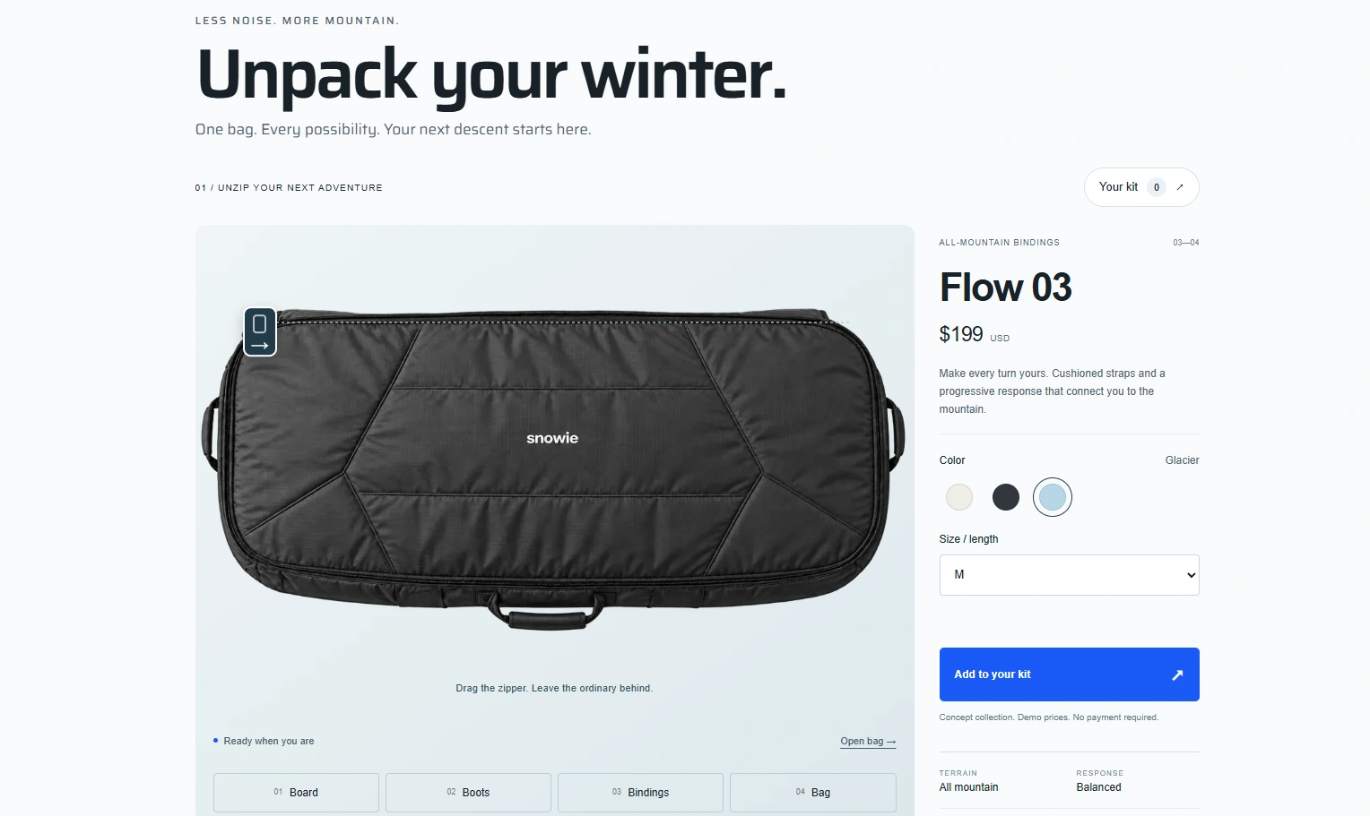
The website opens with a packed snowboard bag. Dragging its zipper reveals a board, boots and bindings arranged inside. Each item becomes an entry point into the collection, inviting visitors to explore through an interaction that belongs to the world of the brand.
The result is a concept storefront that combines an expressive introduction with familiar shopping controls, clear product information and a quieter editorial layout.
Front page
The challenge
The central challenge was to make a distinctive interaction useful. The bag needed to create a memorable first impression while still helping visitors understand the products, compare colors and choose sizes. The experience also needed to work on smaller screens and offer alternatives to dragging or hovering.
Creative direction
A snow-inspired palette of off-white, glacier blue and graphite establishes the atmosphere. Restrained typography, generous spacing and alpine imagery keep the focus on the equipment. A compact snowie identity ties the bag, collection and interface together.
The headline, “Unpack your winter,” connects the brand story directly to the first interaction. Further down the page, “Go where you feel alive” shifts the emphasis from equipment to the experience it enables.
The interactive bag
The bag acts as an interactive introduction to the collection. Visitors can drag the zipper to progressively reveal its contents, use the Open bag button, or operate the slider with the keyboard.
Product markers and equipment tabs provide two ways to explore. This keeps the experience accessible on touch devices and gives visitors a clear route to an item without requiring precise hovering.
The opening went through several iterations. A simulated 3D fold introduced visual weight and friction, so the final version uses a simpler progressive reveal. Pointer updates are coordinated with the browser’s animation frames, and the button-driven opening uses a short eased animation. Reduced-motion preferences are respected.
The opening
Product close-ups and color selection
Selecting an item opens a dedicated product view. The equipment appears larger against a subdued background, with the product name, price, available colors and sizes beside it.
Color selection changes the actual product image. Boots are shown in Graphite, Snow and Pine; boards in Glacier, Graphite and Snow; and bindings in Snow, Graphite and Glacier. Each option has its own visual asset rather than changing only the selected swatch.
The original studio backgrounds were removed to integrate the equipment into the interface. Subtle transitions connect the different views, while Back to kit and Escape return visitors to the bag.
Colors
A functional concept shopping flow
Visitors can choose a color and size, add products to a demo kit, review the selected variants, remove items and see the total. The kit is stored locally in the browser so it remains available between visits on that browser.
The collection and FAQ sections are managed through Framer CMS. All customer-facing copy is in English, and responsive layouts adapt the experience across desktop, tablet and phone.
This is a concept project: the products, specifications and prices are illustrative. It does not process payments, orders or reservations.
Performance and refinement
Visual polish also meant reducing delays. Early product views loaded their images only when selected, and remounting the image on every change added unnecessary work. The revised gallery keeps product images mounted and prepares them before selection.
The eleven transparent product and bag assets were exported as optimized WebP files, reducing their combined size from approximately 1.8 MB to 0.81 MB. This is an asset-size comparison, not a measured page-speed or conversion improvement.
The work was checked through Framer’s component type checking and interactive desktop/mobile previews. Verification included opening the bag, switching products and colors, choosing sizes, adding and removing demo-kit items, and returning from product views with the keyboard.
Build and tools
The site combines native Framer layouts and CMS content with a custom React/TypeScript component for the interactive bag and product exploration. AI-assisted image generation was used to develop the conceptual equipment imagery, color variants and transparent assets, followed by visual review and compression.
Scope: visual identity direction, web art direction, interface design, interaction design, responsive implementation, product-image development, English website copy and a portfolio motion piece.
Outcome
Snowie turns a familiar preparation ritual into the core of a browsing experience. The bag introduces the collection, product close-ups support exploration, and the demo kit gives visitors a practical next step.
The project demonstrates how a playful interaction can coexist with clear navigation, consistent visual language and attention to loading behavior. It is presented as a self-initiated concept, without invented client results or performance claims.
Live website: https://attractive-types-236212.framer.app/
Like this project
Posted Sep 29, 2026
A motion-design walkthrough of snowie, built from the project’s product imagery and website captures. It moves from a packed Ski bag into the digital storefront
Likes
0
Views
9
Timeline
Sep 28, 2026 - Sep 29, 2026