TREND | Logo, Packaging & 3D Mockups
Muhammad Asad Khan
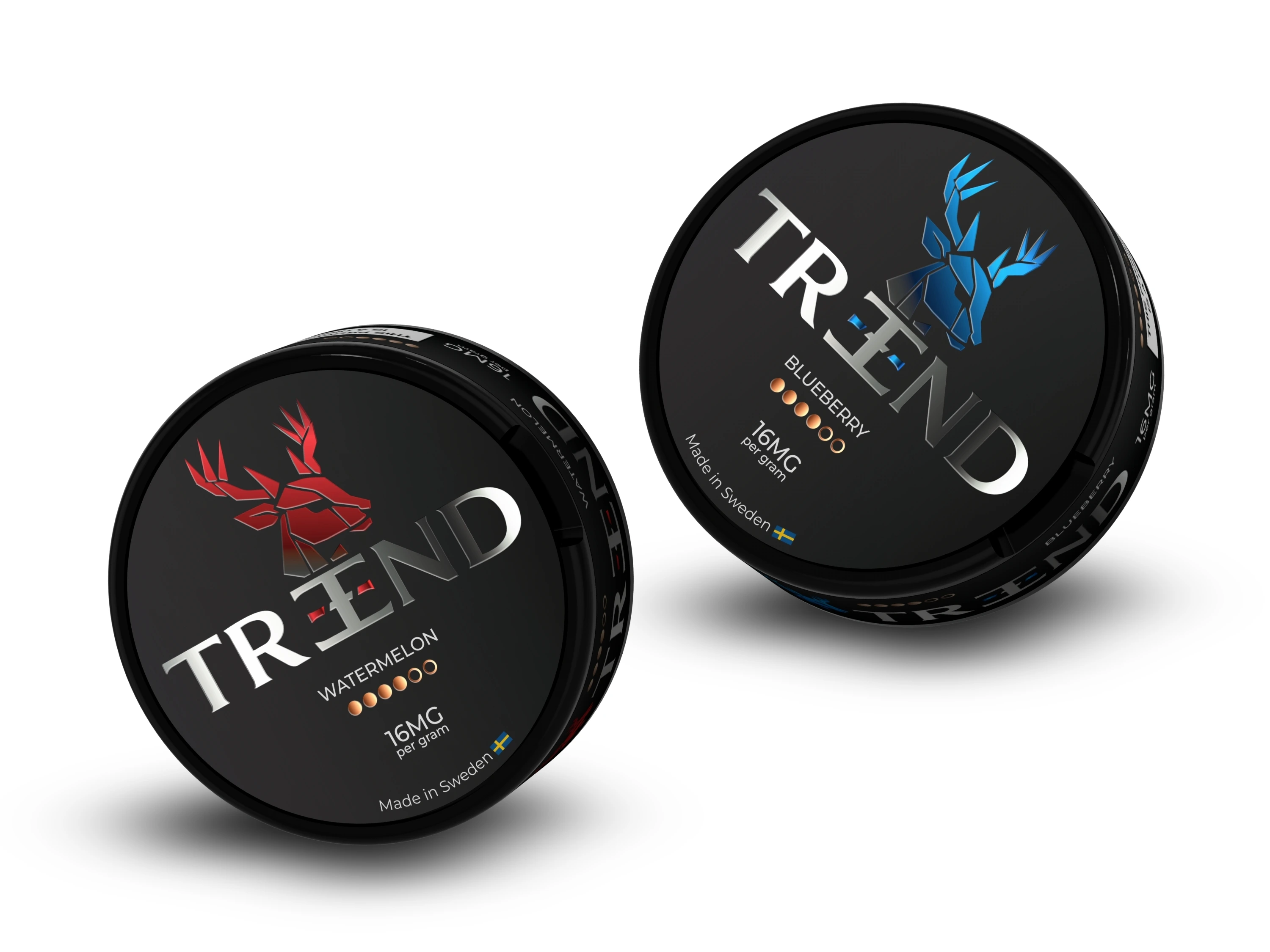
TREND
TREND is a nicotine pouch brand that wanted the opposite approach to Hype+, where that brand leaned into restraint and minimalism, TREND wanted to feel bold, sharp, and impossible to miss on a crowded shelf.
The logo became the centerpiece of the whole identity, a stag motif built into the wordmark itself rather than sitting beside it as a separate icon, giving the brand a single, distinctive symbol that works as a mark on its own even without the full name attached. That same boldness carried through into the packaging, strong color contrast, confident typography, and a finish meant to catch the eye under store lighting rather than blend into the row of competitors next to it.
3D mockups were used throughout to test how the design actually read on the physical tin shape, color and contrast that look strong on a flat screen don't always hold up once light hits a curved, reflective surface, so getting that translation right before production mattered.
This project is a good example of range, the same underlying process, identity first, then packaging built around it, but a completely different visual outcome depending on what the brand actually needed to say.
Like this project
Posted Jun 26, 2026
Bold brand identity and packaging system for TREND nicotine pouches, from stag-motif logo to shelf-ready 3D mockups designed to dominate retail displays.
Likes
4
Views
5
Timeline
Apr 1, 2026 - May 1, 2026