Data Analysis and Visualization for profit and loss dashoard
Muattar sattar
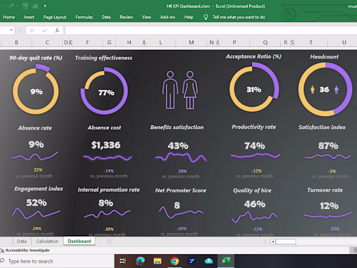
Data Analysis and Visualization for a profit and loss dashboard involves creating a visual tool that helps businesses understand their financial performance.
Key Features:
Income and Expenses: A clear display of all revenue streams and outgoing expenses.
Net Profit: Calculation and visualization of net profit after all deductions.
Gross Profit Margin: Percentage indicating the gross profit margin relative to sales.
Churned Customers: Tracking the number of customers who have stopped using the service or product.
Net Operating Income: Income from operations after subtracting necessary operating expenses.
Like this project
Posted Mar 13, 2024
Performed data analysis on a large dataset to identify trends and patterns, created visualizations to present findings in an easily understandable format.