Susie Yorkie — Website That Converts Authority into Leads
Ernesto Carrazana
Susie Yorkie’s Website Redesign: Modern UI & Usability
Redesigned her website to reflect her authority in food marketing mentorship. Clean UI, clear messaging, and strategic CTAs now guide visitors to book calls and join her programs — turning her site into a lead-generation tool.
"A website shouldn’t just look good — it should work like your best sales partner."
When I started working on Susie Yorkie’s website, the goal was clear: transform her digital presence into a powerful tool that reflects her authority in food marketing and female mentorship, while making it easy for visitors to connect and convert.
The existing site lacked clarity, visual cohesion, and a clear path to action.
It looked outdated — and worse, it didn’t reflect the depth of her expertise.
My task wasn’t just to modernize the design.
It was to rebuild trust from the first second.
🧩 The Challenge: A Site That Didn’t Match Her Impact
Susie is a respected voice in food marketing and women’s leadership.
But her website told a different story:
Outdated layout and typography
No clear value proposition
Weak CTAs and poor lead capture
Inconsistent branding across sections
👉 The result? Visitors left without understanding who she was or how to work with her.
The challenge wasn’t aesthetics.
It was perception: how to make a personal brand feel both warm and undeniably professional.
See full project: http://u.pc.cd/D1VrtalK
💡 My Role: Visual Branding Designer & Conversion Strategist
I stepped in as more than a designer — I became a digital ambassador for her brand.
From Figma to final handoff, I led a complete UI/UX overhaul focused on three pillars:
✅ Clarity First
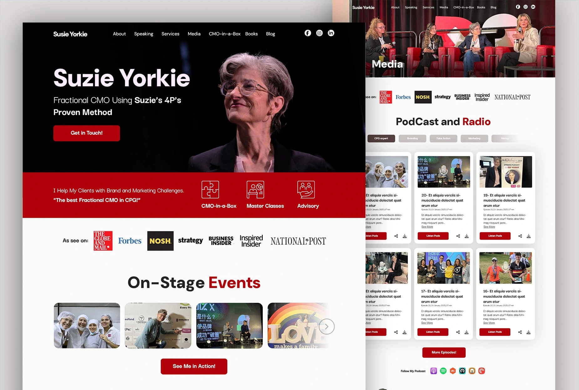
Restructured the homepage around one central message: “I help women in food marketing build authority and visibility.”
Created a hero section that answers “What do you do?” in under 5 seconds
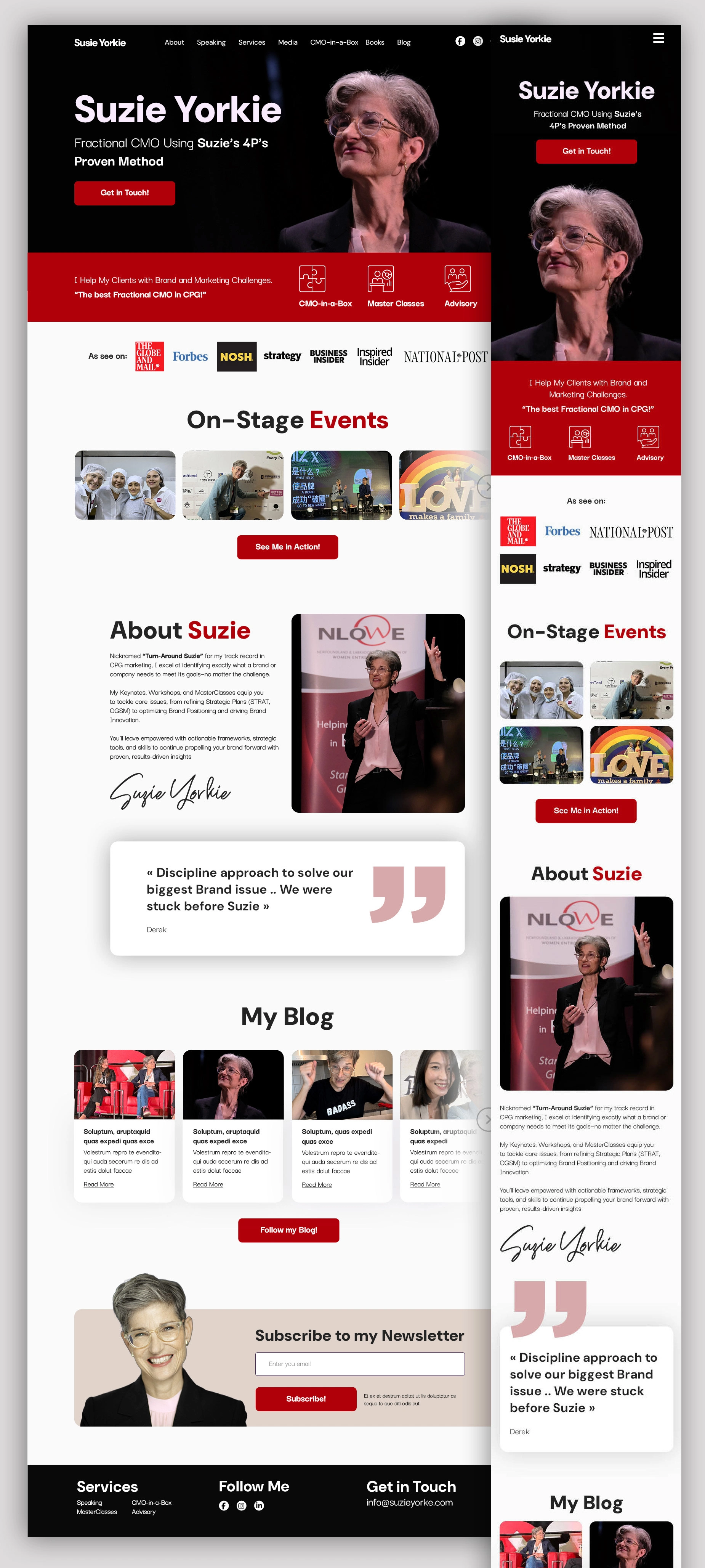
🎨 Modern, Warm Visual Identity
Refreshed the color palette: soft neutrals with bold accents for contrast
Introduced clean, readable typography (Inter + Playfair Display)
Used authentic photography to reinforce approachability and expertise
🔁 Conversion-Focused UX
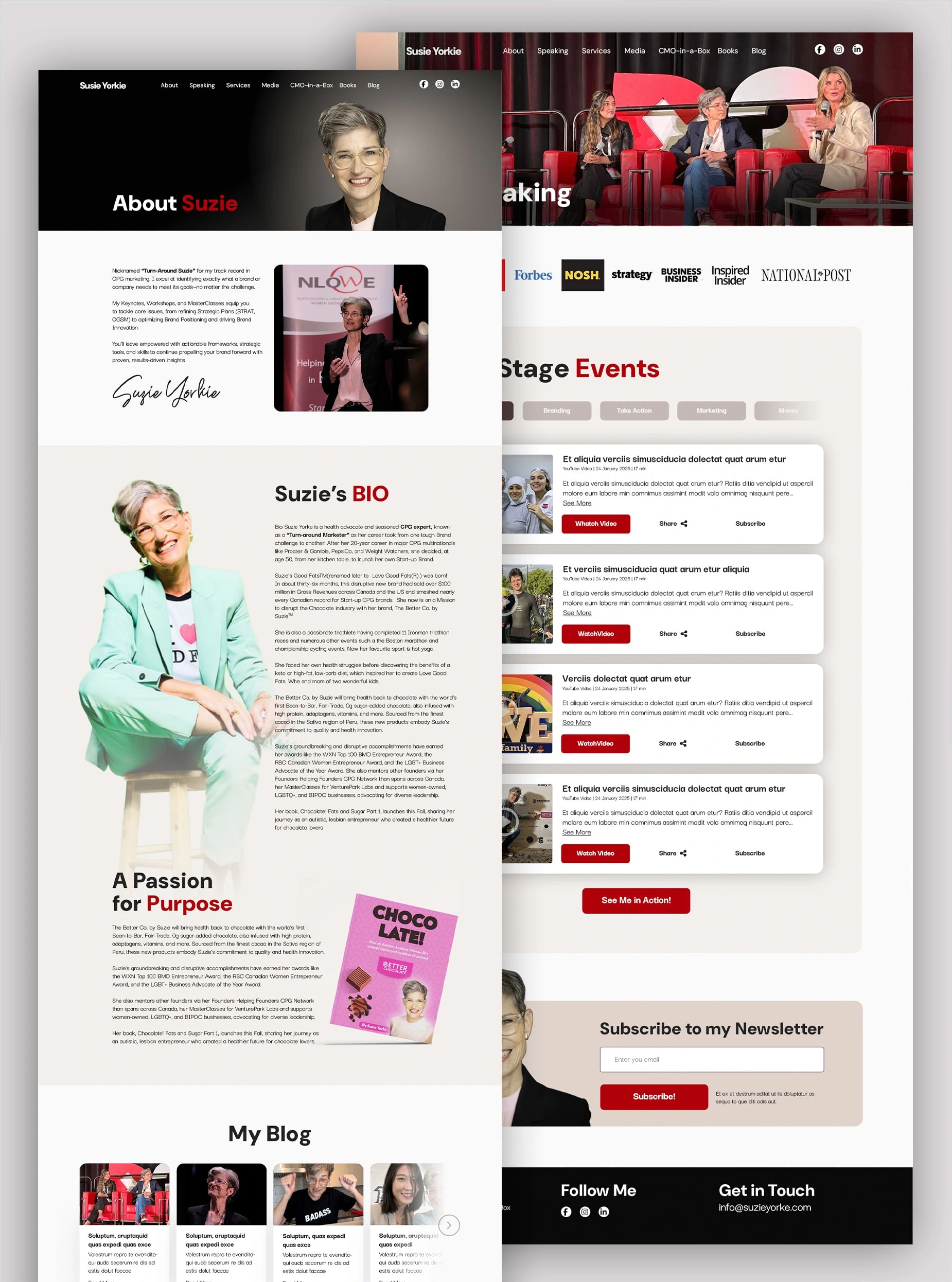
Designed intuitive navigation and clear content hierarchy
Added prominent, high-value CTAs: “Book a Call”, “Join the Mentorship”
Integrated lead magnets (free guides) directly into key pages
Optimized for mobile-first experience
Every decision was made with one question in mind:
“Does this help the visitor take the next step?”
Homepage design for Susie Yorkie highlighting CTAs for the "CMO in a Box" mentorship program.
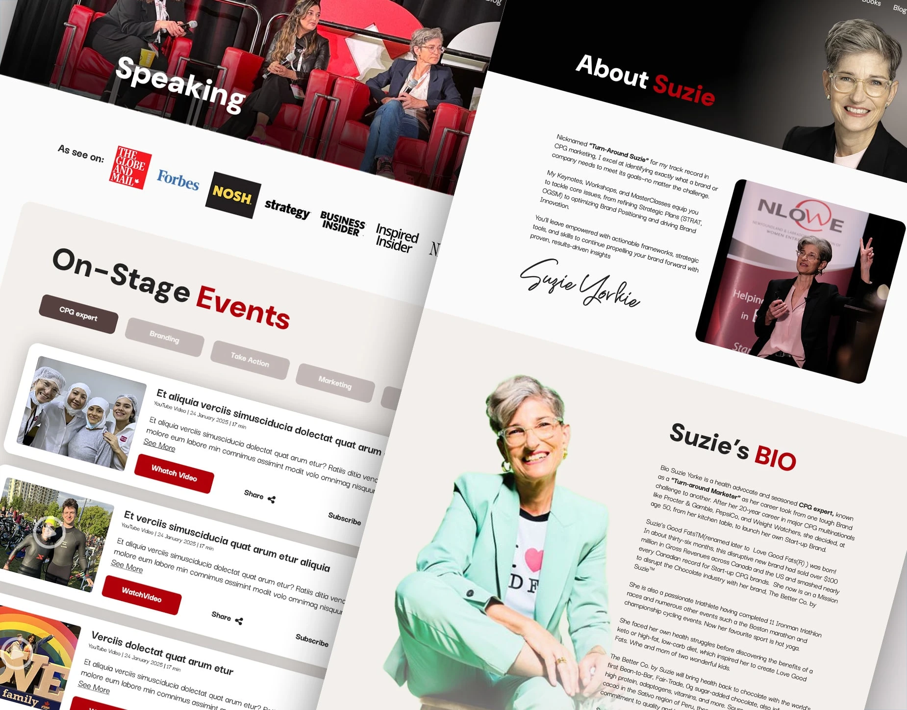
Bold hero section showcasing female leadership and personal branding in the chocolate industry.
Dedicated section for promoting exclusive mentorships in marketing with lead generation focus.
🛠️ Tools & Process
Figma – for wireframing, prototyping, and design system creation
Webflow / WordPress – recommended for development (client choice)
Photoshop/ Canva – editable templates for future content
Client collaboration – 3 feedback rounds, fast iteration cycles
And I delivered a simple PDF guide with:
How to update content
Design dos and don’ts
Best practices for email integration
So the site could grow — without losing its soul.
📈 The Result: A Website That Works Like a Team Member
After the redesign, the new site achieved:
Immediate improvement in perceived professionalism
Clearer messaging that resonated with her ideal clients
Higher engagement on key pages (especially "Work With Me")
Smoother lead capture process
One of her testimonials after launch:
“I finally have a website that feels like me — but better. It’s not just pretty. It’s effective.”
That’s what happens when design serves strategy.
Like this project
Posted Oct 3, 2025
Redesigned her website to reflect her authority in food marketing mentorship. Clean UI and strategic CTAs now turning her site into a lead-generation tool.