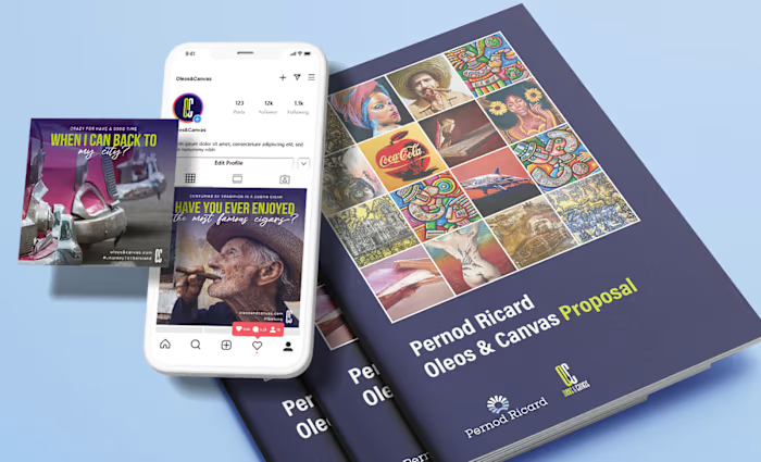
Santa Maria Tours - Logo Design & Visual Branding
Ernesto Carrazana
Santa Maria Tours - Logo Design & Design and Visual Branding
Created a clean, authentic brand identity from scratch for an eco-conscious travel agency. Focused on warmth, nature, and human connection — with a logo, color system, and guidelines ready to scale.
When I started working with Santa Maria Tours, the vision was clear: create a travel experience that felt intimate, respectful of nature, and deeply connected to local culture.
But the brand lacked a visual identity that reflected that soul.
My task wasn’t just to design a logo.
It was to capture the essence of slow, meaningful travel — in one symbol, one color palette, one voice.
🧩 The Challenge: Building Identity from Nothing
The client had a strong mission but no visual foundation.
No logo, no colors, no typography — just an idea: “We offer eco-conscious tours that connect people to real Cuba.”
Without a cohesive identity:
It was hard to stand out in a crowded market
Marketing materials felt inconsistent before they even existed
The team couldn’t communicate their value clearly
👉 The risk? Becoming just another tour operator.
The challenge wasn’t aesthetics.
It was meaning: how to make a brand feel authentic from day one.
See full project: http://u.pc.cd/1OR
💡 My Role: Visual Branding Designer & Strategic Partner
I stepped in not just as a designer, but as a brand architect — someone who could translate values into visuals.
From scratch, I developed a complete visual system:
✅ Logo Design
Created a custom wordmark with subtle organic curves
Designed an abstract icon inspired by natural paths and human movement
Focused on simplicity, scalability, and emotional warmth
🎨 Brand Identity System
Defined a warm, earthy color palette: terracotta, deep green, sand white
Selected clean, legible typefaces (Inter + Playfair Display) for digital and print
Established clear rules: spacing, hierarchy, dos and don’ts
🖼️ Application Across Touchpoints
Mockups for business cards, brochures, and vehicle signage
Social media templates (Canva) for consistent storytelling
Guidelines for photography style: candid, natural light, people-focused
Every decision reinforced the same message: authenticity over perfection.
A clean, authentic identity for a travel brand rooted in nature and human connection
📈 The Result: A Brand That Feels True
The final identity didn’t try too hard.
It simply felt right.
Visitors to their website or social media immediately sensed:
This isn’t mass tourism
This is intentional, human, grounded
The client said:
“When I saw the logo, I knew this was different. It looked like it had always been there.”
That’s the power of purposeful design.
🔑 Key Takeaway
This project reminded me that you don’t need complexity to create impact.
Sometimes, the most powerful brands are the quietest ones —
the ones that don’t scream “look at me,”
but instead whisper:
“you’re home.”
Like this project
Posted Oct 3, 2025
Created a clean, authentic brand identity from scratch for an eco-conscious travel agency. Focused on warmth, nature, and human connection.