Hey Ernesto – Building a Brand from Listening, Not Aesthetics
Hey Ernesto – Building a Brand from Listening, Not Aesthetics
I built my own brand from the ground up. No shortcuts. No fake projects. Just conceptual work, emotional strategy, and intentional decisions.
When I decided to create Hey Ernesto, I had an advantage: over 20 years of designing brands for others.
But I also had a gap: I’d never had to define my own brand strategy before.
It wasn’t about choosing a color.
It was about answering uncomfortable questions:
Who am I? What do I promise? Who do I serve?
How does my voice sound when I’m not trying to impress?
I didn’t have a logo. Or a color palette. Or a tone of voice.
Just one conviction: every valuable idea deserves to be heard, understood, and chosen.
🧩 The Challenge: Building the Foundations from Scratch
The risk wasn’t technical. It was human:
If I didn’t define myself first, any design would just be noise.
So I became my first client.
And my biggest challenge.
💡 My Role: Strategist of My Own Brand & Visual Identity Designer
Before opening Figma, I built the foundation:
🔹 Pillar 1: Purpose, Vision, and Values
Purpose: Help people with valuable ideas be heard, understood, and chosen.
Vision: Make clear branding accessible — not elitist or complicated.
Values: Honesty > Inspiration • Listening > Execution • Strategy > Aesthetics
🔹 Pillar 2: Positioning and Voice
Who I serve: Solopreneurs, founders, creators who already have something important to say.
Positioning: Brand mentor, not logo designer.
Tone of voice: Clear, human, no jargon.
🔹 Pillar 3: Brand Personality
Archetype: The Translator (I turn ideas into presence)
Slogan: “I’m here to help you be seen, understood, and chosen.”
Only then did I start designing.
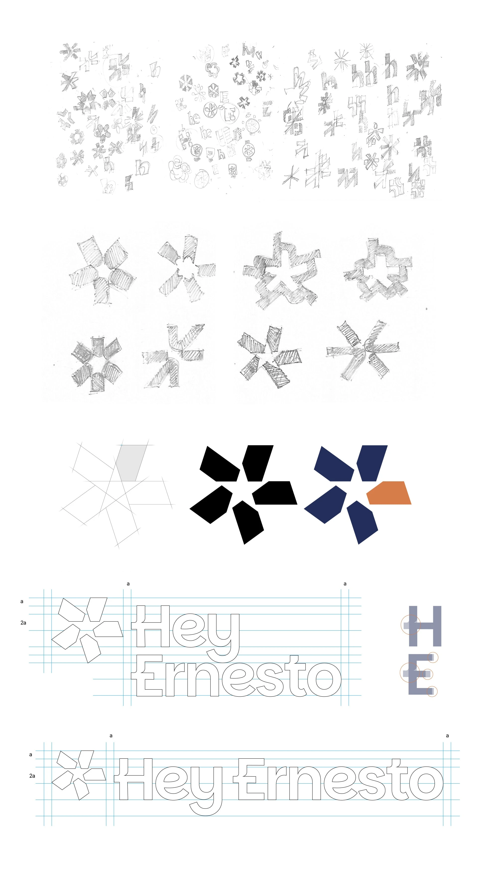
✅ Visual Identity: Clear, Human, Intentional
Every element was born from purpose — not preference.
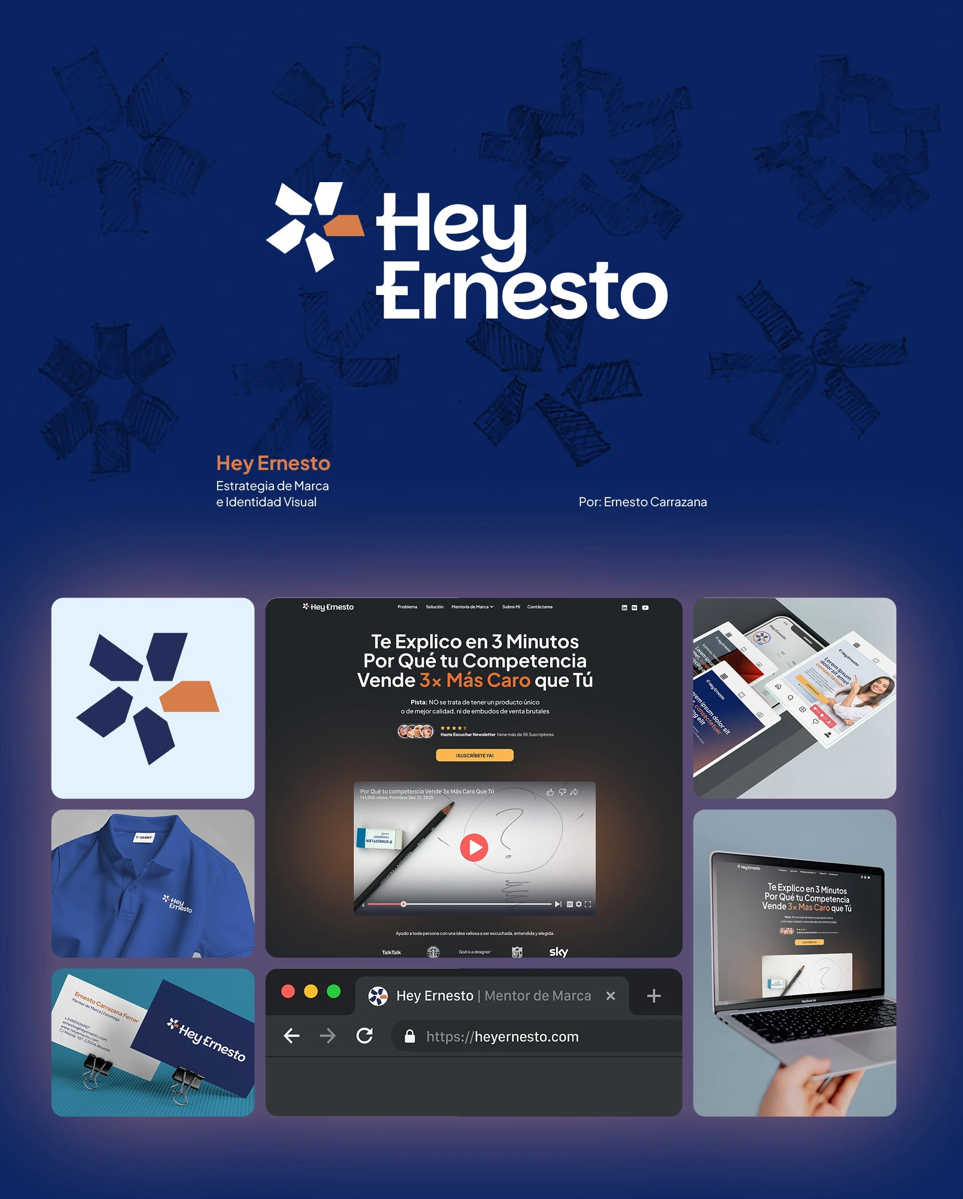
The asterisk: Interrupts the noise. Says: “This is important.”
The star: Guides. Lights the way.
Together: They represent the mission: helping what matters to be noticed.
Typography (Plus Jakarta Sans): Rounded, legible, no jargon. Because the message should feel like a conversation — not an ad.
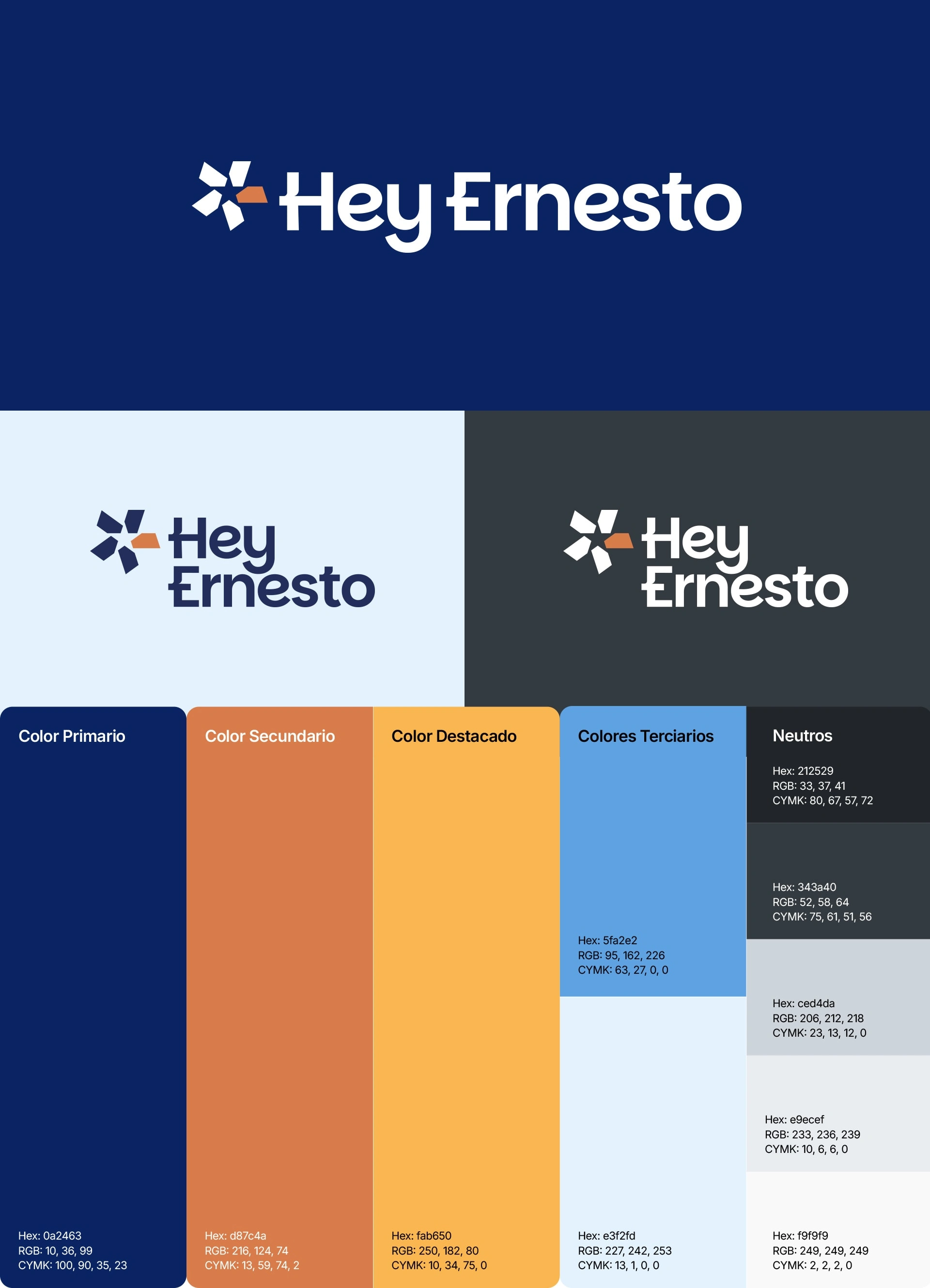
🎨 Graphic System: A Palette with Purpose
Organized by emotional hierarchy:
Deep Blue (50%) → Clarity, strategic thinking
Soft White (30%) → Space, breathing room
Terracotta (15%) → Human warmth
Amber (5%) → Attention without shouting
Every percentage has a reason.
Nothing is decorative.
Gradients, backgrounds, and applications reinforce the message — without losing essence.
📦 Applications: Functional, Not Ornamental
Business card: Minimalist. Human. With space to breathe.
Website: Conversion-focused. Lead capture. Total clarity.
Blue polo shirts: My visual uniform. Worn in meetings, webinars, social media.
Social content: Posts, carousels, reels with a clear, human tone.
Everything communicates the same thing:
Clarity. Intention. Humanity.
📈 The Result: A Brand That Feels Authentic
Today, Hey Ernesto doesn’t just look different.
It feels different.
It doesn’t copy trends.
It doesn’t shout.
It simply gets attention.
It’s the image of a mentor who helps build brands without elitism or noise.
Accessible. Real. Human.
And those who arrive say:
“Your message isn’t ‘look at what I do.’ It’s ‘I understand what you’re going through.’”

🔑 Key Takeaway
This project reminded me of something powerful:
The simplest solutions don’t come from inspiration.
They come from conceptual work.
From uncomfortable questions.
From hours of listening, defining, and letting go.
Sometimes, the strongest brands aren’t the brightest.
They’re the most honest.
The ones that don’t say “look at me,”
but instead:
“…I see you.”
Like this project
Posted Jan 12, 2026
Created my own brand from scratch — a strategic, human-centered identity focused on clarity, not noise. No fluff, just purpose.
Likes
1
Views
25
Timeline
Dec 10, 2025 - Dec 1, 2026

