Built with Spline
Logo Redesign Proposal for a Global Remittance App
Ugochukwu Osuagwu
Connecting Currencies, Empowering You

Project Description
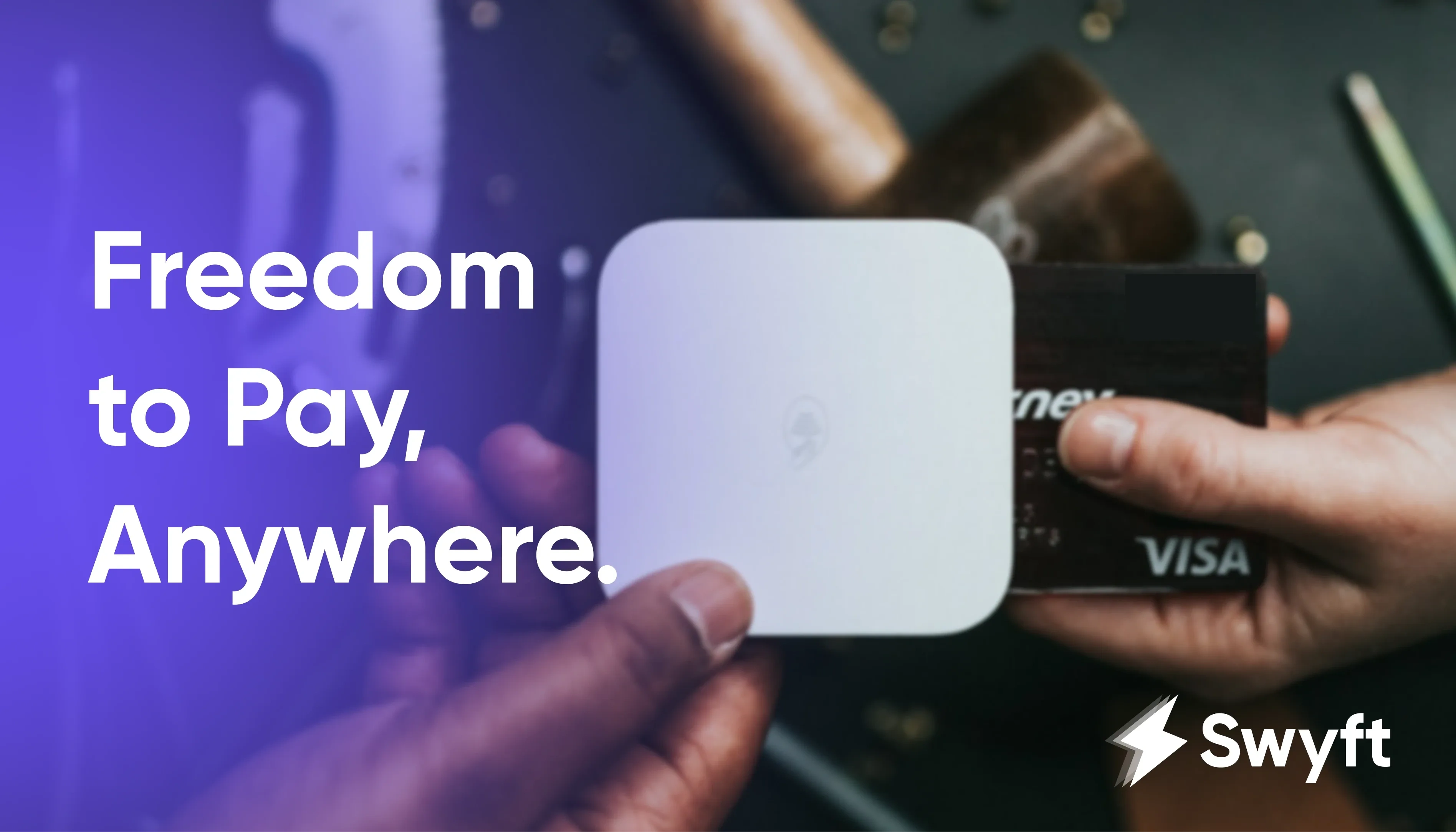
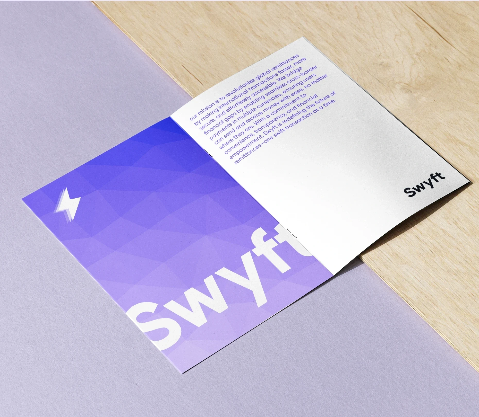
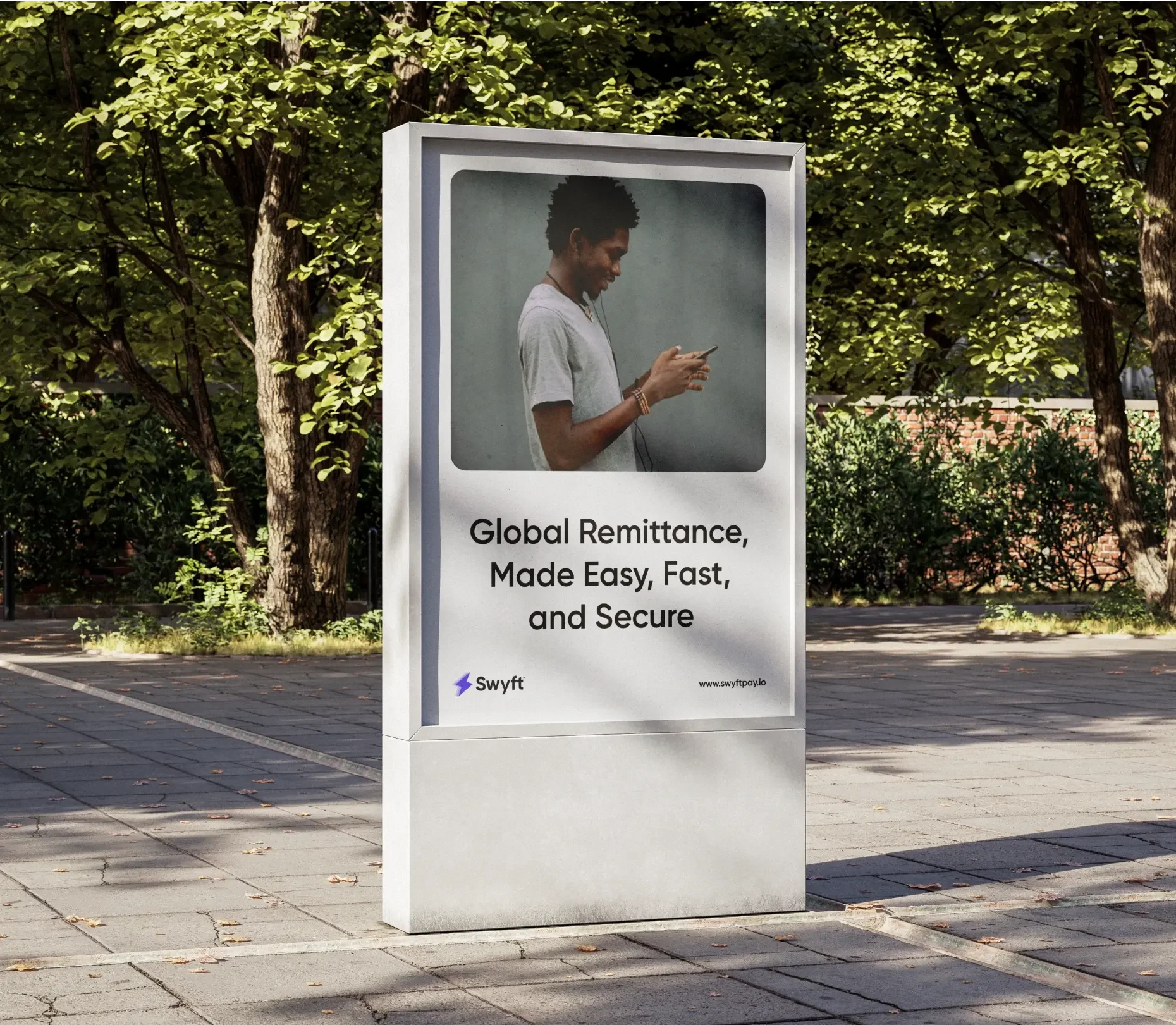
Swyft is a global remittance platform that simplifies international payments by enabling swift, secure transactions across multiple currencies. With a focus on convenience and financial freedom, Swyft empowers users to send and receive money seamlessly, wherever they are.
My Contribution
I was responsible for designing a new logo identity that reflects Swyft’s v Alongside the logo, I created additional visual design elements to strengthen the brand’s identity and ensure visual consistency across all touchpoints.
Key Deliverables
Brand Identity Design
Visual Identity Elements
Industry
Fintech

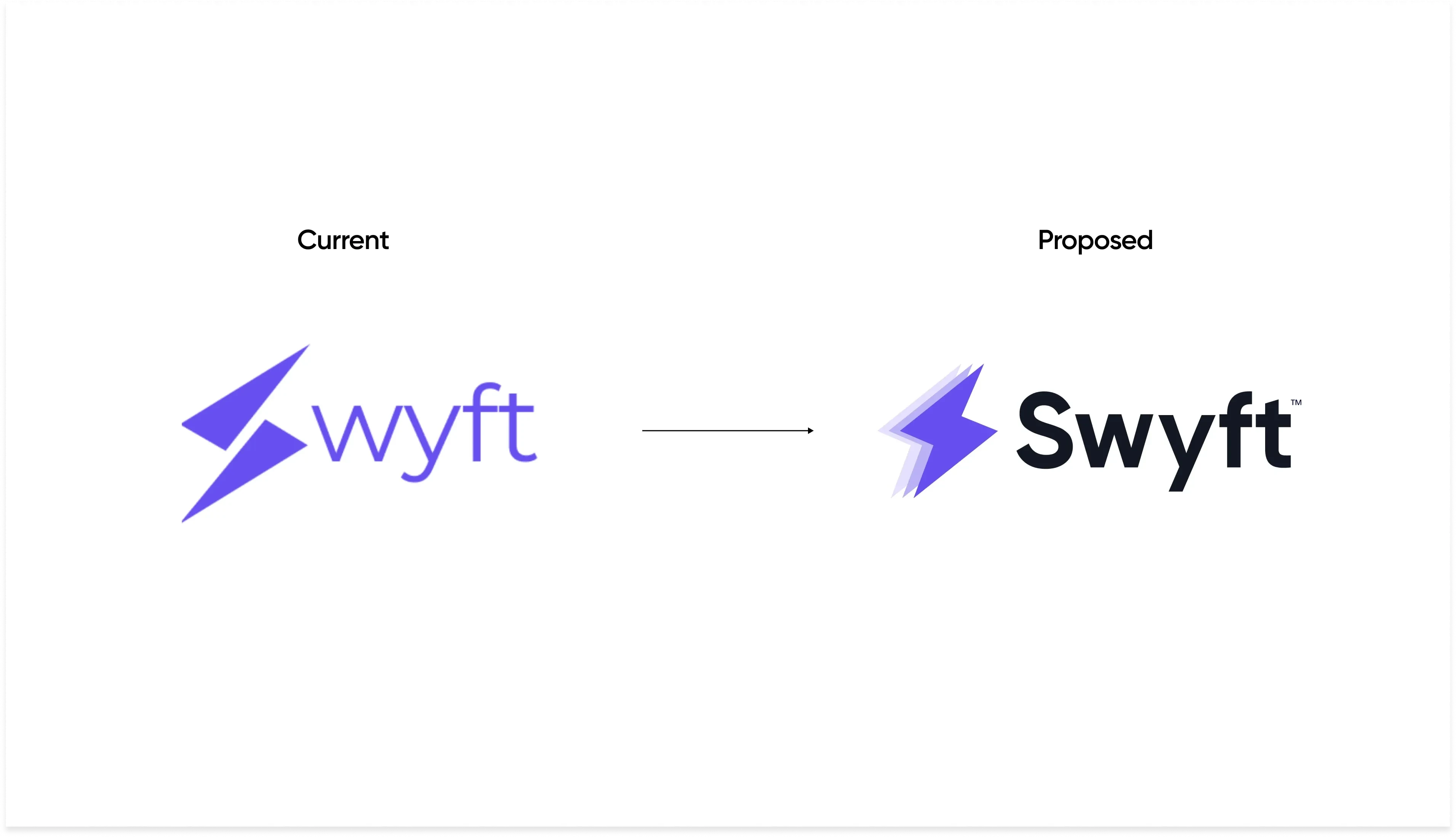
A Proposed Rebrand
In Q1 of 2024, while researching fintech companies, I came across Swyft, a global remittance platform focused on enabling fast and seamless transactions. However, I noticed a major issue with the brand’s visual identity—the typography made it difficult to read "Swyft" clearly, often appearing as just "Wyft." The original design attempted to blend an icon-mark and a wordmark, but this approach weakened the brand's clarity and recognition.
Seeing the need for a stronger visual presence, I reached out to the founder to discuss the design. He shared similar concerns and gave me the green light to explore an upgrade. The redesigned logo enhances readability with a bolder, more refined font while integrating a sleek icon that symbolizes speed, security, and effortless transactions—aligning perfectly with Swyft’s core mission.
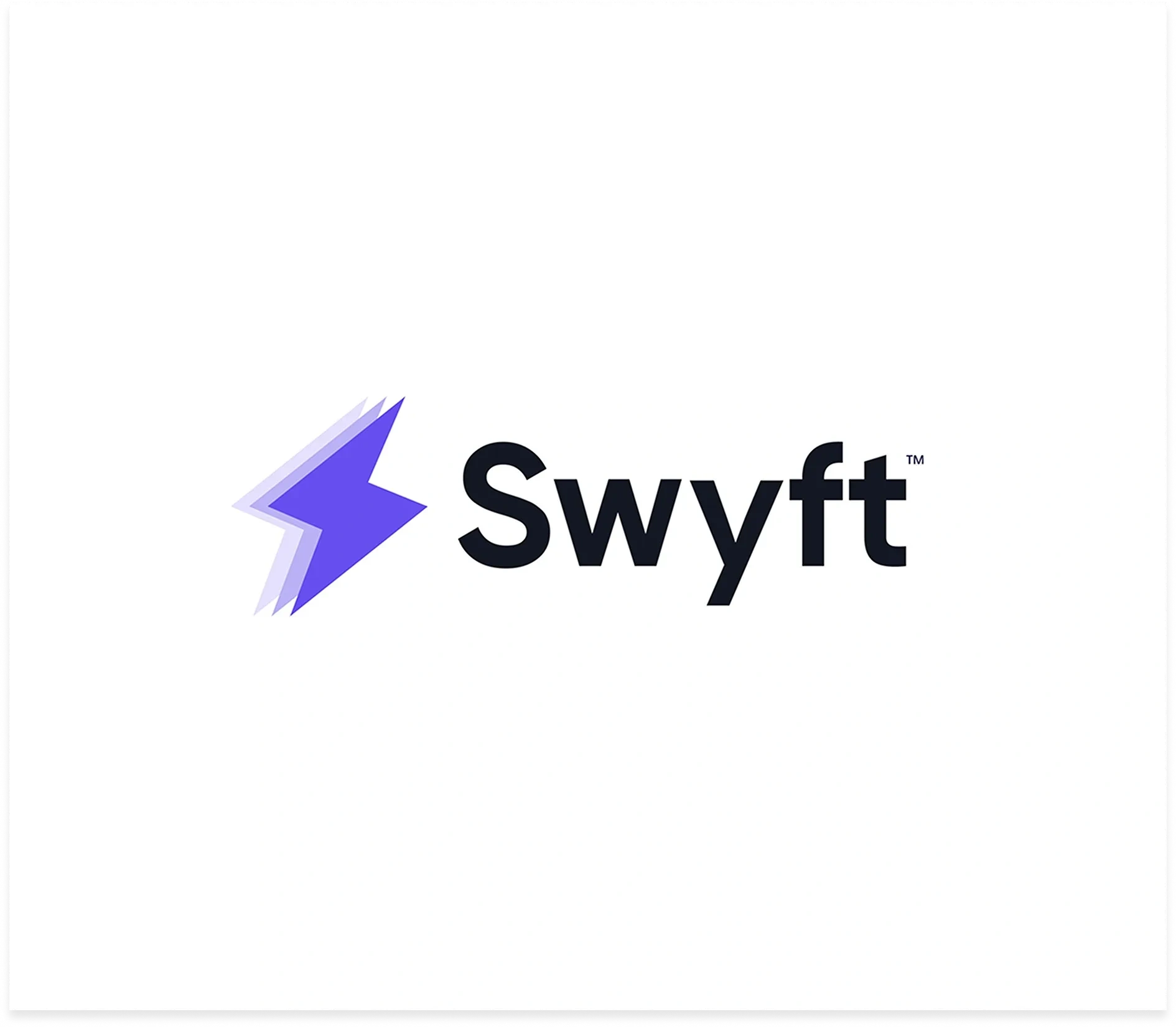
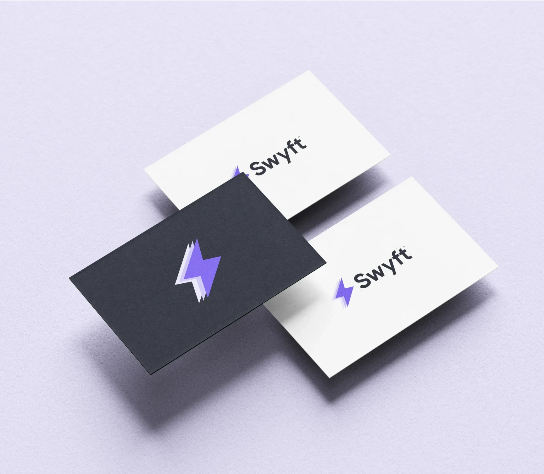
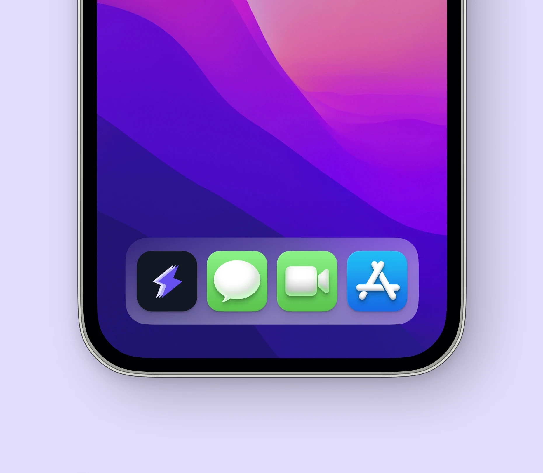
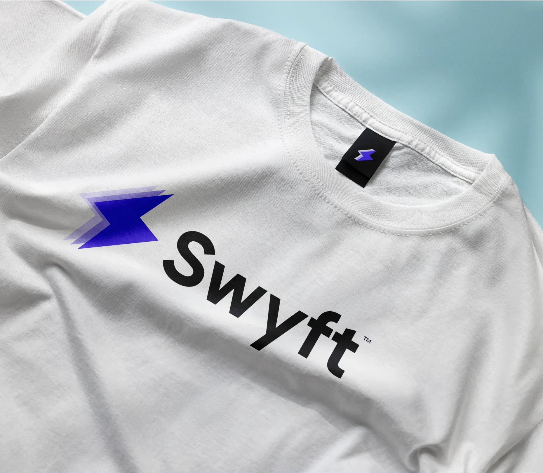
The Logo
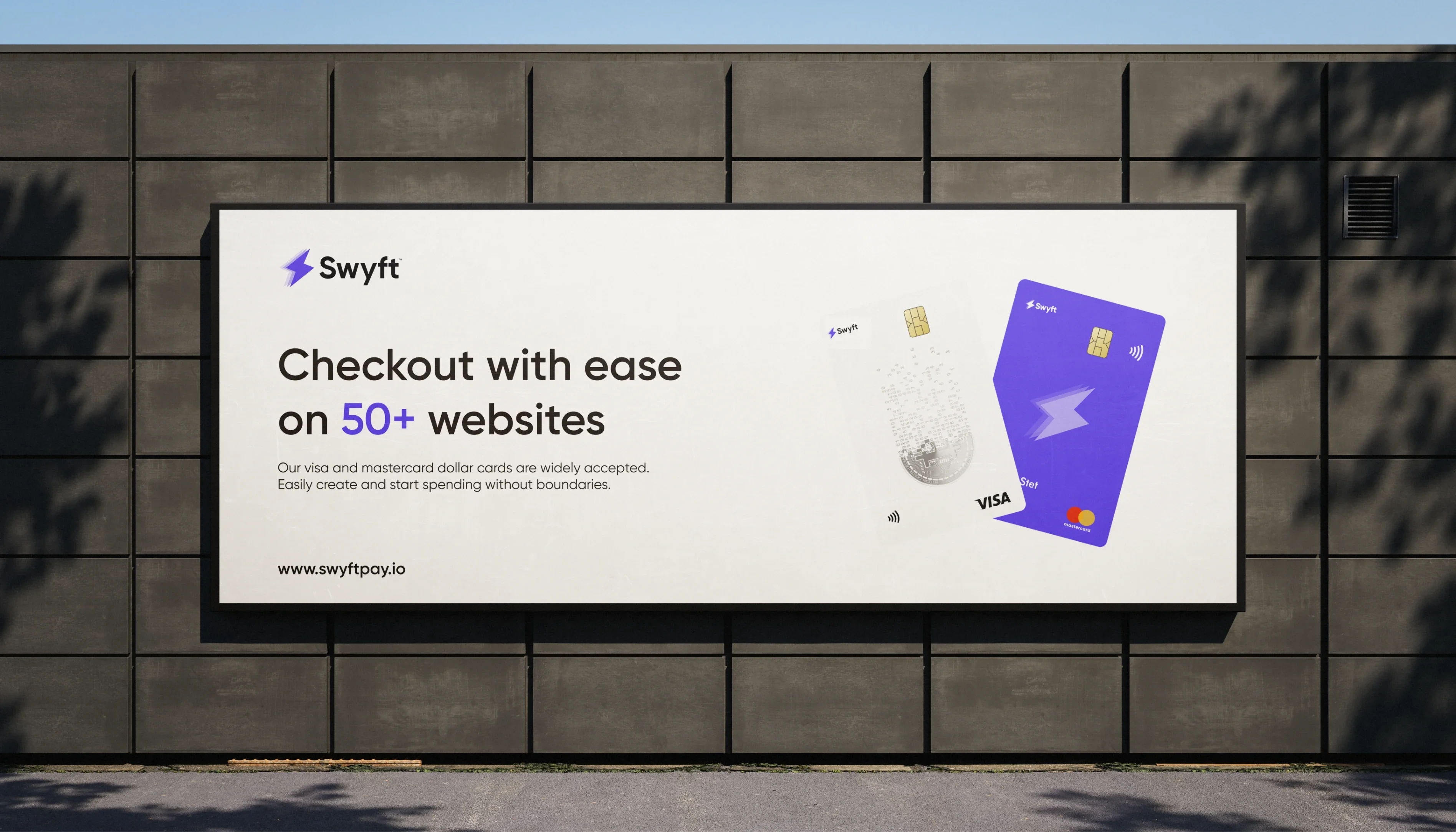
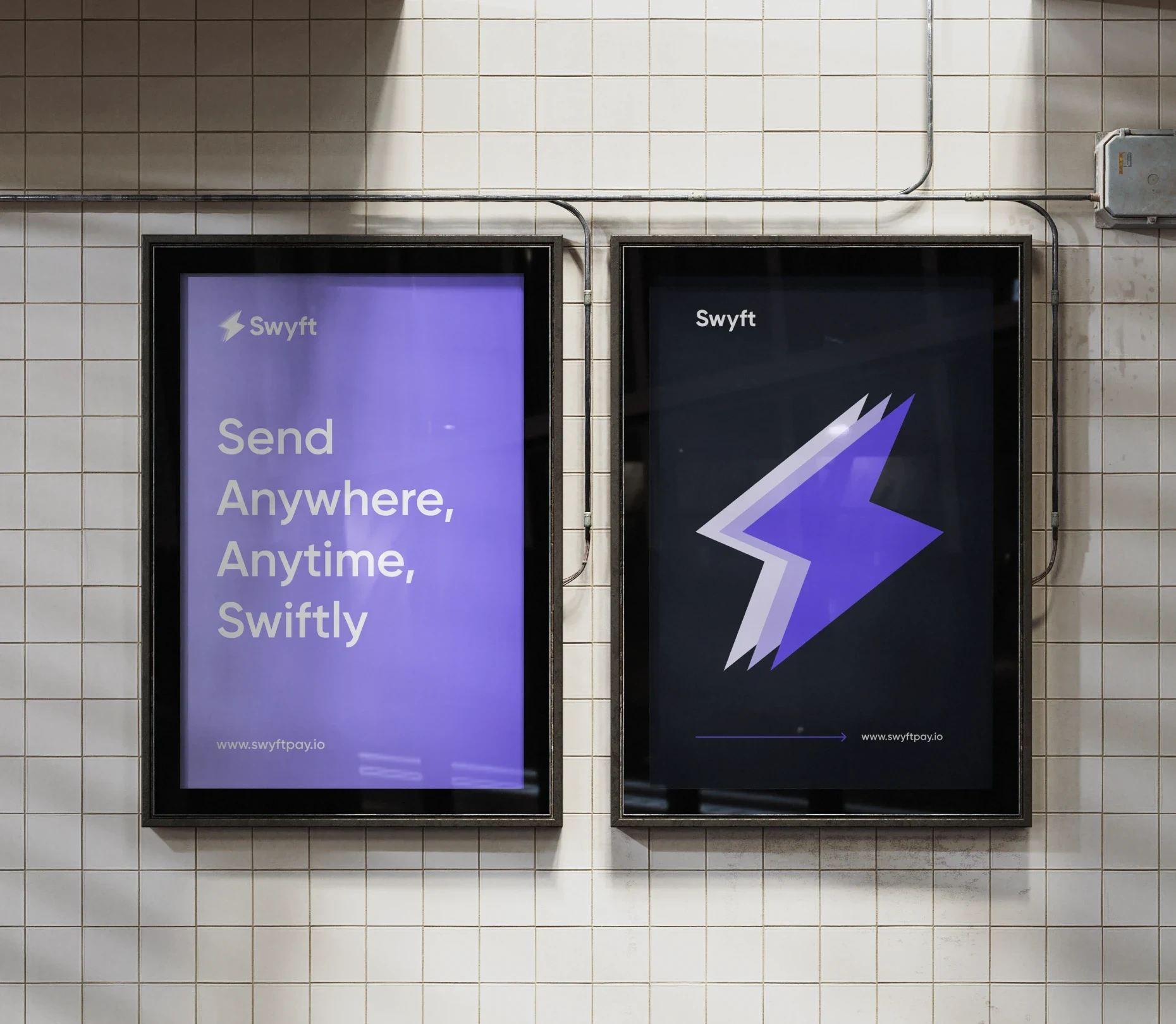
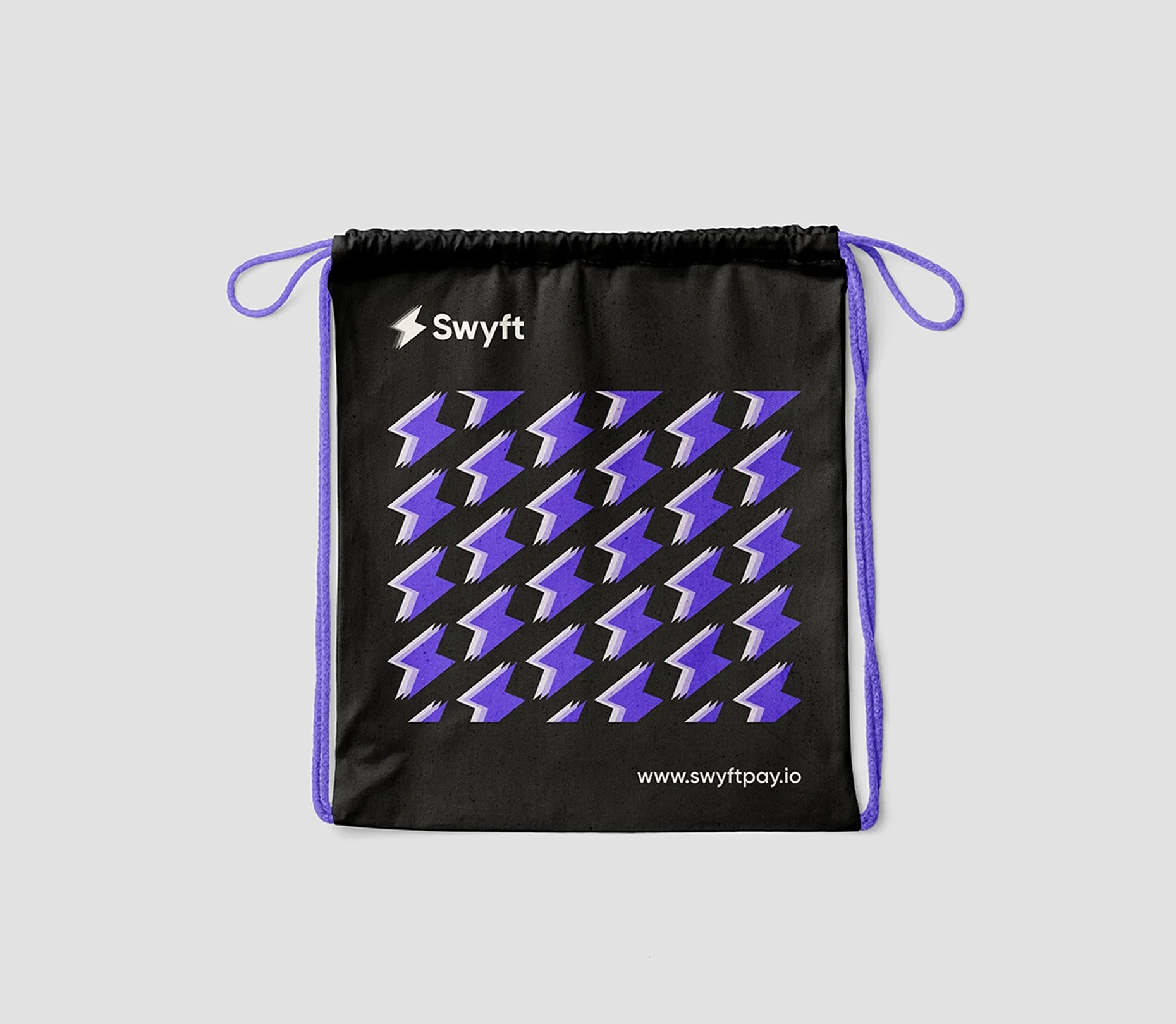
The redesigned Swyft logo embodies the brand’s core values—speed, efficiency, and security—while enhancing clarity and impact. The icon is a refined evolution of the original thunderbolt, now featuring a dynamic, motion-inspired effect that visually reinforces the idea of swift transactions. This layered design creates a sense of acceleration, perfectly aligning with Swyft’s mission of fast and seamless remittances.
The color palette remains consistent with the existing brand identity, maintaining the signature primary shade while introducing lighter gradients to add depth and dimension. The typography has been upgraded to a bold, modern sans-serif font, ensuring stronger visibility and a commanding presence in the fintech space. This boldness not only enhances readability but also conveys trust, reliability, and confidence—key attributes in the financial industry.
Overall, the refreshed Swyft logo is a perfect balance of familiarity and innovation, reinforcing its position as a forward-thinking brand in the global remittance ecosystem.

Like this project
Posted Feb 18, 2025
I was responsible for designing a new logo identity that reflects Swyft’s core values.
Likes
1
Views
4
Clients
Swerv