KERI Branding
Munawar Designs
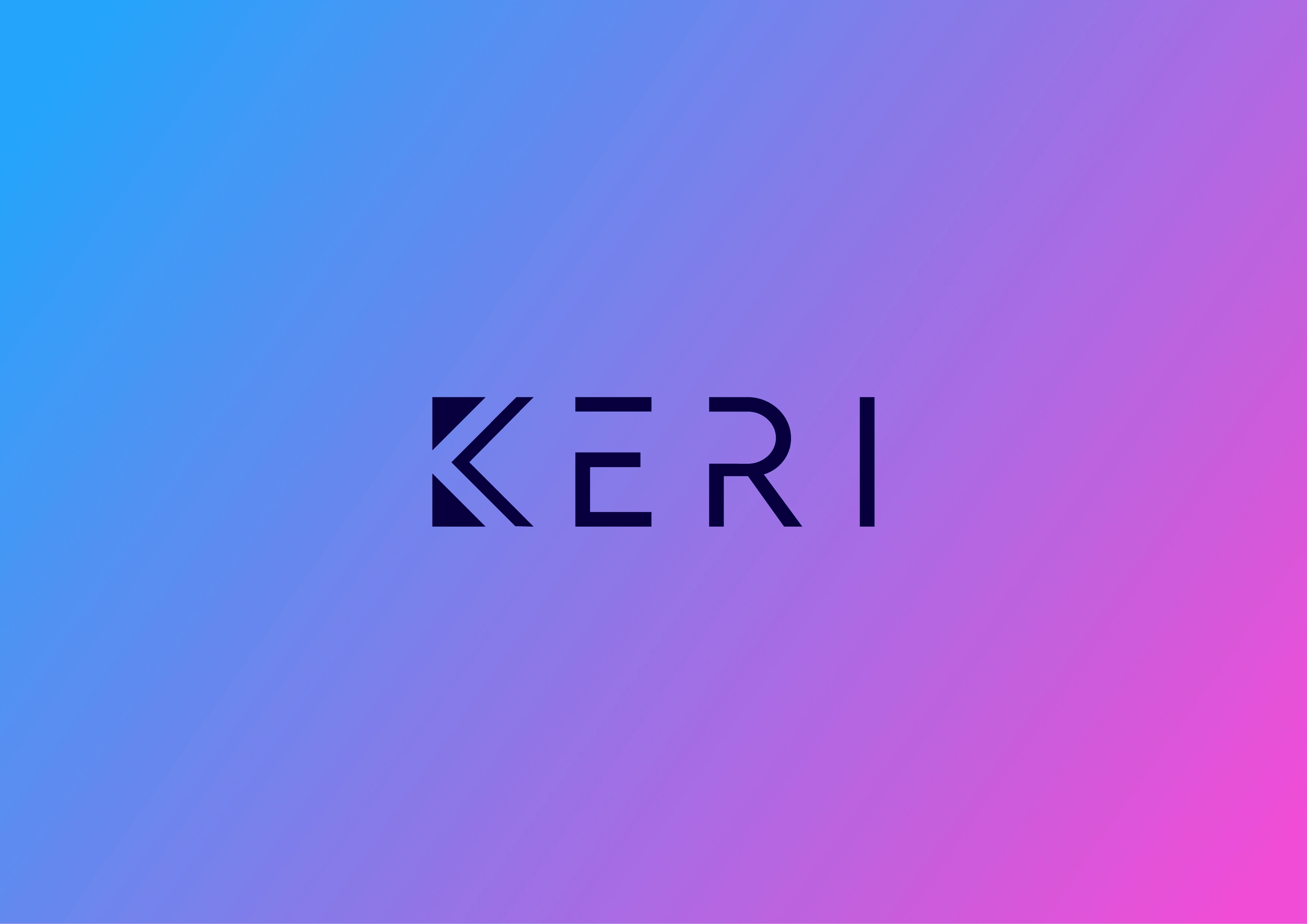
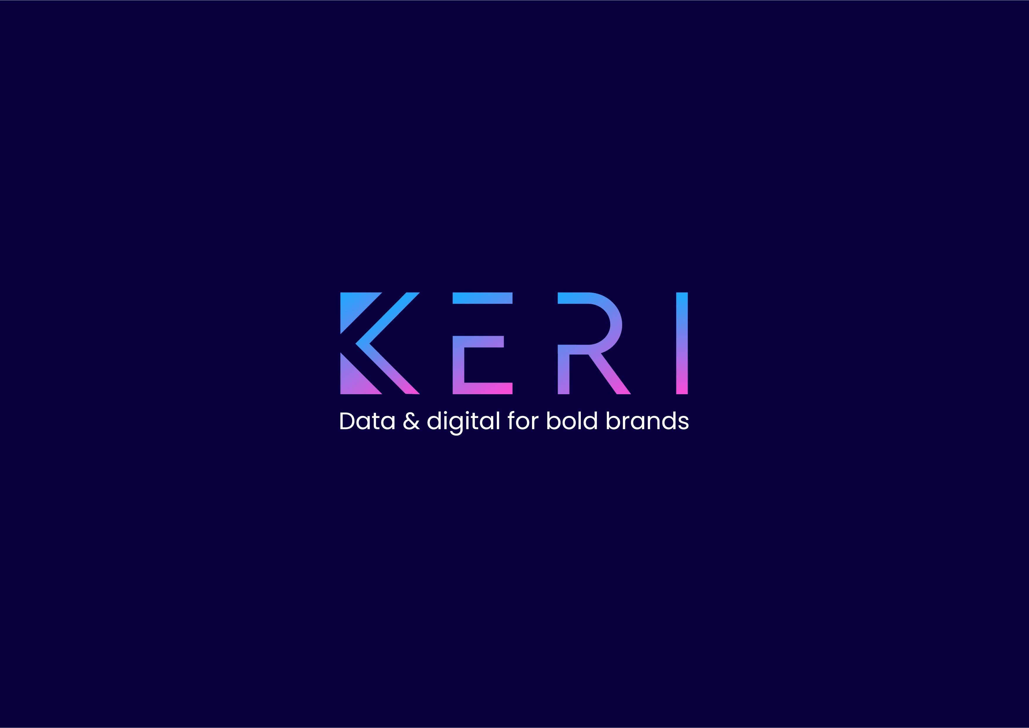
Main Logo
Secondary Logo
Project Title:
Rebranding for KERI – A Creative Agency
Client:
KERI – Creative & Branding Agency
Industry:
Creative Services / Marketing & Design
Project Goals:
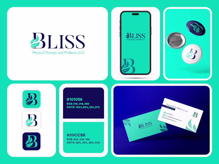
KERI, a creative agency, was undergoing a full brand refresh to align with modern design trends and better reflect their bold, innovative personality. They wanted a sleek, text-based logo infused with sharp geometric elements—hinting at creativity, structure, and forward thinking.
Creative Process:
I explored custom typography with sharp edges and subtle mathematical angles to add a geometric touch without compromising readability. The chosen palette—a bold mix of dark blue, purple/pink, and blue gradients—reflects modern energy while keeping a professional edge.
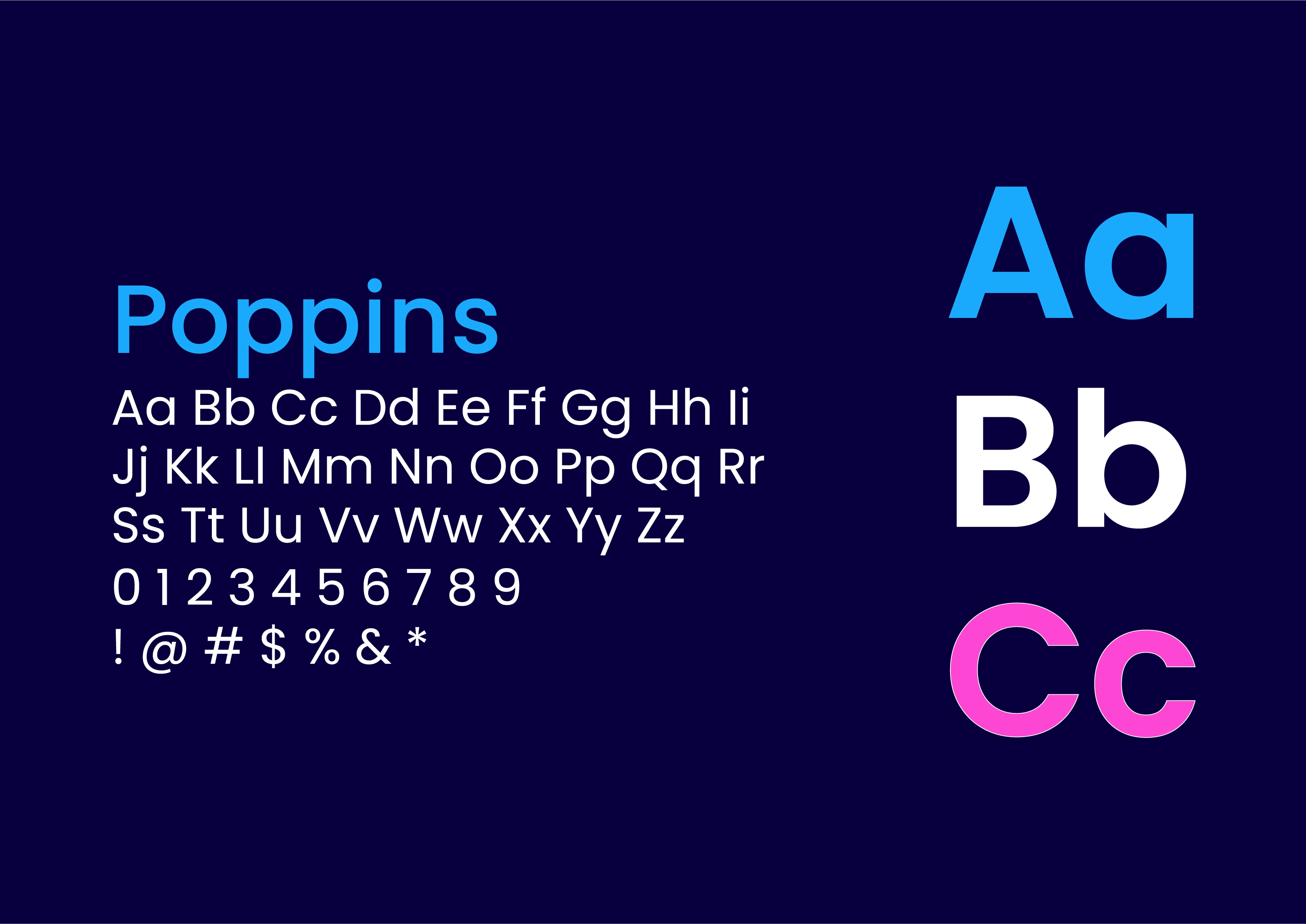
Typeface
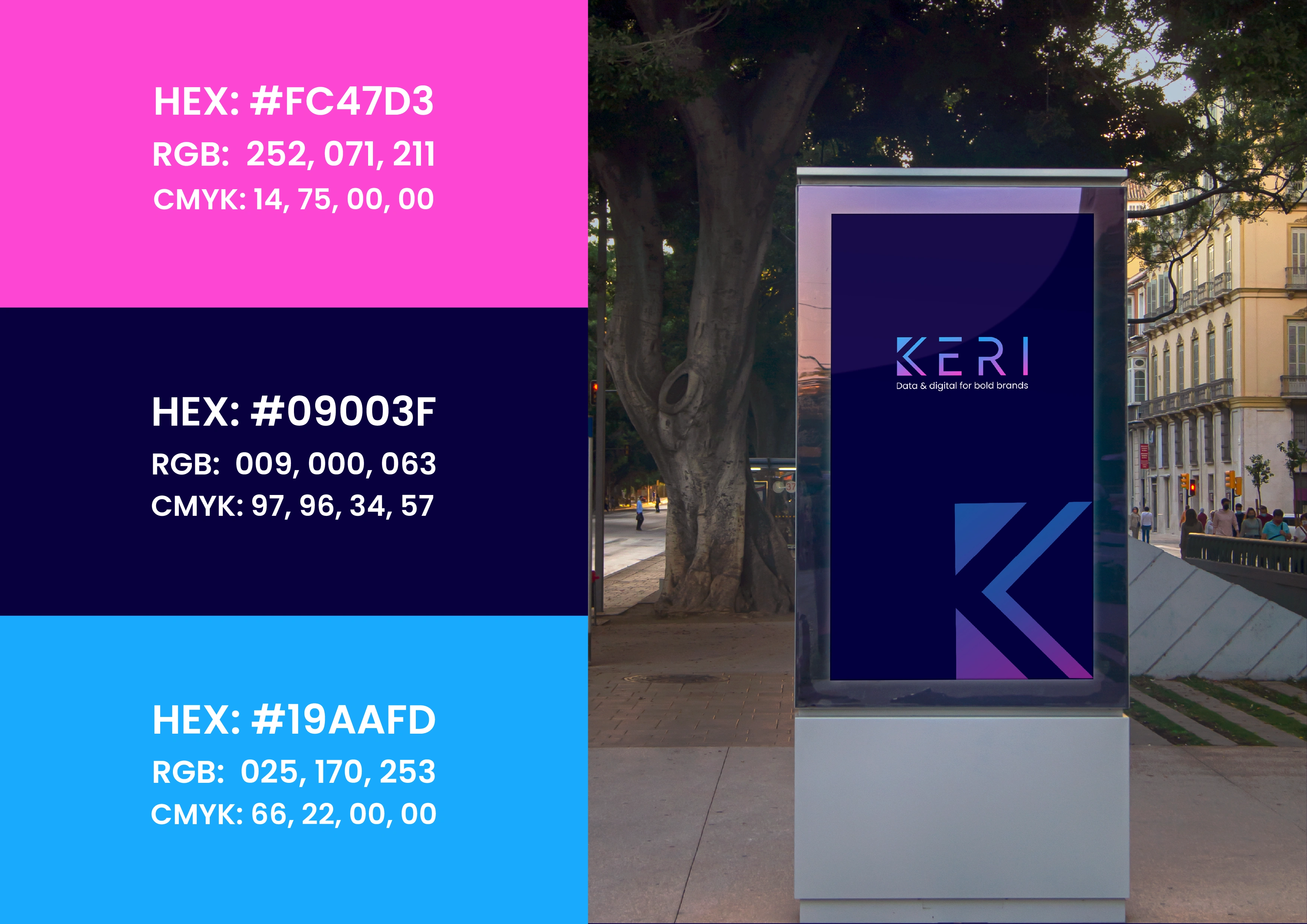
Color palette
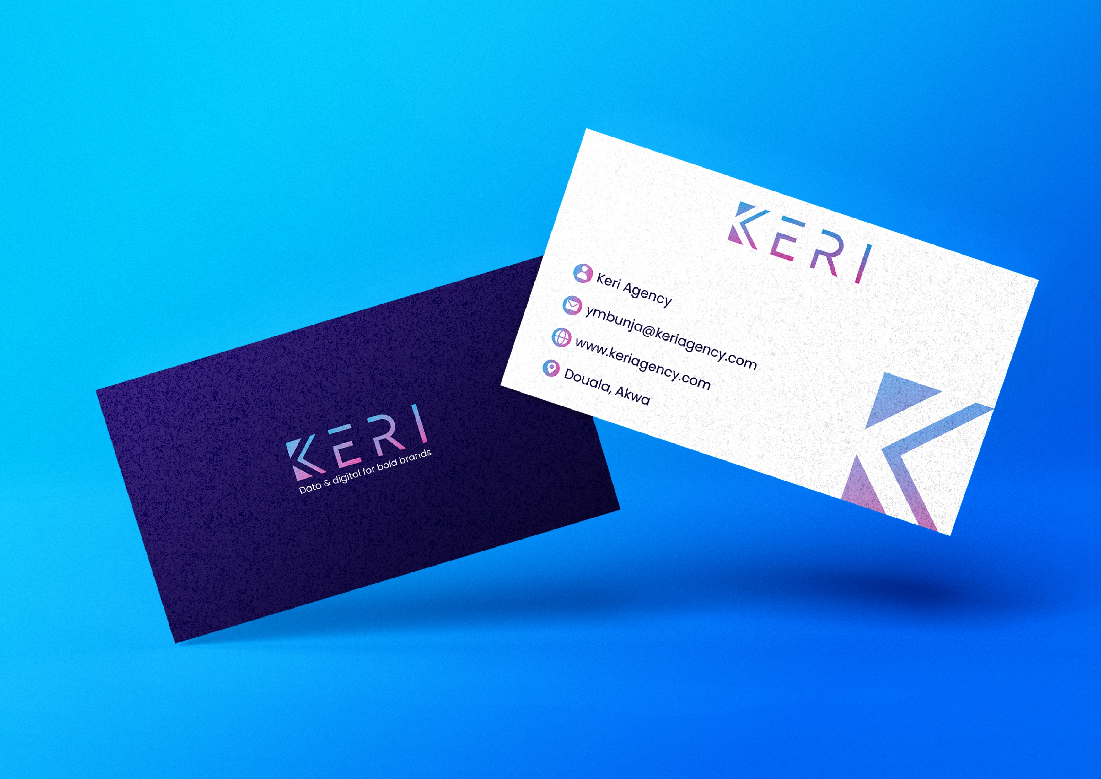
Business Card
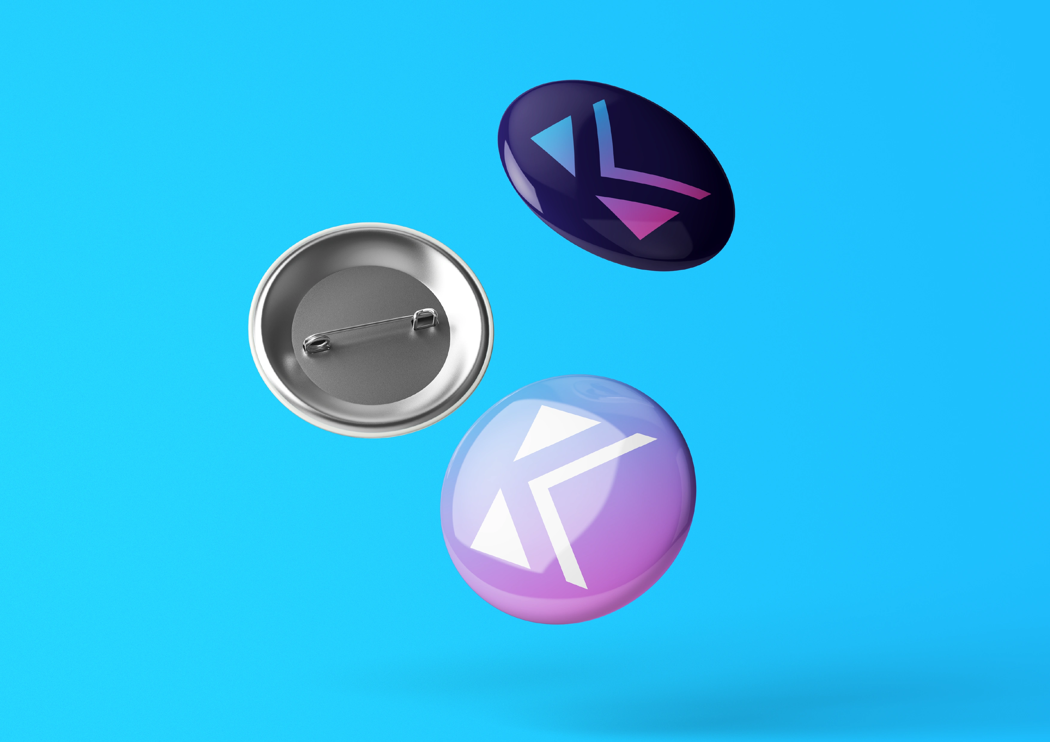
Mokcup 1
Results:
KERI’s new identity now feels confident, vibrant, and ready to compete in the creative industry. The final design strikes a balance between playfulness and professionalism, making the brand visually impactful across digital and print.
Project Duration:
1–2 weeks
Tools Used:
Adobe Illustrator, Photoshop, Figma
Like this project
Posted May 11, 2024
Developed a modern rebrand for KERI, a creative agency. Designed a sharp, text-based logo with geometric elements and a bold gradient palette.