A to Z Family Logo & Branding
Munawar Designs
Presentation
Project Title:
Icon-Based Branding for A-Z for Family
Client:
A-Z for Family
Industry:
Family Services / Parenting / Lifestyle & Wellness
Project Goals:
A-Z for Family needed a warm, approachable brand identity that reflects inclusivity, care, and connection for families. The goal was to create a logo that feels comforting and universal while keeping it visually minimal.
Creative Process:
I designed a soft, icon-based logo using a minimal tree symbol to represent growth, nurturing, and the strong foundation of family. The color palette was carefully chosen in pastel tones, giving the brand a calm, welcoming feel while ensuring it stands out with softness instead of boldness.
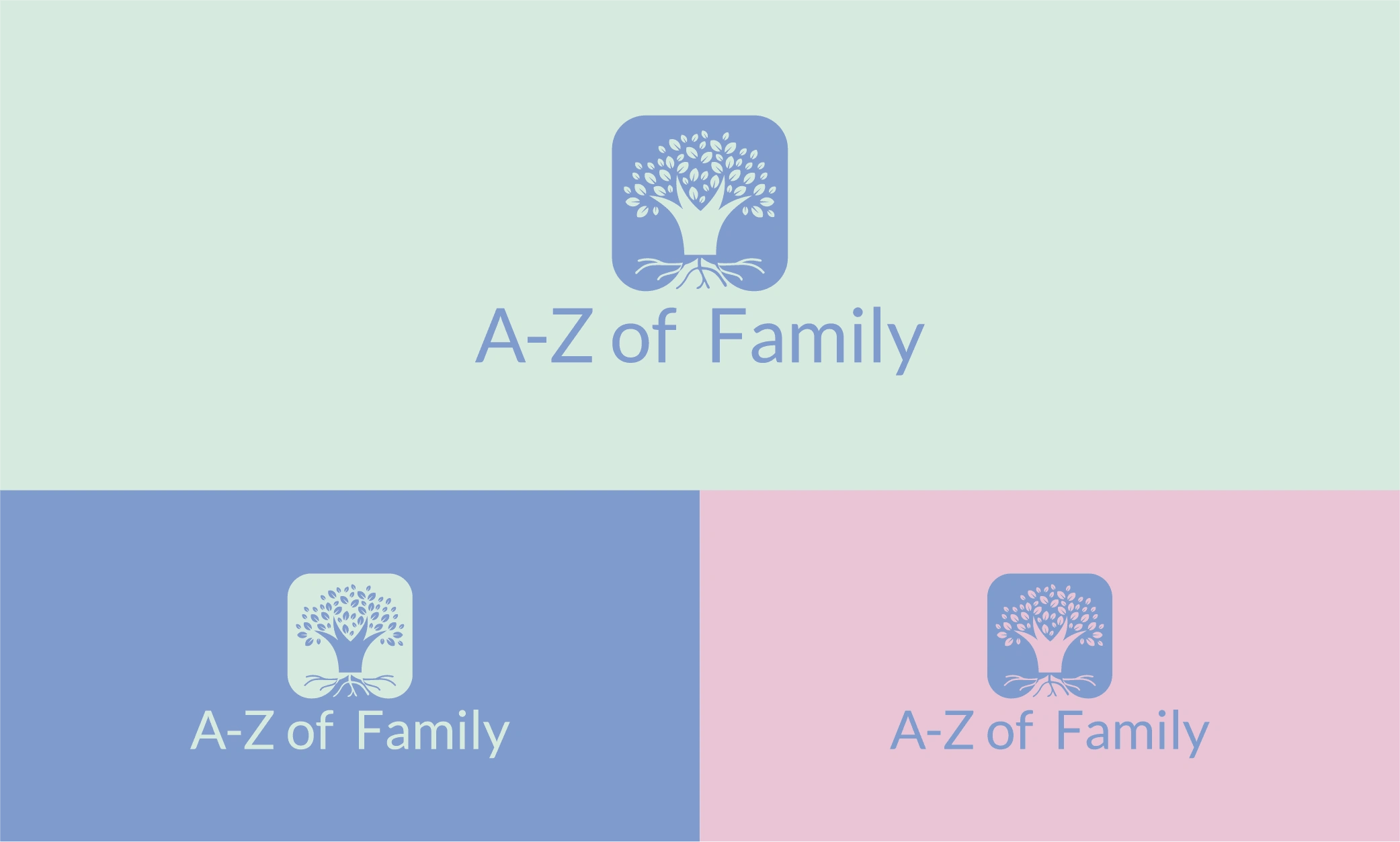
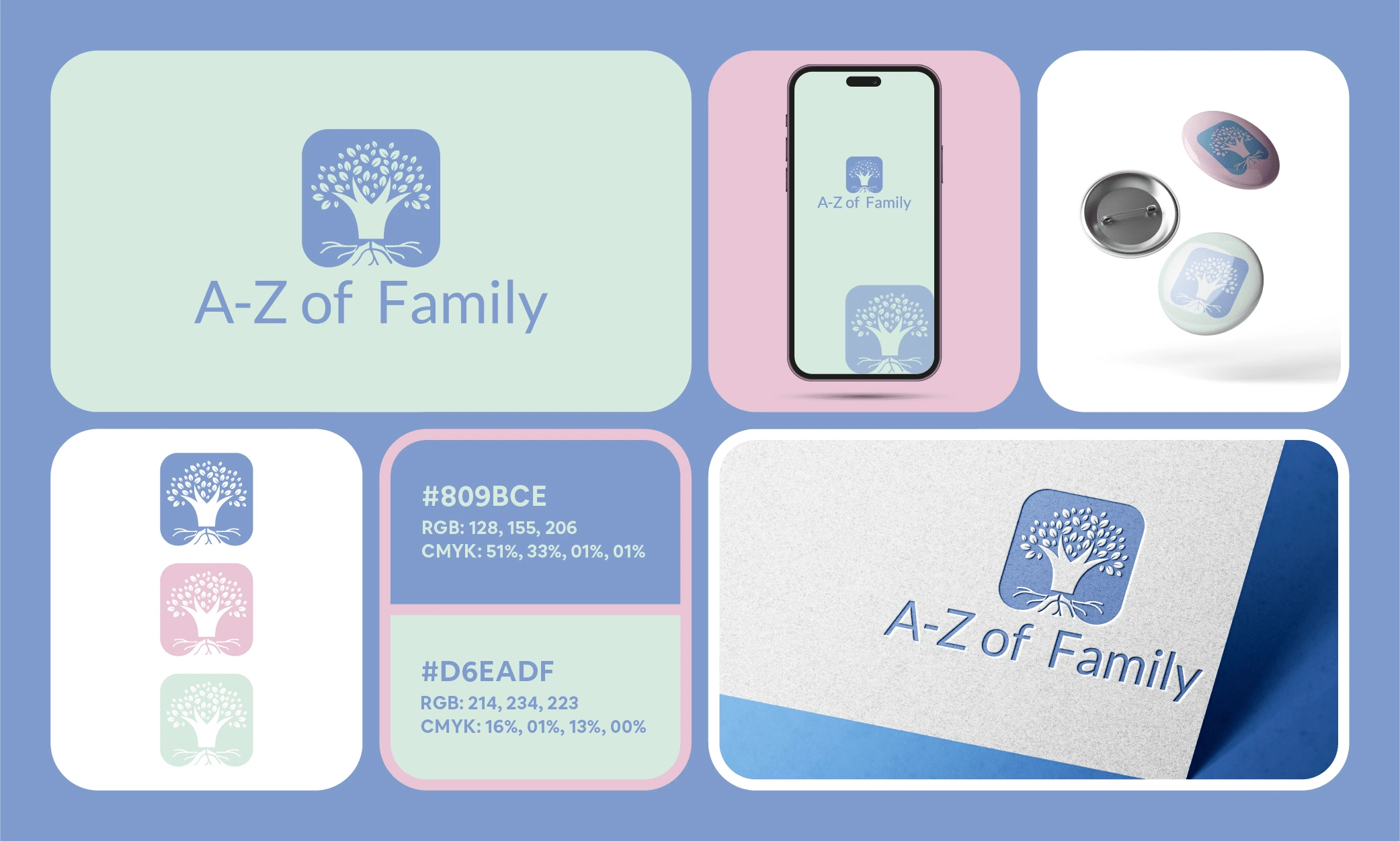
Main Logo
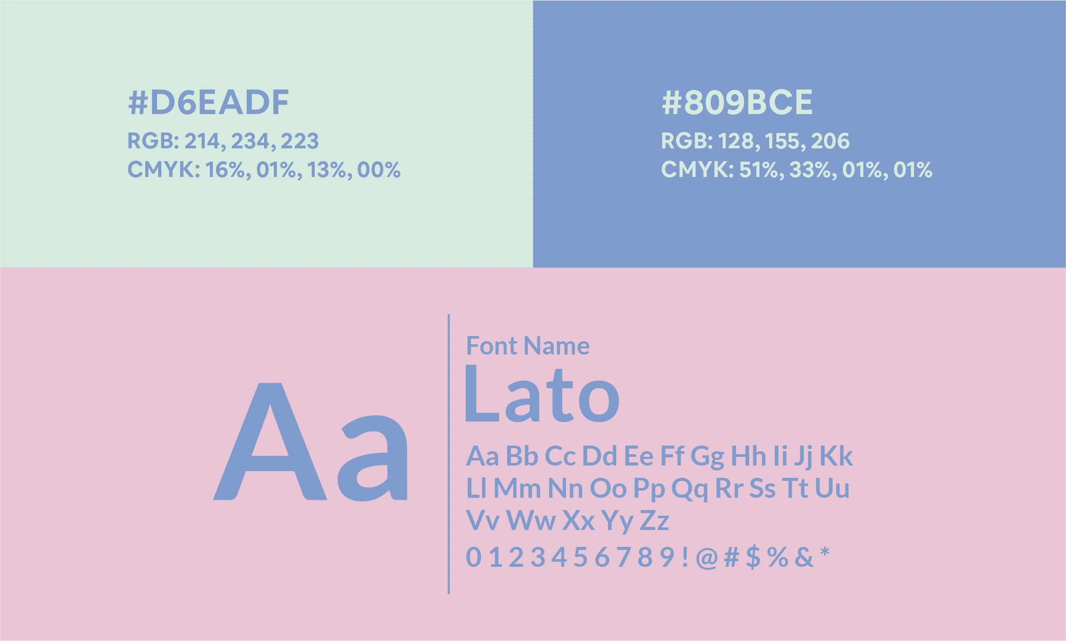
Color Palette and Typeface
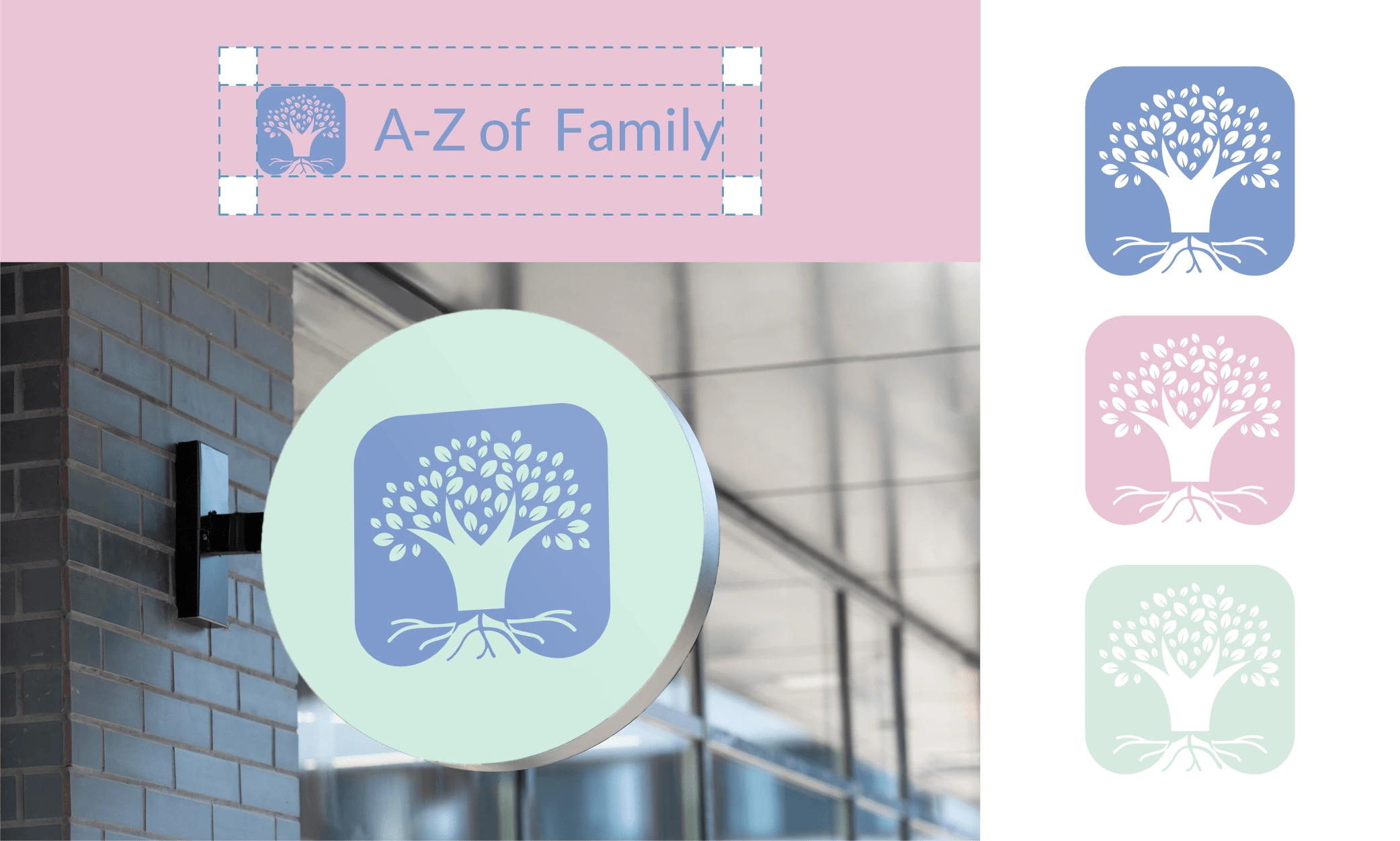
Brand Mark

Mockup 1
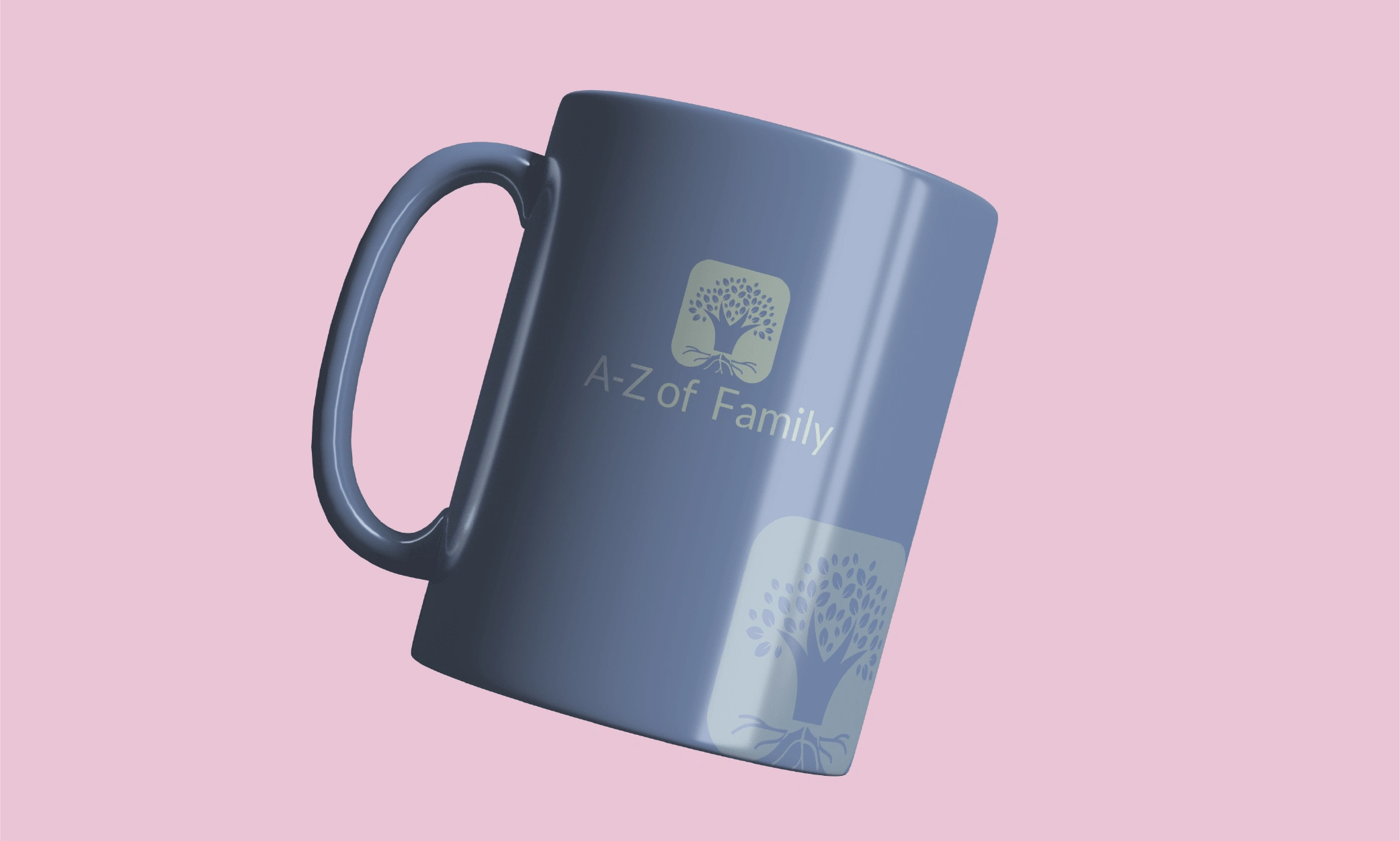
Mockup 2
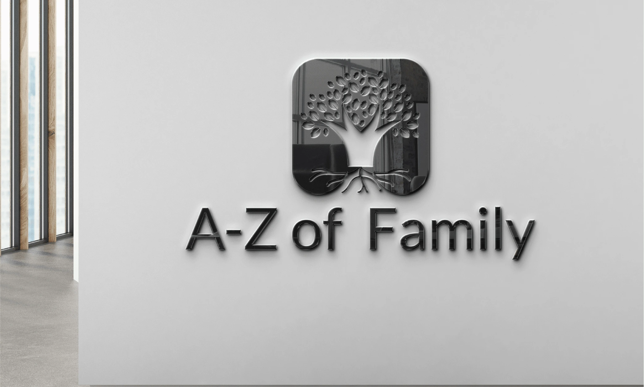
Mockup 3
Results:
The final brand identity feels gentle, supportive, and rooted—perfect for a brand that aims to support families across all stages of life. The visual language sets a positive tone for the audience and offers flexibility across digital and physical platforms.
Like this project
Posted May 20, 2024
Designed a soft, icon-based logo for A-Z for Family using a minimal tree symbol and pastel color palette to reflect warmth, care, and family connection.