Branding for landscaper
Rooted in Simplicity, Thriving in Style
For a young, ambitious landscaper ready to shake up the industry, I crafted a brand identity that blends timeless elegance with a modern, minimalist sensibility.
A Fresh Take on Green Thumbs
While most landscaping brands rely on played-out imagery of manicured gardens and rubberized work boots, I wanted to carve out a distinctive space in the market. My strategic workshop unearthed the client's core values - a dedication to sustainable, high-quality work delivered with a personal touch.
Monogram Magic
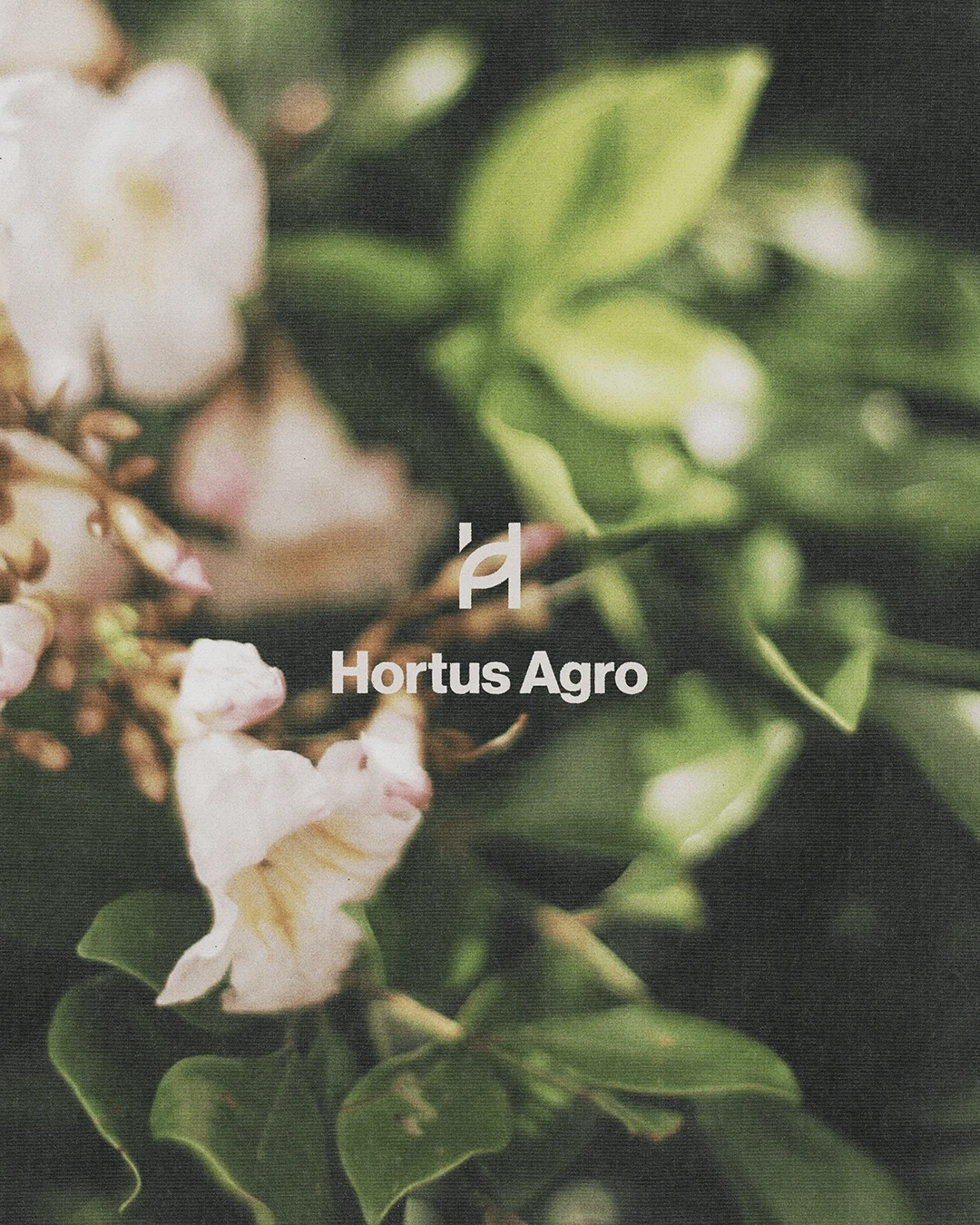
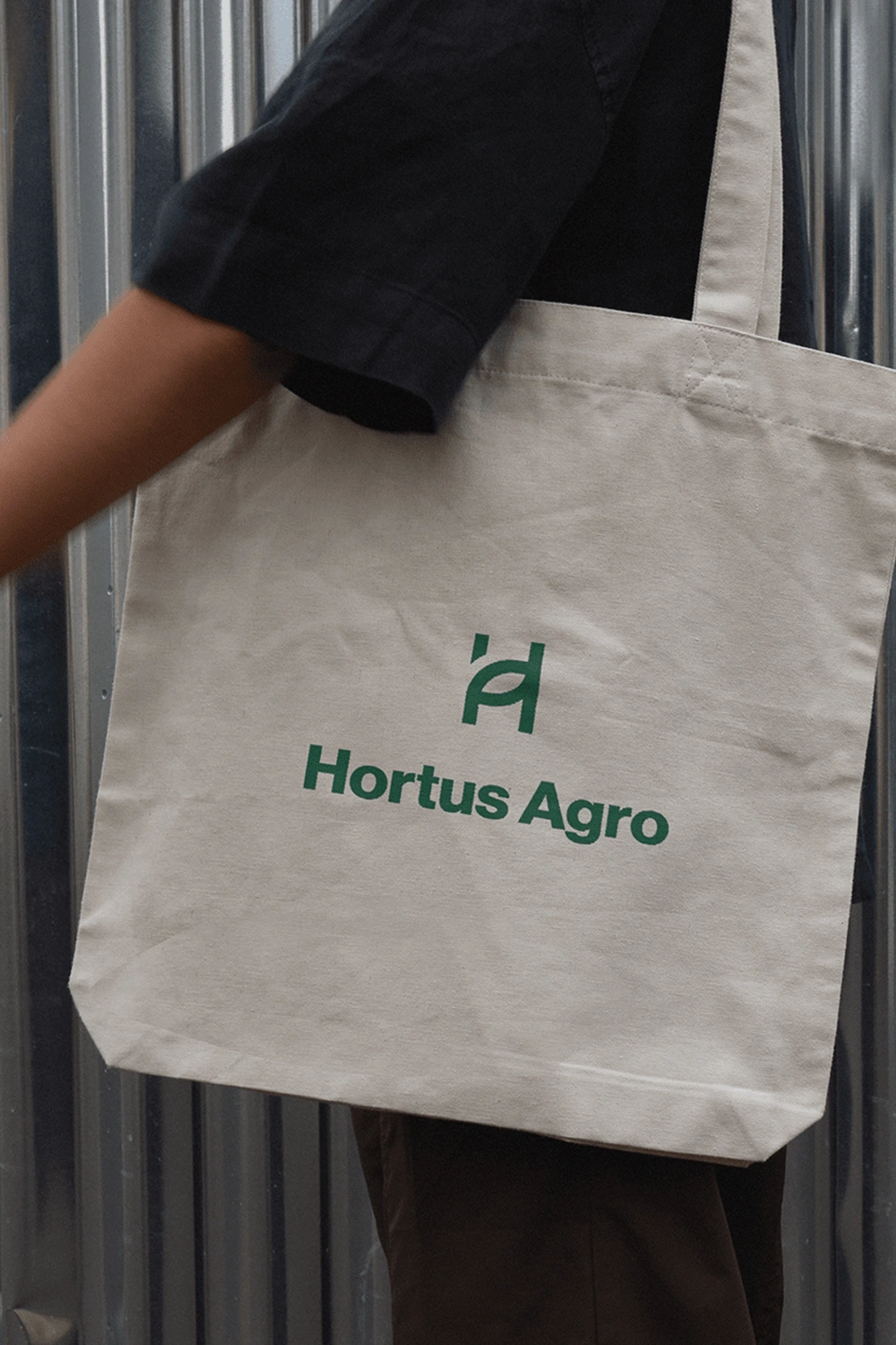
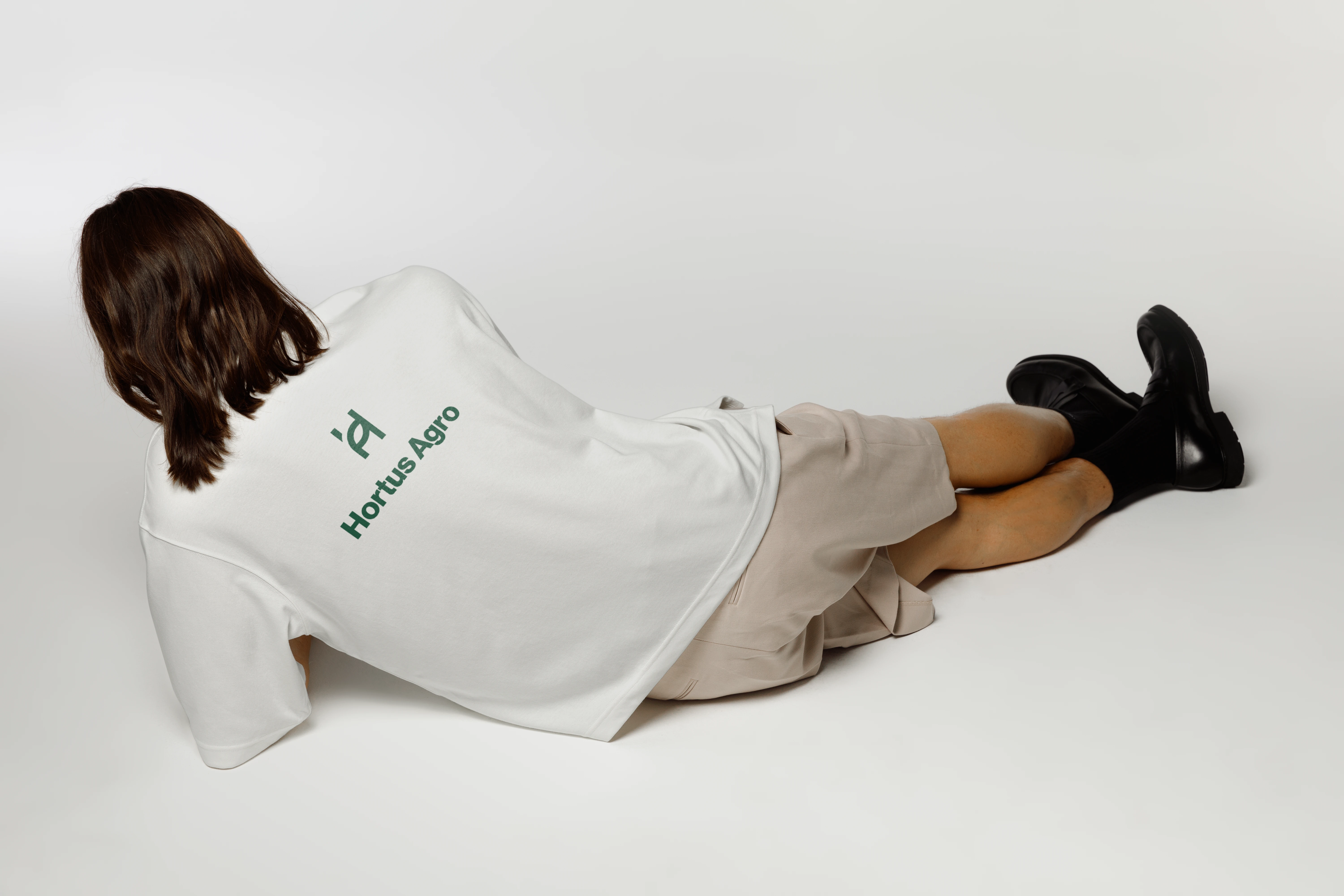
At the heart of the brand, a clean, geometric monogram seamlessly blends the client's initials, "H" and "A." This versatile icon serves as an instantly recognizable mark, equally at home stamped on trucks, embroidered on uniforms, or adorning branded collateral.
A Vibrant Palette
To complement the minimalist monogram, I built a vivid, nature-inspired color palette that brings the brand to life. Rich greens and earthy neutrals evoke the lush landscapes the client creates, while bold pops of color like sunshine yellow and deep teal lend a contemporary edge.
Cultivating a Cutting-Edge Identity
The end result is a brand identity that stands in stark contrast to the industry standard. It's elegant without being stuffy, professional without losing its personality. Most importantly, it captures the spirit of a young landscaper who is transforming perceptions - and lawns - one meticulously designed project at a time.
Like this project
Posted Apr 2, 2024
Landscaper's fresh brand. Strategic workshop, versatile monogram, and a colour palette that makes other brands green with envy. This is landscaping, elevated.
Likes
0
Views
18


