Visual Identity Design for MINOA
Amina BJ
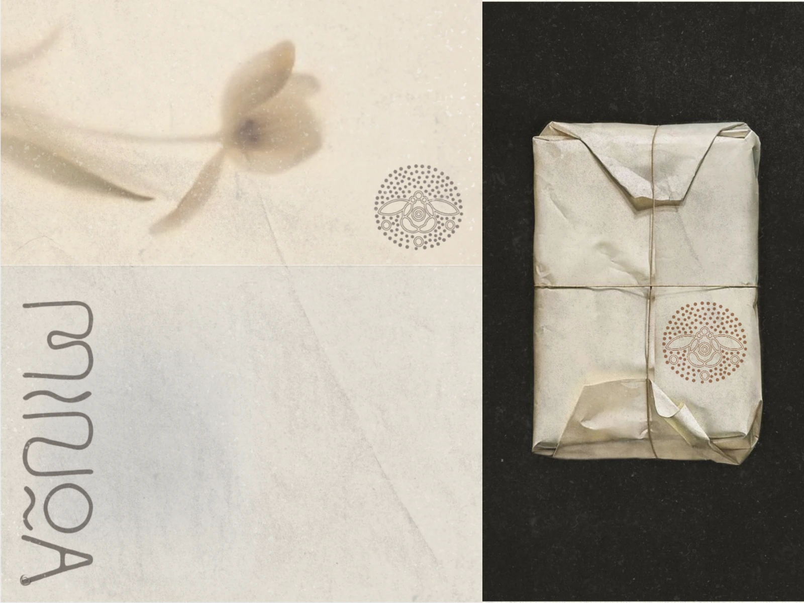
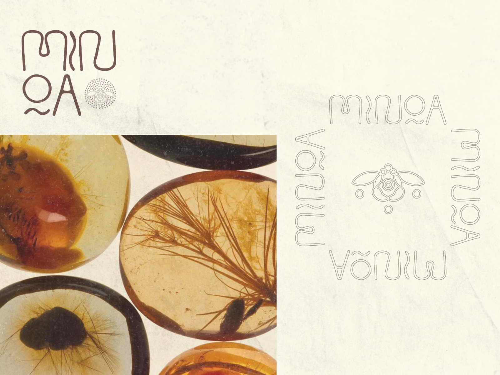
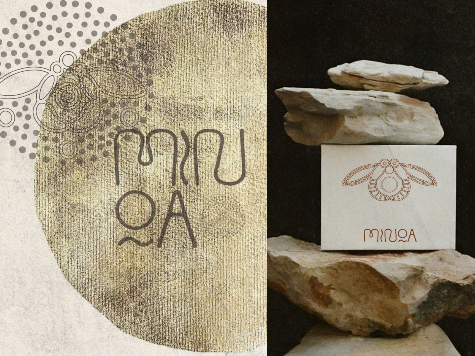
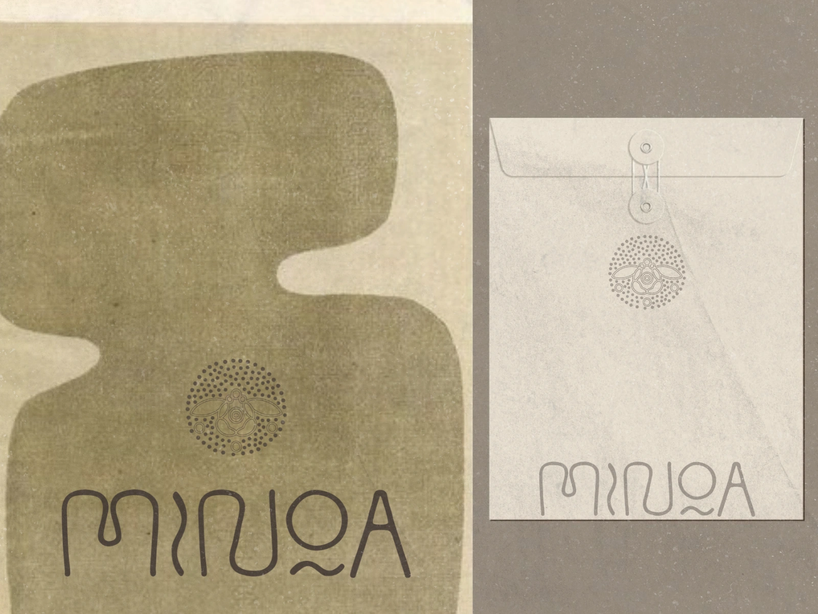
INTRODUCING: ✺ MINOA ✺
When I started working on MINOA, the inspiration behind the brand instantly stood out to me. The entire identity was rooted in the story of the ancient Minoan bee pendant: a symbol dating back more than 3,800 years(!) and deeply connected to craftsmanship, nature & timeless beauty.
MINOA is a family-owned organic honey brand created with a strong appreciation for heritage, authenticity and slow, intentional living. The goal was to design a visual identity that feels warm, grounded & naturally elegant. Something that reflects both the purity of the product and the history woven into its inspiration.
CONCEPT & VISUAL LANGUAGE
The bee pendant became the emotional core of the identity: delicate yet powerful. Symbolic yet organic. From there, the visual direction evolved through earthy tones, soft natural textures and timeless typography inspired by ancient forms and handcrafted details.
The intention was never to create something overly modern or polished. Instead, the goal was to make the brand feel honest, soulful & quietly luxurious, like something passed down through generations. Familiar, authentic and deeply connected to nature.
Like this project
Posted May 8, 2026
Designed a warm, grounded visual identity for MINOA: a family-owned + organic honey brand.
Likes
1
Views
5
Timeline
Apr 24, 2026 - Apr 29, 2026